For many brands, dropping a new logo is a big deal. Not only does it take months to perfect your design, but once it drops, you've got a sea of opinionated fans to impress. If you're worried about a frosty reception, why not take a leaf out of Rocket League's book and create a new logo so subtle that fans are scratching their heads trying to spot the difference?
There's no formula for creating the best logos, but when a design revamp is in order, you'd typically expect to see a slight difference. The irony-filled 'announcement' from NIP Rocket League quickly divided fans as they scrambled to look for any change in design, but it seems no one could agree.
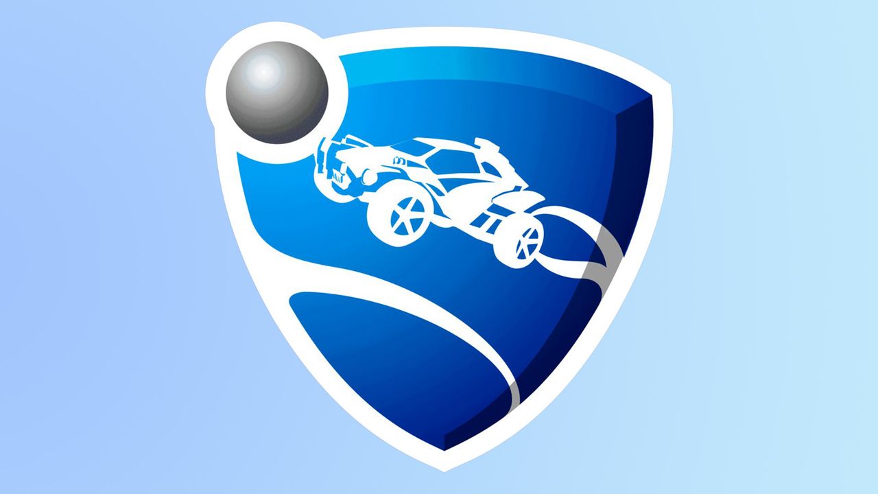
‼️Rocket League has updated its logo pic.twitter.com/3b0rr7uIfWMarch 24, 2026
For those unfamiliar with the intricacies of Rocket League, the physics-based multiplayer video game is essentially football with rocket-powered cars. The logo in question features a vehicle in a shield motif, with a white border and a blue gradient. The 'new' logo revealed by the esports team Ninjas In Pyjamas is exactly the same (according to my best judgment).
"You can use the cross-eye method to quickly spot changes, and in this case, there are 0," one fan helpfully commented, while another admired the change writing, "The 1 pixel change is huge." Another suggested, "Gradient is slightly different? I think?" while another added, "only thing I see is that the color changed on the logo."
For more logo design news, check out these big brand logos that look ridiculously similar, or take a shot at our ultimate logo quiz.