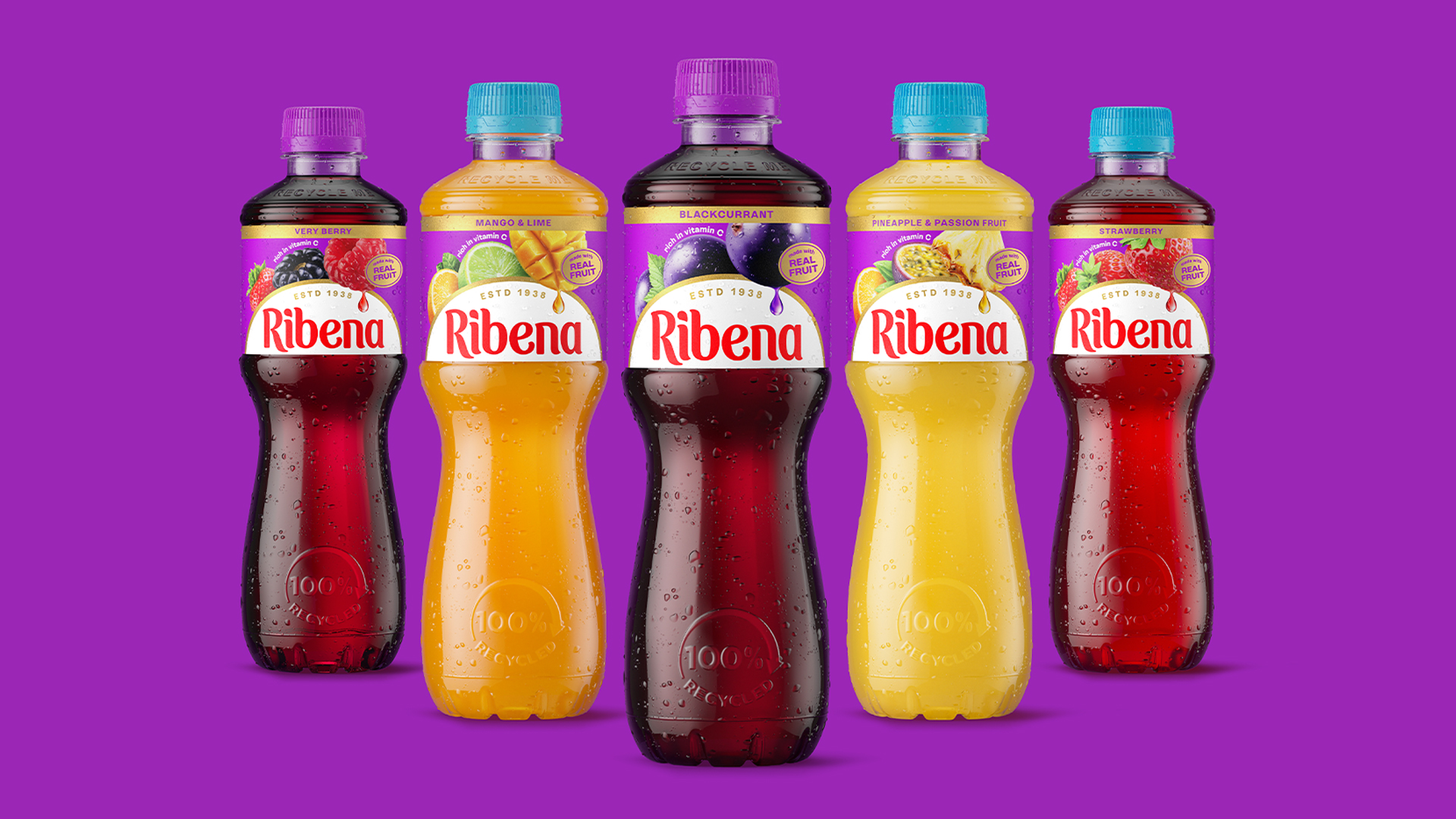
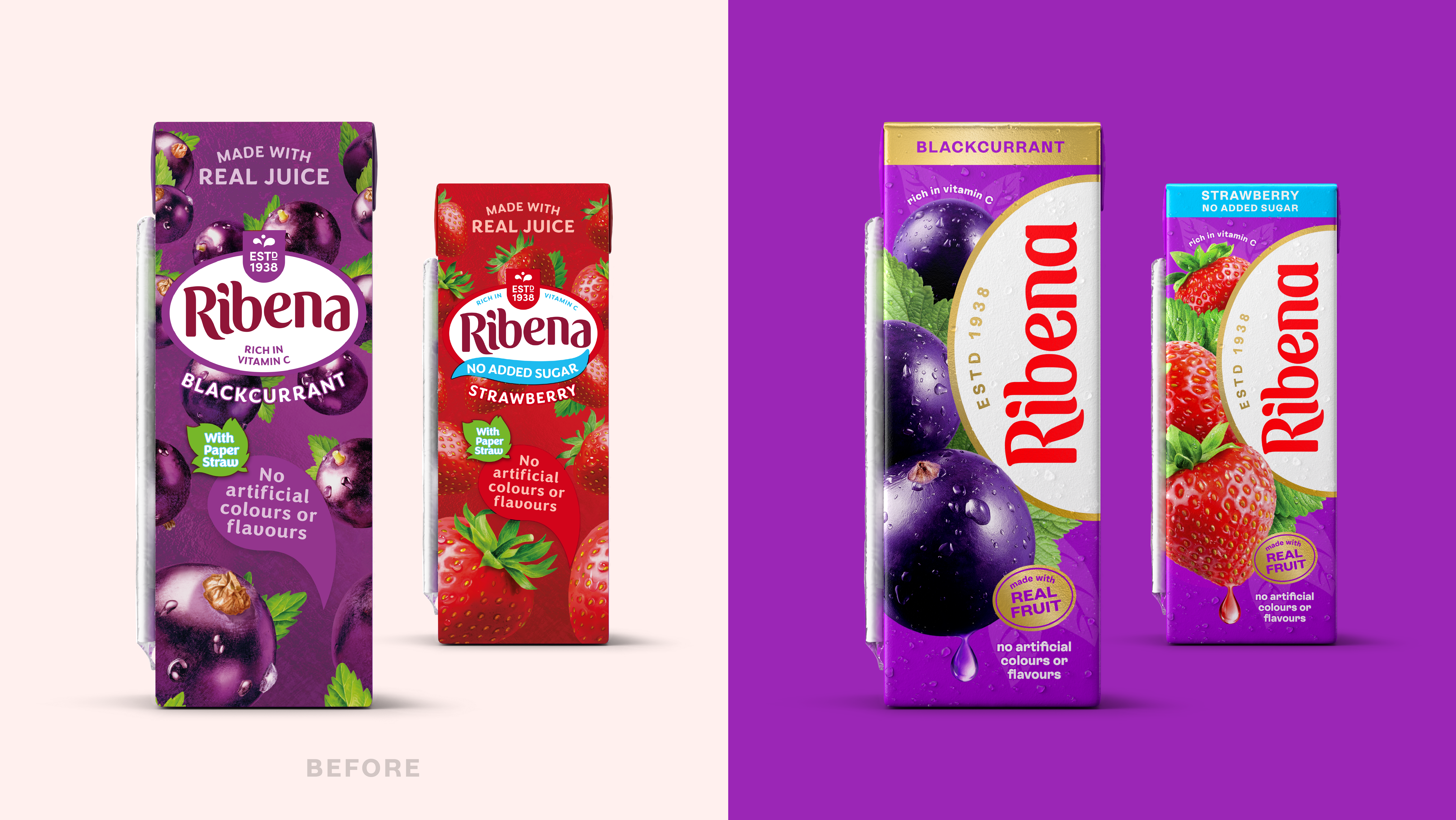
Soft drink brand Ribena has unveiled a refreshing brand revamp, bringing its heritage identity into the modern era. With a brighter new look featuring a refined wordmark and fresh icon design, the new identity excels in creating a modernised look that successfully preserves the brand's iconic legacy.
As we've learned from some of the best rebrands across the decades, reinventing a brand's identity is no mean feat – it requires precision and thoughtful design to balance heritage with contemporary style. Ribena's revitalised new look is a prime example of how small, yet specific tweaks can breathe life into an old brand, giving it the power to entice a whole new audience of fans.
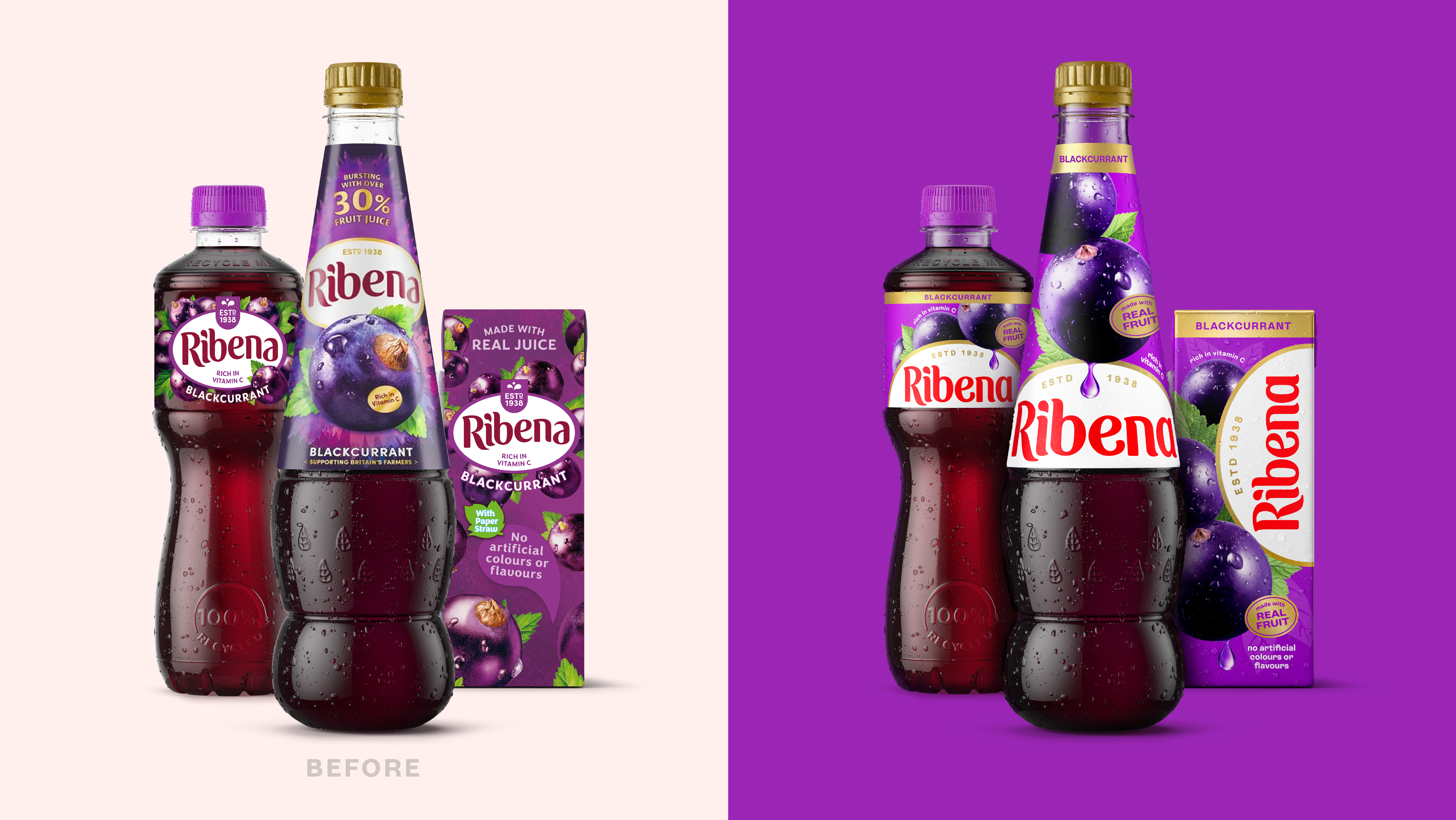
Created in partnership with global design consultancy Elmwood, Ribena's brand refresh set out with a mission to reinforce its existing identity, modernising its design to help strengthen its shelf appeal.
At the centre of the new look is the brand's revamped wordmark, refined with the help of typographer Luke Ritchie. The straight baseline paired with the brand's signature red creates a sense of "pride and trustworthiness", while its brighter, larger presence on the packaging makes the brand's signature heritage asset the star of the show.
In addition, the new letterforms have a plumper, juicier appeal, creating a sense of fun thanks to their "playful flicks and fluid terminals". The new " juicy droplet" icon, paired with flourishes of gold, gives the brand a sense of indulgence and taste, while the use of real fruit imagery reinforces Ribena's focus on freshness.
“Our goal was that of ‘familiar difference’”, says Elmwood's creative director, Charlotte Distefano. “We needed the new design to be instantly recognisable as Ribena, whilst dialling up brand standout and creating a consistent look and feel everywhere the brand comes to life – whether on pack, in store, or online.”
“We wanted to create a look and feel that reflects the vibrancy, care and love that we put into every bottle," adds Sarah Fleetwood, head of Ribena. "Working with Elmwood, we’ve created a bold, joyful and refreshed identity that captures the unmistakable taste and spirit of Ribena – rooted in nature but full of life.”
Ribena's revitalised brand identity exemplifies how simple design tweaks can elevate a brand identity. While we might often think that a grand metamorphosis is the way for brands to reinvigorate audiences, Ribena proves there's just as much power in subtle brand tweaks that reinforce heritage, rather than replace.
For more design inspiration, take a look at Amazon's new logo (that you probably didn't notice) or take a look at why Shutterstock’s ‘safe’ rebrand is mundane, but perfect.
Have you created a standout logo or branding? Enter the Brand Impact Awards.