The Premier League kits have all dropped – and if you're like anything like FourFourTwo, you're all fingers and thumbs on the calculator app, working out if you can justify £360 leaving your bank account or whether Klarna need a call.
Since the end of last season, shirts have been drip-fed to us with all 60 now out and released – that's three each: home, away and third. You know the drill by now: some of them are stonking and some of them are honking: so we asked every member of the FourFourTwo team to score every kit.
Remember to have your say in the comments…
60. Manchester City third
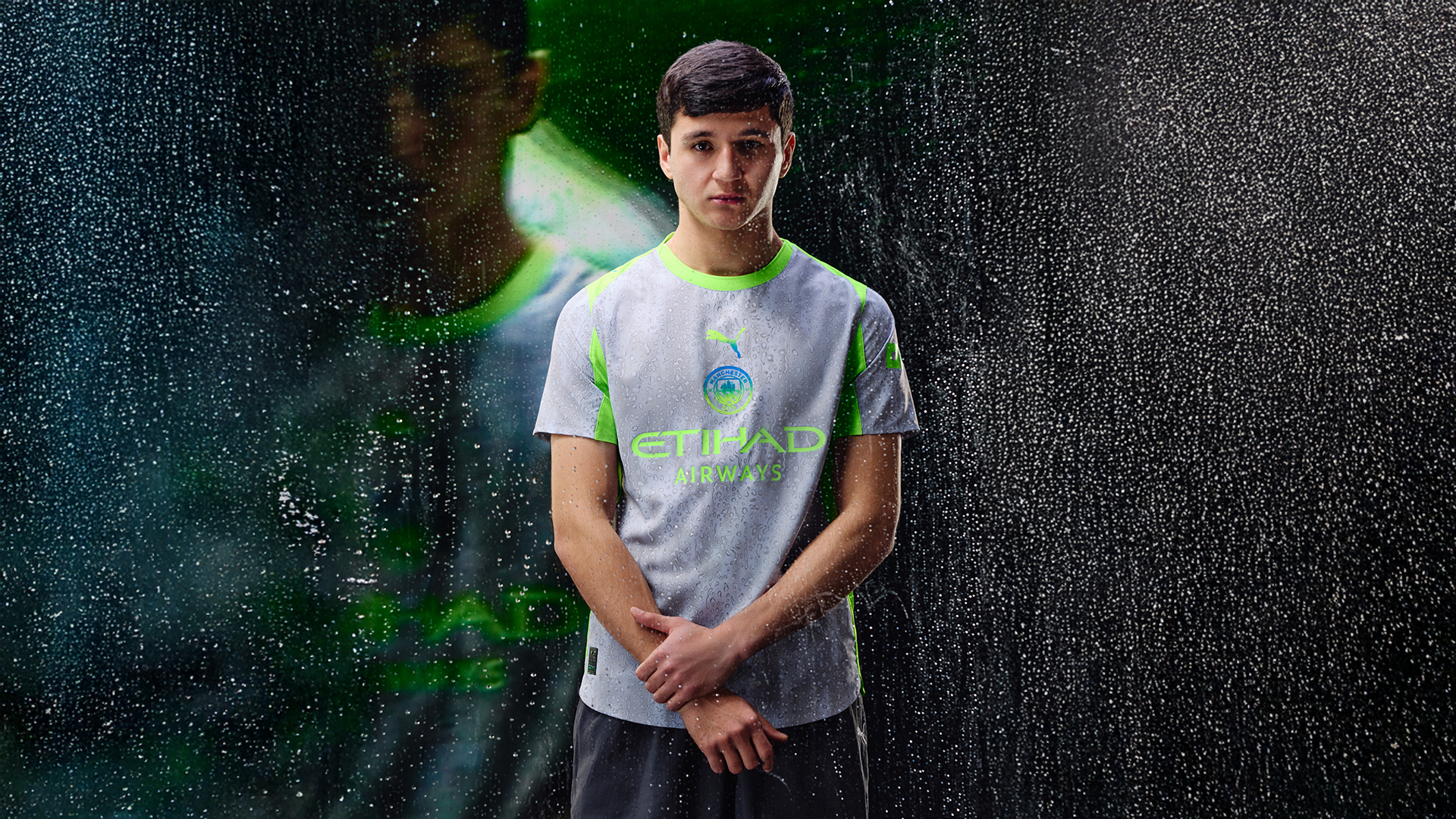
SHOP Buy from Puma
A shirt that will go down in history for Manchester City for all the wrong reasons. The Sky Blues have been given some abhorrent designs in the past but Puma's day-glo, rain-soaked third effort really does take the biscuit. The only shirt on our list to be given a 0/10 by anyone.
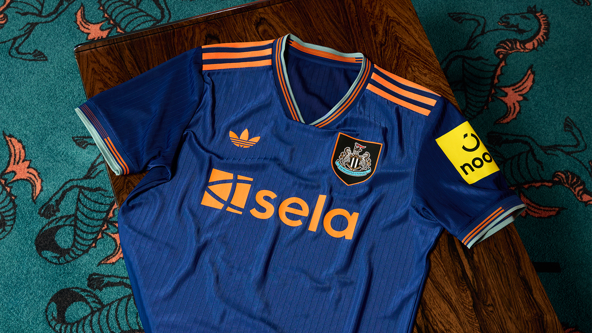
59. Newcastle United away
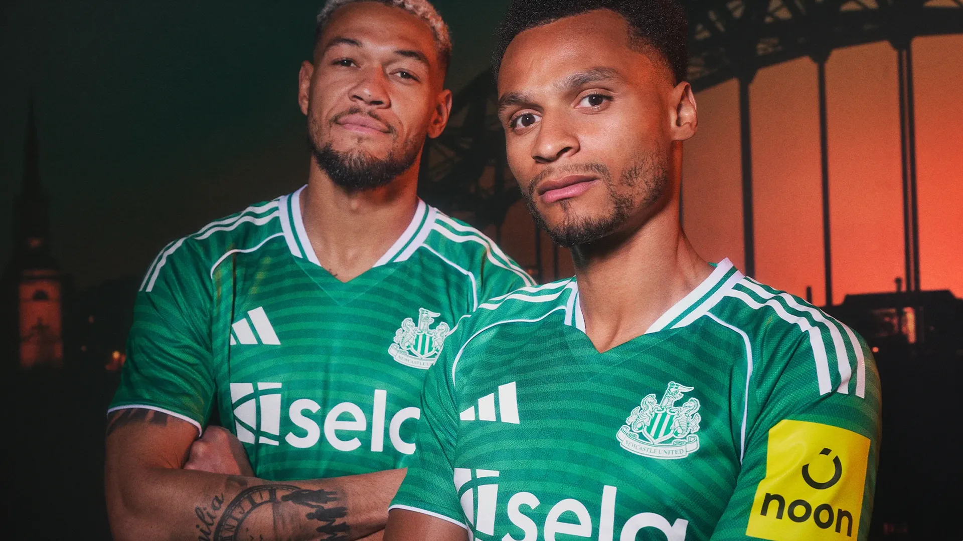
SHOP Buy from Adidas
Newcastle United barely won a game with their last green kit but that's done little to deter Adidas, with this away shirt's dull pattern apparently inspired by the Tyne Bridge. It makes the material look a little cheap and plenty don't like the Saudi connotations.
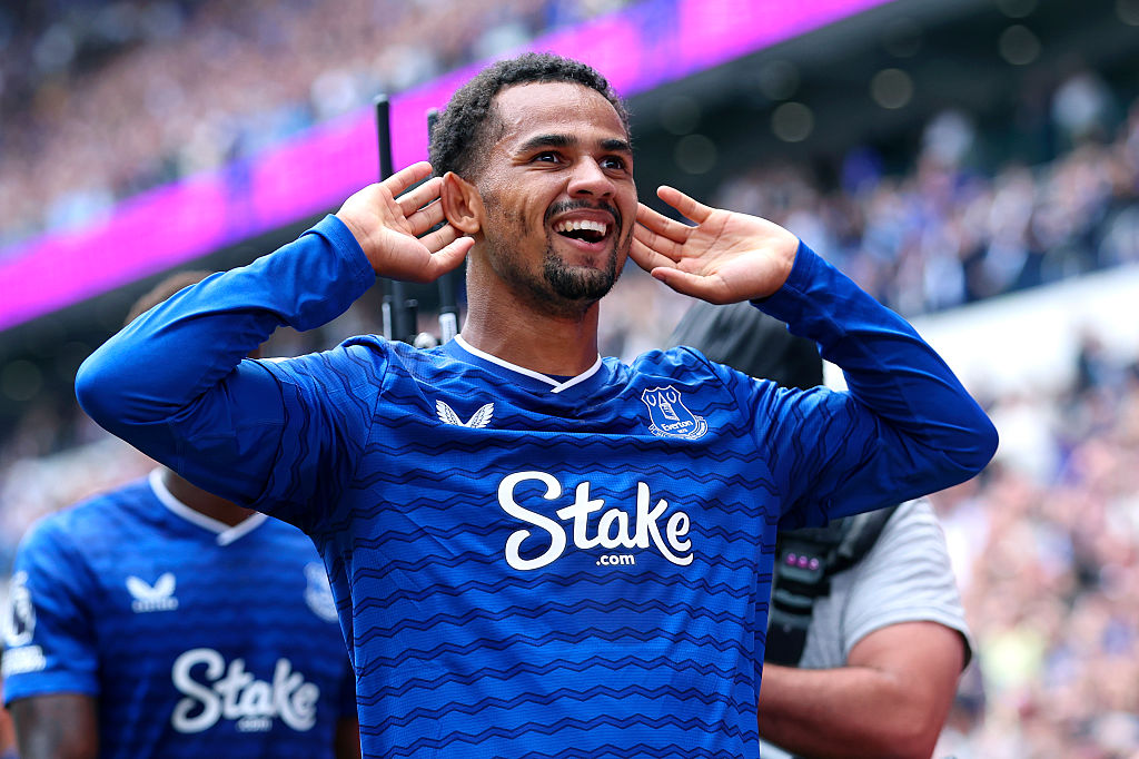
58. Everton third
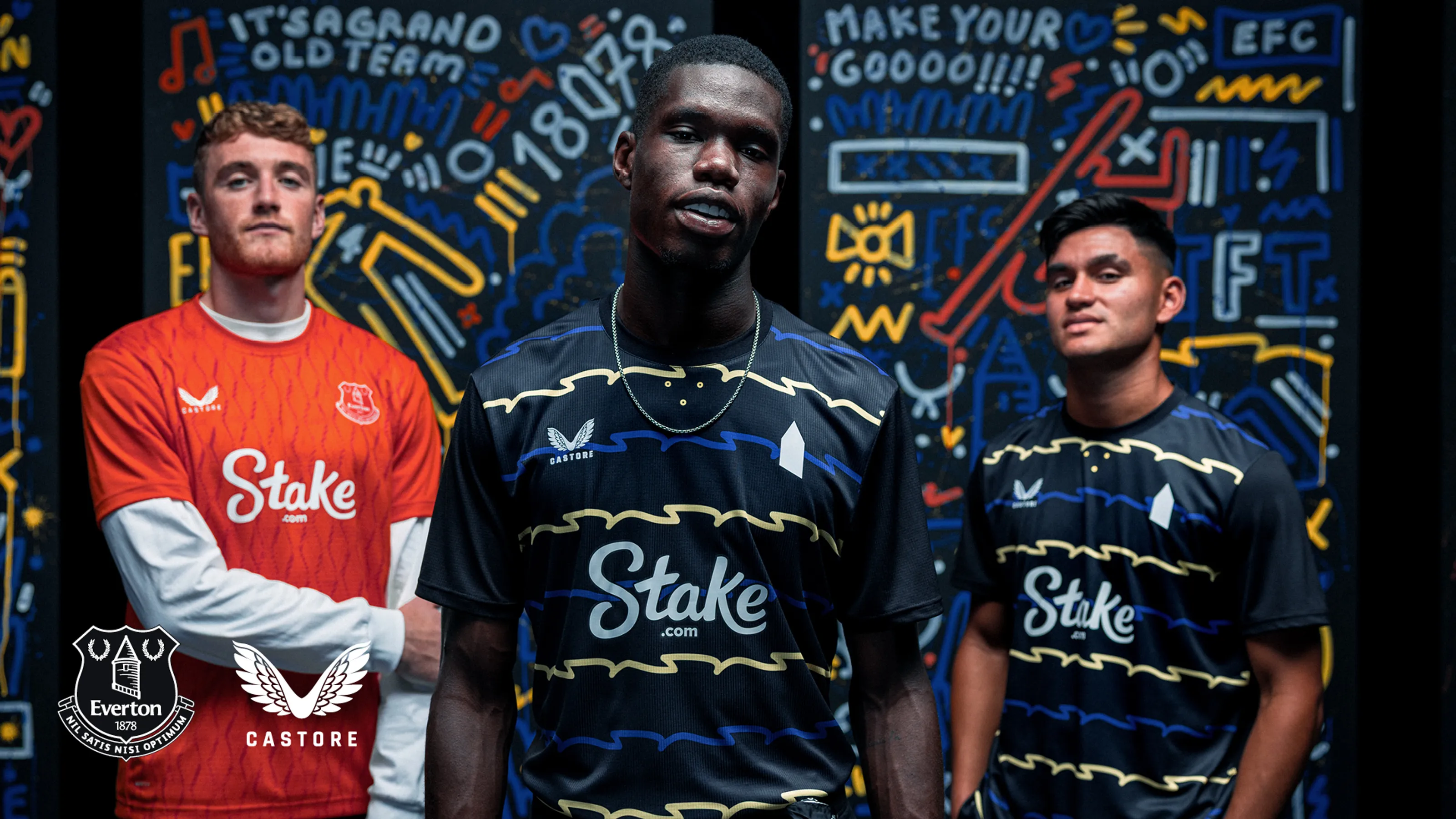
SHOP Buy from Fanatics
Uninspired and jarring, Castore have taken the colours from Everton's home and away shirts and put them in wavy lines across a black base. Let us guess, the wavy lines are there to reflect the Mersey?
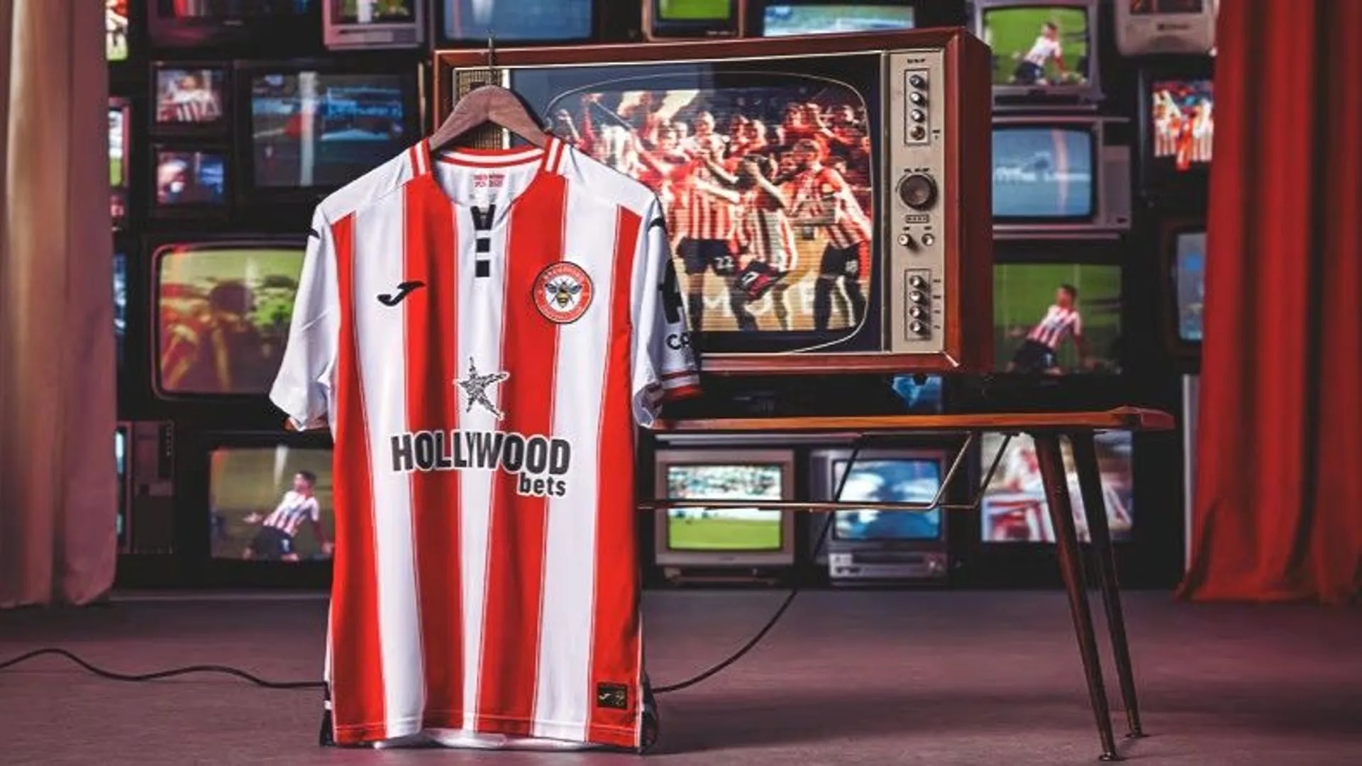
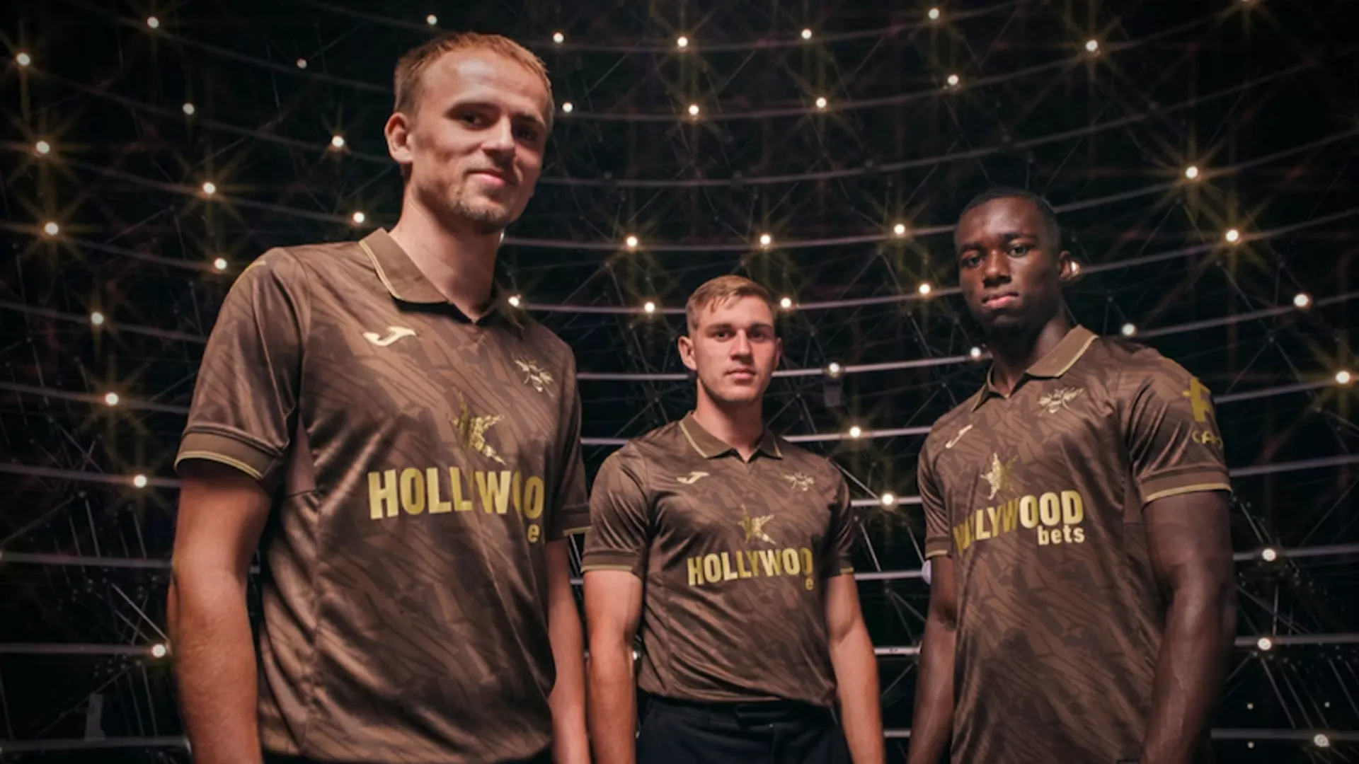
57. Brentford third
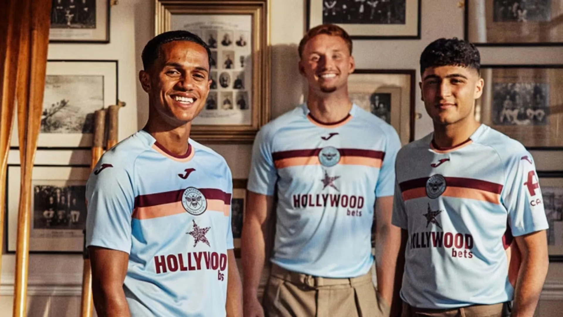
Brown, orange and light blue isn't a renowned colour for football kits. Perhaps this is why.
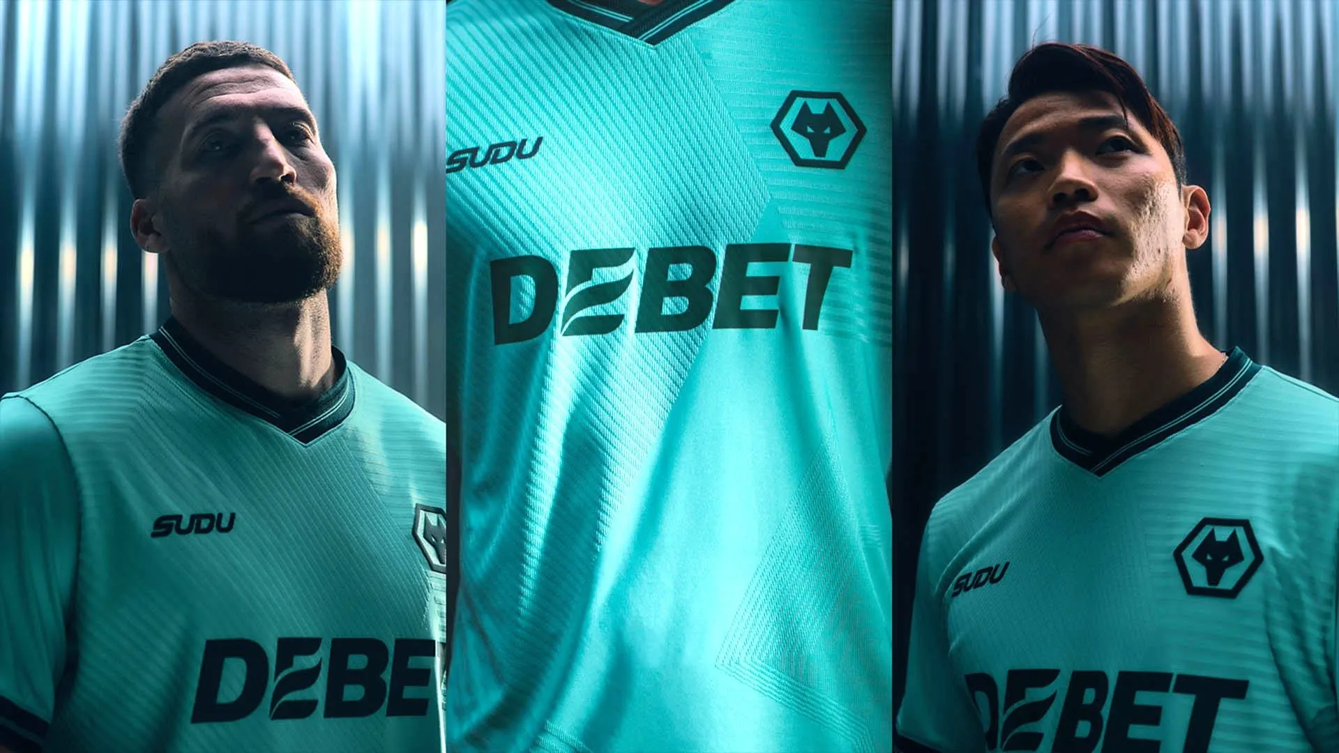
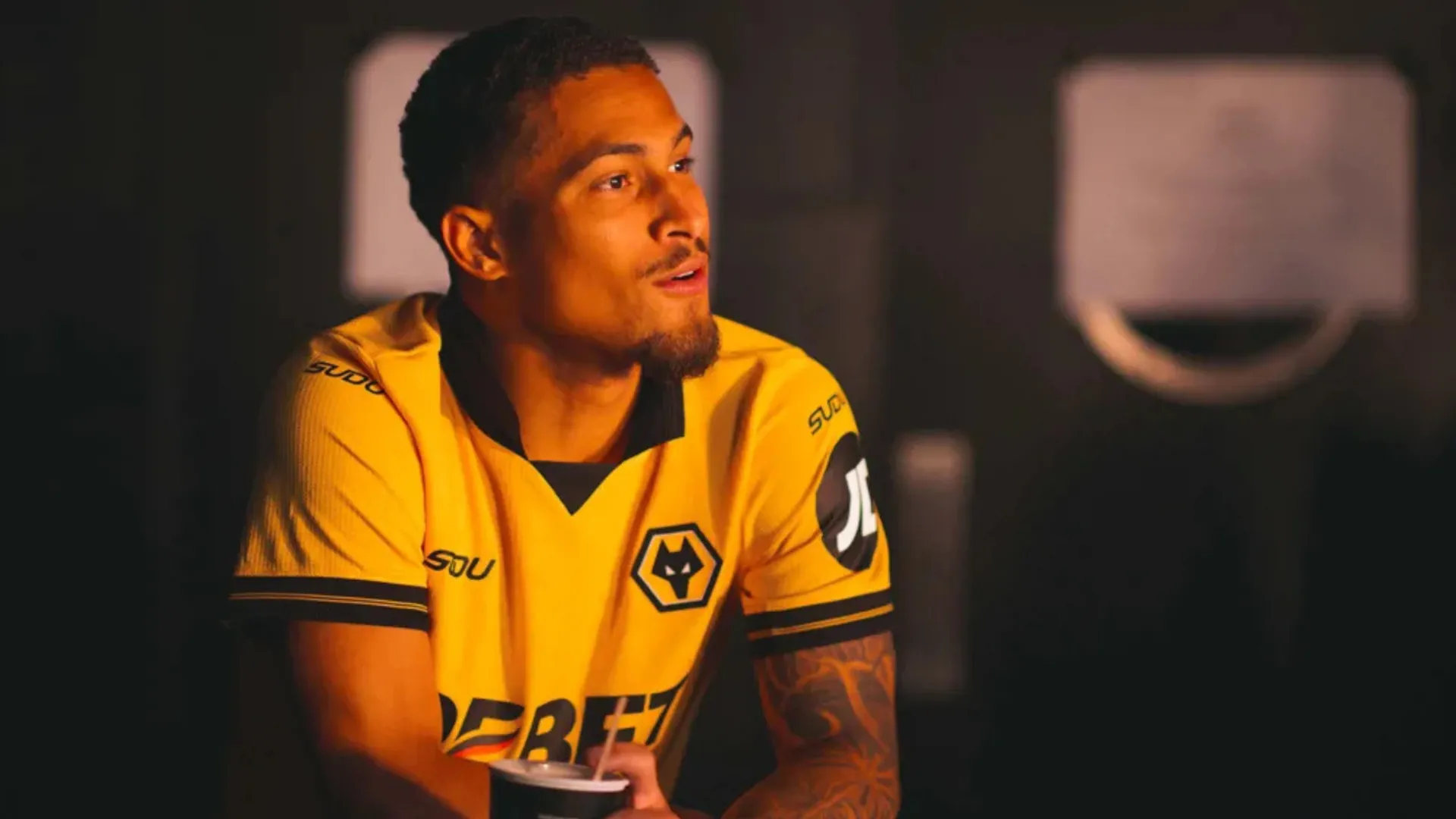
56. Wolverhampton Wanderers third
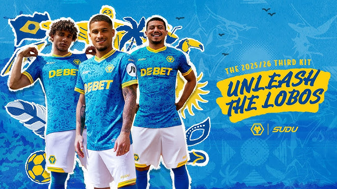
SHOP Buy now from Sudu
Too jazzy? Everything about it should work – but Wolves' samba-flavoured third misses the mark with a busy pattern, garish blue and white shorts. A colour combo fit for Brazil, not the Black Country.
55. Leeds United third
A real victim of Adidas only really caring about the big clubs, here. It's not that Leeds United's latest third effort is particularly bad, it's that it's utterly forgettable, with our scores ranging from 3/10 to 6/10.
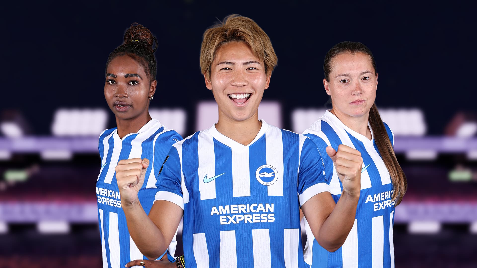
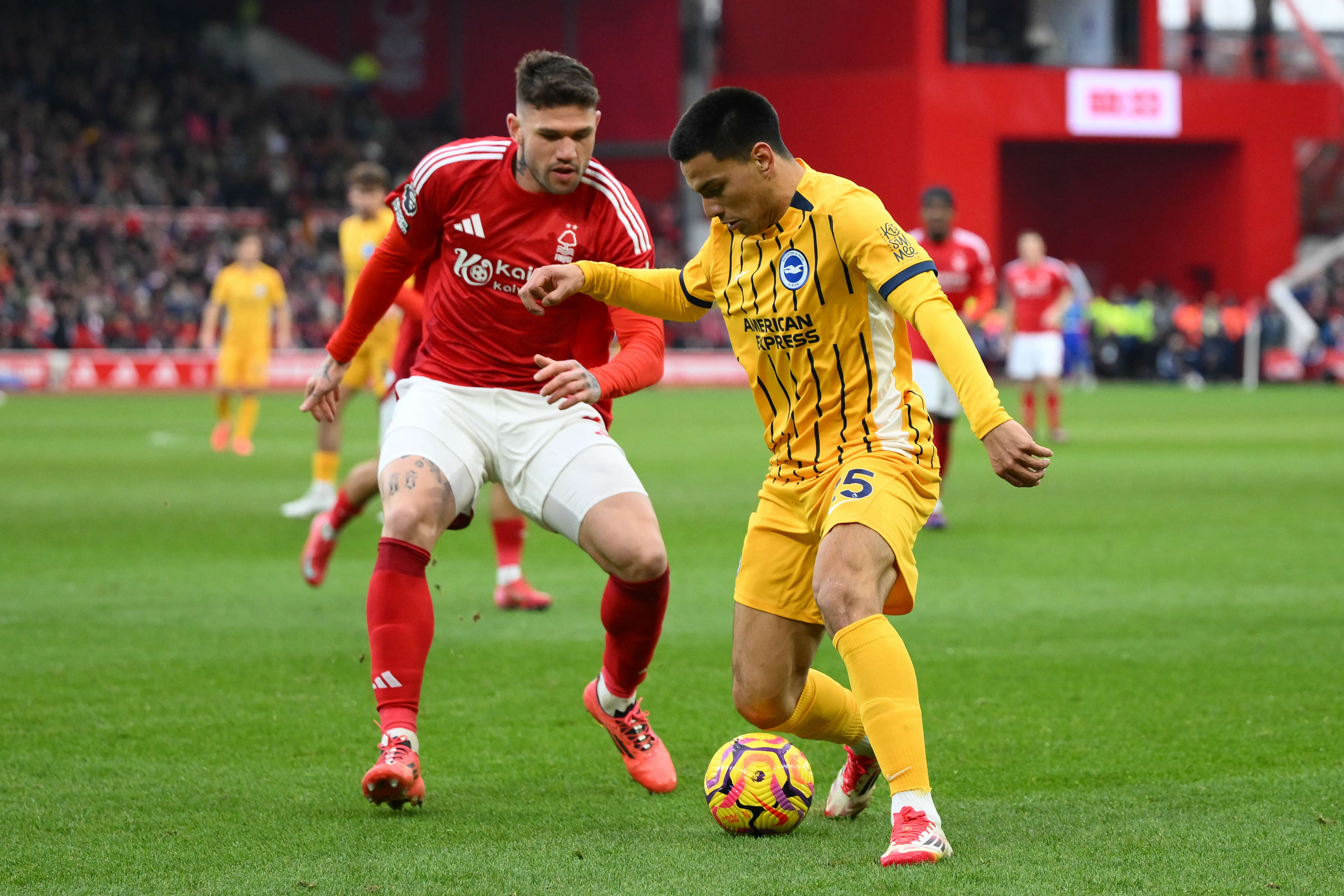
54. Brighton & Hove Albion away
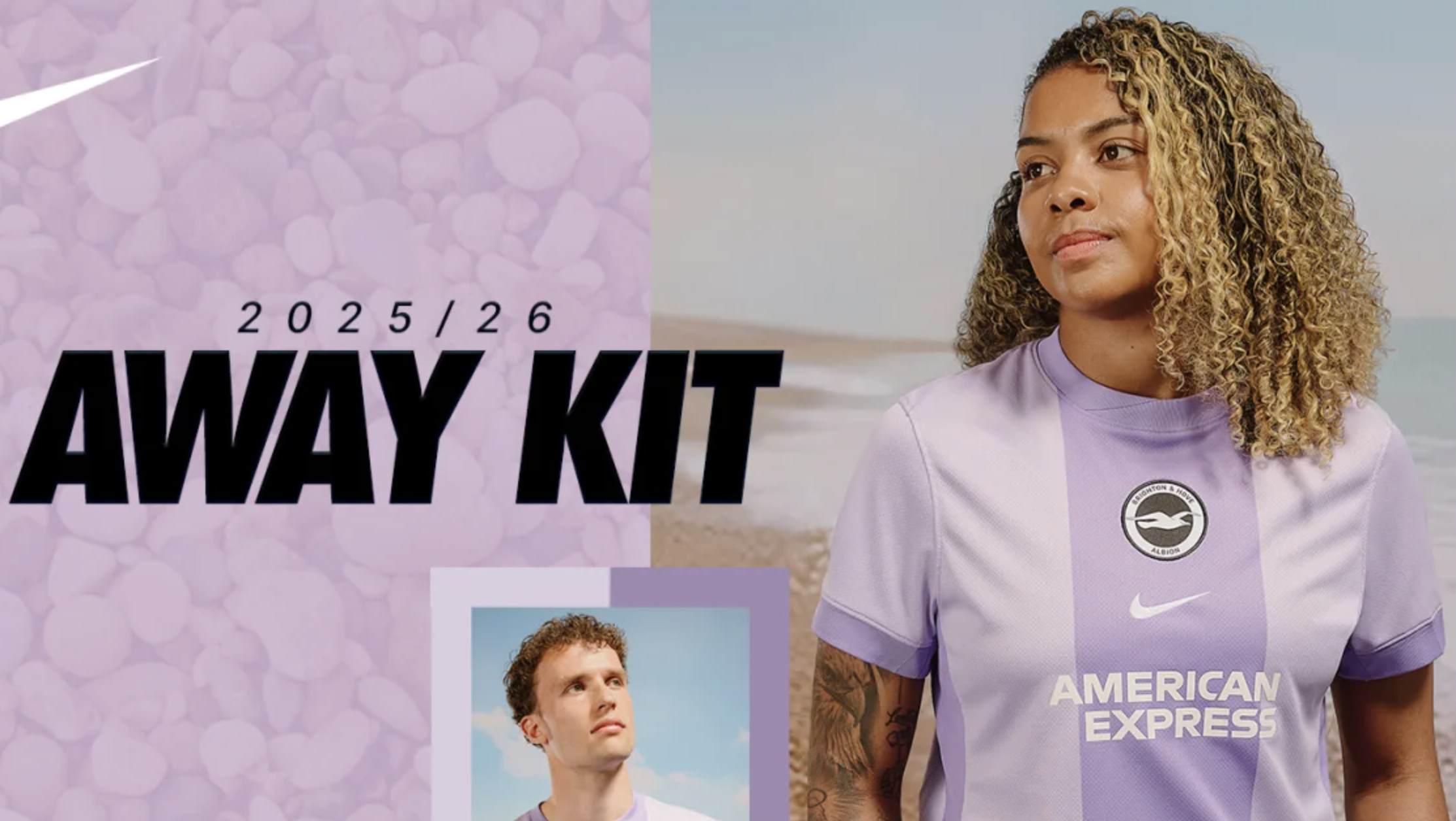
Credit to Nike for giving Brighton & Hove Albion something different – but with such a brave colour choice, there's nothing else to grab you with this. No fancy collar, intricate pattern, callback to Brighton's heritage… and the badge in black feels wrong. Lazy, all in all.
53. Burnley third
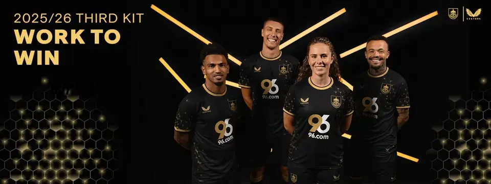
SHOP Buy from Burnley.com
Honestly, we usually love black-and-gold as much as the average millennial who remembers Sam Sparro. There's little effort in Burnley's effort, however, with a generic hexagon pattern and the sponsor breaking rank with white.
52. Manchester City home

SHOP Buy from Puma
Now we're getting into kits that we don't actively hate, nor particularly adore. The sash is a bit too ‘trying to be modern’ for our liking, but it's a clean effort, otherwise.
51. Everton away
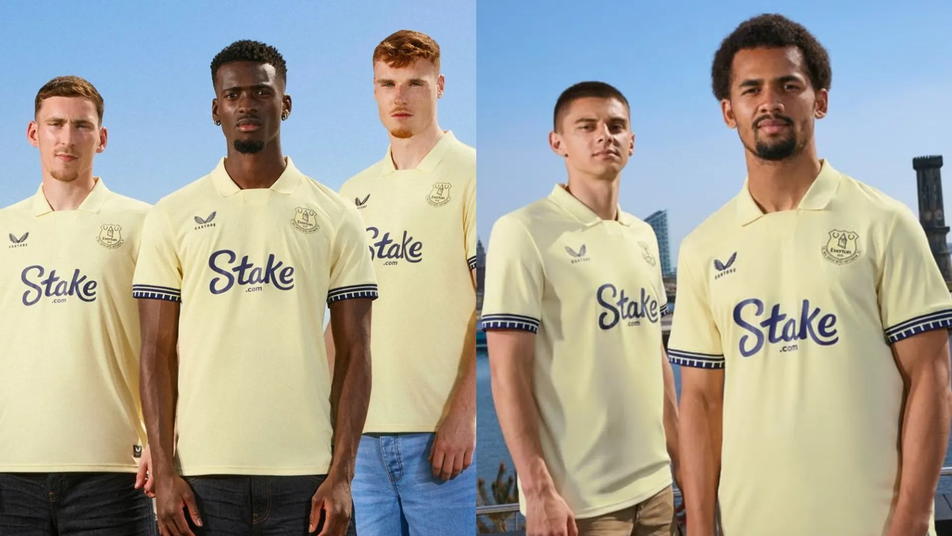
SHOP Buy from Fanatics
The cuffs are nice, the shade of yellow is fine. Two members of our team gave this a 7/10… but the score was brought down by a 1/10 vote.
50. Burnley away
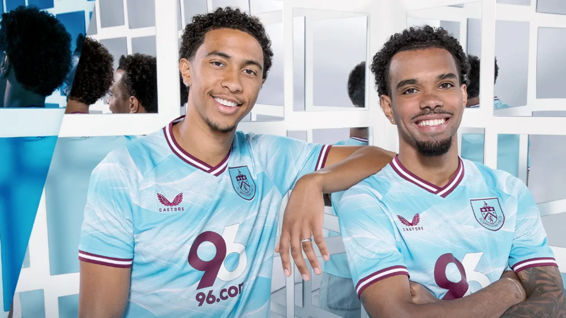
SHOP Buy from Burnley.com
One team member gave Burnley's away a solid 8/10 – but no one else was sold on the sky-like shirt. Again, that sponsor's pretty bad.
49. Wolverhampton Wanderers away
SHOP Buy now from Sudu
It's not as loud as the third shirt – but when “not as bad as the other” is a the defining feature of a kit, it's no surprise to see it down this low.
48. Manchester United away
SHOP Buy from Adidas
Adidas really are rinsing Manchester United's snowflake graphic, aren't that? The devil badge is lovely but it's hard to get excited about yet another minimal white United shirt.
47. Brentford home
Brentford's first Joma home shirt is absolutely fine – but as mentioned by pretty much everyone… what's going on with that collar?
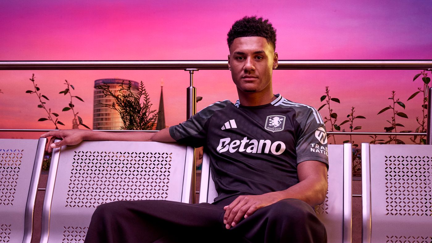
46. Aston Villa third
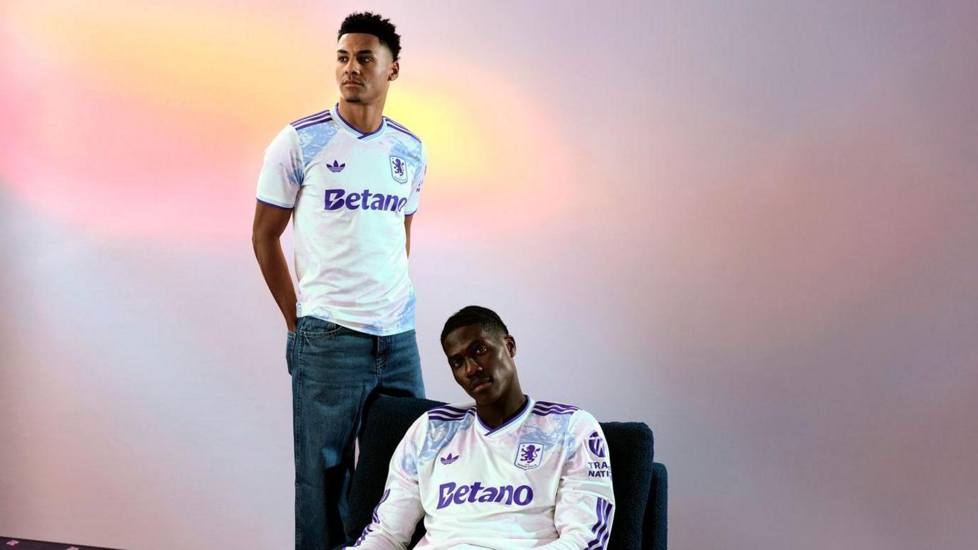
SHOP Buy now from Adidas
Another white Aston Villa shirt? Is that the sound of a barrel we hear getting a good old scraping? The stain-glass pattern is nice enough, the Trefoil logo is lovely… it's just lacking a bit of character otherwise.
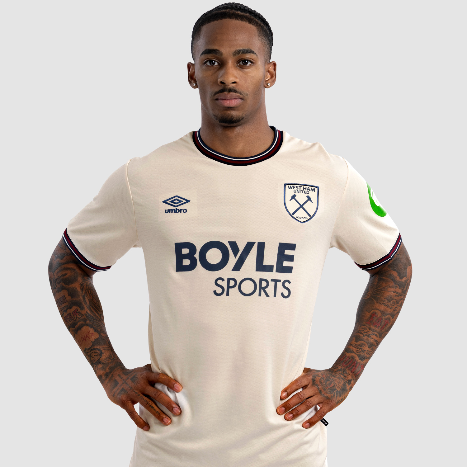
45. West Ham United home
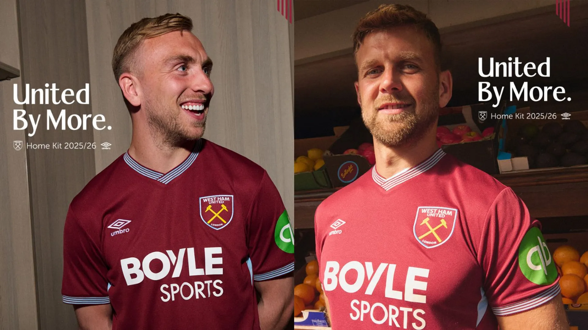
SHOP Buy from whufc.com
And with the West Ham United home shirt, we're firmly into the territory of shirts rated as an average 5/10 or more. That's a fair enough assessment of Umbro's latest effort, which does little to either offend or inspire.
44. Bournemouth third
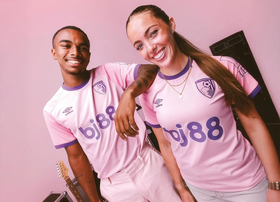
SHOP Buy from afcb.co.uk
Bournemouth had some lovely graphics on their change strips last term but eschew anything so bold on their latest pink shirt to play it safe. The result is very much meh – the different shade on the sleeves is a little jarring, mind.
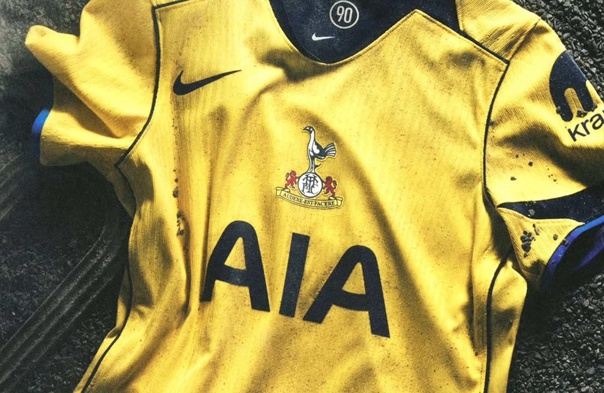
43. Tottenham Hotspur home

SHOP Buy from Nike.com
After years of seemingly giving Tottenham the same white shirt over and over again, Nike's latest home top reinvents the wheel with a central badge, beige sides, and modern-looking navy trim – yet typically, it has been widely panned by fans. Still… something different, eh?
42. Sunderland away
SHOP Buy from safcstore
Hummel have delivered belter after belter for the Black Cats and this one has all the hallmarks of another classic: lovely all-over graphic, classic badge and bright colour with red-and-white piping. Yet it doesn't quite hit the mark for that oversized sponsor and general business… not as nice as last year's.
41. Chelsea third
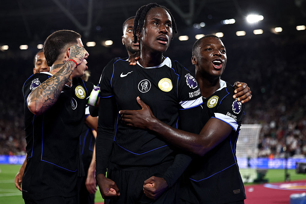
Some of our panel rated this one very highly for its throwback nature: the classic Chelsea badge and the return of Nike's Total 90 template has made this one very popular with Blues fans. Others on the FourFourTwo team just didn't get the hype: perhaps you had to be there.
40. West Ham United away
SHOP Buy from whufc.com
Absolutely fine and nothing else: it's an off-white shirt with no details and a thick navy collar. In fact, the only talking point is why the badges have a rectangle cutout around them. An error or a poor design choice? Who knows.
39. Everton home
SHOP Buy from Fanatics
Objectively classy. Everton are opening a new stadium with a simple blue shirt that has wavy lines across the base – and it looks great. Unfortunately, their placing as 39th-nicest kit on list means we've got through the Toffees before any other club.
38. Brentford away
Brown is a hard sell. Aside from St. Pauli in Germany, there aren't many big-name clubs that opt for the shade – and Joma have produced something absolutely fine, it's not exactly one that we'll be rushing out to buy either.
37. Aston Villa away
SHOP Buy now from Adidas
Said to be inspired by the Bull Ring, this is one of Villa's best away shirts so far with two-tone black and sky blue details. Solid effort with praise across the board for this one.
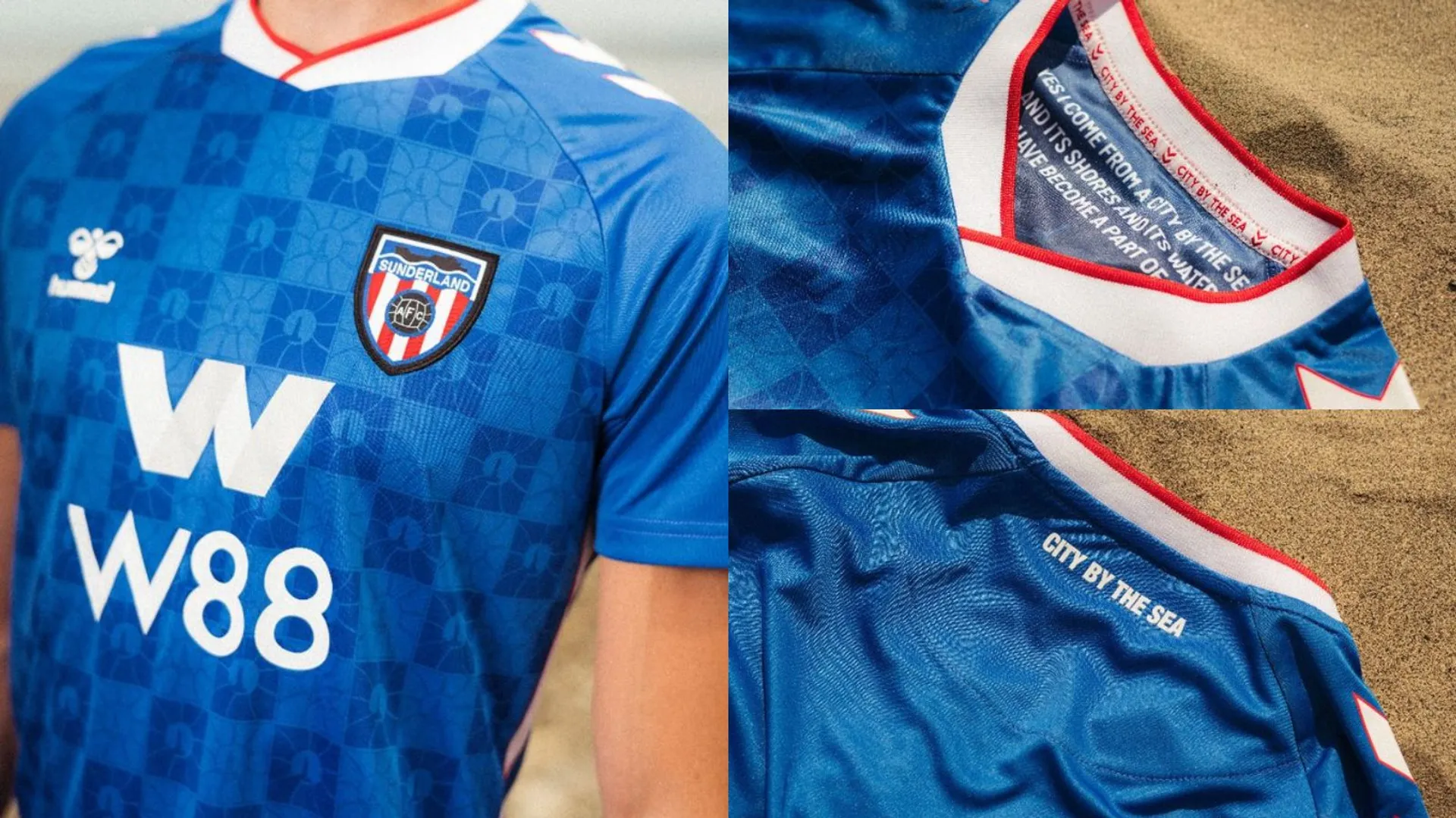
36. Sunderland home

SHOP Buy from safcstore
Massive sponsor and polarising centre-badge-choice aside, this is everything Sunderland fans wanted for their return to the big time. Hummel are certainly smart kit-makers.
35. Leeds United home

Similarly to Daniel Farke bringing in Dominic Calvert-Lewin as his big-name forward, Adidas refuse to throw caution to the wind for Leeds – but have decorated the new home kit with a brickwork-inspired blue-and-yellow pattern on the cuffs and collars. White home shirts are limiting but this is a nice compromise between something bold and what fans expect.
34. Burnley home
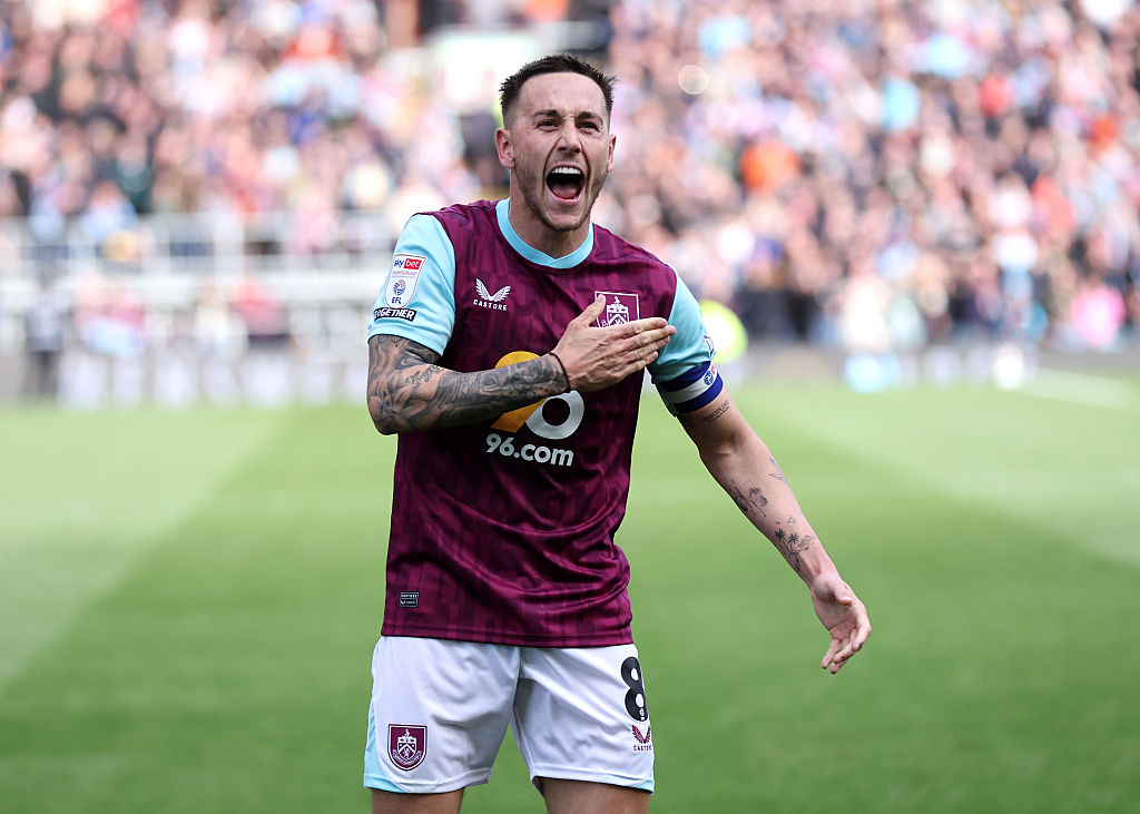
SHOP Buy from Burnley.com
And now to wrap up Burnley: we still don't like the sponsor but the contour patterns across this one are lovely, as are the sky-blue touches on the shorts. Excellent work, Castore.
33. Wolverhampton Wanderers home
SHOP Buy now from Sudu
Hard to go wrong with such an iconic kit, isn't it? Sudu have introduced a lush new collar and thick cuffs for this one: it's nothing brave but it works nicely.
32. Manchester United home
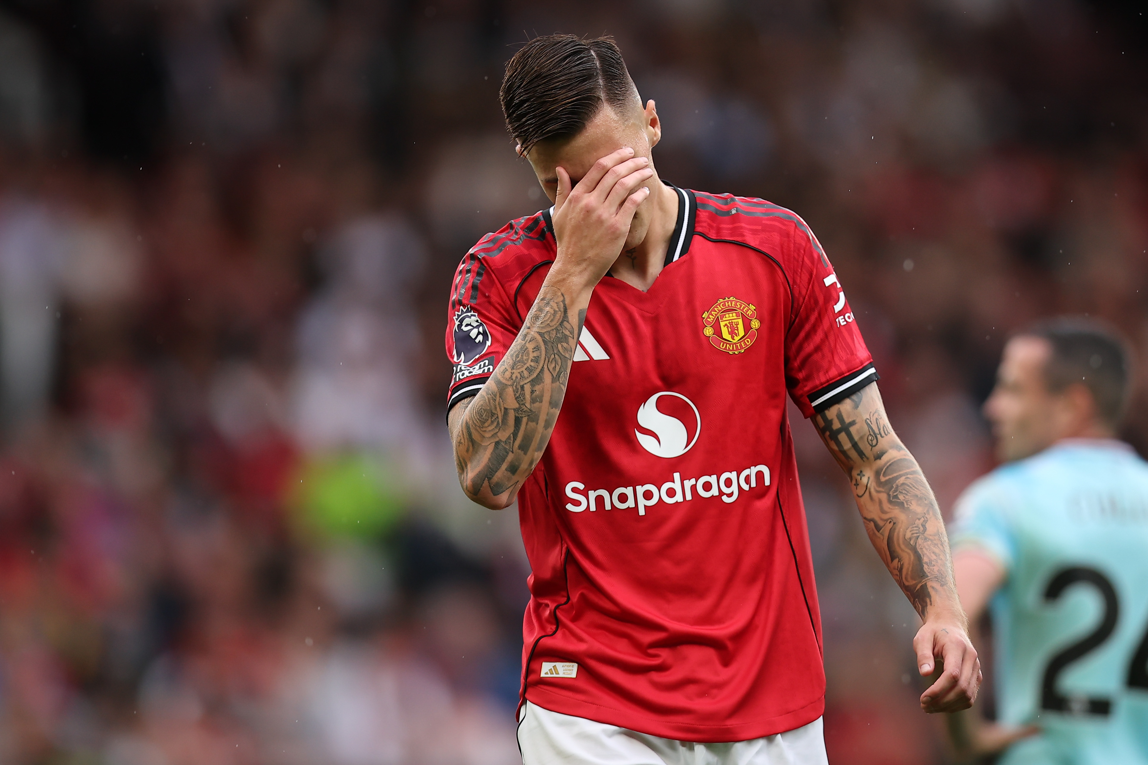
SHOP Buy from Adidas
The 90s inspiration gets a big thumbs up, but let's be frank: Manchester United's home kits under Adidas are starting to get extremely samey, as they alternate between black or white stripes down the sleeves, and some kind of inoffensive pattern on the base. Yes, it's a lovely shirt and yes, it's hard to be too exciting with a home jersey – but we need them to do something a little more out-there to see a United top climb this list next year.
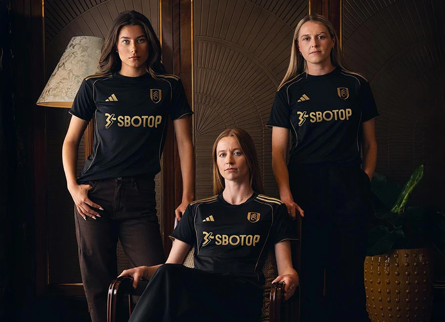
31. Fulham away
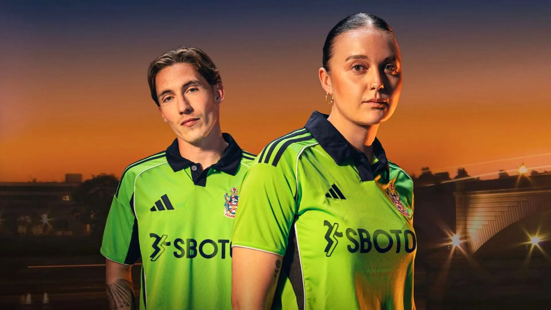
What's not to love? It harks back to a classic, uses a retro badge (that's way better than the naff ‘FFC’ crest), has a classic polo collar and incorporates a classy navy. Superb.
30. Chelsea home

After the absolute mess of last year, Nike have dialled things back for something a little more classic. Chelsea's home kit has a Bridge-inspired graphic, pairs the blue with white and red and still doesn't have a sponsor – but it's a return to form.
29. West Ham United third
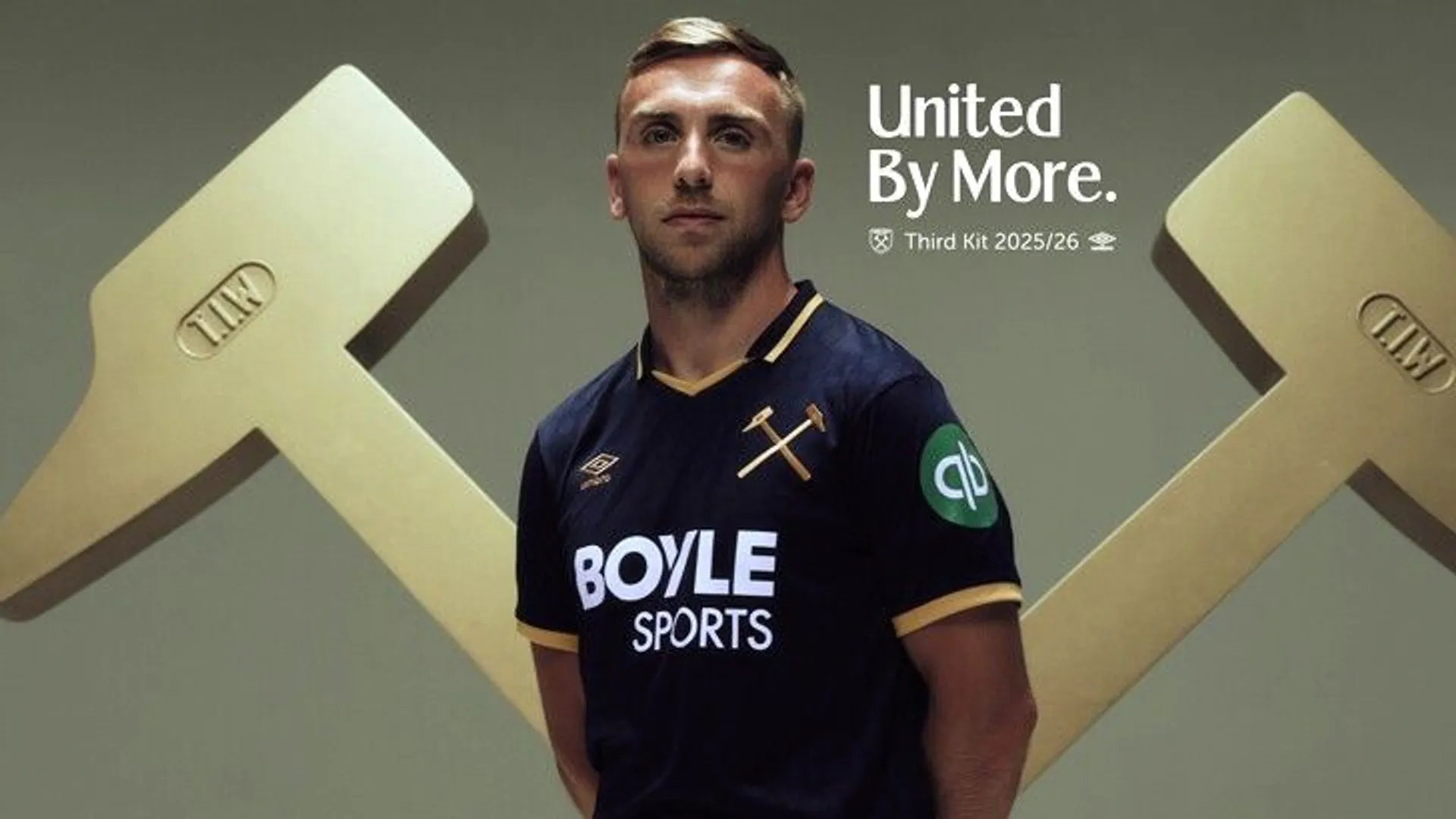
SHOP Buy from whufc.com
According to Hammers fans, West Ham are massive everywhere they go. We can only assume that's the inspo for that huge badge on an otherwise classy navy top.
28. Nottingham Forest third
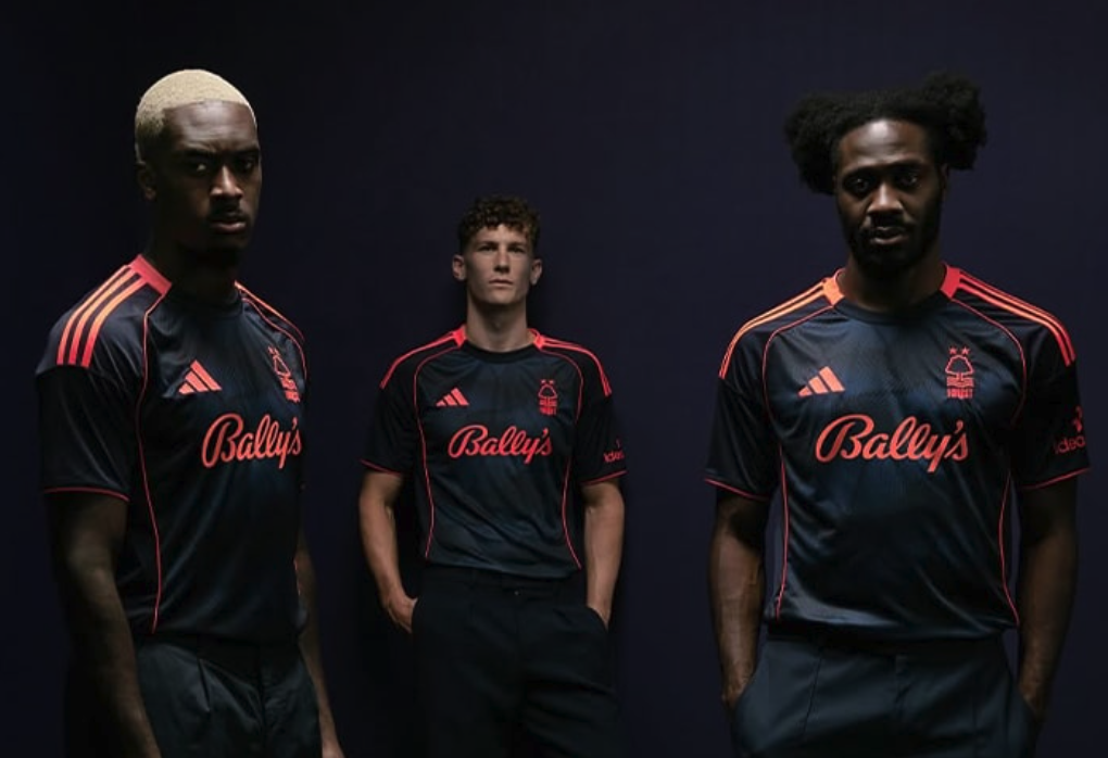
Objectively a lovely football shirt. The navy-and-coral colour scheme is stunning, providing Nottingham Forest with some modern-looking thireads alongside their two more classic-inspired kits.
27. Sunderland third
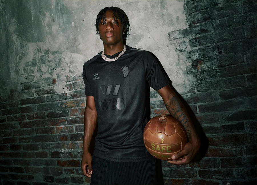
SHOP Buy from safcstore
OK, so the blackout kit hasn't been fresh since before the pandemic but we'll make an exception for Sunderland, who have delivered a unique black cat badge and paired this one with the Premier League's yellow font and matching yellow cats' eyes on the back of the neck. Easily the Wearsiders' finest this term.
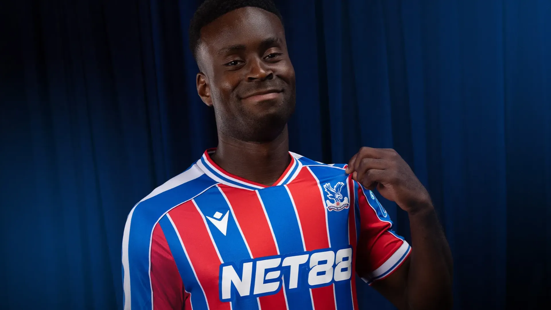
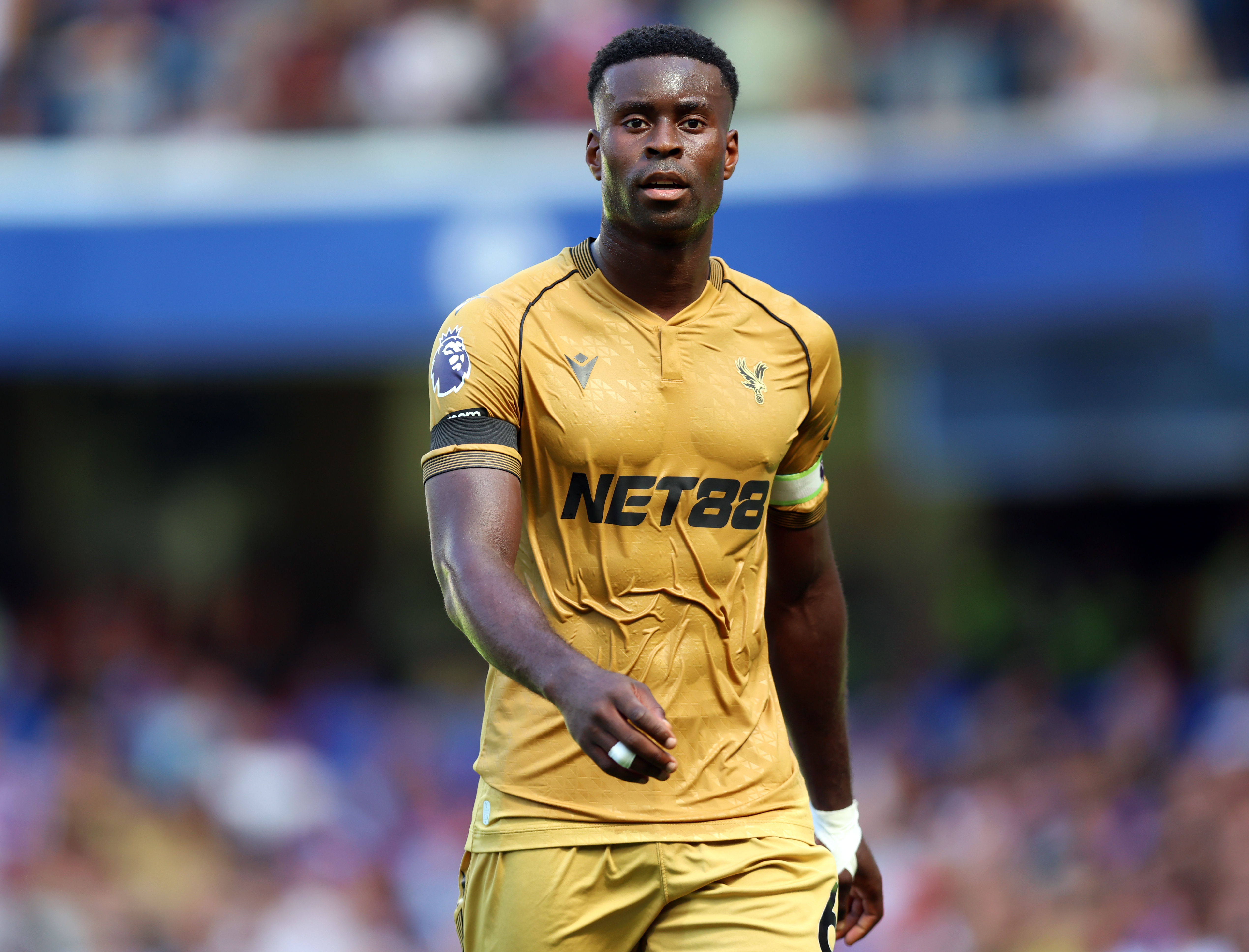
26. Crystal Palace third
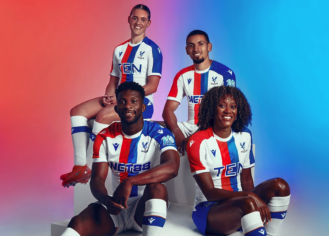
SHOP Buy from cpfc.co.uk
The Crystal Palace third doesn't do anything new – in fact, it feels like they've worn this before – but Macron are experts in delivering modern-looking change strips for the Eagles. This is another fine example.
25. Chelsea away

You could tell us that Nike were simply getting use out of a Portugal shirt they scrapped and we'd believe you – but that's not to say that it doesn't suit Chelsea. The lack of a sponsor really accentuates those pinstripes, too: it's the Blues' best effort this season.
24. Bournemouth away
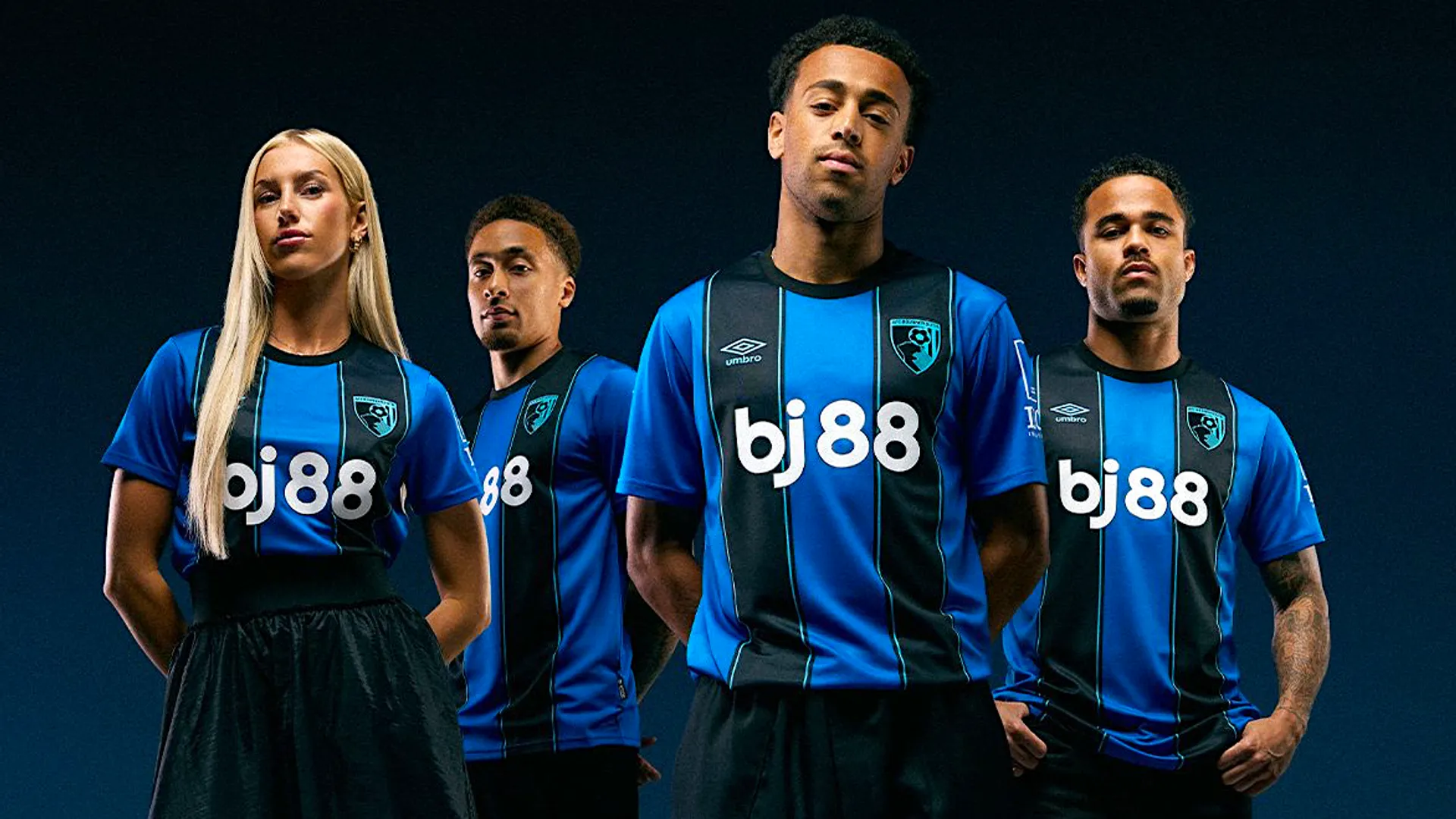
SHOP Buy from afcb.co.uk
A remarkable likeness to Ajax's 2021/22 away shirt from a few years back… but who cares? After several fancy shades of blue, Umbro have gone for a stronger, bolder tint this time around for the Cherries, and it perfectly complements the home shirt.
23. Liverpool third
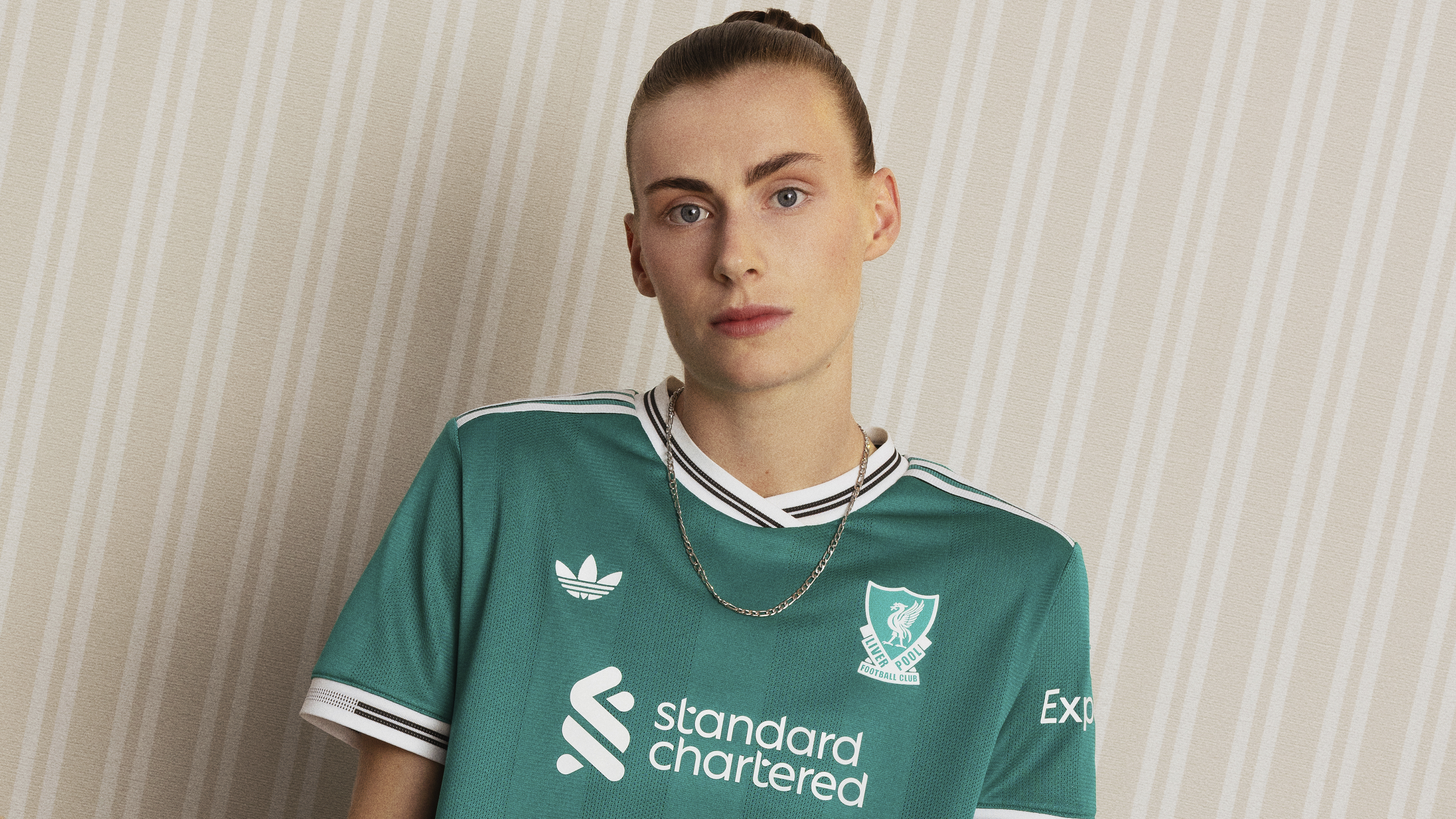
SHOP Buy from Adidas
With the shade, badge and Trefoil logo, Adidas have gone back to the 90s for Liverpool's third shade: it feels distinctly modern, too, however, and fit for a new era.
22. Liverpool home
SHOP Buy from Adidas
Straddling the line between simplistic and boring perfectly, Liverpool's home effort is everything you want from a Reds home shirt: deep shade, thick cuffs and no frills. It has the potential to become one that future generations flock to collect, depending on how the season pans out.
21. Fulham home

After quite a few years of the Cottagers incorporating red into their home threads, Adidas have stripped this one back to just white and black. The result is minimal and majestic.
20. Nottingham Forest away
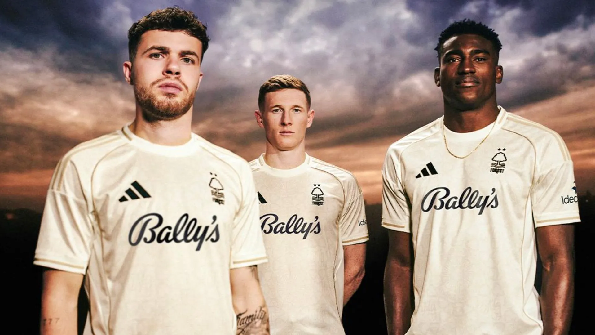
Forest have gone with an off-white for their away, complete with Adidas stripes in the same colour and black logos: the result is elegant, like a fine pinot to complement the red home shirt. And that Bally's typeface just gives it even more class.
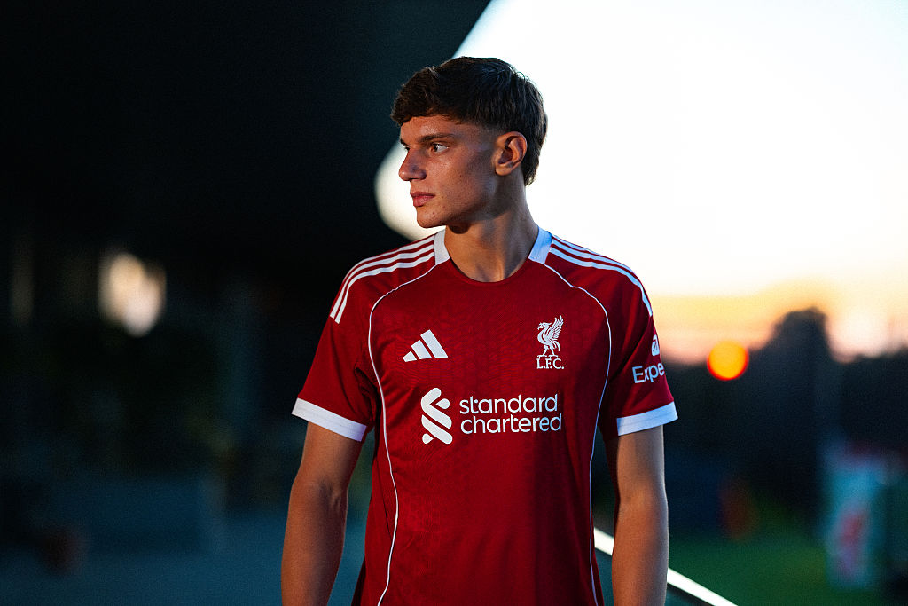
19 Newcastle United home
SHOP Buy from Adidas
The last time that a kit manufacturer tried to deliver Newcastle anything other than stripes, it was a special shirt from 2013/14 that was received with all the support of a Swedish transfer request – so credit to Adidas for bringing a ‘tartan’ idea to the stripes and incorporating blue without invoking the wrath of the Toon. This is a healthy evolution from last year's effort without doing anything controversial, and we're here for it.
18. Brighton & Hove Albion home
Brighton are sometimes forgotten among Nike's clients, with the likes of Chelsea and Tottenham higher-profile – yet they often get nicer designs. Aside from the asymmetrical collar, this is another banger, with teal a nice change as a tertiary colour.
17. Bournemouth home
SHOP Buy from afcb.co.uk
Bournemouth have had a few away and third tops in recent years inspired by the beach – yet this time, it's the home that brings a sand textures into the stripes. It's minimal, clean and stylish – and their nicest effort this term.
16. Aston Villa home
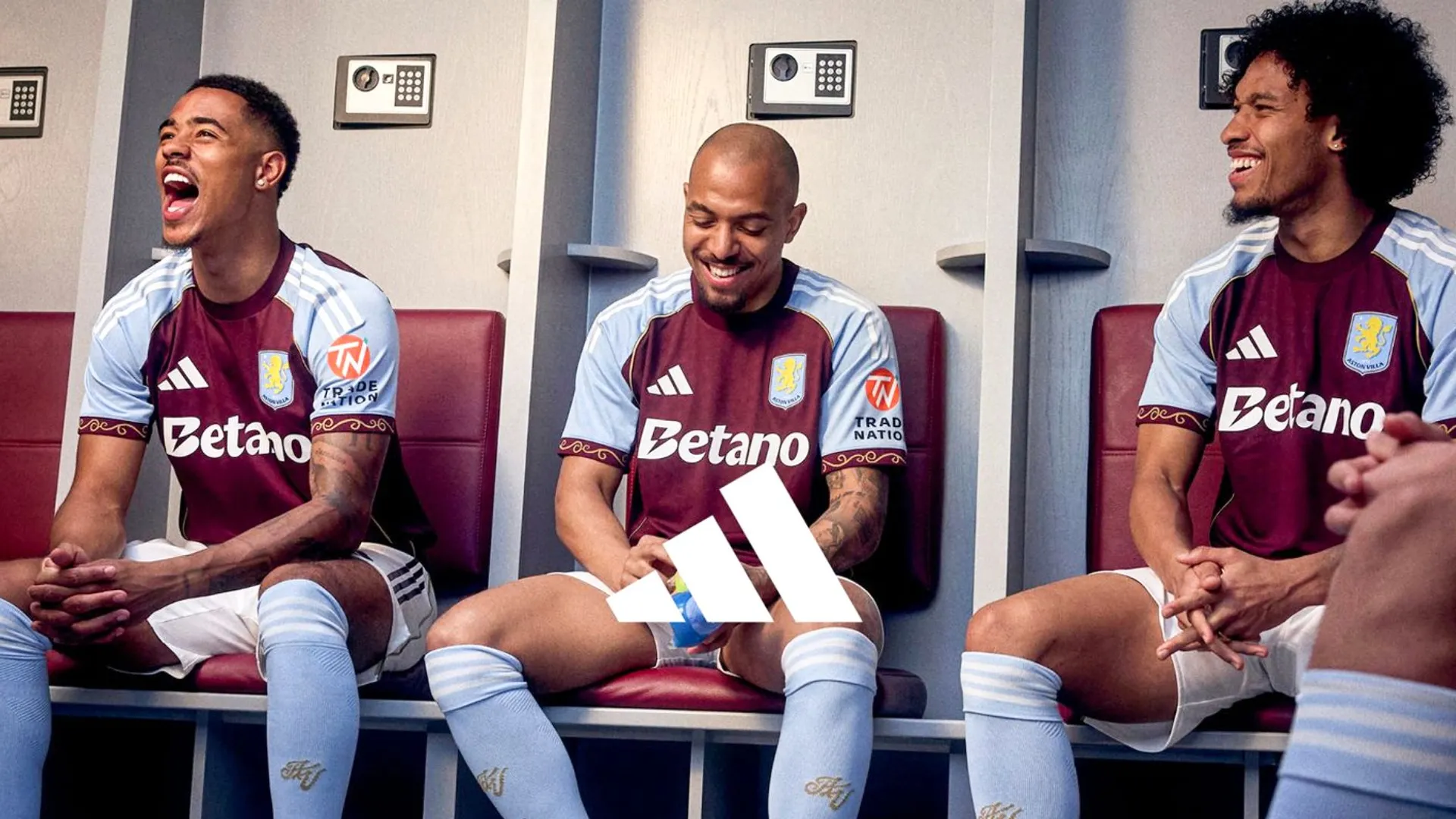
SHOP Buy from Adidas
Sometimes the best ideas are the simplest. Adidas refuse to overcomplicate things for Villa this time with an ornate cuff design inspired by Villa Park and the same gold piping down the sides. It's absolutely glorious.
15. Manchester City away
SHOP Buy from Puma
We don't mean to go on about the rain kit but this more than makes up for it: black-and-silver is an underused but excellent combo, with the collar on this one meaning that it doesn't come across as too modern. Extra points for the iridescent badge, too.
14. Crystal Palace home
SHOP Buy from cpfc.co.uk
Fresh, bright and very smart, Macron have done it again. The Palace home shirt doesn't try and be anything too edgy, it just delivers with bold blocks and a winning colour combo. It's the old mantra that you're not cool if you try to be – and it works fantastically.
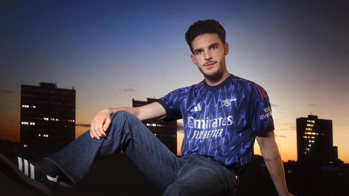
13. Arsenal home

SHOP Buy from Adidas
It maybe shouldn't come as a surprise that there are 47 shirts worse than any of Arsenal's, given their status as Adidas's clear favourites. The plainest of their three designs is still a lovely top, too, with a thick, round collar recalling the 70s and all-over ‘A’ graphic a reference to the 90s.
12. Tottenham Hotspur away
SHOP Buy from Nike.com
Tottenham have donned all sorts in their Nike partnership but there's no beating the hits: a sophisticated black number with intricate patterning is all that it takes to knock it out the park for a Spurs away shirt and this is one of their finest in yonks.
11. Manchester United third
SHOP Buy from Adidas
Eric Cantona highlights on TikTok are enduring proof that if you package up anything that reminds of us our childhood, we'll snatch it with both bands – and sure enough, United's latest away shirt gets an average of 7/10 from our voters. Black-and-yellow is very much in, making this as current as it is misty-eyed for the 90s.
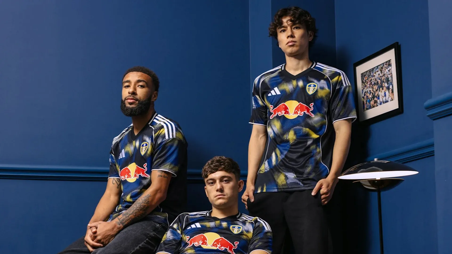
10. Leeds United away
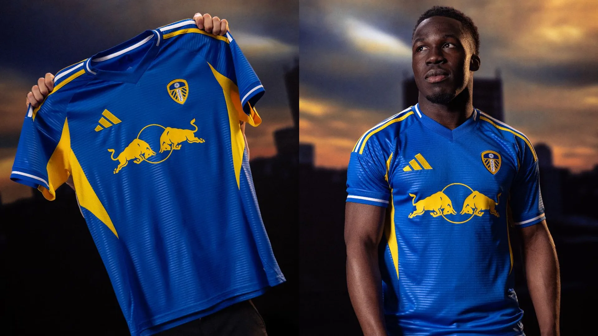
A recent shift towards manufacturers paying tribute to rival kit-makers' backcatalogue is overdue – not least because Leeds' latest away threads are the tribute we never knew we needed to the Strongbow-era change strip we'd all but forgotten about.
Meticulously reimagined from the subtle striping to the underarm panels, this is a great effort: even the Red Bull sponsor recalls the curve of the original sponsor from a distance.
9. Brighton & Hove Albion third
So good they kept it another year, Brighton have a habit of making last year's away this year's third – and we're very glad they did once more.
We've had a year to live with this top so perhaps its familiarity played a part in our voters' minds – but it's a smart kit that does well to combine yellow, navy stripes and white panels. One of the Seagulls' best of recent years.
8. Arsenal
SHOP Buy from Adidas
Some years, we'd be lauding a lightning-inspired two-tone blue Gunners away strip with metallic logos as the best of the bunch. It's only that the German manufacturer have done this all before that we firmly believe there are seven kits better this season.
By this point, a design that was originally introduced by Nike now feels just as synonymous with Adidas, though – the red stripes down the sleeves are a great touch and with Arsenal's other two shirts designed to look more retro, this is a more modern-looking away.
7. Liverpool away
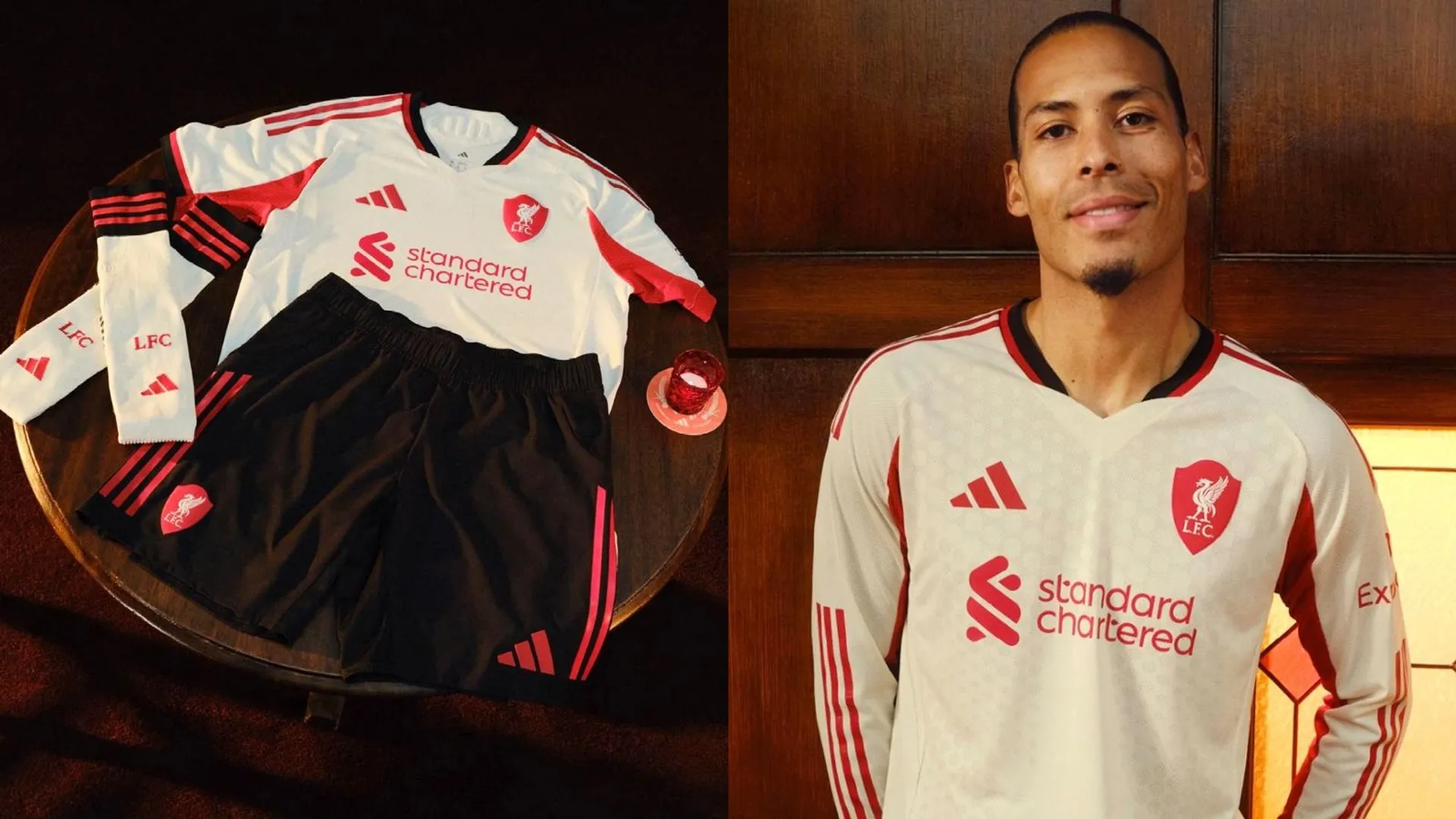
SHOP Buy from Adidas
You know when you just picture a club's shirt and get an image of what it should look like?
Liverpool's first away effort of this new Adidas deal is perhaps the definitive change strip for the Merseysiders: off-white with red accents, with modern panels under the sleeves. It's a work of art.
6. Crystal Palace away
SHOP Buy from cpfc.co.uk
Yes, football kits are designed months in advance and can't possibly reference events of the previous season's campaign. It just feels so right for Palace to wear gold after winning the FA Cup, though.
We love a gold shirt at FourFourTwo and Macron haven't tried to be too clever with this one: simple black details and no pattern to steal the glare from a winning base colour. Perfection.
5. Tottenham Hotspur third
SHOP Buy from Nike.com
Nostalgia turned up to 11: the colour's reminiscent of 2000s Spurs away tops, the design draws on Nike's Total 90 range and the old badge is back for the Lilywhites.
The similarities with Chelsea's third shirt are there: maybe the Blues' looks more like a training top (since it has no sponsor) or the blue doesn't mesh well enough with the black.
But Tottenham's is magnificent. It doesn't even feel like it's harking back or referencing 20 years ago: it feels like it was dug up from a time capsule under White Hart Lane.
4. Newcastle United third
SHOP Buy from Adidas
Honestly? When we heard Adidas were going to be drawing on the Magpies' 1997/98 away shirt, we rolled our eyes a little. It's not one of their more memorable, it's a design that doesn't exactly lend itself to the 21st Century and there are better to reference.
Yet the manufacturer have taken the base colours from that top – oh, and the badge – and just created something entirely different.
The result is something far greater than the influence. Newcastle's third kit is a future classic in its own right, blending green and orange with dark blue – yeah, really – for something that feels distinctive and modern.
3. Fulham third
Black and gold. You just can't beat it.
Fulham are the latest to try the trend with simple lining down the sides the only defining feature for this one. The Cottagers are no stranger to black change strips but with Adidas often opting for something out-there with Fulham change strips – see pink hexagonal patterns, Barbie shock pink or garish brickwork – it's refreshing to see them play it cool this time.
One of the best black-and-gold kits in the history of the Premier League? Why not. The Whites have a history of pushing the boundaries with their shirts but this one feels timeless.
2. Nottingham Forest home
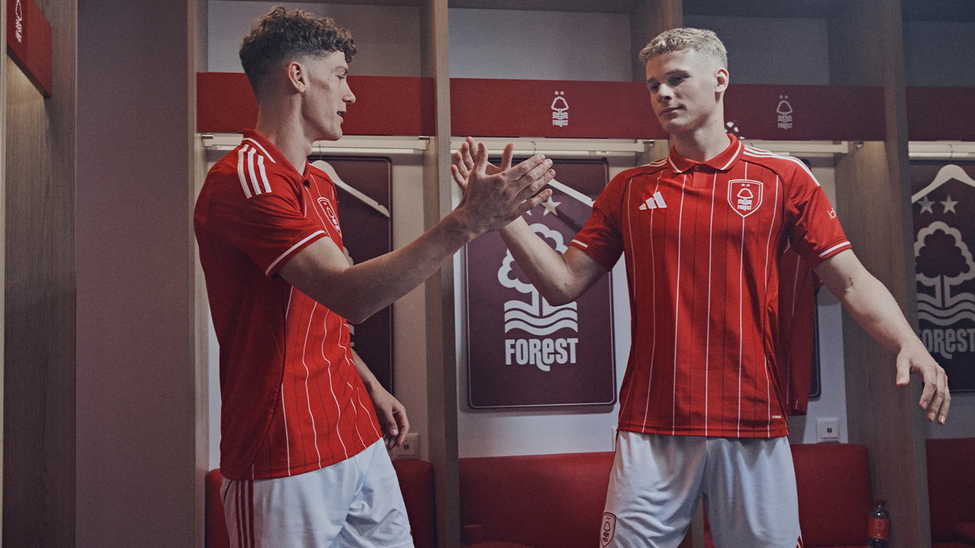
Forest in Europe: it conjures sepia images of Cloughie barking instructions from the under the lights on winter evenings.
Such an evocative return is fitting of this, the best home shirt in the Premier League this season bar none. Adidas have gone full retro with the collar and introduced new lore with the pinstripes, even placing that lovely badge in a shield for its travels across the continent.
It's rare that a shirt can blend the old with the modern to quite an exquisite standard – but this is an absolute triumph.
1. Arsenal third
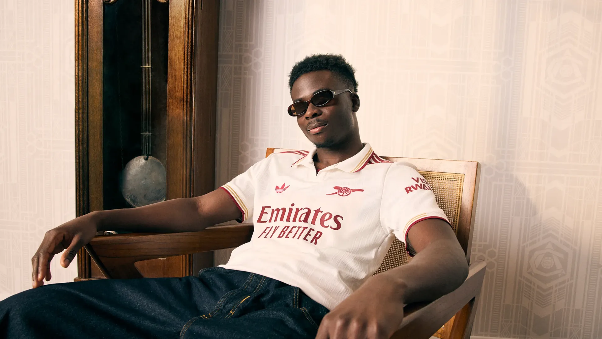
SHOP Buy from Adidas
Do you know how good an Arsenal shirt has to be to one of their greatest-ever?
The easy answer for Adidas to celebrate 20 years since Arsenal left Highbury would have been to give the Gunners a deep red shirt to recall the home top of 2005/06. But what they've produced even rivals that classic in terms of style.
The white base has Highbury's iconic patterns embossed into the fabric itself, with touches of redcurrant – naturally – and gold for a truly regal effort. This is everything a football shirt should be.