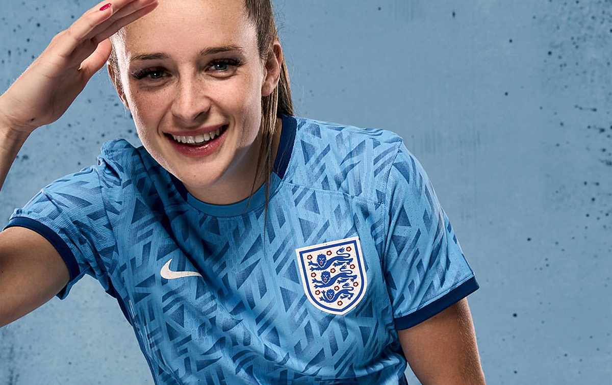
There are some things that the England national football team struggle with. Penalties, for example, despite them getting our hopes up in 2018; the distraction of WAGs at Baden Baden or letting the manager pick the team in peace.
But fashion comes easy to the Three Lions – whether we're talking Phil Foden's ice-blonde mop or Gareth Southgate doing his bit for M&S waistcoat sales. Since American manufacturer Nike started making the team's shirts in 2013, there have been plenty of nice additions to our wardrobes, too.
And some that, frankly, we didn't rate. Let's run through the worst to the best…
Ranked! Every England Nike shirt ever
Honorary mention: World Cup 2018 prematch shirt
Based on the 1982 Admiral kit, this prematch work of art was reported to have been rejected by the FA on the grounds of "too jazzy", only for it to outsell the actual 2018 home shirt.
That rumoured boob notwithstanding, the shirt has become a modern classic among fans, whose imaginations were captured when they saw it on display in Russia. If anything, its relegation to warm-ups has only done it favours in making it cooler than it already was.
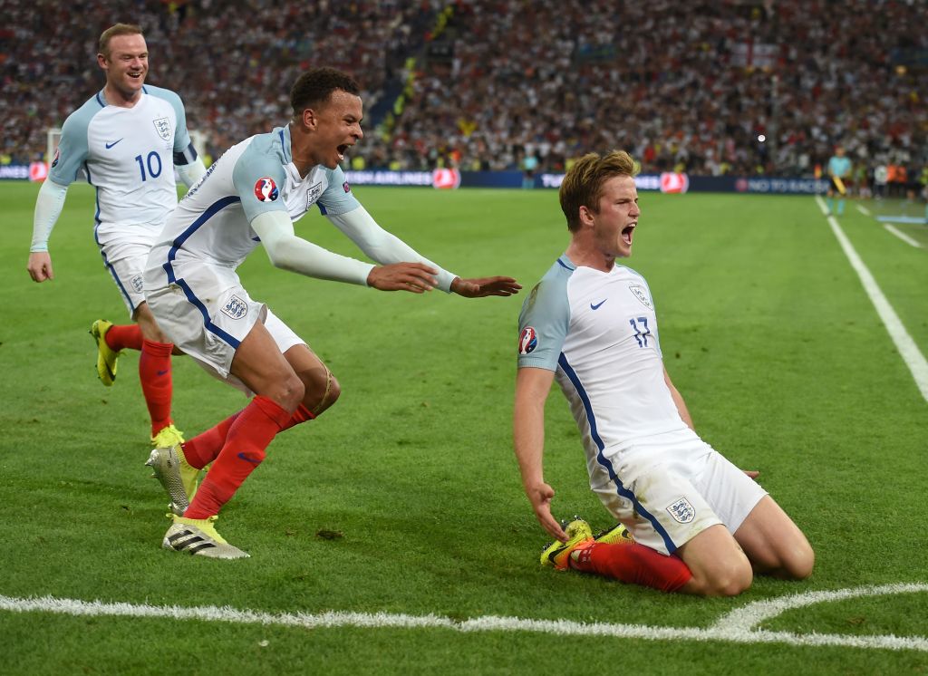
19. Euro 2016 away shirt
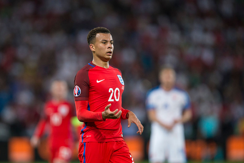
The absolute nadir of Nike's unimaginative carbon-copy kit-making. In 2016, every one of the brand's teams took the same kit to the Euros: a boring base colour, different coloured sleeves and the same font for the numbers.
Yes, it looked remarkably similar to the Portugal home shirt but no, it didn't really sit right. The dark red, bright red and royal blue trimming all looked a little uneasy together with this shirt getting just the one outing at the tournament, a bore draw with Slovakia. A lazy effort, this one.
18. Euro 2016 home shirt
Speaking of lazy efforts, here's the shirt that England were knocked out of Euro 2016 to Iceland wearing.
Nike went for light blue sleeves on the home shirt that summer, to recall the heady days of Euro 96 – and it looked remarkably similar to the France away shirt. Luckily, football shirts started to become just a little more individualised following this tournament and we never have to go back to that awful template – or the memories of thousands of Scandinavians clapping us off the pitch – ever again.
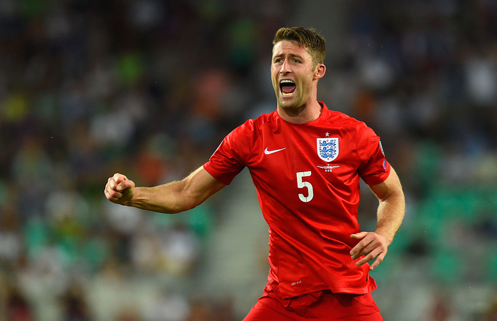
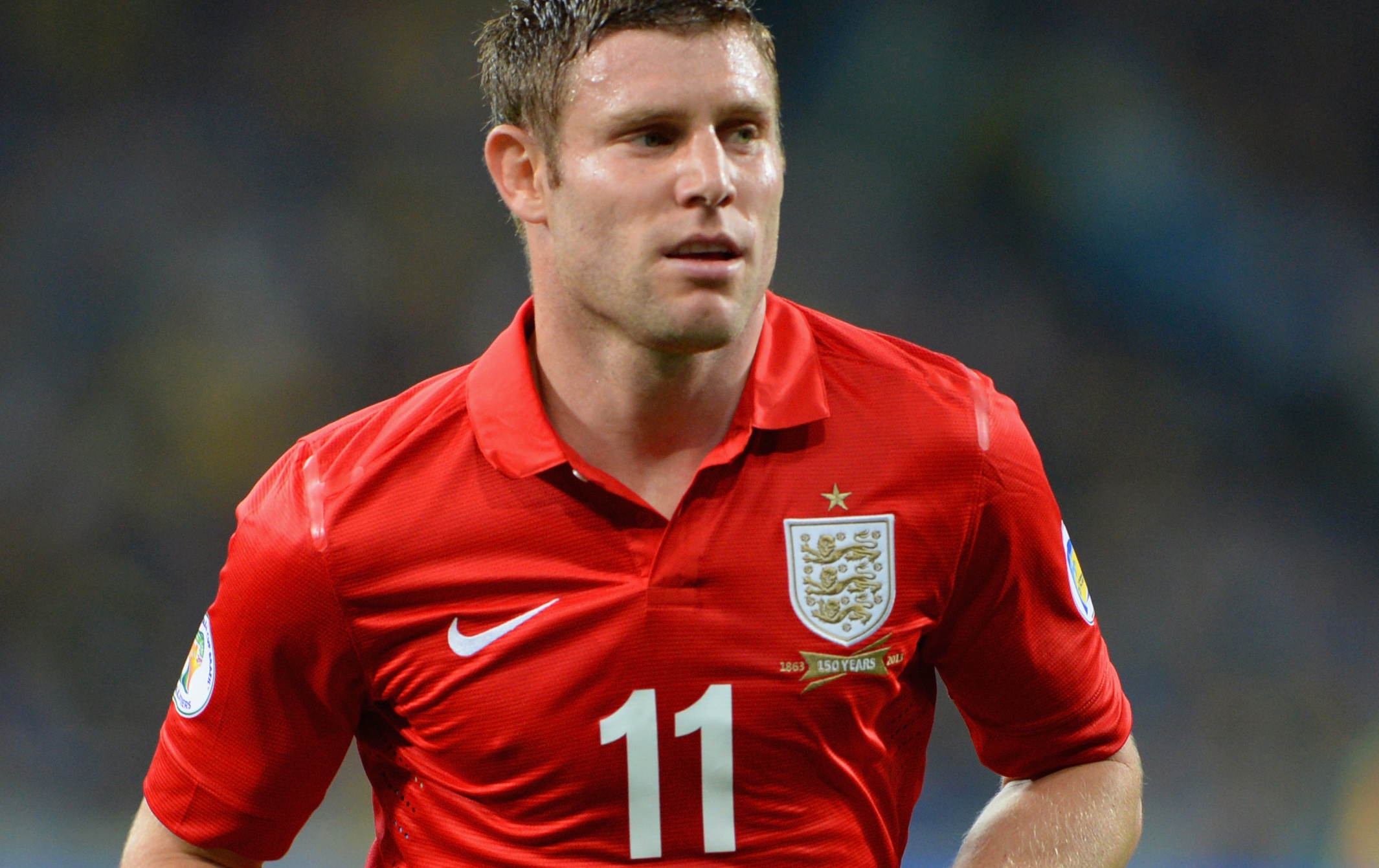
17. 2013 home shirt
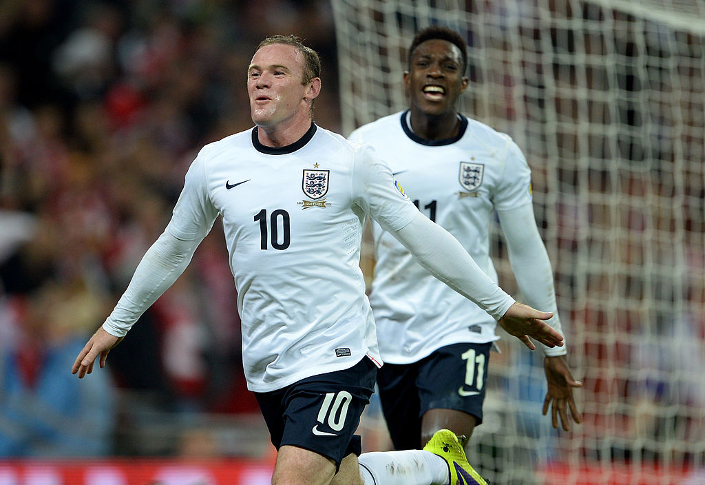
Euro 2012 was the last tournament with Umbro as the kit supplier. Umbro had already been acquired by Nike but following the tournament, the Three Lions got their very first Nike tops.
The word you're looking for is "inoffensive". When a round, navy collar is the defining aspect, it's perhaps a little too safe and as a result of starting with a completely blank canvas, these tops look like something you'd find on a FIFA game if EA didn't have a license for the real kit. Still, an upgrade on silly sleeves.
16. 2017 third shirt
The away kit England should have got at Euro 2016 was belatedly worn a year later in a friendly against Germany. All navy, with sky blue numbers on the front.
There was absolutely no need to bring this shirt out – and it only got one wear. Still, it wasn't too garish and the colours were a lot nicer than the red version from the Slovakia game.
15. World Cup 2014 home shirt
At a time in which England were led by Daniels Sturridge and Welbeck, it's not particularly fitting that the home shirt is quite this yawnably boring. It's essentially a white t-shirt with a v-neck.
The 2013 shirt with its round collar never really felt like an England shirt – perhaps thanks to its lack of tournament experience and its 150-year anniversary badge from the FA – but the one released a year later really does. It has a nice typeface, at least, and the royal blue feels fresh on the shirt.
It was always a basis for Nike to get more creative in tournaments to come but looking back on this top, it wasn't that bad. Just not very exciting, either.
14. World Cup 2014 away shirt
The 2014 World Cup away shirt never got its time in the Brazilian sun, owing to England's early exit from the group stages. But this shirt walked so that future tops could run.
The away shirt that year looks fairly nondescript on first glance but was very subtly pinstriped with the cross of St. George. A classy, simplistic design that came with a nicer typeface and didn't mess with the colours too much: we don't ask for much, do we?
13. Women's World Cup 2019 home shirt
A subtle evolution of the 2018 World Cup shirt, England women's first exclusive home shirt was a simplistic white with two-tone red cuffs. It wasn't particularly groundbreaking but it still looked stunning.
This set a standard of women's shirts going forward – it was a minimal customisation of a classic we already knew and loved… only Nike didn't want to do anything too controversial, given that the away top was the headliner for the tournament.
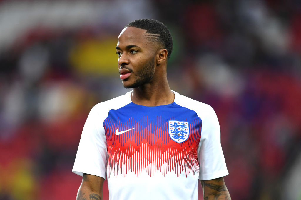
12. Euro 2020 away shirt
One that divided fans, the Euro 2020 away shirt plumped for royal blue as the change shade, breaking from a generation of red and occasional navy. It wasn't everyone's cup of tea but it had redeeming features.
Again, a sort of pinstripe adorned the kit, with a pattern resembling the Three Lions badge itself plastered all of the shirt. The numbering was funky and with touches of red and a big, brash colour, this was steeped in 90s nostalgia without actually being directly influenced by one kit in particular.
But England didn't actually wear this one either at a major tournament, donning white throughout Euro 2020's seven matches, despite opportunities to switch it up. One that will no doubt be remixed 20 years from now.
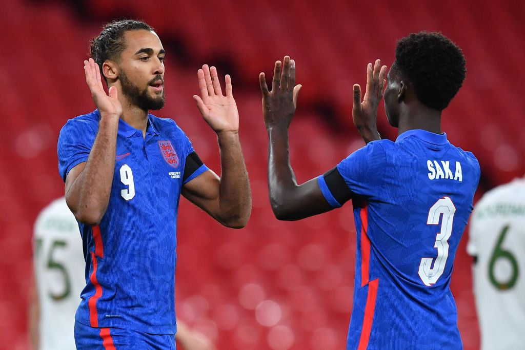
11. World Cup 2022 home shirt
Look, we love remake shirts as much as the next bucket hat-wearing, World In Motion-singing fan park dweller – but this is a little different.
Sure, the colours themselves are inspired by the 1996 top from when football came home and Gazza scored that goal against Scotland. But the rest was brand new. The gradients on the shoulders were completely fresh.
This one divided fans but overall, it was a welcome addition after so many shirts that looked backwards rather than forwards. Not one that we'll yearn for in years to come but a solid effort, all the same.
10. Women's Euro 2022 away shirt
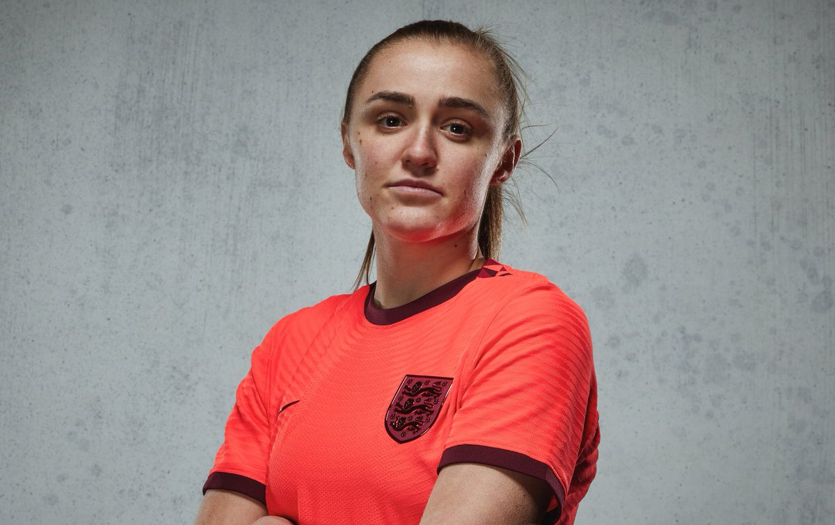
Nike claimed to be viewing the "most famous red shirt in football through neon-tinted glasses" when they looked to give England women a top that felt modern, fresh and completely different from anything they'd ever done before.
This was something daring for an exciting new generation. The coral-coloured masterpiece never did get an outing at the home Euros but it was one that had beautiful details, such as the diamond pattern of the home shirt on the back of the neck and on the socks.
The last six England away shirts – men's or women's – have all been different colours. This one was perhaps the most controversial and wasn't unanimously adored by fans. But it was a statement nonetheless.
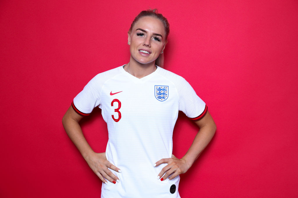
9. 2013 away shirt
Gary Lineker not being given the chance to break the all-time scoring record, Frank Lampard's ghost goal against the Germans and this kit not getting taken to an international tournament. Take your pick from the three for the greatest injustice ever in England's history.
The shade of red is perfect, the colour is great and even the white/gold badge gives it a regal look – but perhaps the clincher is the addition of subtle St. George's crosses on either shoulder to make this one feel a little more modern than your run-of-the-mill England away shirt.
FFT still find it gutting to this day that this one was replaced for the 2014 World Cup. We'll always have that night away to Ukraine, though.
8. World Cup 2022 away shirt
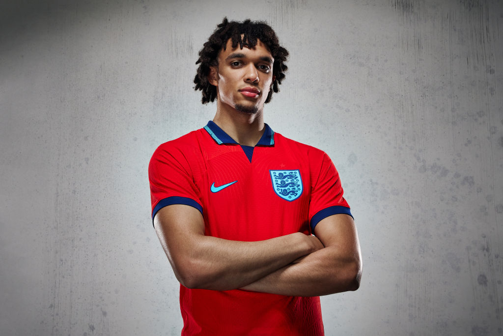
Again, it never got a runout in a tournament. The England away shirt for Qatar was influenced by the 1990 away top, with a lighter red and the omission of any white whatsoever. A classic collar was introduced, with navy and sky blue for the flourishes.
It's so difficult to reinvent the wheel when it comes to a red England shirt but Nike did an excellent job on this one, to give them their credit. The colours marry together exquisitely, the navy/sky blue badge looks fresh and different, while the pattern on the collar – and the '3 Lions' insignia when you lift it up – are beautiful details. Another that will be lost in the annuls of history because it never got a big enough spotlight, it was a stunning shirt all the same.
7. Women's World Cup 2023 home shirt

For those of a certain age, those triangles emanating from the collar are reminiscent of a kit template that England never actually had. This – and some of Nike's others for the Women's World Cup – was inspired by the 2002 World Cup shirts, bringing a nice little facet of nostalgia into 2023.
As a kit itself, it's quite safe – but the addition of the blue and the subtlety of this one make it a winner. You'd think this wouldn't be one that would last in the memory for decades… but the shirt it was inspired by did, didn't it? It's just simple, classic and classy – and for that, we quite like it.
6. World Cup 2018 home shirt
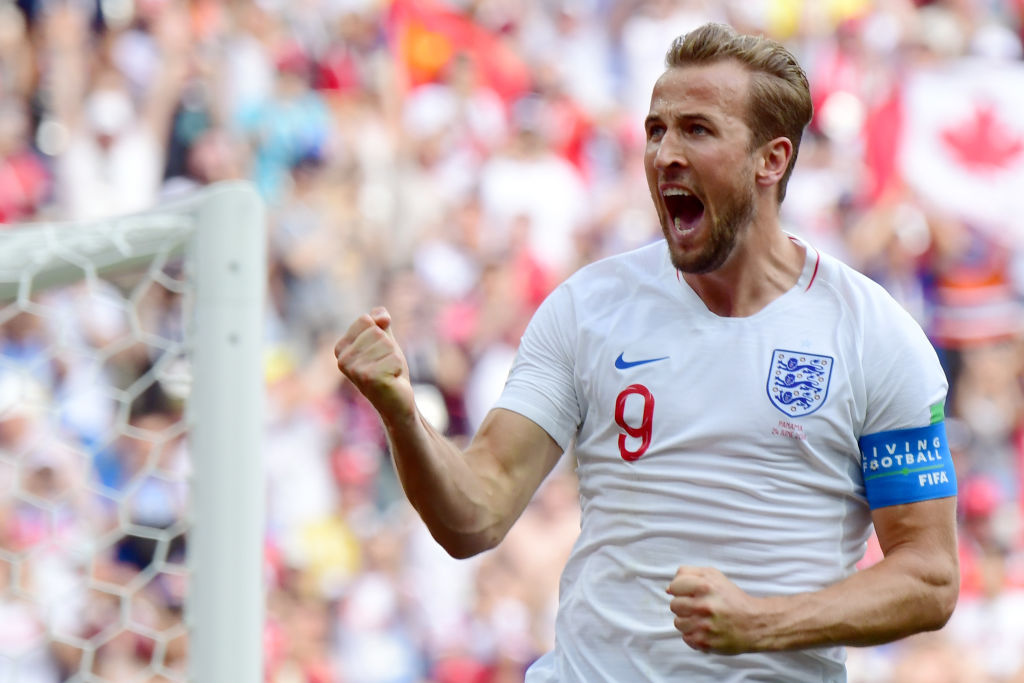
Maybe it's the nostalgia talking – the memories of pub gardens, pre-COVID, Dua Lupa and Calvin Harris on repeat, as you play HQ Trivia on your phone – but the England home shirt of 2018 was simply beautiful.
The collar was simple with the nice touches of a red cross on the next, the font was probably the best England had ever had and putting the number below the Nike swoosh made a nice change. We didn't just feel proud of the boys but proud of our get-up in this tournament – and though Nike may have dropped the swankier pre-match top in favour of this one, we're not mad about it.
Frankly, we'd buy this one every two years if they made it available.
5. Women's World Cup 2023 away shirt
Oh, do we love a throwback. So when Nike released an away shirt for England women that was riffing on the iconic, diamond-patterned sky blue change strip from the halcyon days of the early 90s, we couldn't contain our excitement.
The result is something that feels unmistakably modern, despite looking a cross between that masterpiece famed in the World In Motion video and Arsenal's bruised banana from '91-'93. The navy ties simply ties it all together – it looked absolutely beautiful Down Under.
4. Euro 2020 home shirt
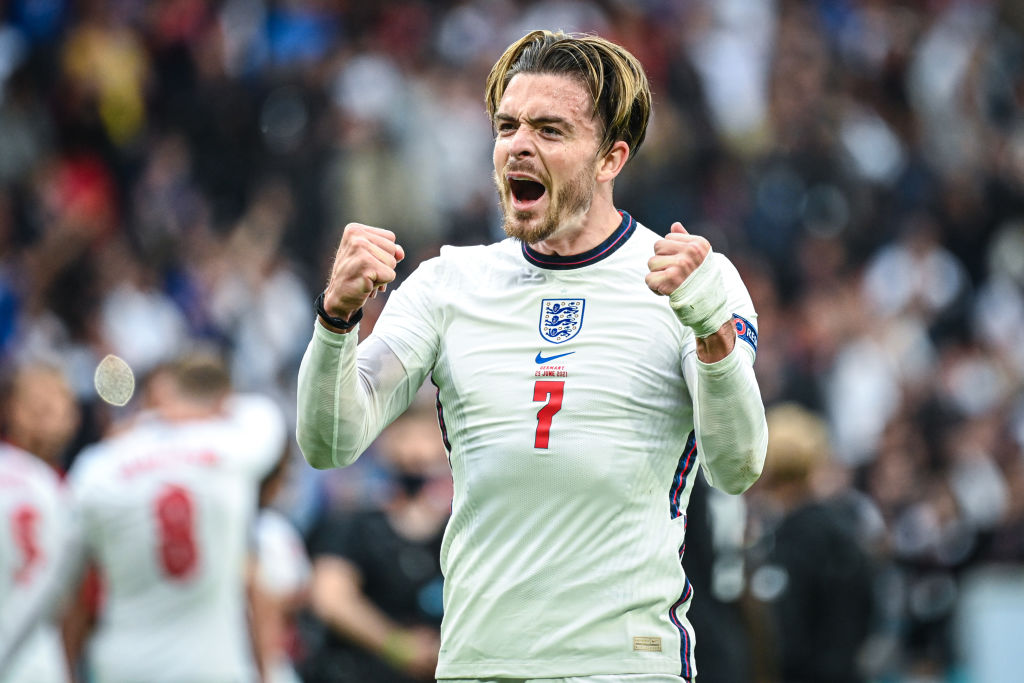
It's not just because we did well wearing it, either.
The Euro 2020 shirt was a subtle hark back to France '98, with the badge, number and swoosh central and the numbers back to a chunkier font. But there was so much subtlety to this one to love, too: the touches of red intertwined with the navy, the intricate, thick collar and the broken stripe down either side that actually grew on us as the tournament progressed.
You couldn't buy this shirt for love nor money when the weather was baking, and it's not just because the people's prince, Jack Grealish, looked a million dollars in this thing. It's a design triumph – and it would've been had England crashed out to the Scots.
3. Women's World Cup 2019 away shirt

One of the most distinctive England shirts of all time and the first foray into how Nike could create iconic shirts purely for the Lionesses, the 2019 away top was a thing of beauty that still holds up today.
The main body of the shirt was a deeper shade of red with flora representing the English counties printed across the body. The design was split into four corners, too, to reflect the St. George's Cross. It looked like nothing the national team had ever worn before and became a favourite with future captain Leah Williamson.
“The colour is unique for a national team kit and it’s the nicest I’ve ever seen,” the Arsenal star said at the time. She's not wrong.
2. World Cup 2018 away shirt

We're going to go out on a limb, here. If England had worn this shirt in the semi-final of the 2018 World Cup, they would've hung onto that lead against Croatia.
This is quite simply one of the most stunning Three Lions tops ever and a great example of how to incorporate multiple elements into one cohesive design. The textured St. George's cross over the body looks excellent, the font particularly works well with this one and thank god that they went with the blue/white badge and not a naff red/white one.
This shirt was so magnificent that it was the sole reason England won a penalty shootout. What a piece of kit.
1. Women's Euro 2022 home shirt
It's really easy to say it's the greatest Nike England shirt ever because it's also the most successful. But it's also got the most beautiful design, too.
For this effort, the American brand introduced a "pearlescent" badge for the first time ever and gave the base of the top a subtle diamond graphic. It was conjured in conjunction with the players themselves with the idea that diamonds form under extreme pressure – and the result was perhaps the most elegant, unique home top the nation has ever seen.
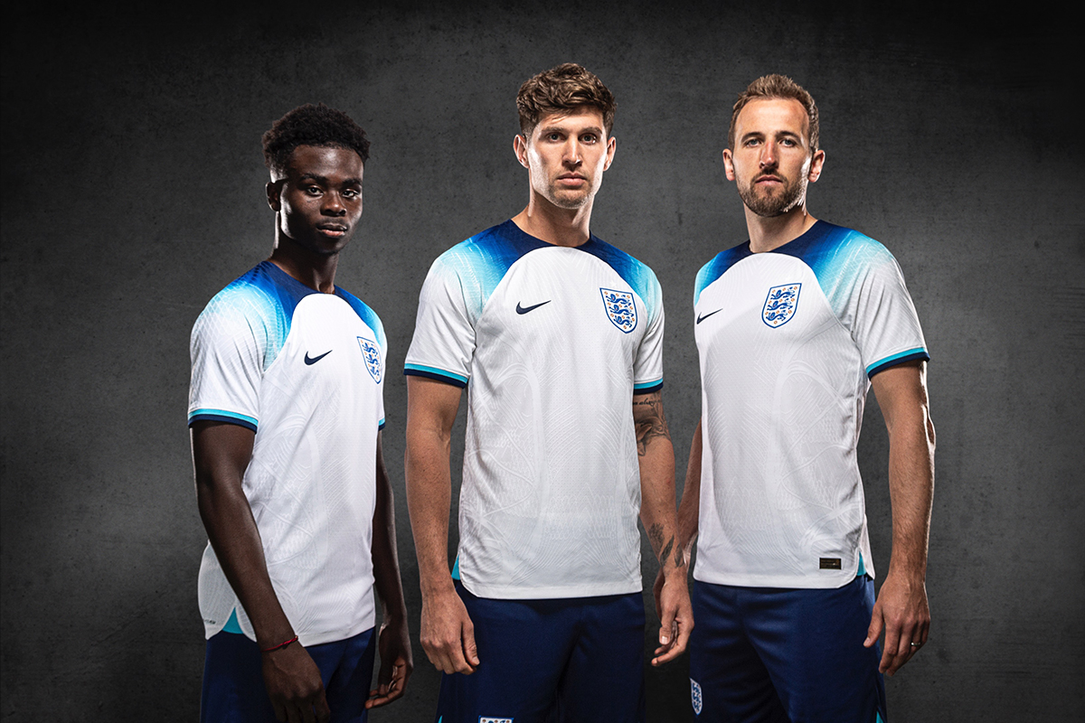
Fit for a home Euros and perfect for bringing football home. This is the standard of national team shirts going forward.