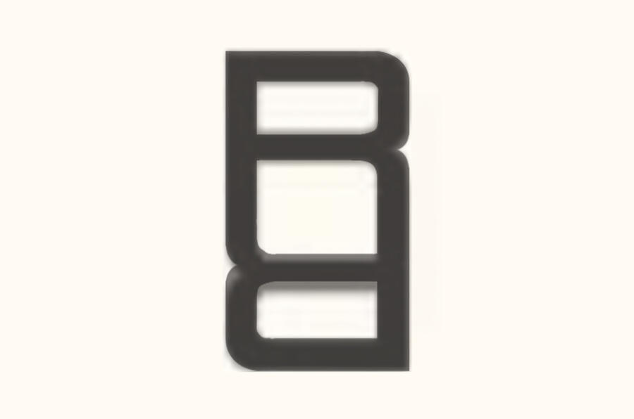
Earlier this month, news of Range Rover's new logo, the first in the brand's 55 year history, was met with raised eyebrows. Rather like Jaguar's much-derided rebrand, the new 'RR' symbol was seen a weirdly goofy look for a storied luxury car brand. But it turns out the new look involves more than just a new symbol.
In a new interview with Design Week, Range Rover has revealed more about the rationale behind the new identity, along with an updated version of the Range Rover wordmark. Far less of a departure in style, the new wordmark features subtly tweaked lettering, aimed at "decoding and recoding Range Rover’s existing DNA into a set of guidelines that support modern luxury communication.”
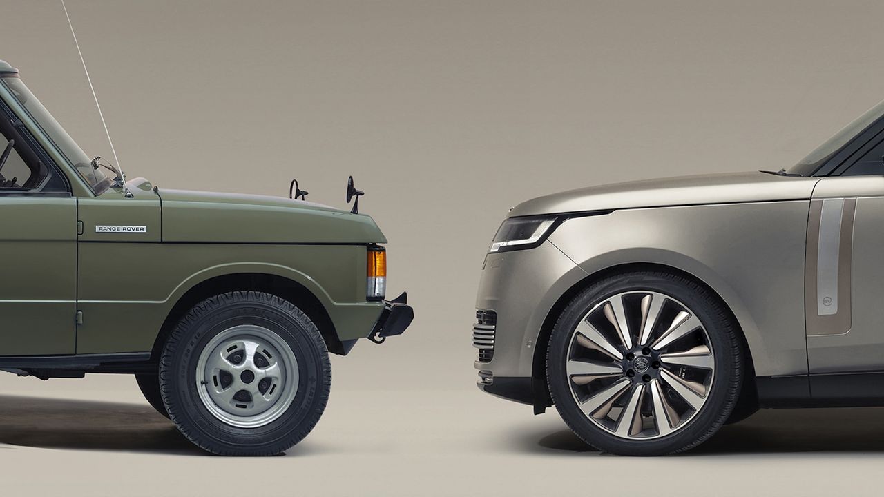
Brand design chief Will Verity told the publication that the new look is designed to highlight that Range Rover, which launched in 1970, was the "first automotive brand to combine utility and luxury".
Indeed, while not many cars have been shown in The Louvre as an "exemplary work of industrial design", this honour was bestowed upon the original Range Rover. Released in 1970, the elegant SUV managed to convey both ruggedness and luxury. Only five iterations of the vehicle have been designed in the last 55 years, the most recent being 2022's fifth generation model.
Particularly without context, the new Range Rover logo raised eyebrows last week. Featuring a pair of 'R's going toe-to-toe, the new logo ends up forming a single shape that certainly looks... interesting (or as Motor1 puts it, "goofy as hell"). It drew one of the same criticisms that was levelled at the Jaguar rebrand – that it looks like it isn't designed for a car brand. From jewellery brands to hip hop artists, plenty of social media users have suggested the new symbol looks like it was made for anything but a luxury SUV brand.
But Range Rover's new wordmark is reassuring in its familiarity. Unlike that curvy Jaguar text, it doesn't suggest a brand looking to completely upend its heritage.