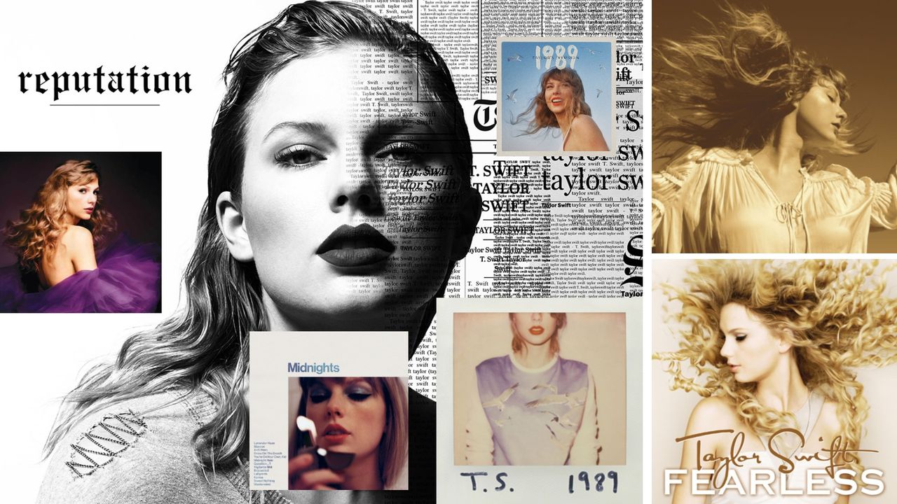
Taylor Swift recently announced her next album, The Life of a Showgirl. With it came a flurry of excitement over the new colour palette (orange, to match the door she went through on the final night of the Eras tour), album cover variants and general styling. Safe to say, when Taylor launches something new, there is a whole design ecosystem to explore.
This has inspired my most recent quiz, all about the visual design of Taylor's discography (or Eras, if you want to be a Swiftie about it). From typography to colour palettes, below you'll find 10 questions designed to test how much attention you've been paying to Taylor's visual identity. Some questions are easier than others. Good luck!
So, how did you do? Are you gaining a Reputation as a Taylor Swift aficionado or do you need a few more points to be a true brand Lover?
Sorry.
To learn more about Taylor's recent release, find out here how web design professionals are sighing at her new website – it seems accessibility wasn't at the forefront of her team's minds. And now discover how Taylor's new website provides some key lessons for us all.