When thinking of fall colors, powder blue is unlikely to be the first to come to mind. This time of year is usually dominated by warm, earthy hues that nod to the colors of the changing leaves, while powder blue feels more in keeping with the cool hues of summer.
But this year, powder blue is cropping up in fall color trends, and it is proving to be the unexpected way to create balanced interiors that put a fresh twist on seasonal decorating.
Here, you can find out all you need to know about this unexpected shade for fall decorating ideas, including how to decorate with blue in an elevated way – from painting the walls to smaller decor accents.
Why Is Powder Blue the Unexpected Color Trend for Fall?
Cool color schemes have been making a comeback this year, and so the idea of using powder blue for fall color schemes is a natural progression. We've noticed designers favoring the soft tones of powder blue in many stylish rooms – a fresh alternative to the rich, warm color schemes that often dominate at this time of year, especially for decorating styles that lean a bit more understated and calm.
The rise of powder blue for fall also coincides with the latest color trends in the fashion world, where we've seen powder blue look effortlessly chic when teamed with rich chocolate browns and lighter butter yellows. It's no surprise to see the same hues entering our homes.
The beauty of decorating with powder blue is that it can basically work as a neutral color. It doesn't overwhelm, but quietly adds color to rooms and works with most other hues on the color wheel. 'Cool and collected, powder blue is the perfect foundation for a room’s color scheme,' says Helen Shaw, color expert at Benjamin Moore.
'It is an ideal hue for those wanting to experiment with color as it creates a statement without being too bold, and its calming undertones delicately balance the need to make the home a sanctuary,' Helen adds.
While adding powder blue to your home this fall can be as simple as adding accent cushions or a rug, paint ideas are a great way to make it more of a prominent feature. When doing so, it's important to be aware of the orientation of your room, warns Ruth Mottershead, creative director at Little Greene:
'South and west-facing rooms will benefit from the cooling of the very warm light of the middle and end of the day, whereas those rooms facing east could well benefit from a warmer color treatment. In north-facing spaces, the bluer light can emphasize the blue or gray undertones.'
'Gentle powder blue shades such as Bone China Blue or Delicate Blue are popular, versatile choices for creating serene bedroom spaces, light and airy hallways, and home offices, where they provide a calming backdrop,' says Ruth.
How to Decorate With Powder Blue Throughout Your Home
From powder blue bedrooms to light blue kitchens, there are lots of ways to incorporate this trending hue into your home right now, and below, we've rounded up some stylish ideas to help you on your way.
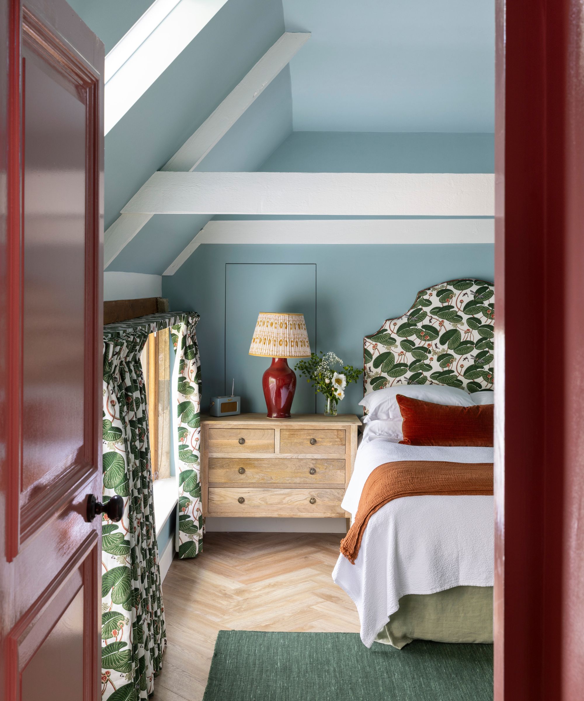
1. Add Powder Blue to Calming Bedrooms
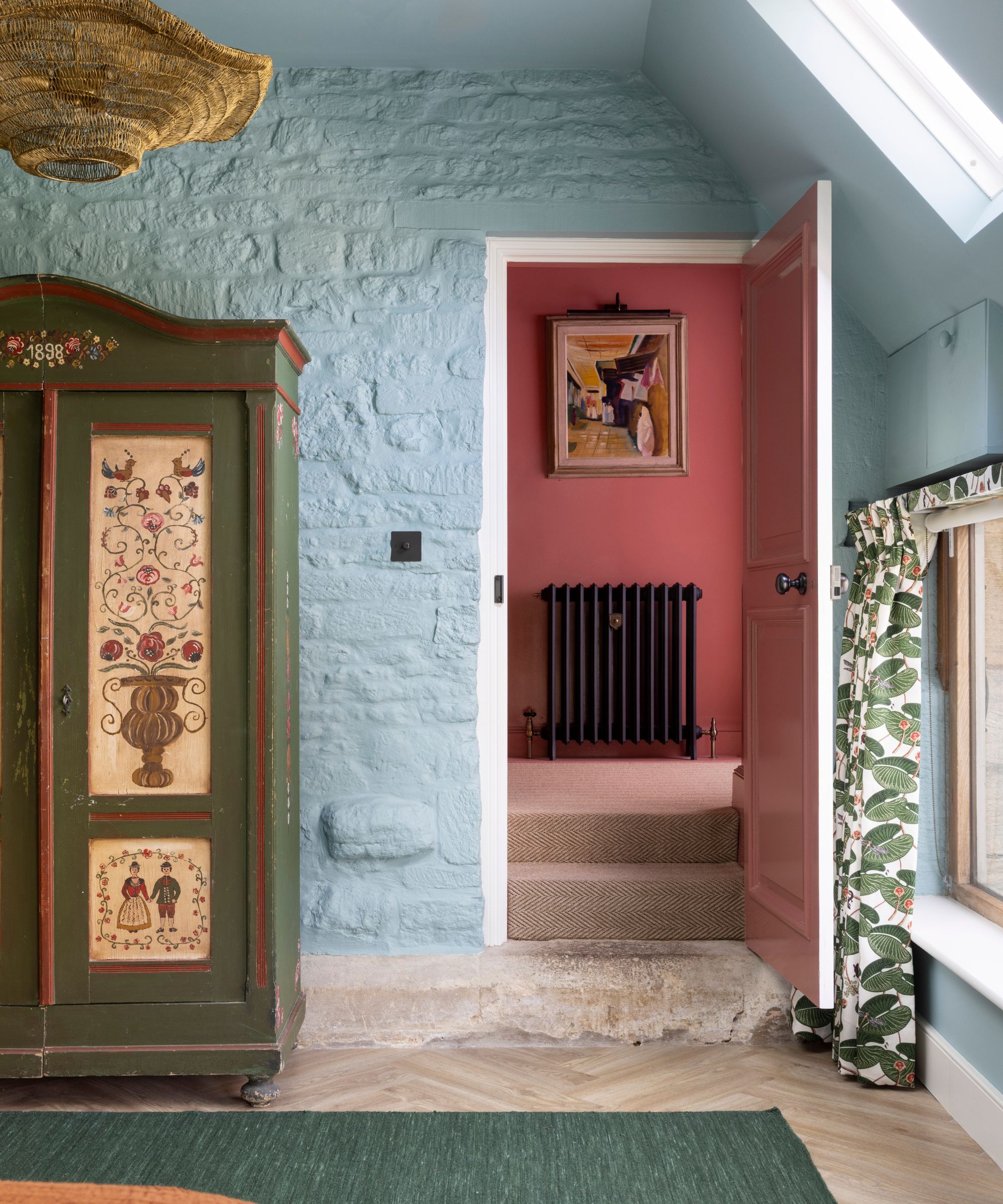
Blue is one of the most calming colors, especially light and powdery hues, and so it makes sense to add it to spaces used to relax in, such as bedrooms. In this neutral bedroom, the pop of powder blue adds interest and contrast to the warmer tones.
'Blue is a perennial favorite for its versatility and neutrality, and powder blue in particular creates a soft, serene atmosphere,' say the designers Michael Abrams and Gina Valenti of Abrams Valenti Interiors.
'We love using it in primary suites, where clients often prefer a tailored, calming palette that encourages rest and restoration,' the designers add. 'A powder blue bedroom brings a soothing, spa-like feel, offering a peaceful, sanctuary-style retreat.'
2. Go for Powder Blue Kitchen Cabinets
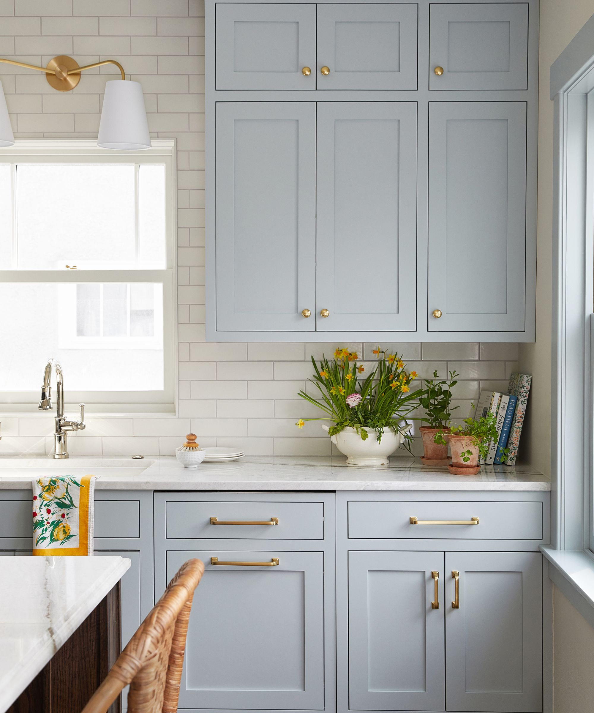
If you're looking for a fresh shade for kitchen cabinets, powder blue is a stylish option. Light enough to keep the room feeling airy, powder blue cabinets are an on-trend departure from the likes of beige, and going for a gray-toned blue ensures liveability, much like Benjamin Moore's Wales Gray, which was used here.
'This blue has a gray undertone, and while gray alone might be out of fashion and a little sad, we do love colors with gray or muddy undertones because they are so livable,' explains the Chicago-based interior designer Claire Staszak of Centered by Design.
'This client did not want a white kitchen, and so a soft blue (with a wood island) was a very timeless combination,' Claire adds. 'We also painted the trim work blue for a more historical look.'
3. Add Personality With Powder Blue Patterned Wallpaper
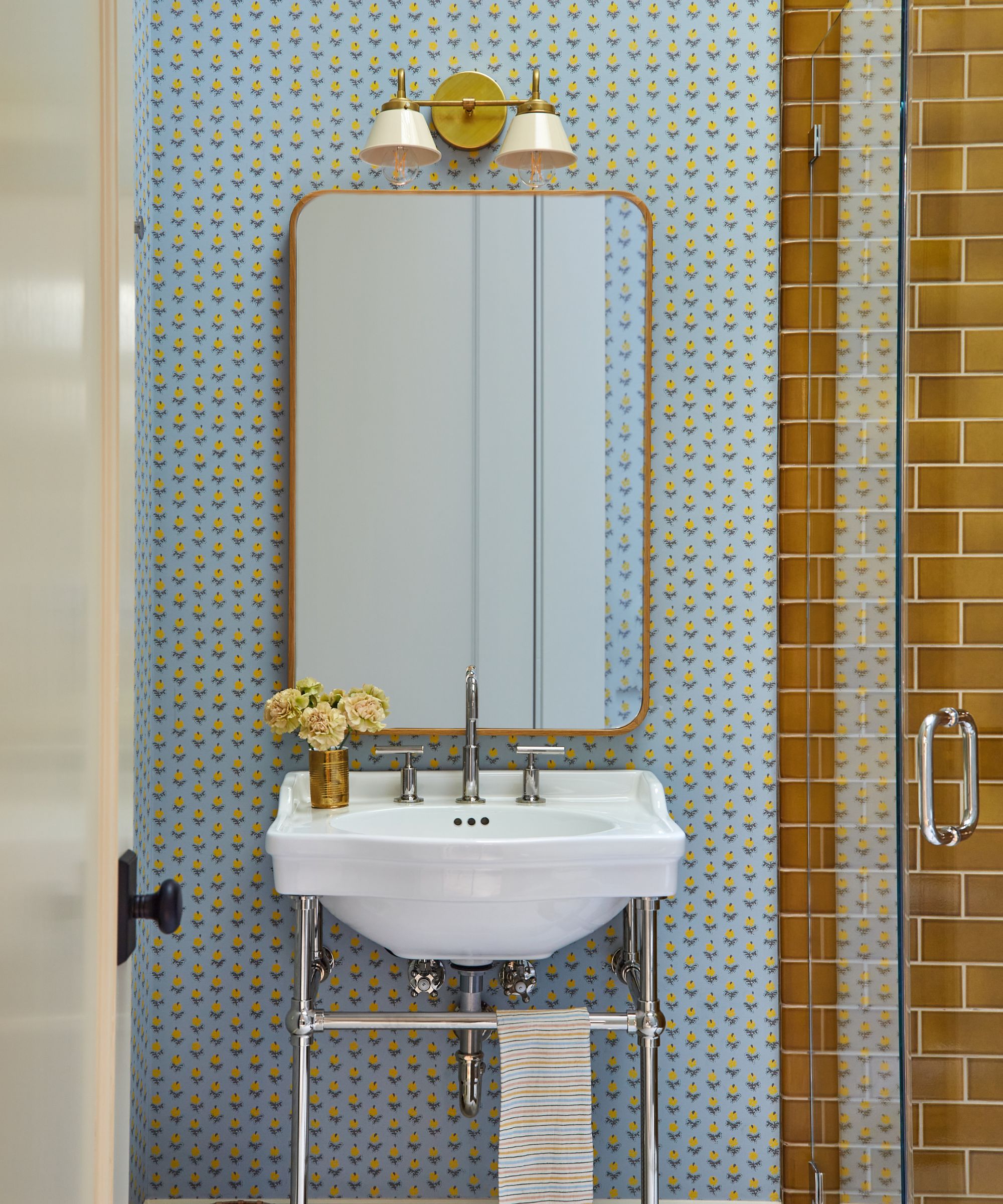
In the right setting, powder blue can come across as a retro color trend, nodding to the pale pastels of the '80s. To lean into its nostalgic charm, wallpaper ideas in a traditional pattern can fill rooms with character, much like in this bathroom.
'Powder blue is a fantastic color because it feels so effortlessly cheery and bright, even in a small space like this,' says the designer Maria Wu of Studio Wu. 'It's incredibly versatile – look how it instantly makes the mustard yellow shower tile feel warm and inviting, complementing the yellow notes in the Adelphi Paper print. This color offers an uplifting foundation that’s surprisingly sophisticated and always soothing.'
4. Pair Powder Blue With Warm, Rich Colors
If you want your powder blue scheme to feel colorful and cozy (perfect for fall), layer it with deep, warm shades such as red. 'Powder blue works particularly well with warm natural tones, or with pops of red and green to add contrast, depth, and a sense of versatility,' says the designer Cath Beckett, co-founder of the design studio Yellow London.
'These bolder accents help elevate the light blue, making it feel more dynamic and layered rather than overly flat,' adds Cath. 'It’s a timeless choice that adapts beautifully across both contemporary and classic interiors.'
5. Color-wash Walls for a Soothing Scheme
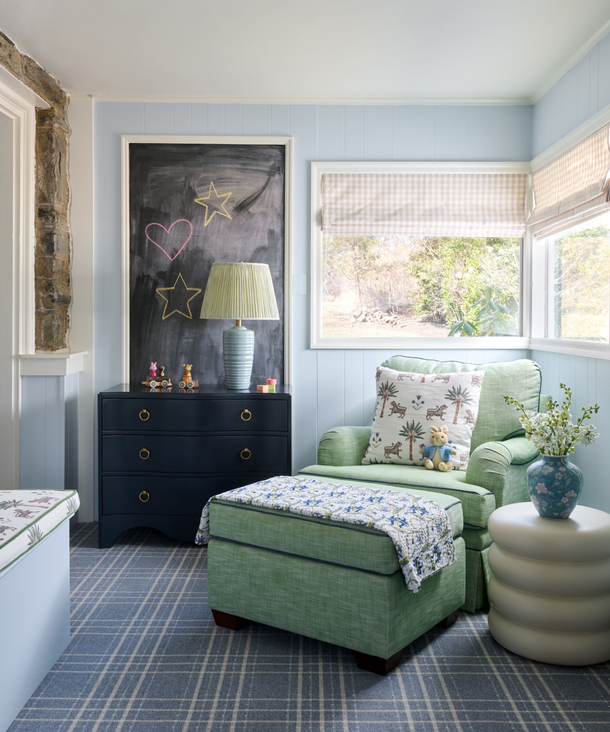
Color-washing walls in a pale powder blue is a wonderful choice for bedrooms, bathrooms, and home offices. It sets a tranquil backdrop that allows you to layer richer shades through decor.
'Powder blue is enough of a color to make an impact, but soft enough not to feel too bold,' says the interior designer Michelle Gage. 'I love it for bedrooms, as it is incredibly soothing. It is also a great neutral hue for playrooms and creative office spaces.'
In this playroom, Michelle opted for Benjamin Moore's Sheer Bliss on the walls, which is pale enough to keep the space feeling timeless.
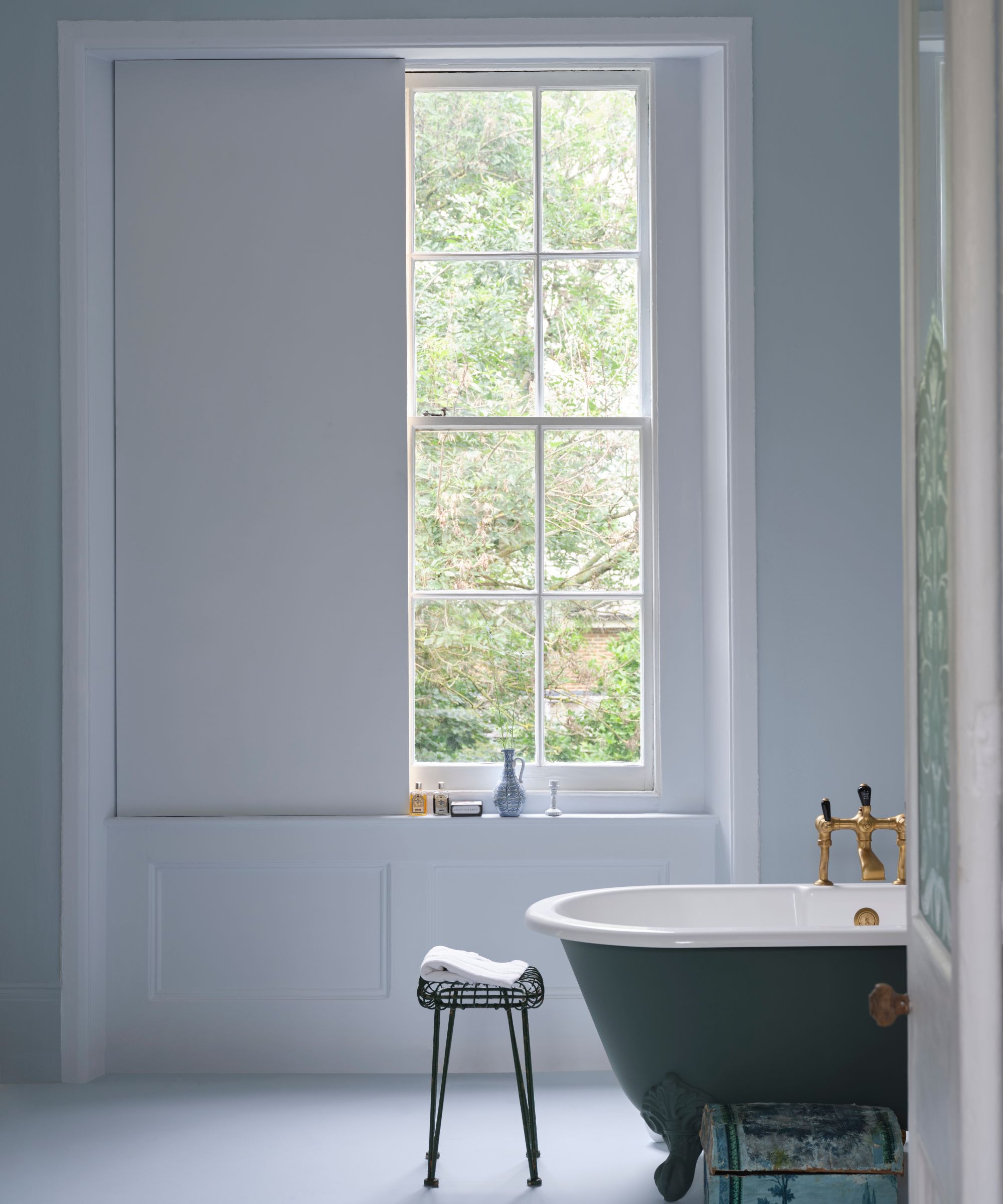
6. Add Powder Blue Accents in Bathrooms
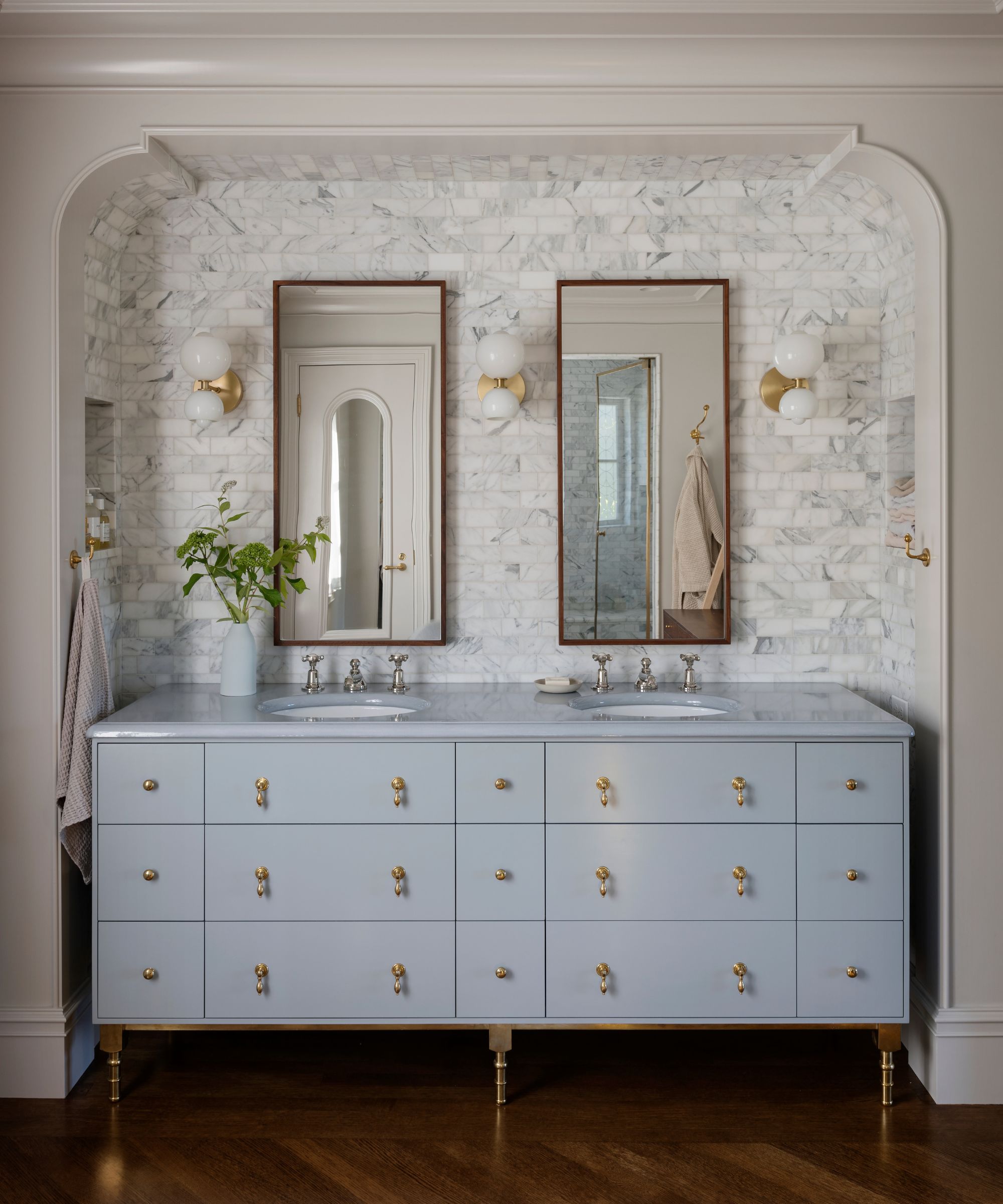
In bathrooms that are commonly decorated with neutrals, a pop of powder blue brings design flair and keeps the space interesting. 'Powder blue, when used as an accent in a sophisticated environment, can add a soft breath of fresh air to ensure the space doesn’t feel too stuffy,' says Mira Eng-Goetz, lead designer at Jessica Helgerson Interior Design.
While small decor elements, such as powder blue textiles, can be all that's needed, painting bathroom furniture takes this idea a step further. 'A shade like Jet Stream is a nice choice for bathrooms as it gives a refreshing, spa-like feel, especially when paired with a crisp, clean white,' says Helen Shaw.
Add Powder Blue to Your Home This Fall
Feeling won over by powder blue? Bring it into your home with these decor pieces that not only work for fall, but will transition seamlessly year-round.
Perfect for adding coziness in the winter months, this throw blanket features various shades of on-trend blue.
These linen napkins would make for a stylish and unexpected take on fall tablescapes this year.
This botanical-print pillow feels timeless and traditional, a great way to refresh your sofa for fall.
Bedding is a simple way to add a new color to bedrooms, and this linen style would work wonderfully in neutral spaces.
Add a subtle dose of powder blue to your bathroom with these grid-patterned cotton towels.
Classic and sophisticated, this blue table lamp would make a stylish addition in transitional living rooms.
From decorating with the best pale blue paints to adding powder blue through your decor, there are lots of stylish ways to embrace this unexpected color trend this fall. To ensure a rich and layered look, pair it with on-trend burgundy – a color combination that oozes sophistication.