Yes, I had money in IceSave. And, as I search around to find someone to blame other than my own judgment, the Icelandic government and of course the global financial crisis, I can't help but think that their website had something to do with it. It's so slick, is the thing. The design is clean and clear, with the white spaces and rainbow-coloured single word logo so comfortingly reminiscent of everyone's online friend, Google. The site has fast response times and is laid out intuitively, with a helpful and extensive list of FAQs and an easy to find Contact Us button which leads to an actual telephone number, rather than funnelling me to an online feedback system. Yes, IceSave's website is a model of customer-friendly design; it's a pity they don't have any money left.
It's rather embarrassing to realise that I was so swayed by site design. After all, I've been spotting online imposters, with the help of Snopes, for more than a decade now. Bill Gates will give money to charity if I forward this email? Don't make me laugh. You need me to update my pin due to identity theft? Pull the other one.
Add to this that the web-savvy reader or consumer is constantly being told to withhold trust. We all know that the person we're talking to online might not actually look like the picture they've posted of themselves – even if their aim isn't out and out fraud. And phishing scams are steadily increasing. One really ought to know by now not to use online presence as a guide to trustworthiness.
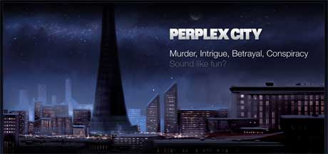
I have more reason than most to know that all that glisters online certainly isn't gold. For nearly three years, I was lead writer on alternate reality game Perplex City, an online narrative which tried as hard as possible to look real. We occasionally succeeded too well. For our wrap party, we wanted to order some M&Ms printed with the logo of a drug we'd invented, Ceretin, a "cognitive enhancer". We had a call back from Mars after we'd placed the order, though. M&Ms have a rule that they won't custom print their chocolates with the name of any drug; having checked our entirely fictional pharmaceuticals website, they'd concluded that Ceretin was a real product and thus on their banned list. On the internet, it's all too easy to look like something you're not.
So I suppose, although it's entirely irrational, I'll be shying away from financial institutions with beautiful websites for a while. I'm starting to notice a trend, actually. Northern Rock's site is pretty attractive in a white-on-black Steve Jobs presentation way. Kaupthing Edge, as well as having a name that sounds like a midtown NYC extreme sports shop, has a funky bubble effect going on in the background of its site rather reminiscent of O2. IceSave's design makes other institutions like Alliance & Leicester or Nationwide look clunky and old fashioned. But then, Alliance & Leicester and Nationwide haven't gone bust. Perhaps, in this era of decreased trust all round, ugly website design is going to stage a resurgence.


