Car logos are often claimed to contain secret messages. From the alleged letters in the Toyota logo to the true meaning of the Audi rings, there are plenty of design theories out there. But one persistent claim that probably isn't true is that the BMW logo depicts a propeller.
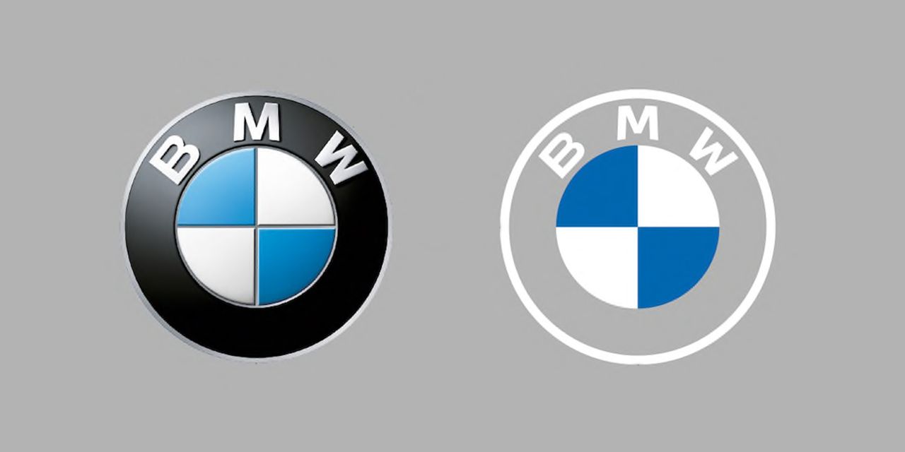
It might be ones of the best car logos of all time, but it seems people can't decide what they're actually looking at when it comes to the BMW logo. But a viral TikTok video has cleared things up.
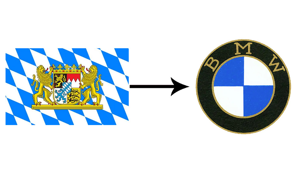
In the early 1900s, BMW's original logo came from the RAPP Motor Company, and BMW decided to keep the circular shape of it. "The white and blue - in every single one of the BMW logos - that is a part of the Bavarian flag in Germany, and that's where BMW hails from. BMW has kept it throughout every single logo during the years."
At the time of BMW's creation, there was a popular movement for Bavarian independence from Germany, so it makes sense that it would adopt the state colours.
Taking inspiration from regional iconography is not hugely unusual in car branding. The Porsche logo features a black horse from the coat of arms of Stuttgart, the Alfa Romeo logo features a man-eating snake from the coat of arms of Milan, the Cadillac logo shows the invented family crest of French explorer and fake noble Antoine de la Mothe Cadillac, who founded the city of Detroit.
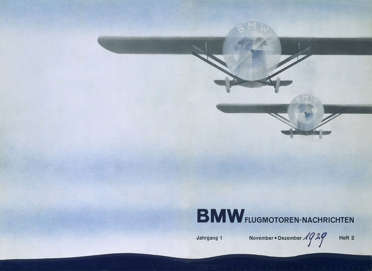
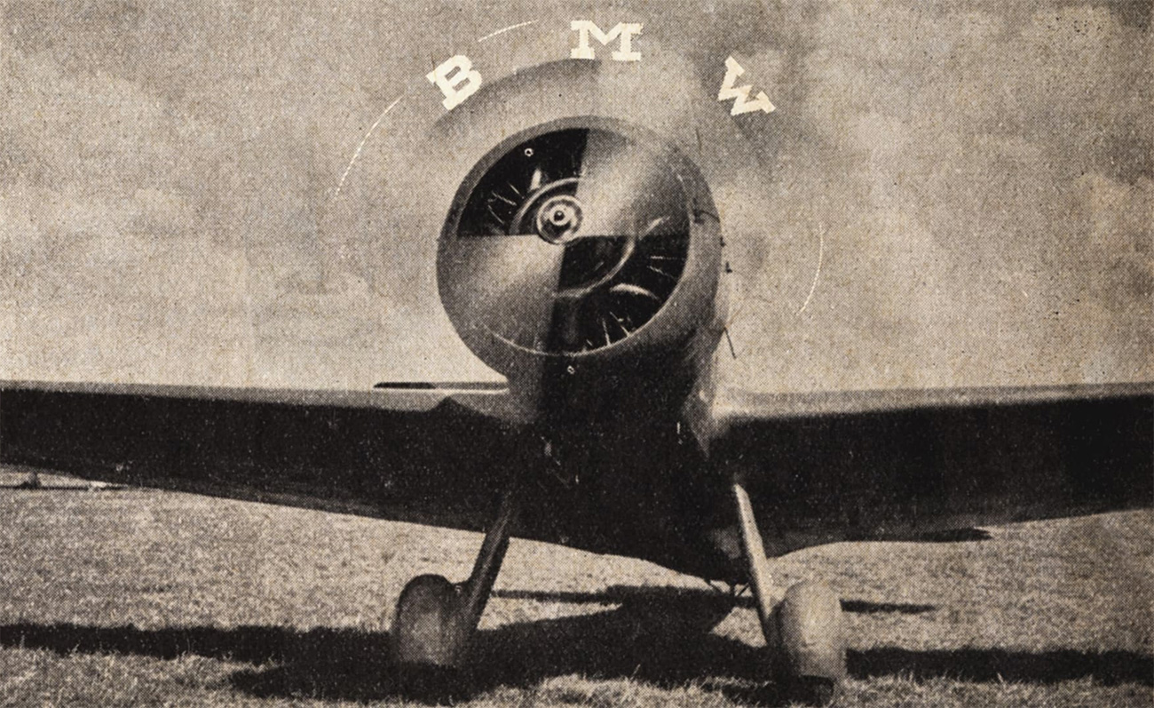
So where does the propeller idea come from? The urban myth owes a lot to the BMW's own advertising in the first half of the 20th century. Rapp Motor became Bayerische Motoren Werke GmbH in 1917, but it continued to make aircraft motors for some time. In the late 1920s, BMW produced a clever advertising campaign that placed the brand logo over the spinning propellers of aircraft to promote the association. It revived the idea in the 1940s. If the campaign intended to create a powerful association in people's minds, it certainly worked, since the idea that the logo shows a propeller persists to the present day.