Many of the best logos contain clever visual puns, such as the famous FedEx arrow or Amazon smile (which, of course, also points from A to B). And here's a new example that, judging by the response, has served an ace. The only problem? It isn't real.
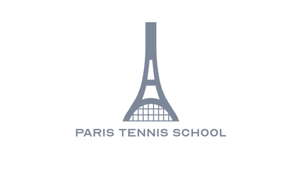
Currently doing the rounds on Reddit and social media is an ingenious logo design for Paris Tennis School. Featuring what looks like both the Eiffel Tower and an upside-down tennis racquet, it's the perfect emblem for a Parisian tennis establishment. One that, alas, doesn't exist.
There is good design and there is this https://t.co/NxiOxQmQun pic.twitter.com/asx2XoOMq5February 16, 2026
"It’s the perfect logo," one Redditor declares, while over on X, AI Linus Ekenstam declares, "There is good design and there is this". That tweet (above) has received over 9M views.
Alas, a rudimentary Google search for 'Paris Tennis Schoo;' reveals that there's no such place. The logo, as it turns out, is the work of a designer called Ramin Nasibov. Similar visual puns abound on the designer's website, and there's also a nice concept for an AirPods logo.
"My name is Ramin Nasibov and I’m a Designer & Art Director specialising in Branding, UI/UX Design, Design for Social Media, Packaging Design and related Visual Communication for your brand," reads the designer's bio. "Being based in Berlin, Germany and working with clients throughout the world, the goal is to exceed any expectations by creating outstanding Brands and Design, making the projects stand out of the overwhelming crowd of brands and products."