As part of its annual tradition, the Pantone Color Institute has announced the colour that it believes will best reflect the year ahead.
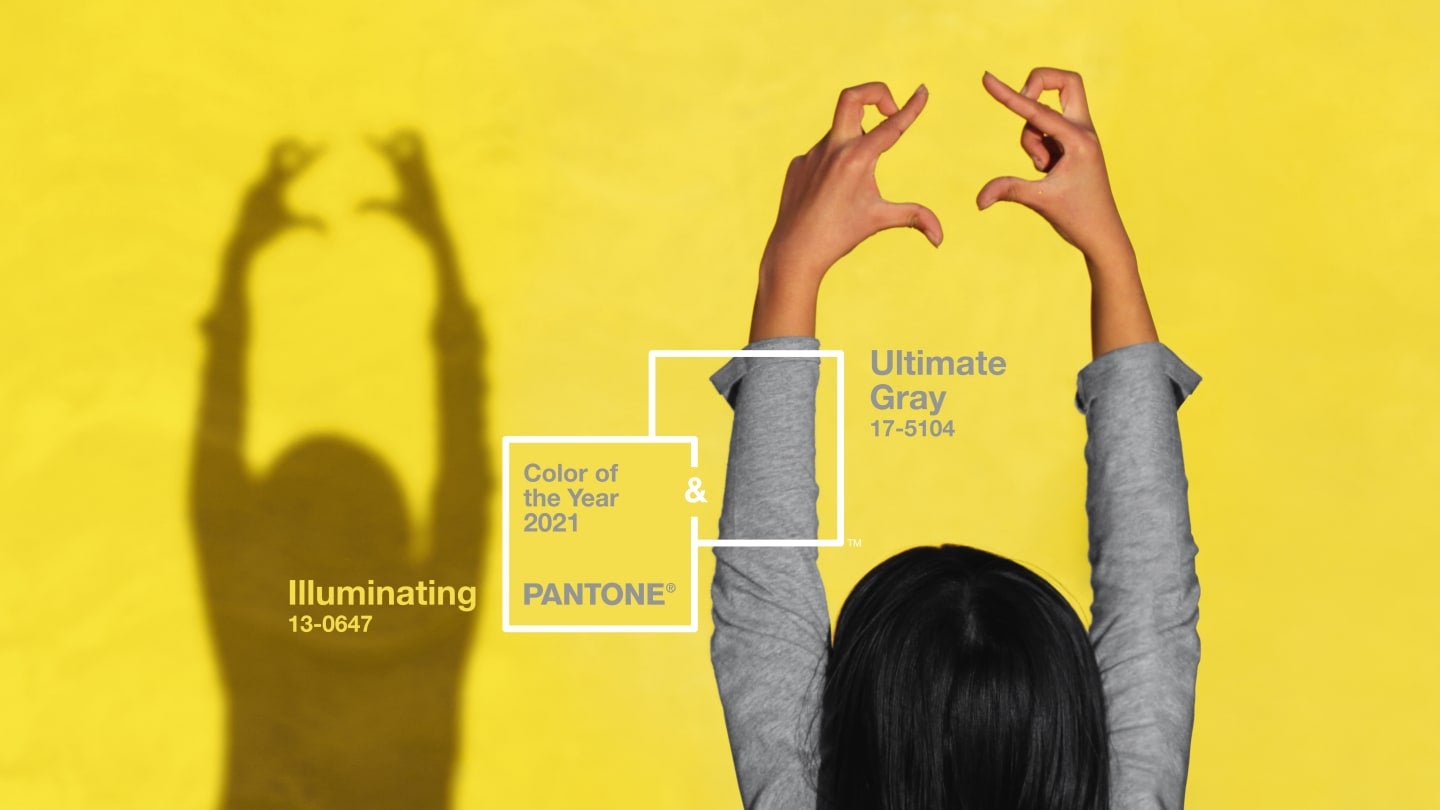
In a decision perhaps reflecting a complex year in 2020, the colour authority has declared not one, but two colours for 2021: the neutral “Ultimate Grey” and the vibrant yellow “Illuminating”.
The grey is meant to represent the qualities of “composure, steadiness and resilience”, while the yellow is “bright and cheerful”.
“The union of an enduring Ultimate Grey with the vibrant yellow Illuminating expresses a message of positivity supported by fortitude,” The Pantone Color Institute’s Executive Director Leatrice Eiseman said in a statement.
“Practical and rock solid but at the same time warming and optimistic, this is a colour combination that gives us resilience and hope."
She added: “We need to feel encouraged and uplifted; this is essential to the human spirit.”
Laurie Pressman, vice president of the Pantone Color Institute, agreed, stating that the combination “speaks to the resilience, the optimism and hope and positivity that we need, as we reset, renew, reimagine and reinvent,” in a video call with Eiseman.
This is only the second time the design experts have announced two colours; in 2016, a pink and blue duo known as Rose Quartz and Serenity were selected.
The Pantone Color Institute studies trends throughout the year in design, fashion, beauty, interiors – and even politics – to arrive at their annual hue.
Its colour has become increasingly influential in branding and design, with companies licensing the colour for exclusive product lines.
Brazilian shoe brand Cariuma was just one firm who created a Classic Blue version of its popular OCA high and low-top trainers to reflect 2020’s colour.
The first Colour of the Year, Cerulean – a calming blue – was chosen in 2000 at a time when fears over the millennium bug dominated the news.
“Our goal is to engage people in a conversation around colour,” said Pressman. “It has to be organic. It has to be truthful to what's taking place.”