Let's face it, renewable energy isn't the sexiest topic, so cooking up an exciting identity around it is no mean feat. Enter Palmetto – a clean energy brand with an ultra slick identity that doesn't rely on tepid eco aesthetics (or the colour green, thankfully) to spark its renewable revolution.
There's no formula for creating the best rebrands, but standing out from the crowd is essential for building an iconic identity. With its stylish mix of cosy aesthetics, slick illustration and bold brand voice, Palmetto bursts onto the clean energy scene with a refreshing attitude built on the unexpected.
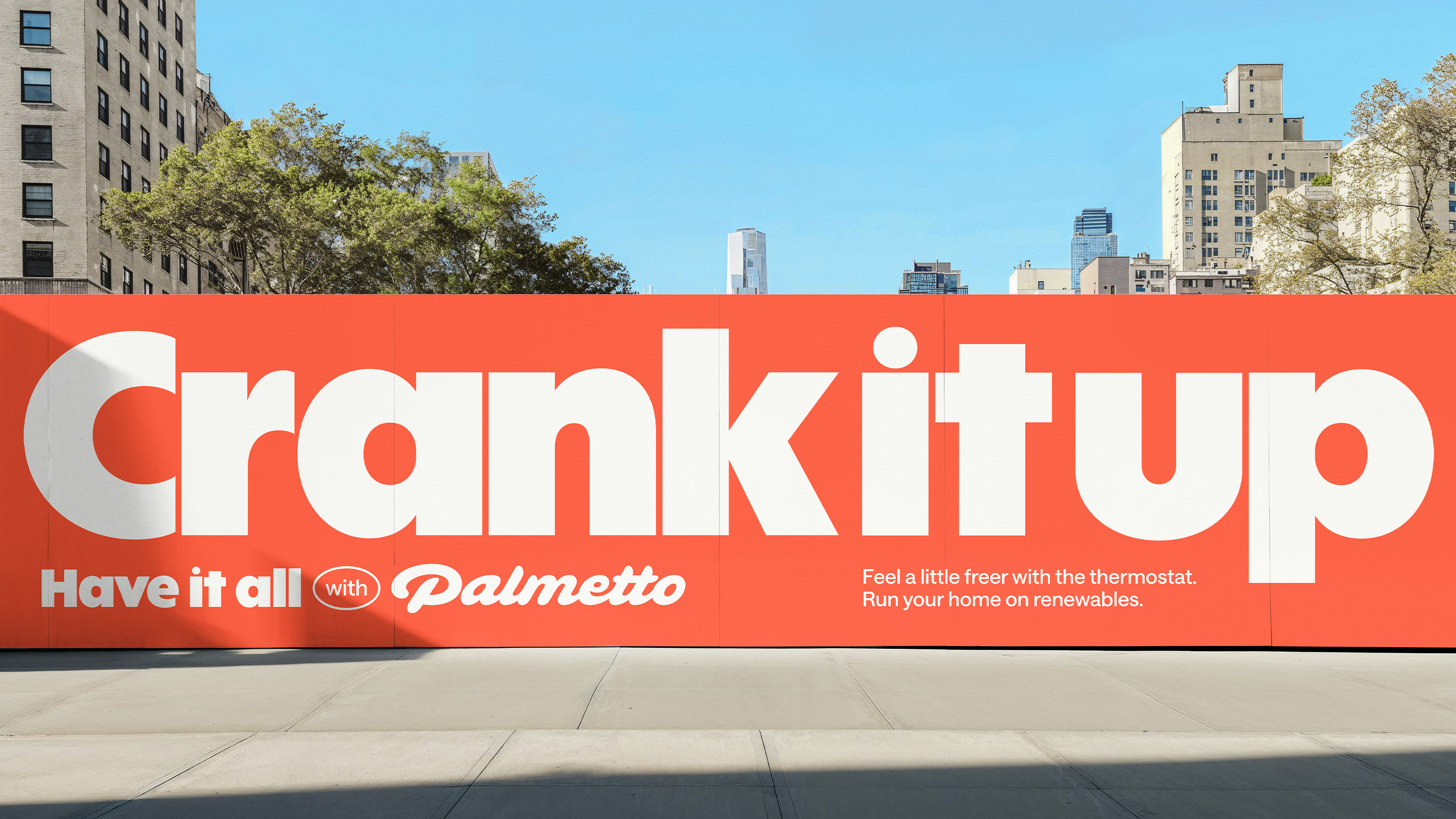
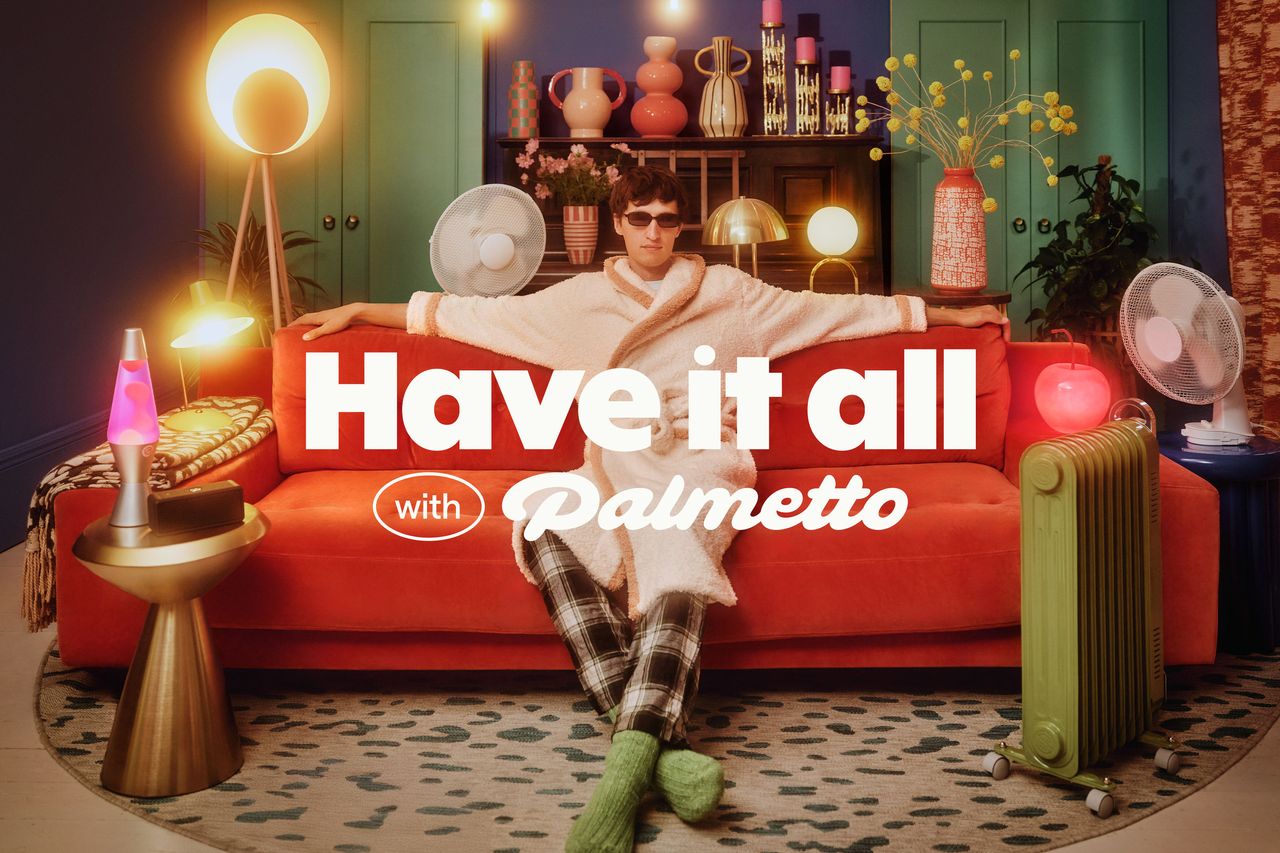
Created by branding agency Ragged Edge, Palmetto's new identity is shaped around the freedom to "have it all". While typical eco energy branding focuses on saving and compromise, Palmetto's world of abundance paints a future of simple, attainable comfort.
"The category has always leaned on guilt. But guilt only gets you so far," says Ragged Edge's strategy director Christy Madden. "By shifting the story from scarcity to abundance, Palmetto makes renewable energy feel like common sense. Not a cause. Not a compromise.”
Disregarding tired renewable energy motifs, Palmetto crafts a brand experience rooted in cosiness. The new retro-style logotype creates a sense of familiarity and warmth, while the clean typeface ABC Solar brings a sense of authority without feeling stuffy.
“Designing for abundance meant breaking every visual trope of green tech,” adds Andrew Kitchener, associate creative director at Ragged Edge. “We needed a system that felt rich, abundant and guilt-free. Presenting a version of clean energy that can cut across political divides. Palmetto makes renewable energy feel like common sense, not a cause.”

What sets Palmetto apart from competitors is it's strong brand voice, playfully inviting customers to live life to the max. “The brand is speaking to people who haven’t yet seen a good reason to swap. Inviting you to indulge your energy desires.” says Fia Townshend, copy director at Ragged Edge. “It's radical change under the radar. And not a soapbox in sight.”
For more design inspiration, check out Ragged Edge's rebrand for Tilt that proves fintech branding can have a soul or take a look at its rebrand for crypto wallet Solflare.