Patterns always have a knack for entering the zeitgeist followed by an inevitable fade out from popularity. It usually says something about us: what’s changing in our culture, what conversations are happening, what we’re dreaming of, and how we want our home to feel like a sanctuary.
It’s also worth noting that ‘what’s in’ and ‘what’s out’ is never definitive, the jury is still out, and having whatever patterns you might have at home – whether it’s in the zeitgeist or not – doesn’t diminish its worth or its value. What’s most important is creating your own personal style and knowing what interior design trends work for you and your home. With that in mind, here are what designers are seeing exciting new trends come to the fore, and which ones are evolving.
These 4 pattern trends feel outdated – here’s what coming next
When it comes to fabric trends, wallpaper ideas and home decor ideas, almost anything goes, but our panel of experts advises approaching the following trends and features with extreme caution.
Here's what designers recommend you do instead...
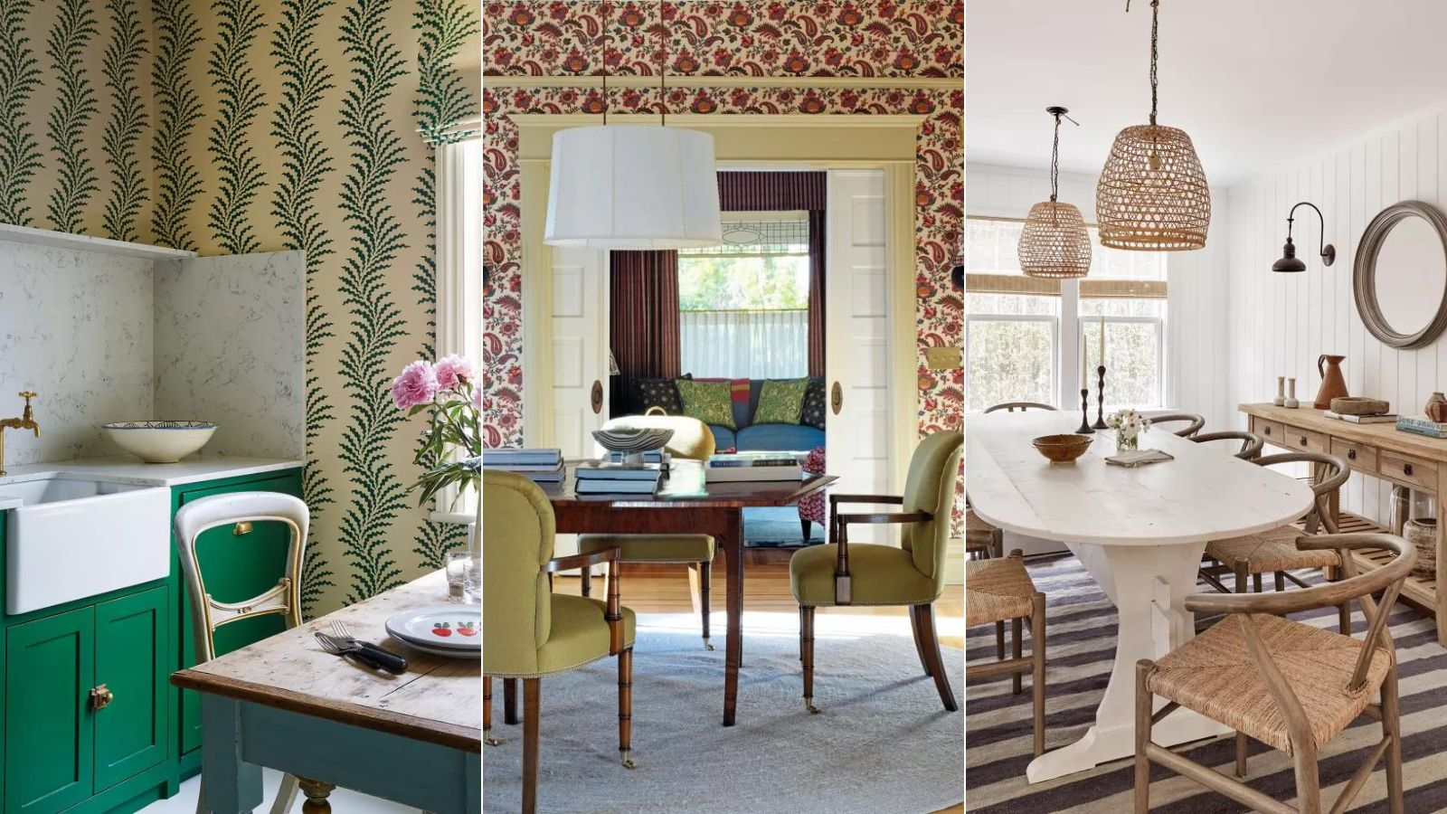
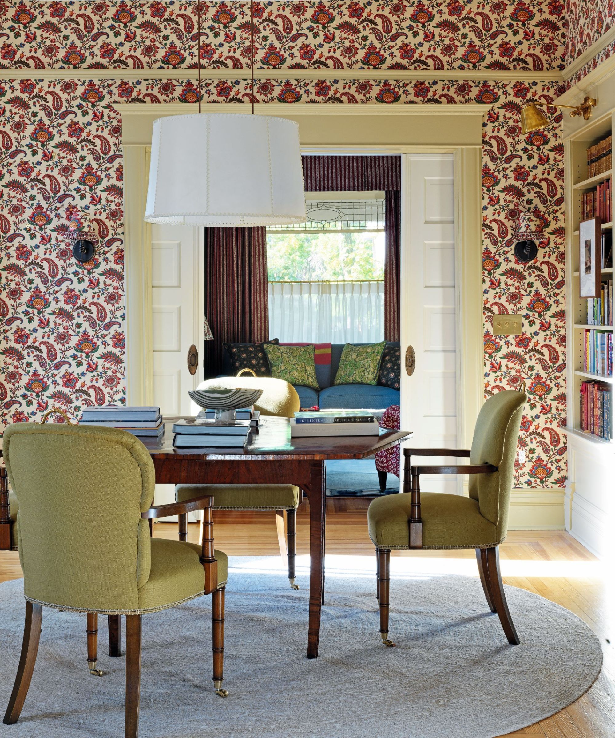
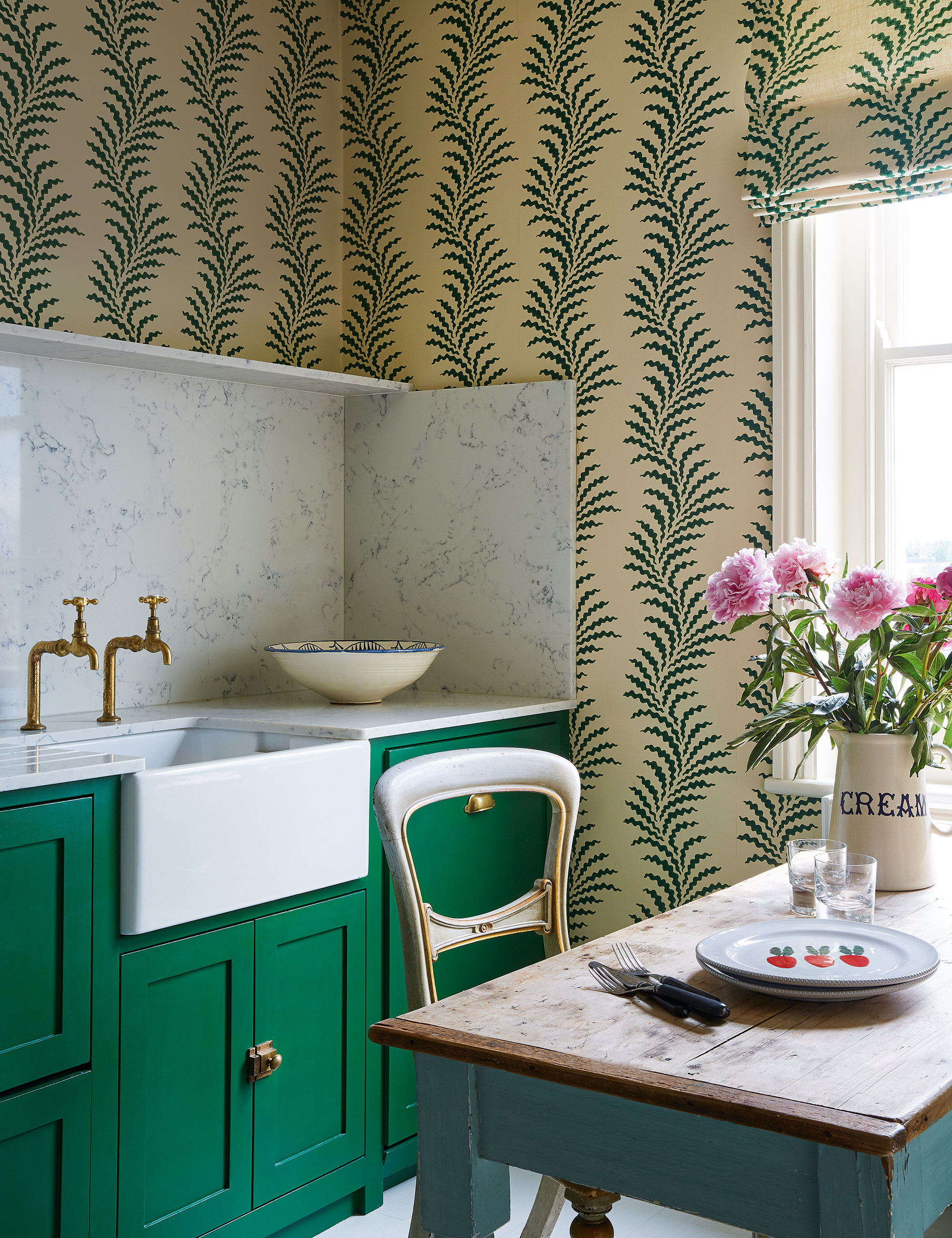
1. Regional flora over tropical patterns
Banana leaf prints, schematic monstera line drawings, and generalized jungle and tropical paradisiacal patterns feel overly propagated on the 'gram these days. A search for the monstera leaf yields over 713,000 results on Etsy in the form of cookie cutters, pins, dishes, posters, and prints. There’s even a day for it: #monsteramonday.
The monstera leaf pattern is well and truly entwined with Millennial culture: being the wallpaper pattern of choice for a whole slew of stores: Leo’s Oyster Bar in San Francisco, and on clothes at Old Navy, Forever 21, Lulus, and Alice + Olivia.
The same applies to generalized tropical patterns. It’s ubiquitous. Maybe it first came to the fore when J-Lo broke the internet with *that* Versace jungle dress at the Grammys in 2000. Or maybe earlier with the banana leaf Martinique wallpaper that first entered the zeitgeist back in 1949 when it was installed in the Beverly Hills Hotel, that quickly became a cult icon that evoked ideas of Hollywood gilded glamor that recently found a resurgence in the 2020s when mid-century modern styles came back into vogue.
Motifs of the distant tropics have been an enduring trope in Europe for hundreds of years – becoming synonymous with paradise in Europeans’ minds. First from early explorers who saw the lush, abundant foliage, vivid colors and oversized flowers akin to the Garden of Eden. And then later on the trope was further entrenched in the cultural cachet with artists like Gauguin, Matisse, and Rousseau who depicted paradisiacal worlds of ‘exotic’ flora and fauna.
Tastes though, might be changing. We’re looking in our own backyards and doorsteps for nature to inspire us rather than looking at far-away projected ideas of paradise that can feel out of touch with our everyday climes. We’re also reconsidering the idea of a ‘nature’s paradise’ in the context of a climate crisis too – should we covet ideas and create patterns of faraway ideas of tropical utopia when we should begin to reconnect with the nature that’s local to us?
‘Instead of tropical prints,’ Lauren Chiu, color & materials expert at trend forecasting agency Stylus, says ‘botanical themed designs and soothing biophilic patterns are becoming more prevalent as consumers crave subtle cues that bring them closer to nature. For example, rhythmic patterns resembling moss, wood grain or rippling water, or more abstract speckled designs that mimic the irregularities found in nature.’
It’s something British interior designer Pandora Taylor has also noticed: ‘More and more clients are open to the idea of bold feature wallpapers or wallpaper murals. I think people are tired of the Banana Leaf look and I always try to steer my clients to be more sensitive to their environment. If it is a home in London, I prefer to draw on inspiration from the surrounding area whether that be skylines or local parks, I like interiors that feel rooted in their surroundings.’
2. Swap overdone polka dots for geometric pattern clashes
‘Harvard isn’t going to be impressed that you aced the history of polka dots’ goes that famous line in Legally Blonde. Obviously, a fatal flaw to underestimate the social cachet of the spot, since the polka dot pattern has had a curious hold over us in recent years. First, there was the spotted Zara dress that came over us in 2019, prompting its own Instagram account @hot4thespot. Then there was a frenzy for the spotted art of Yayoi Kusama, otherwise named ‘The Princess of Polka Dots’, which culminated this year in Louis Vuitton overhauling its stores across the world in polka dots, featuring life-like and human-scale animatronics of Kusama placed in the window displays repeatedly painting polka-dots. Polka dots have been apparently so contested that artist Damien Hirst even took to performatively setting his polka dot artworks on fire to incineration in October last year – which, comedian Dan Rosen recently called time on, calling his polka dots ‘boring’, and garnering millions of views online in the process.
So has the penchant for the polka dot finally crested? ‘The uniformity of polka dots feels quite dull when compared to contemporary abstract patterns and graphic designs like colorful geometrics, which are more fun and playful’ adds Lauren Chiu. Alberto Pezzato, design director of Italian fabric masters, Rubelli agrees: ‘More recently we have witnessed an array of exciting new pattern trends shaping the design landscape. Geometric patterns with bold shapes and vibrant hues are capturing attention.’
So instead of the soldier-like polka dots, enter a hotch-potch smorgasbord of geometric personalized pattern clashes, apparently. It’s something Matt Siberry, head of home at Pinterest has seen an uptick in – especially when it comes to floors: ‘In the coming months it will be floor tiles which are set to be the go-to pattern vehicle. We’ve seen searches for ‘bathroom tile combinations’ tripling in the past six months on Pinterest.’ ‘Especially,’ he adds, ‘when each is a different pattern, making the style choice feel fresh and not over-considered.’ So maybe think of geometric pattern clashes by Haines, and quirky combination-fitted Mosaic factory tiles, and jazzy geometric twists by In Casa By Paboy and Luke Edward Hall as new pools of inspiration.
3. Wildlife and nature-inspired designer make way for animal print
Animal patterns, as they’re currently designed, are ripe for renewal. A 2023 survey by interiors platform, 1st Dibs – that’s taken by 880 interior designers – reports that animal pattern prints have tumbled into the single digits down to the bottom of the list of popularity, gaining only a 4% vote.
This could be for a variety of reasons. One might be because using real fur has firmly fallen out of sartorial favor. A whole host of luxury fashion brands (like Prada, Vivienne Westwood, Burberry, Chanel – among a long string of others) have ceased using animal fur. So this might have meant a reverberation into interior pattern trends where oblique ‘fur type’ patterns of animal prints like python, zebra, and tiger (which have historically denoted ideas of problematic ‘exotic’ animal ownership) have fallen out of style.
But this isn’t to say animal patterns in the interior world are gone forever, far from it. What’s more likely is a shift. As our relationship evolves with animals and wildlife, the way we specifically evoke them in our homes will reflect this. More fantastical animal prints may come to the fore, away from ‘fur focused’ patterns for example, says Chiu: ‘Whimsical wildlife illustrations are garnering interest for a fantastical take on nature that feeds a storytelling narrative.’ We’re taking our cue from House of Hackney’s Trematonia wallpaper as a case in point.
4. Reconsider nautical clichés
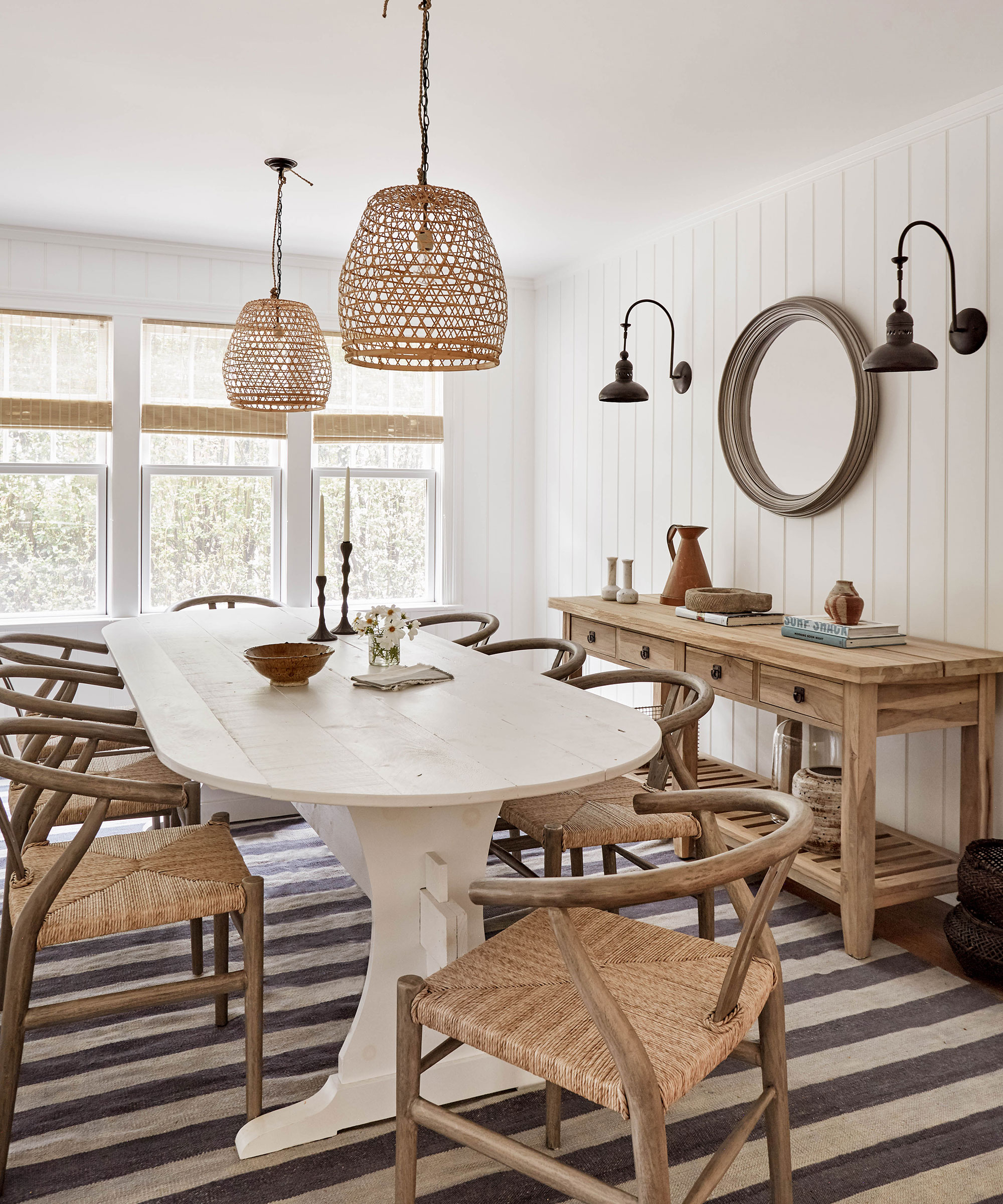
Matt Siberry, head of home at Pinterest says that ‘searches for “beach house” have doubled in the past month’ – but people want patterns beyond the cliches of nautical stripes, anchors, and the sailboats that can feel a little too on the nose. Siberry’s advice? ‘If you’re hoping to incorporate this nautical theme into your home, choose wooden features and let the material’s striped grain do the talking instead of over-indexing on blue and white stripes.’
Follow the grain with this seaside-inspired space, designed by Becca Casey of Becca Interiors, as one example. But if you really can’t resist a striped throw or rug, why not try one in a muted color palette, to echo a sense of New England warmth?