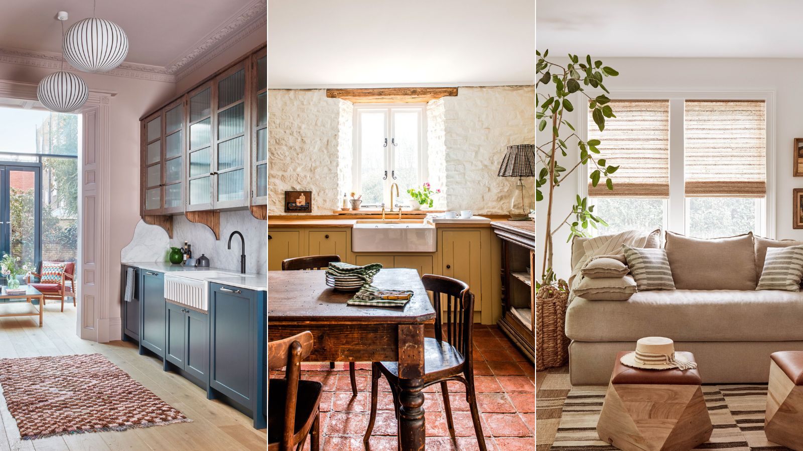
It's all too easy to fall foul of outdated color trends, namely because you may not consider them as 'trends' in the first instance. Yet there are certain color choices you can take that are likely to date your house quickly – and raise a few eyebrows.
Perhaps the more obvious color trends trap is to commit to a current color palette without factoring in its longevity. One of the most important elements in any home, the chosen room color ideas will transform even the smallest or dingiest space into a delightful haven.
Much like with any outdated decorating trend, one of the biggest mistakes is to eschew color altogether for fear that your space will age badly. Here interior designers, decorators, and color psychologists reveal what the worst colors to paint a room are, and how to approach choosing paint ideas for rooms that truly sing, from using the color wheel to help you avoid making disastrous color mistakes to finding colors that will make you feel happier at home.
Outdated color trends to avoid
When it comes to choosing a room color scheme, almost anything goes, but our panel of experts advises approaching the following outdated colors trends with caution.
1. Forgo gray in favor of beige
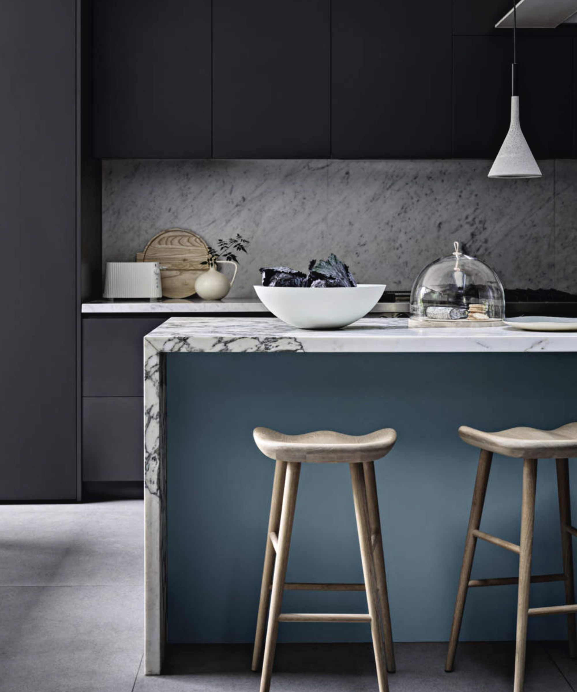
Like most things, color and home decor ideas come and go, so while the cool-toned grays of the early noughties were popular, we are now seeing a sudden shift away from cool tones in favor of gentle, warm color schemes. Unsurprisingly, the color replacing gray is beige. This new neutral will be taking over our homes in 2023.
Often noted by designers and color psychologists as a depressive color, gray is said to cause feelings of self-doubt, insecurity, and instability. It is believed to evoke a mind-numbing response that can leave many feeling impassive.
'The decline in all over gray color schemes reflects our ongoing desire to make our homes, in which we’ve all come to spend more time, feel special and layered,' says Anthony Barzilay Freund, 1stDibs’ editorial director. 'Comforting colors, particularly those that conjure warmth, are visually interesting and also feel emotionally reassuring.'
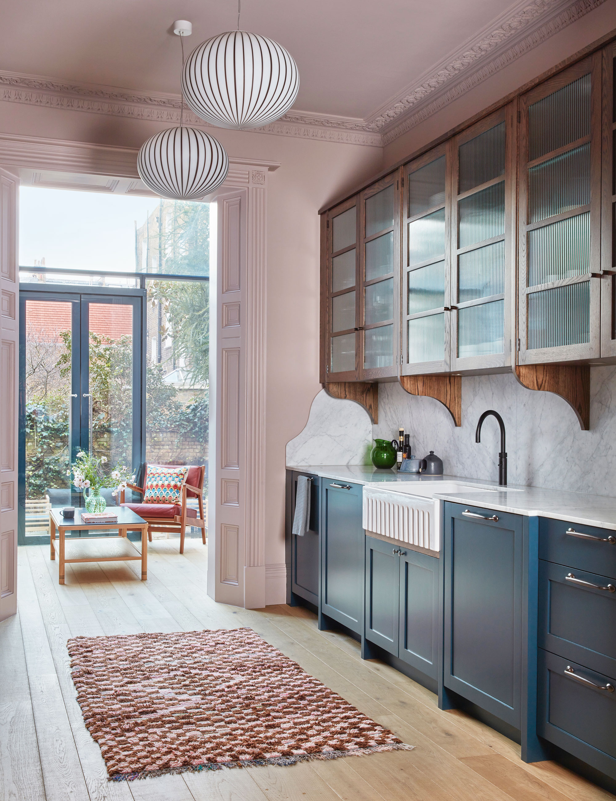
However, if you do love gray, all is not lost. Instead, opt for a warmer-toned gray for depth and dimension, but if you are willing to try something else, we recommend beige. Simple and timeless, beige is one of the most versatile shades in all of design – it instantly brightens while evoking a sense of flawlessness, and can make a small room look bigger. Add interest through colorful art, accent soft furnishings, and antique furniture and objects. It also makes it easier to change up the look of a room.
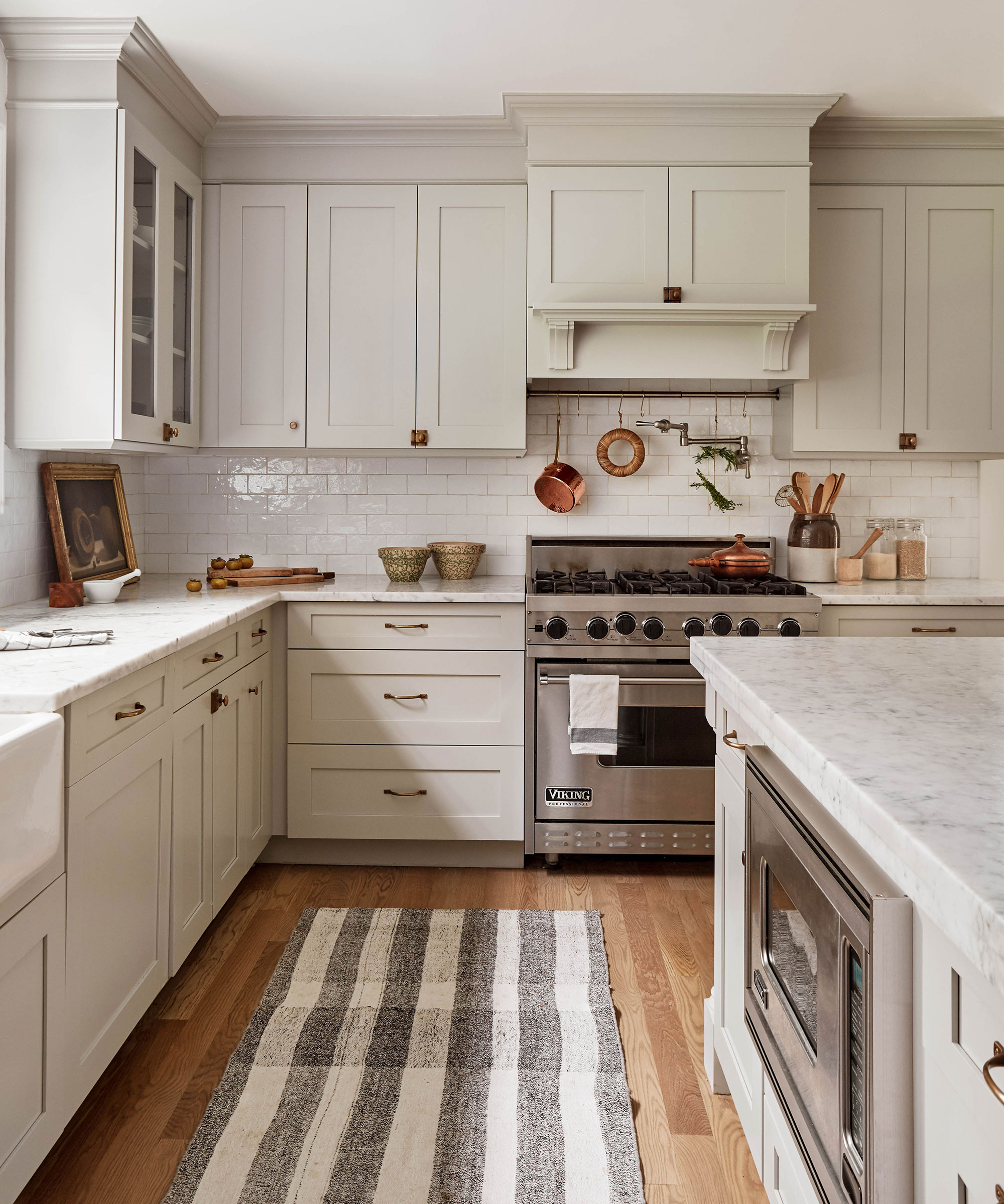
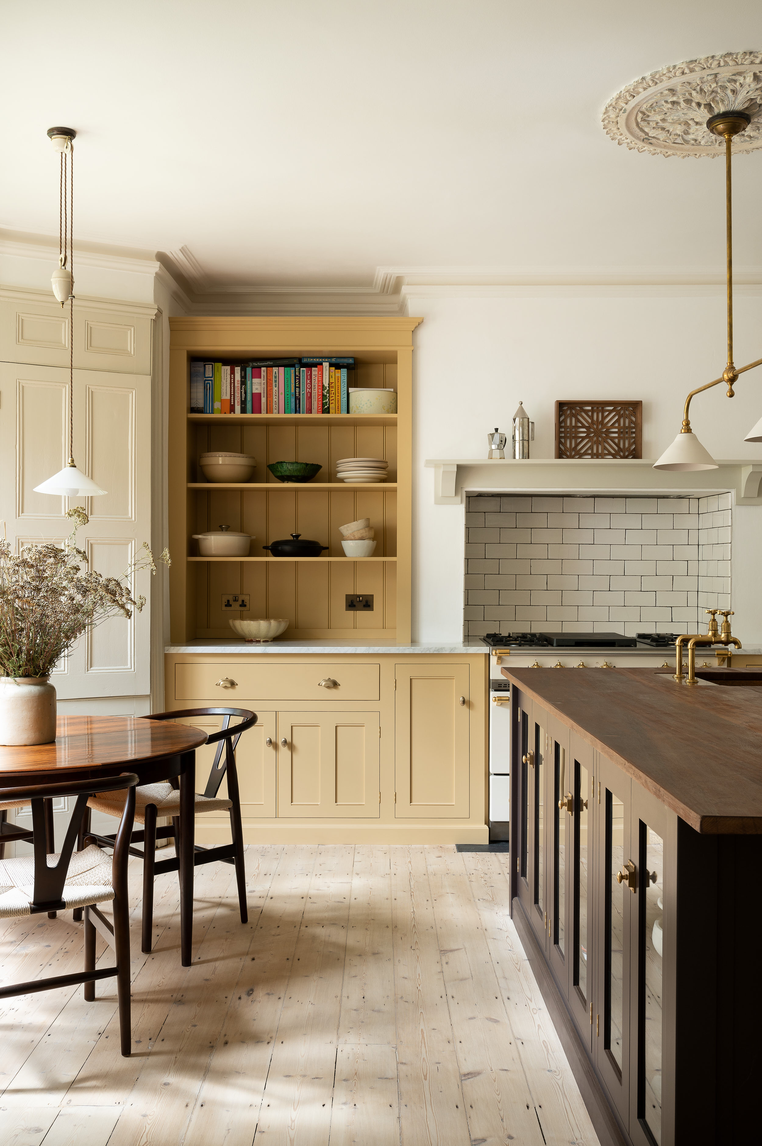
2. Ditch white in favor of a mood-boosting yellow
The power of decorating with white is unparalleled in the world of interior design but used as a whole-house color scheme, white can be draining and a little too clinical.
As it turns out, despite its decorating potential, color psychologists and designers alike are not in favor of predominantly white spaces. 'While white is pure and unblemished, it can also be perceived as cold, impersonal, and unsympathetic,' says Karen Haller, color psychology specialist, and best-selling author of The Little Book of Color. 'It may help calm the noise and chaos of modern-day life, but it can do so at the point of shutdown.'
Hospitals are a good example of how we can experience a color's psychological duality. In the 1950s, psychiatric wards were decorated in all-white because it was believed that 'white rooms' would lower temperatures in patients. But why is white so popular in our homes? This 'no-decision' color is easy, simple, and precise, but it is also one that we would prefer to use in moderation, or as a backdrop to bolder color palettes.
If you have a warm and sunny disposition, try decorating with yellow. There is a touch of nostalgia appearing in schemes: Yellow can create a mellow and uplifting interior. It transports us back to long lazy sun-drenched days in the Mediterranean and it can brighten us up on gloomy days.
Yellow is a welcoming, joyful, vibrant choice, agrees Dominic Myland of Mylands. It works well as an accent color or as the main color within the room. Rich, golden yellows pair well with a range of accent colors. ‘Try monochrome accents for a modern interior – what color scheme could be more uplifting than yellow and white? Or look to nature for inspiration and pair it with soft greens for a fresh but calming feel.
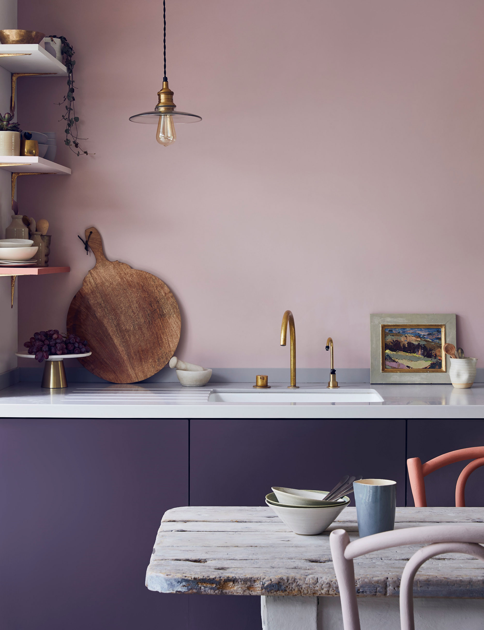
3. Put away deep purple in favor of a softer lilac
Once considered a regal color, deep purple once had its place in our homes, but no more. Dark purple can be imposing and gloomy if not used in the right spaces, or with good lighting.
John Dison, founder of Earthborn agrees: 'As well as overpowering, purple can be bold and impactful, which is why it has gone in and out of fashion over the years. However, choosing a lighter shade, such as lilac, means that the color is much less dominating and allows you to play with other color combinations in your space.'
While vivid violets and royal purples can be seen as daring choices, their softer-toned cousin lilac lends a soothing, gentle feel to a space, and can feel like a breath of fresh air. Conjuring scenes of trailing wisteria and swathes of moorland heather, the myriad variations of lilac can inspire the most elegant and restful interiors.
‘Soft lilac has an inviting, friendly energy and is great for creating a relaxed feel within a home,’ says Francesca Wezel, founder of Francesca’s Paints. ‘Associated with sociability and open-mindedness, it helps make people feel at ease – perfect for communal areas. Lilac also has a slight feminine edge, which reinforces the feeling of comfortability.'
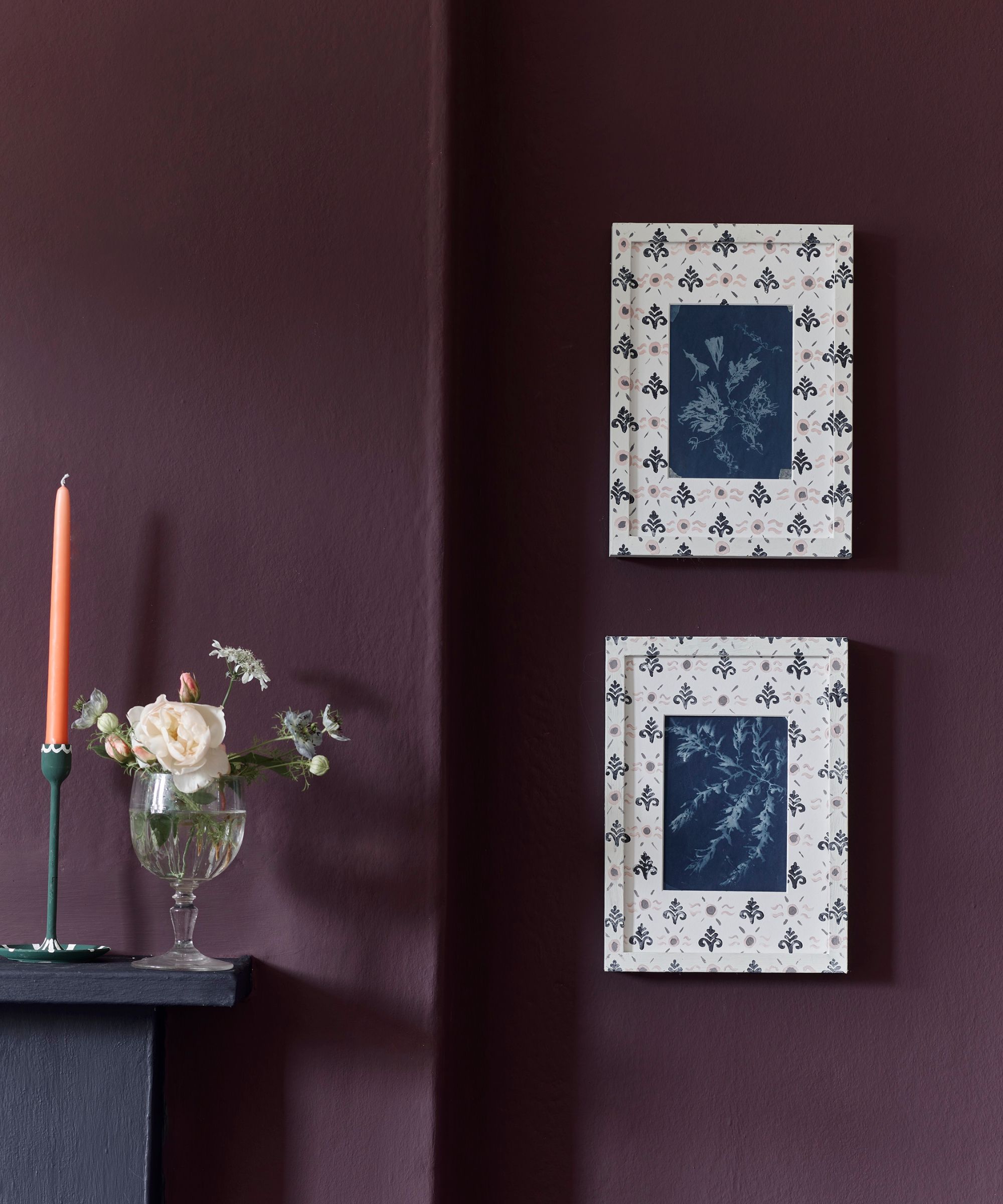
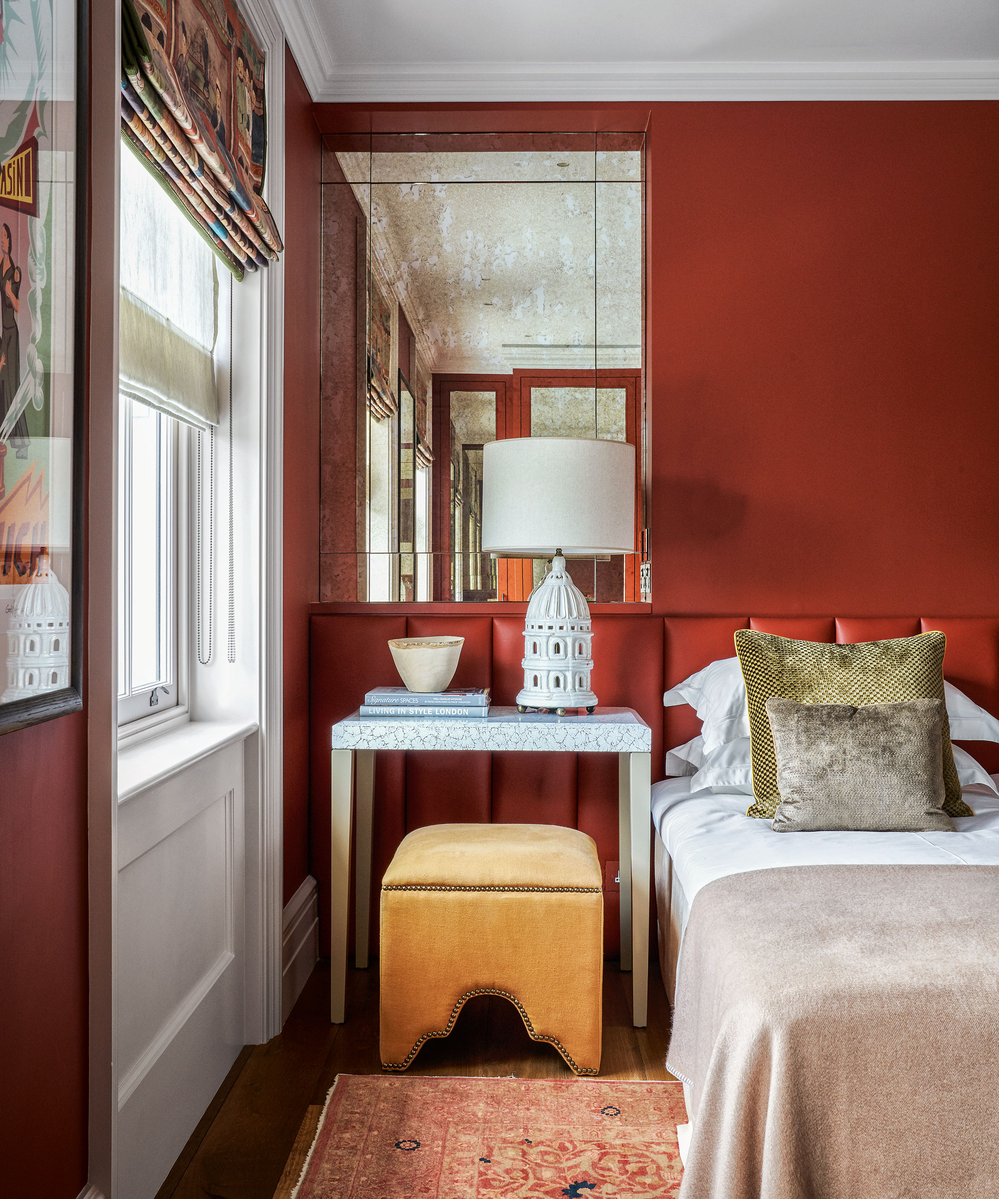
4. Leave behind harsh red in favor of paler variations
Red room ideas can be too intense for most people – and red is considered to be the most stressful color not just in our homes, but throughout history. This harsh color often reminds us of danger and disaster. It is strong, boisterous, and stimulating, which is why it is often used in warning signs and traffic signals.
'Physically, red can induce reactions in the body that are similar to stress responses, such as increased heart rate, higher body temperature, and heightened senses,' says Karen Haller, color psychology specialist, and best-selling author of The Little Book of Color. It is also known to be a color that makes you angry, so should be used with caution.
Now, at H&G, we love decorating with red. In fact, we think it is a color that can make a house look expensive, so if doing away with this color completely is not an option, instead, look for paler variations.
Chad Dorsey, interior designer and founder, of Chad Dorsey Design adores using red in the home: 'Many people think red is harsh, but used in a monochromatic way I find it to be very soothing. Deep earthy red tones such as this are great for hard-working spaces that you don't frequent too often. They are also very forgiving of a scuff or scratch.'
Sherwin Williams’ Color of the Year 2023 is a subtle shade called Redend Point, which is a color akin to red rocks, or clay. It’s a contemporary warm, mid-tone neutral that feels very of the moment. The key is to use red in gentler, nature-inspired hues that work with, rather than against, our environment.
5. Do away with overbearing orange
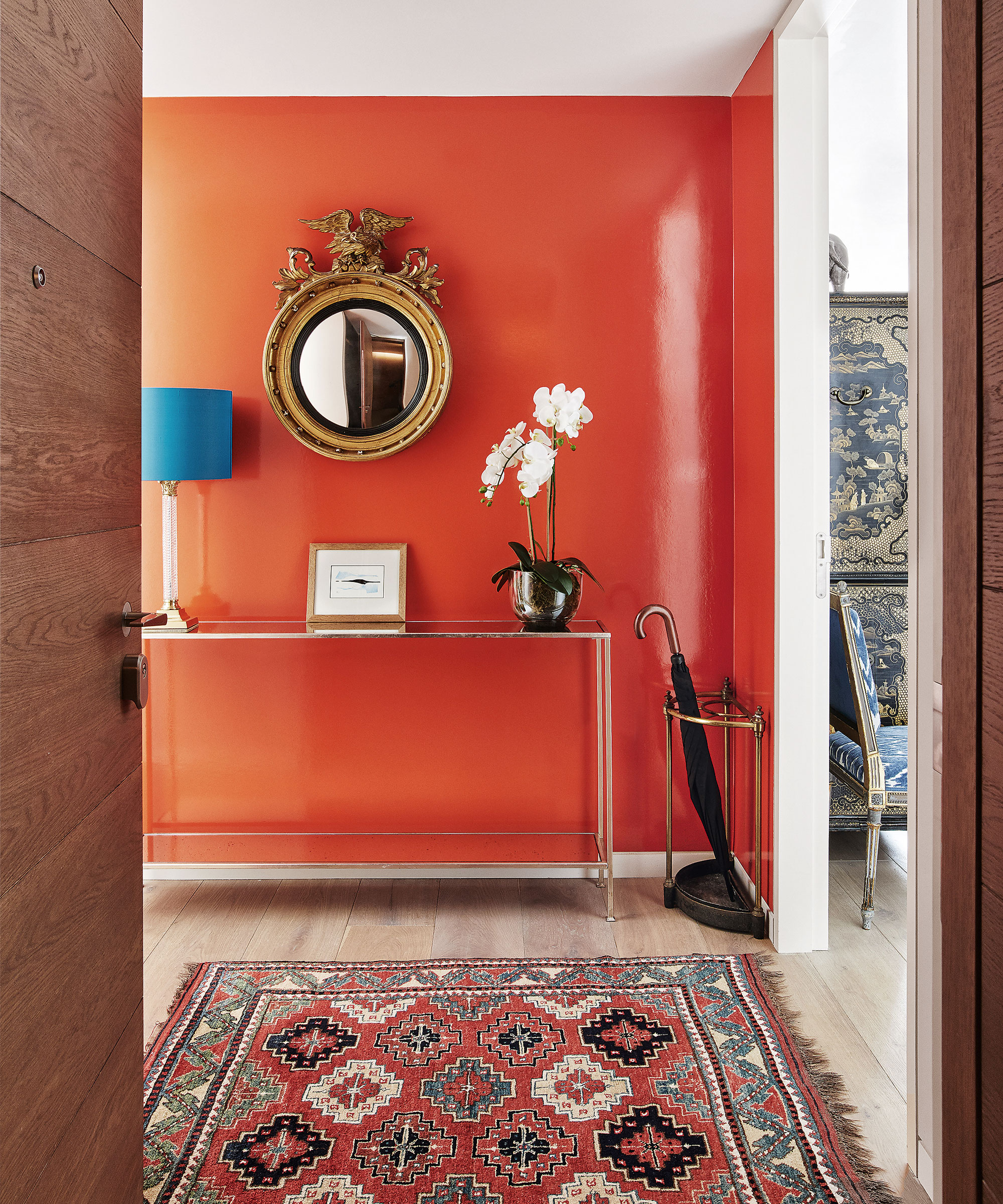
Decorating with orange might be a fun way to add playful color to a room, but it should certainly be used sparingly. Much like red, orange is considered to be an overstimulating color, making it a bad choice for restful spaces, such as the main bedroom and children's rooms.
A bold, fiery color tinged with hints of red and brown, orange in all its variations should be approached with caution. Many color psychologists believe that orange can even change your physiology, as well as the balance of hormones.
'It helps to be mindful of the visceral impact color can have on our mindset. For this reason, I would avoid orange for a child’s bedroom,' says Karen Haller, color psychologist. 'You want them to go to sleep straight away, and the color orange is saying "stay awake" – it’s bursting with energy, and can cause an overactive imagination.' If you are looking for a color to reduce stress, orange should not be the first choice on your list.
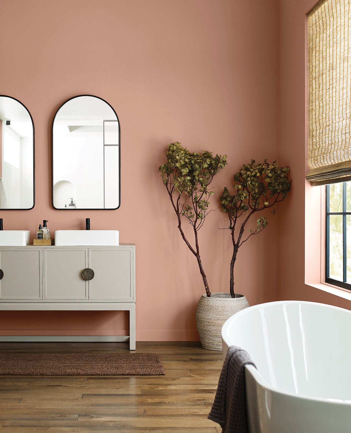
Instead of orange, why not try decorating with pink? Warm and inviting, rosy shades make for a versatile backdrop for bolder colors.
Color conjures up different reactions in everyone, adds designer Sarah Fortescue. ‘Pink warms my heart, cushions my body and I feel its warmth and comfort. There is an infinite spectrum of pinks, however, depending on the room, the history of the house, its scale, and function, pinks can vary hugely. Pinks with orange or ochre hues are wonderful.’ She suggests pairing pink that has an undertone of orange and red with a bright red or using a white backdrop on a piece of furniture. ‘Azure blue, navy and Indian green also help create a harmonious but uplifting space,’ she adds.
When it comes to decorating, not choosing a room color scheme that makes your heart sing is a disastrous mistake to make. Your home should bring you joy and color is a vital – and cost-effective way – to revitalize any space, and should be given as much consideration as any other element in your home.