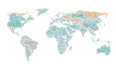
Powerful consumer insights are part of our life-blood here at Outbrain and today we are excited to reveal the first ever Global Interest Map.
Back in December, we were trying to give meaning to 2014 and we wondered: what if instead of relying on news stories to define the year, we explored the keywords that drove the most consumption of digital media in geographies around the world?
In doing this we were able to take a macro view of some of the patterns that emerged between major news stories and those that struck a chord with global audiences, allowing us to determine what a year on the internet actually looks like.
Why does that matter now? Well looking back on our map now, it’s striking to see the patterns that continue to transfix audiences. And so here are a few retrospective observations for your Thursday viewing pleasure. Read on…
Outbrain contributes regular data insight to its partner zone – so visit next week and catch the latest installment
This advertisement feature is brought to you by Outbrain, sponsors of the Guardian Media Network’s digital content hub