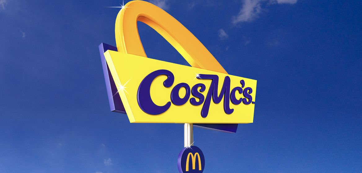
When McDonald's revealed back in July that it was launching a spin-off restaurant based on a character that appeared in its adverts in the '80s, people were understandably baffled. Images of the new establishment, named CosMc's (nope, we're not sure how to pronounce it either) suggest we're in for a blast from the past, with the Starbucks rival (CosMc's specialises in hot and cold drinks) taking on a somewhat spacey theme.
But the branding itself hasn't impressed everyone. Craig Burston, a senior lecturer in Graphic and Media Design, recently told Creative Bloq that the new logo, which is neither strictly retro nor particularly modern, seems a little odd (not one of the best logos of all time, then). Burston is an expert on design, colour, typography and iconic representation, and is a Senior Lecture at London College of Communication.
“The yellow and blue may have more in common with storage facilities than coffee shops," Burston told Creative Bloq. "But it could represent a welcome change to the colour schemes we’ve come to expect from other chains – the old burgundies, brogue browns, and tasteful creams and greens popularised by Starbucks."
So should Starbucks be worried? "You could say it’s refreshingly oppositional, but it’s not at all well-drawn, particularly typographically. It feels AI-generated, as though something were not quite right. It feels like algorithmic graphic design, not super smart minds playing games with corporate aesthetics."
"McDonalds has long been criticised for ignoring the potential of the drinks market. In that context, CosMc’s could be seen as a response to this criticism. They might deserve some plaudits for taking a risk, but in my view, they have not gone far enough. If McDonald’s are truly trying to ‘go retro’ with CosMcs, then it doesn't travel backwards far enough."
Travelling backwards seems to a graphic design trend right now. From Pepsi to Burger King, we've seen plenty of brands take inspiration for their new logos from their own history books in 2023.