iOS 26 is now rolling out to compatible iPhones, but the switch to Apple’s new Liquid Glass interface has left some users feeling a little sore in the head.
“The glass design makes it look heavy and mentally draining,” one Reddit user wrote, while another complained, “it made me dizzy just looking at it.”
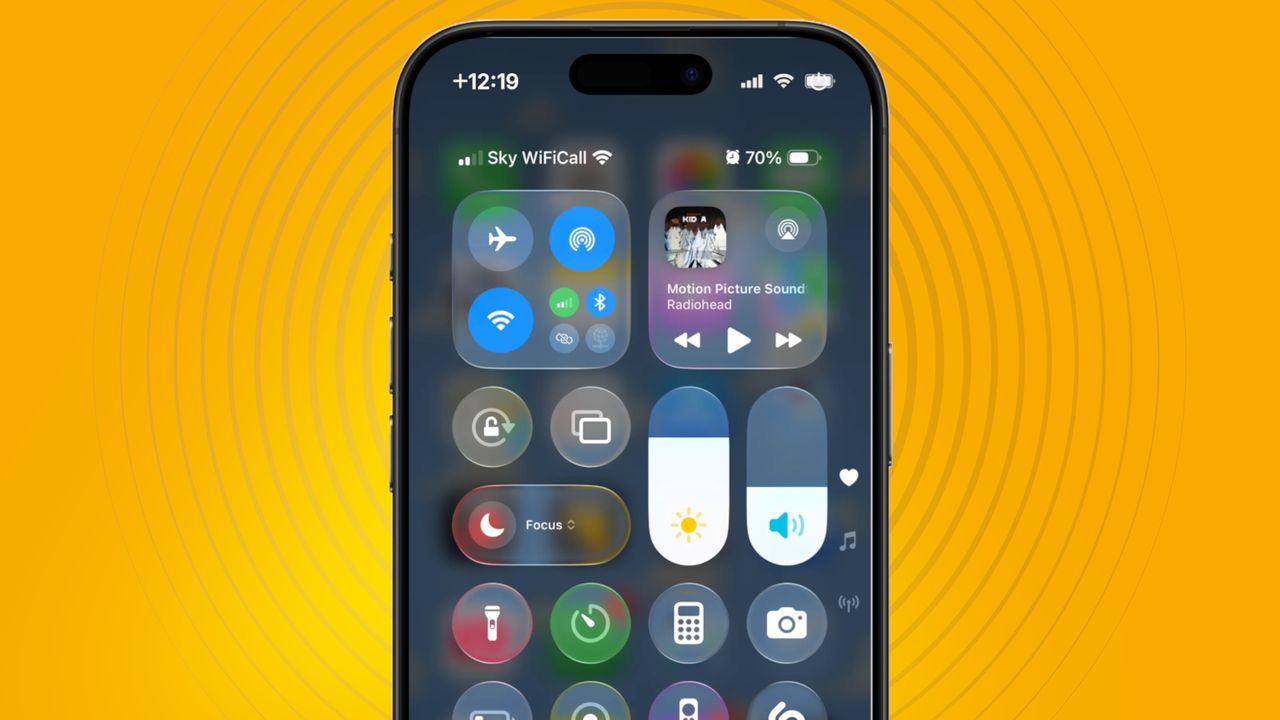
While personally, I’m not ready to condemn Liquid Glass to the ‘flop’ heap just yet, I can understand the frustration. Apple's latest software update gives menus and interface elements a see-through, glass-like quality; iOS 26 is a big change from iOS 18, and one that will take some getting used to.
However, if you’re sure that the default look of Liquid Glass isn’t for you, there are a couple of ways that you can reduce its intensity.
Increase Contrast
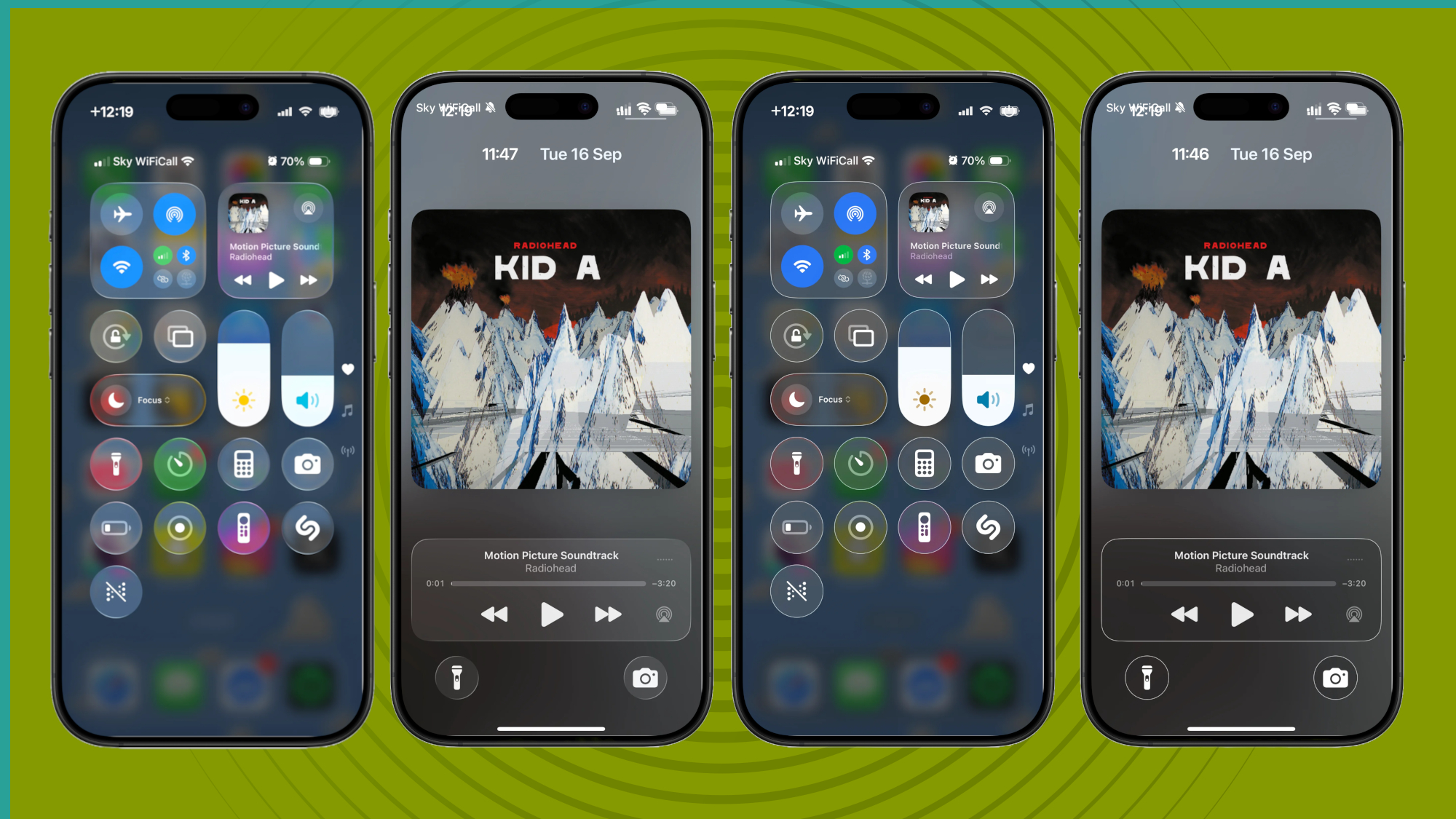
First, to tone down Liquid Glass effects without totally removing them, there’s a handy ‘Increase Contrast’ option in Settings. To find it, head to Settings, Accessibility, Display & Text Size, then toggle the Increase Contrast slider.
This option does as its name describes: it ups the contrast, so interface elements are more defined. Increase Contrast keeps the translucency, but it removes Liquid Glass’ softness, giving icons a more visible border.
See the image above to get a sense of what I mean – the change is particularly noticeable in the Control Center.
Reduce Transparency
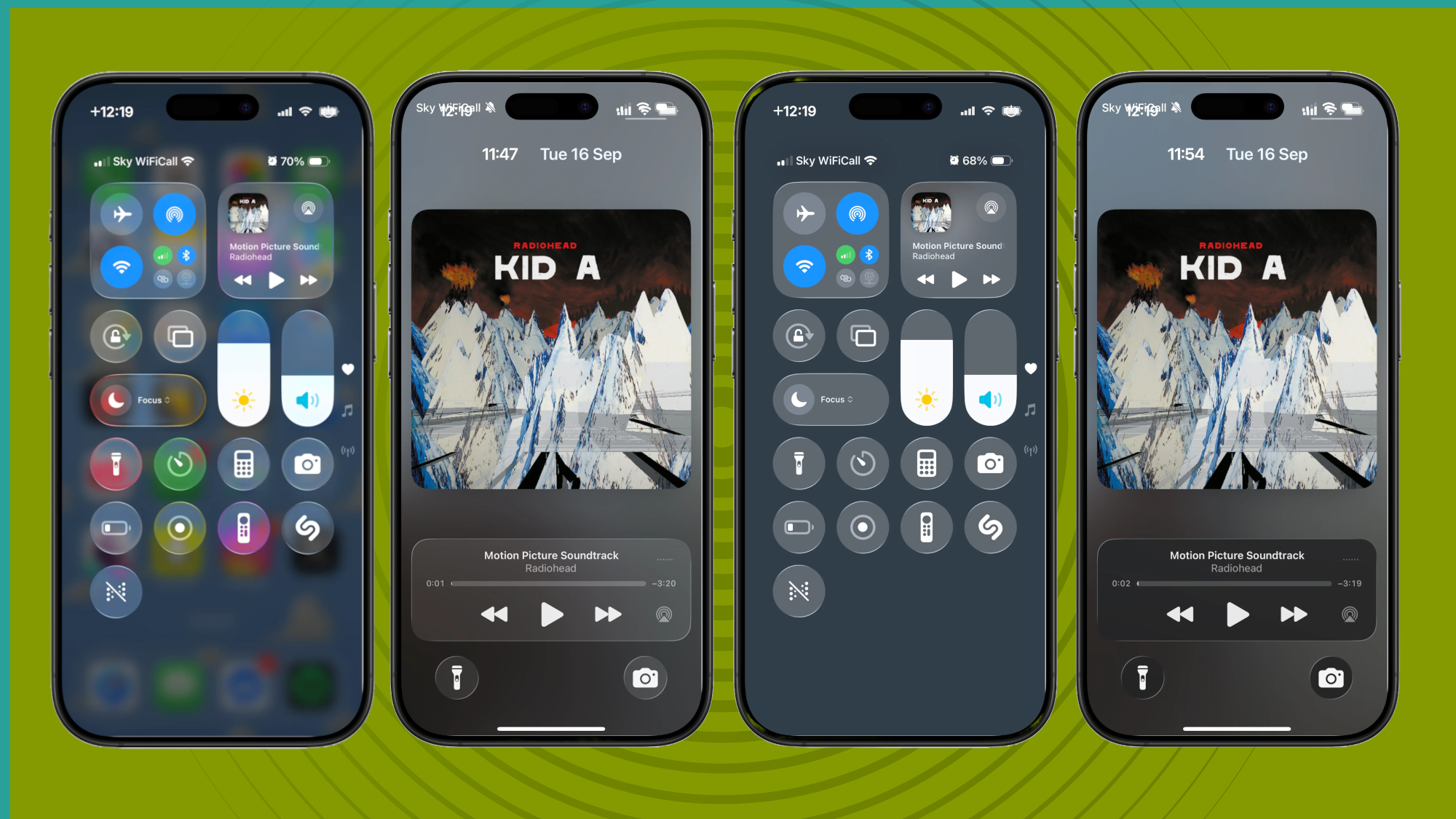
The second, more drastic, option is Reduce Transparency, which removes almost all the translucency from iOS 26.
To turn it on, go to the same Settings page (Settings > Accessibility > Display & Text Size), then toggle the Reduce Transparency option.
Again, the Control Center is a good place to see this change in action. In both images (above), I’ve accessed the Control Center from the Home Screen, but the Home Screen is only visible in the first image (when Reduce Transparency isn’t enabled). When Reduce Transparency is enabled, the background appears as a block color.
Both together
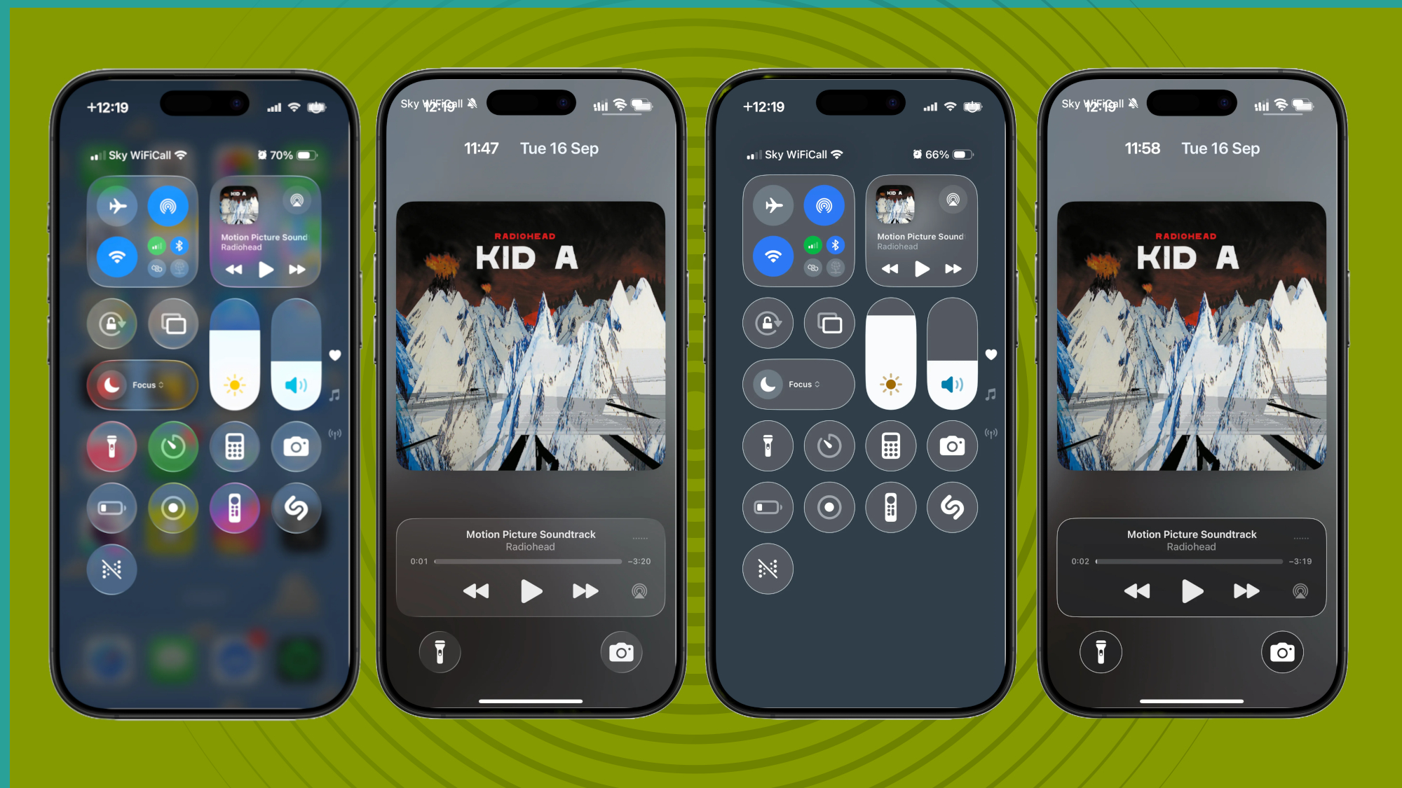
If you really don’t like Liquid Glass, you can toggle both of those aforementioned options (Increase Contrast and Reduce Transparency) simultaneously. This gives you the sharper edges and removes the translucency, making everything much clearer.
For me, this combination is a little too much, but I'm going to give all three options (Liquid Glass default, Increase Contrast, and Reduce Transparency) a try for an extended period of time to see which one I prefer.
What do you think? Do you love or hate Liquid Glass? Let us know in the comments section below. And if you're still undecided on Apple's latest software update, check out our roundup of five must-try features in iOS 26.