There are few harsher tests for a logo than the internet's collective first impression (as we've found with all past Olympic logos). Within minutes of the Alpes 2030 Winter Olympics unveiling its new identity, designers were admiring the execution, branding enthusiasts were dissecting the symbolism, and other people were wondering if they'd accidentally downloaded a new banking app.
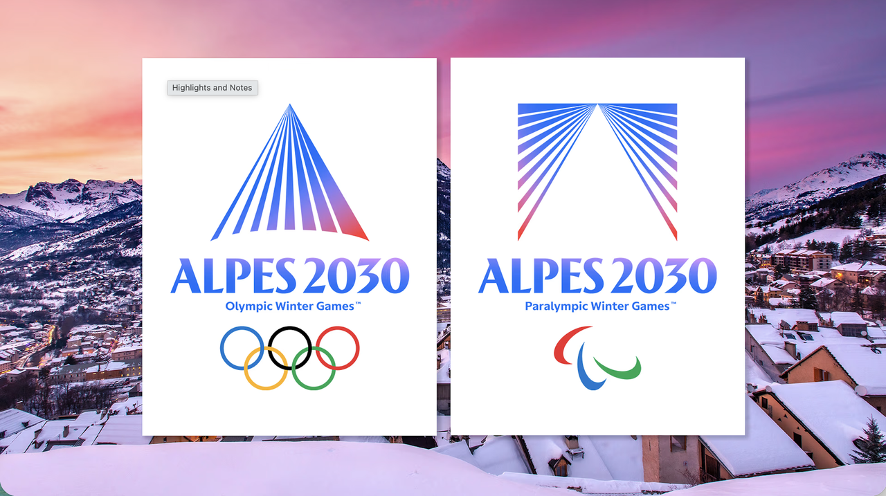
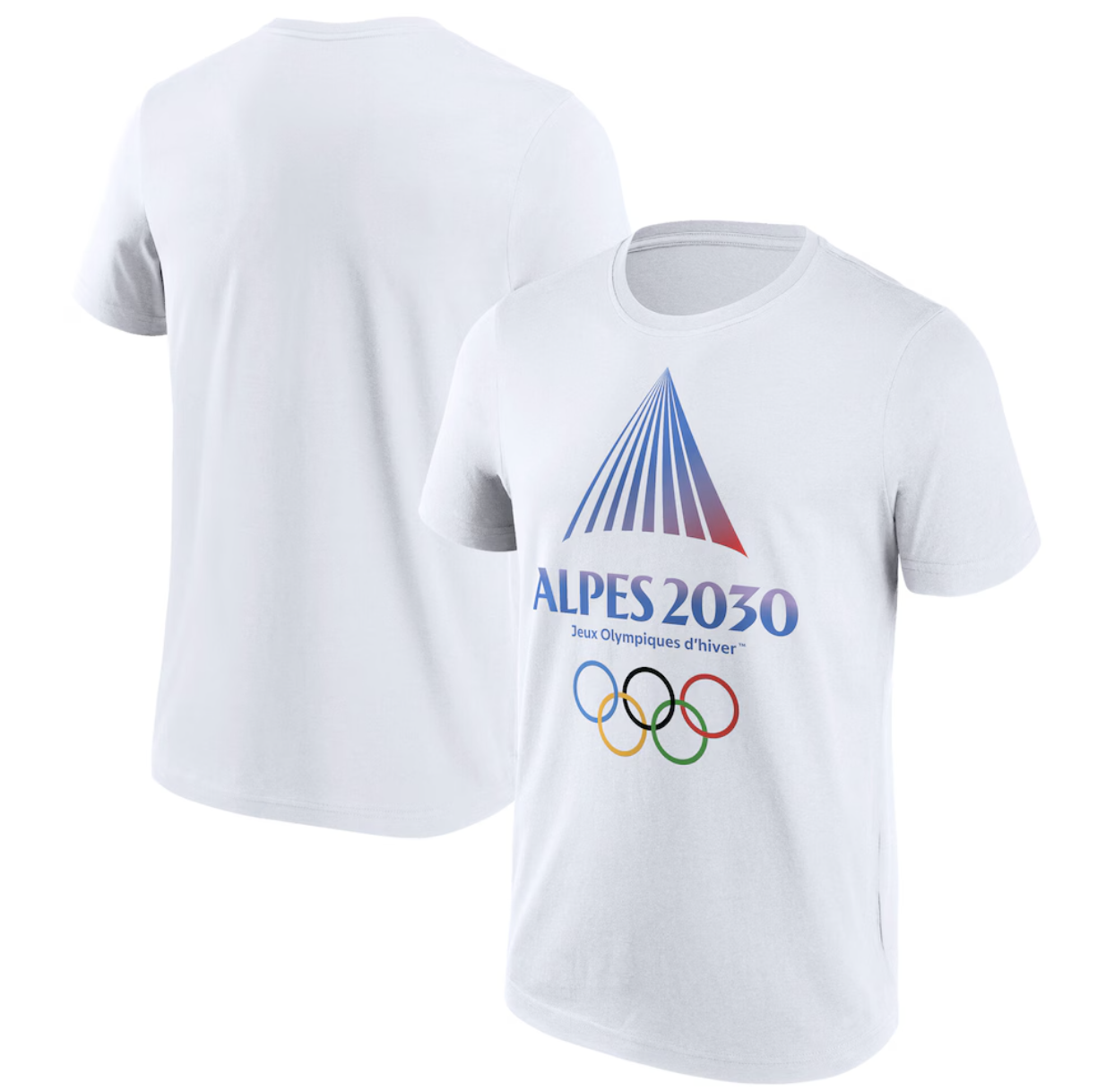
That's not because the logo is bad. Quite the opposite. The mark unveiled for the Olympic and Paralympic Winter Games is elegant, confident and highly contemporary. A series of radiant lines converge into a mountain peak, rendered in gradients of alpine blue and sunset pink. It's clean, memorable and technically accomplished. I very much like it.
I would add, though, that to me doesn't immediately scream "Winter Olympics". Instead, its geometric abstraction and polished minimalism makes it look more like a fintech startup. Glancing at it sideways, you can almost imagine Alpes 2030 offering you commission-free investing and a premium metal debit card.
Mountain + light = triangles
So what's this design all about? According to the organisers, the new emblem is inspired by "a mountain revealed by light". The radiating lines represent the Alpine landscape, illuminated by sunlight, while the point where they converge symbolises unity and shared ambition. It's a neat idea and, visually, it works well.
While the Olympic logo presents a mountain rising towards a summit, the Paralympic version cleverly inverts the shape. The two marks feel connected without being identical. It's a thoughtful system rather than a one-off logo, which is to be applauded.
The colour palette deserves praise too. Midnight and azure blues reference altitude and ice, while pink and red tones are inspired by alpenglow, the warm light that washes over mountain peaks at sunrise and sunset. This helps the identity feels directly connected to the lived experience of being in the Alps (we love colour theory).
Most importantly, the logos are likely to work well in practical terms. They'll reproduce cleanly on everything from giant venue signage to social media avatars and merchandise. Given the complexity of the Olympics ecosystem, that's no small feat.
A French Modernist twist
Another thing that give the logo personality is its distinctly French graphic heritage. The radiating lines immediately evoke the visual language of post-war Modernism, particularly the kinetic graphic experiments that flourished during the 1960s and 70s. There's something wonderfully retro-futuristic about it all.
But again, this feels like it's fighting the brief a little. The logo feels less like a traditional sporting emblem and more like a piece of cultural branding. The repeated stripes create movement and energy, but there's no obvious sporting association to it. For those of a certain age (cough!), it may even trigger memories of vintage TV idents, science museums or album covers, from the era when the future was always represented by converging lines and beams of light.
My biggest question, though, is: if you removed the name "Alpes 2030", would most people immediately identify it as representing the French Alps? And I think the answer is: probably not.
A fair trade-off?
Ultimately, that's the trade-off with abstraction. You gain flexibility and timelessness, but you sometimes lose specificity. Compare the identity to Vancouver 2010's Inukshuk emblem or even Albertville 1992's more expressive visual language and Alpes 2030 feels notably detached from its location.
Again, that's not necessarily a failure. Contemporary branding increasingly prioritises systems over storytelling and symbols over illustrations. Yet it's hard not to feel that one of Europe's most dramatic landscapes has been distilled into something that could just as easily belong to a tech conference, luxury hotel group or venture capital fund.
For now, though, the identity succeeds on its own terms. It's distinctive, well-crafted and likely to age better than many recent Olympic logos. It also gives designers something increasingly rare: a major international identity that's interesting enough to argue about. And if a few people briefly mistake it for a fintech startup along the way, that might be a price worth paying.