New logo designs always face scrutiny, especially when it comes to sports teams. Fans can be particularly territorial about their favourite team's design language, and it can take a while for a new design become accepted – if it ever does. But here's an example that's taking design scrutiny to the next level.
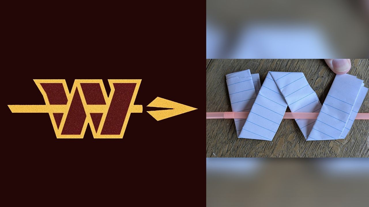
A new 'alternate' logo for NFL's Washington Commanders has been revealed, featuring an arrow passing through the folded 'W' shape of the original logo. The symbol is part of a new suite of branding assets revealed by the team (below), and has led to an unexpected design debate: does it actually make physical sense?
In an Instagram post (above), the team describes the interweaving spear and 'W' as "a powerful joining of past and present", a design that "captures the forward-focussed spirit of the Commander, a leader of warriors.
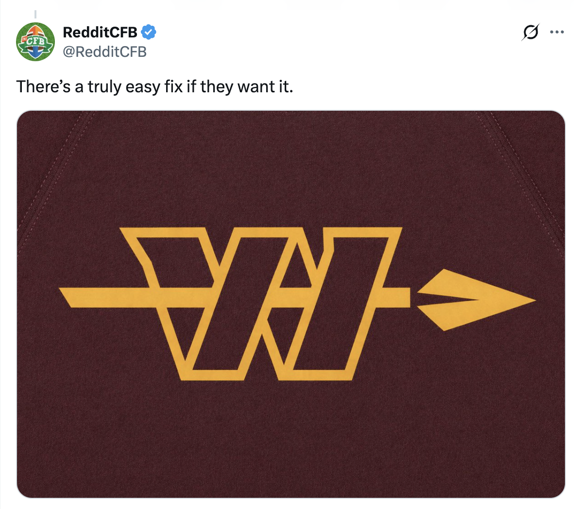
But many fans have argued that the spear doesn't actually pass through the 'W' in a way that makes sense. Some have even created an alternate version of the alternate logo (an alternate alternate logo?), in which the arrow passes through the folds in a more logical way:
But in order to prove that the logo might just make sense, one fan and Redditor has taken matters into their own hands, using good old paper (and a straw) to show that the arrow can indeed pass through the 'W' as it does in the official alternate logo.
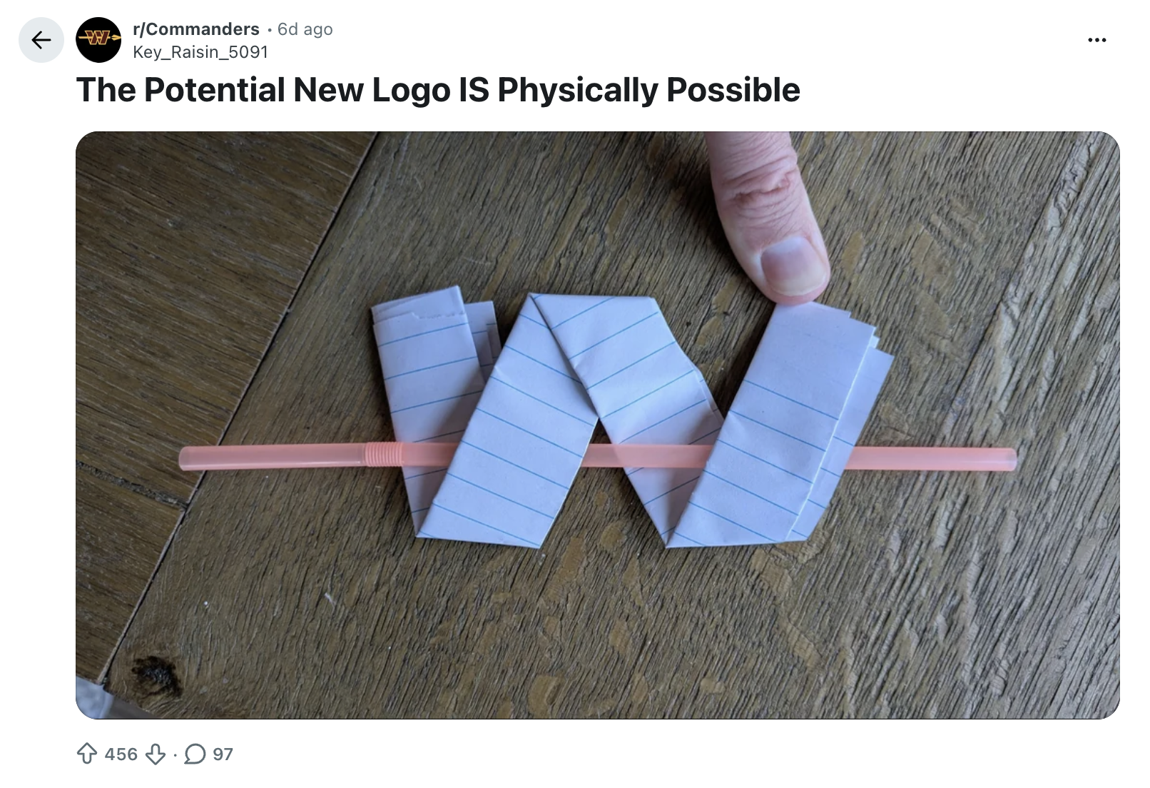
And as you might expect, the above post has been met with several other illustrations explaining why, actually, it doesn't work. "The fact that this has to be done at all is crazy" comments one user among the madness. We couldn't agree more.