We've seen plenty of brand new car logos over the last few years, with the likes of BMW, Kia, Nissan and Rolls-Royce adopting new designs. These have ranged from full rebrands to minor tweaks; often a flattening of the existing design. But Porsche may have just revealed the most subtle redesign yet – and it only took three years.
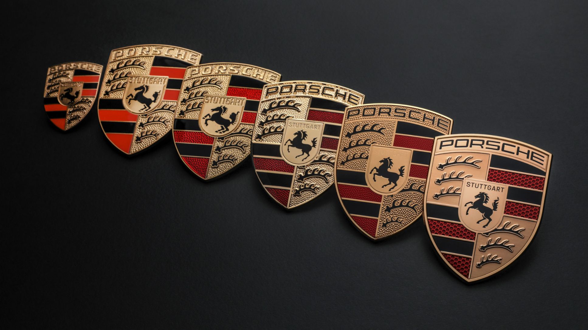
The car brand has revealed a "modernised Porsche crest", a cleaner and slightly more minimal take on the current design, with a few textures removed – although the word Stuttgart has been reintroduced to the centre of the crest. But other than that, it looks very, very familiar. (Looking for design inspiration? Check out the best logos of all time.)
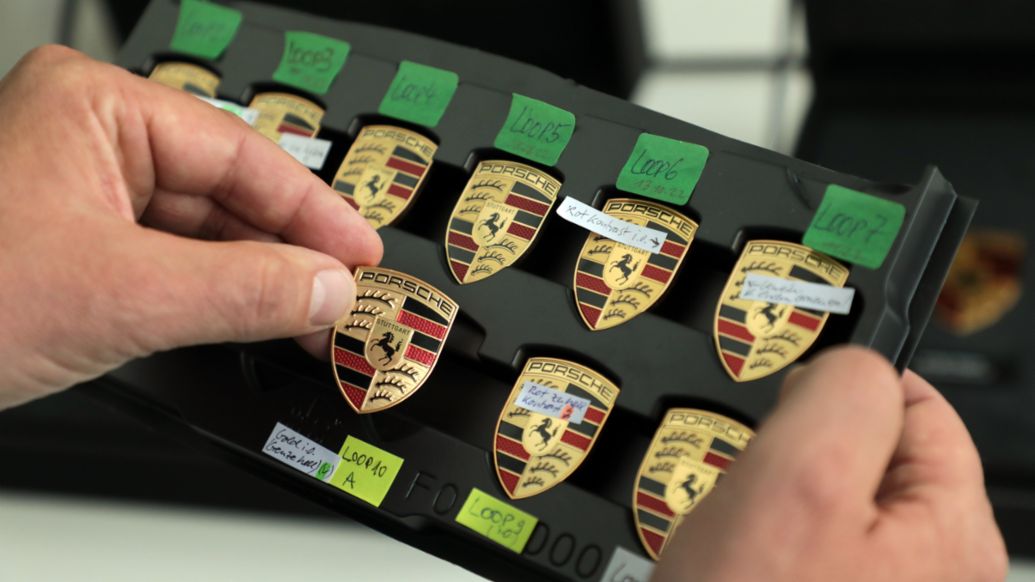
Introduced to coincide with the 75th anniversary of Porsche sports cars, the new design is was created "with loving attention to detail over a three-year process," according to a news post on the Porsche website.
As a few Twitter users have pointed out, it's curious that the process took three years, seeing as how the design isn't all that different to its predecessor. Then again, the crest has undergone a few changes since its inception in 1952, with updates in 1954, 1963, 1973, 1994 and 2008 – all of which were as iterative as this one.
And what perhaps sets the Porsche update apart from its competitors is that the company isn't shutting the (car) door on its previous designs. In a delightful celebration of its heritage, Porsche is now offering all of its historical crests for sale as parts for both vintage and new cars.
Indeed, as a luxury brand, it makes sense for Porsche to opt for an evolutionary rather than revolutionary rebrand. That said, it's certainly possible for a more comprehensive rebrand to maintain that luxury appeal – just look at the new Rolls-Royce identity. And at least the new design remains entirely recognisable – unlike the new Kia logo.