The Daily Telegraph has chosen its 160th anniversary to introduce readers to a redesigned newspaper, with a new headline typeface and the restoration of the former gothic masthead.
It’s an old-and-new combination that looks rather good, at first - and second - look. But the headline change is less striking than the introduction of a larger text size, which marks a truly radical change in the paper’s appearance.
According to the editor, Chris Evans, in his page 2 piece on the redesign, the increase in the size of the text, in company with extra spacing between the lines, “makes our articles far more readable.”
I note that the Telegraph’s official historian, Christopher Howse, greets the new body type with a single word: “hurrah!”.
Evans is right in saying that the increased text size matches what has become the norm in most quality western newspapers while conceding that “there is a small sacrifice in the number of words printed.” He estimates that it will reduce content by about 5%, arguing that “it is a reasonable price to pay in order to make reading the paper far more pleasurable.”
Those of us old enough to recall the comprehensive news coverage of the Telegraph in the 1950s and 60s will wonder, yet again, whether it means a diminution in the number of stories carried by the paper.
Then again, the modern Telegraph publishes many more pages than it did 50 years ago, so my hunch is that the difference may be slight.
Moreover, given that all news breaks online, all sensible newspaper editors in this digital age are giving more space to commentary, reaction and analysis. And the redesigned Telegraph is following the newspaper-as-viewspaper trend by devoting more space to reflection. So current columnists are getting a boost and the paper has also hired a couple more: Emma Freud and Linda Blair.
Overall, the new look, which extends to the business and sports sections, is bright and refreshing. It is tempting to say it is long overdue but that would be overly critical.
It is also fair to say that it is unlikely to annoy traditional Telegraph readers who will surely celebrate the fact that their paper has refused to give up on its broadsheet format.
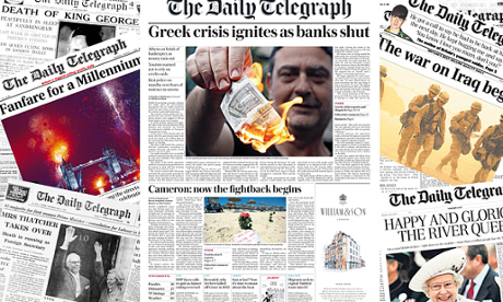
Its loyal audience may well take some pleasure in reading the four-page supplement that celebrates the history of the paper since it was launched in 1855.
One stand-out fact in the page of milestones is the sobering fact that in 1980, during the editorship of Bill Deedes, the Telegraph achieved a record sale of 1,439,000. Now its print version sells 485,000 about a day.
But the Telegraph, as with all papers in this digital age, is read by more people than at any time in its history because of the vast numbers who access it online. In May, it was able to boast that it had almost 5m unique users a day.
All redesigns take some time to bed in, and there will doubtless be tweaks along the way. But it would be churlish to deny that the new-look Telegraph is easy on the eye.