Anyone charged with redesigning a sports logo knows they're playing with fire, so it shouldn't surprise anyone that the rumoured new La Liga logo is dividing opinion. Spain's top football league, which features such giants as Real Madrid and FC Barcelona, is reportedly to get a radical look that turns its back on three decades of previous branding.
While an update was certainly overdue, many fans are not impressed with the new look according to purportedly leaked images. Some find it hard to read, while others think it looks more like a generic motorsports logo than an identity for a major soccer league (see our guide to how to design a logo for tips for your own work, and our pick of the best sports logos).
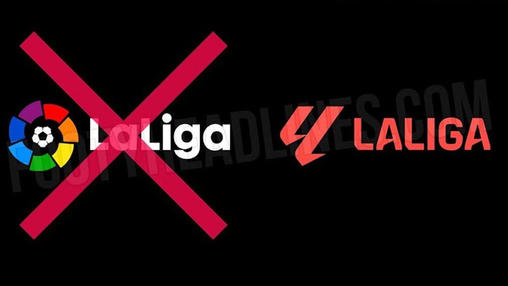
The La Liga logo has barely changed in 30 years. Sponsors have come and gone but since 1993, it's sported a mark that comprises a football surrounded by a ring of coloured patches, from red to violet. The accompanying logotype has been updated a couple of times and there was a minor refresh in 2016. The logo has also been re-energised with the addition of an animated version in recent years, but the main mark has remained the same.
It looks like that's going to change for the 2023-2024 season when EA Games will take over from Santander as the title sponsor. Yes, EA Games. And if the company's own EA Sports FC logo was controversial, we should probably have expected that it might bring some of that to La Liga. One of the big criticisms of the rebranded FIFA game logo was that it looked more like a motorsports brand than a football, and now people are saying the same thing about the reported new design for Spain's first division.
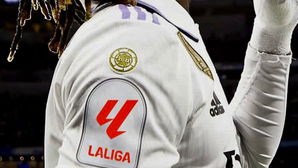
Leaked by footyheadlines.com, the design appears to represent a double 'L', for 'La Liga', but it's so angular that people are finding it as hard to read as 'La Liga EA Sports FC' is hard to say. Some think it looks more like letters from a different alphabet, others a number '4' or '11'. Others just hate it. "Looks like the logo of another endurance motorsport competition," one person wrote on Twitter. "Looks like a video game logo," someone else wrote, which makes a lot of sense.
👕 The new La Liga logo on kits from next season, per leaks. Rate it out of 10? pic.twitter.com/fdwuFdolpfApril 24, 2023
Where have I seen that before… @StantonWarriors pic.twitter.com/pPTimBWwvBApril 24, 2023
The new logo be like pic.twitter.com/QW8YOnlOXAApril 24, 2023
We'll have to wait to see if this becomes the official logo or is just a draft. It's is presumably only part of what will be the final design, which will have the EA Sports FC logo appended to it in some form.
Sports rebrands are among the hardest to get right since fans feel an intense passion for every aspect of the game, including design. La Liga was due a makeover, but if this design is the one that gets chosen, it's going to take some time for fans to come to terms with it. In the meantime, we can have a laugh with these football club logos drawn from memory.