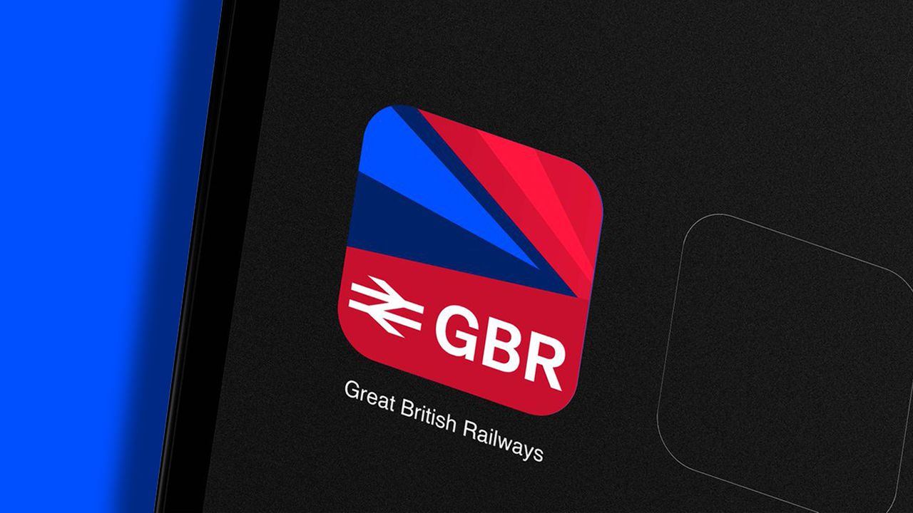
The UK Government has revealed the new identity for Great British Railway, a milestone revival marking the transition towards a nationalised rail system. An evolution of the old British Rail that was privatised in 1997, the new design is not only a fresh look for UK railways, but a promise of hope for many.
The best logos are often simple yet striking, prioritising scalability and timeless design. With these key principles in mind, the revived Great British Railway identity has divided the nation, with some praising the minimalism, while others wish for a more dynamic look.
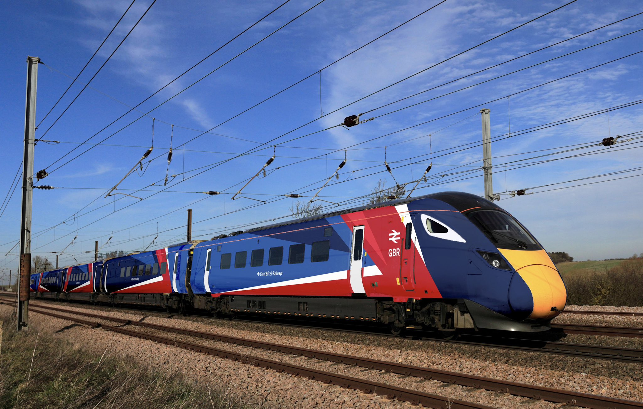
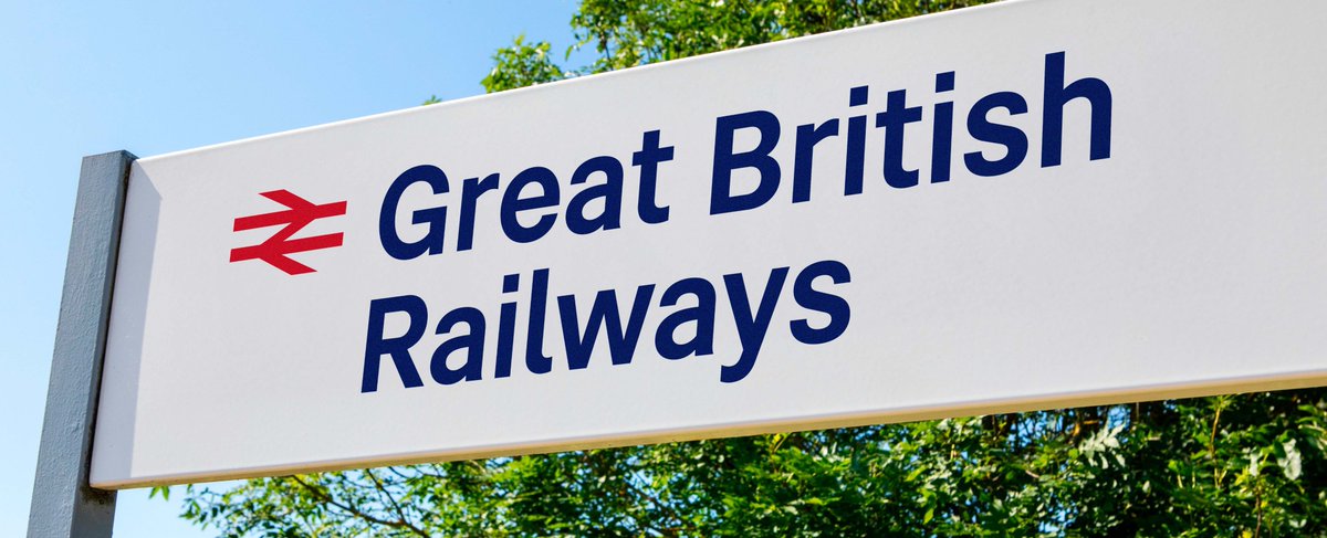
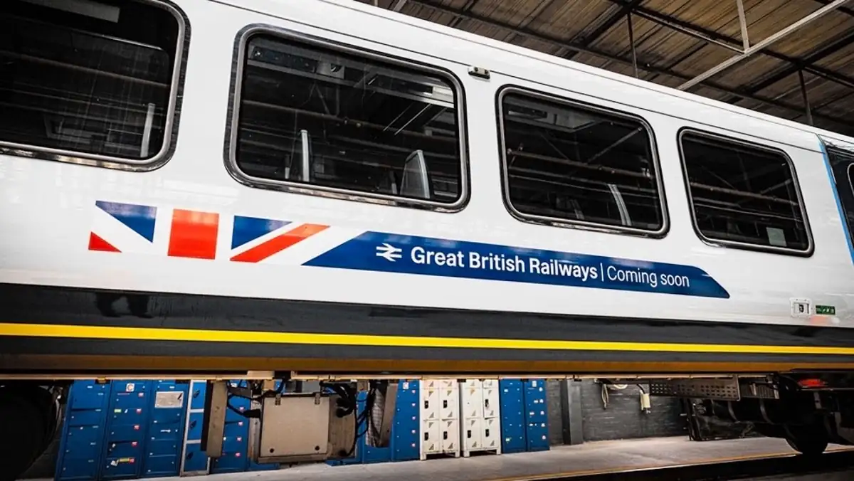
The new Great British Railway logo features the iconic double arrow emblem first used by the original British Railway. As a homage to its heritage, the simple yet striking design symbolises momentum and progression, a key feature of the new GBR. Predictably, the new look features a red, white and blue colour palette in a patriotic nod to the Union Flag. The modern integration of the livery is tastefully presented across the branding so as to avoid an overly kitsch nationalistic effect.
Despite the GWR's fairly innocuous design, the new look was surprisingly divisive. Over on Reddit, one commenter wrote, "This is beyond hideous, especially on the inner coaches. Loud, in your face, distracting, this isn't a British design language but American – doesn't belong anywhere near our timeless classic double arrow logo."
"This one just looks inelegant," another added, continuing, "Leaning in on the flag this heavily comes across as weak to me, as if the designers couldn’t come up with a design strong enough to stand on its own. People still talk about the boldness of the British Rail redesign decades later – I doubt this design will last nearly as long."
For more design news, check out the new London Underground map or take a look at the GOV.uk rebrand that was surprisingly controversial.