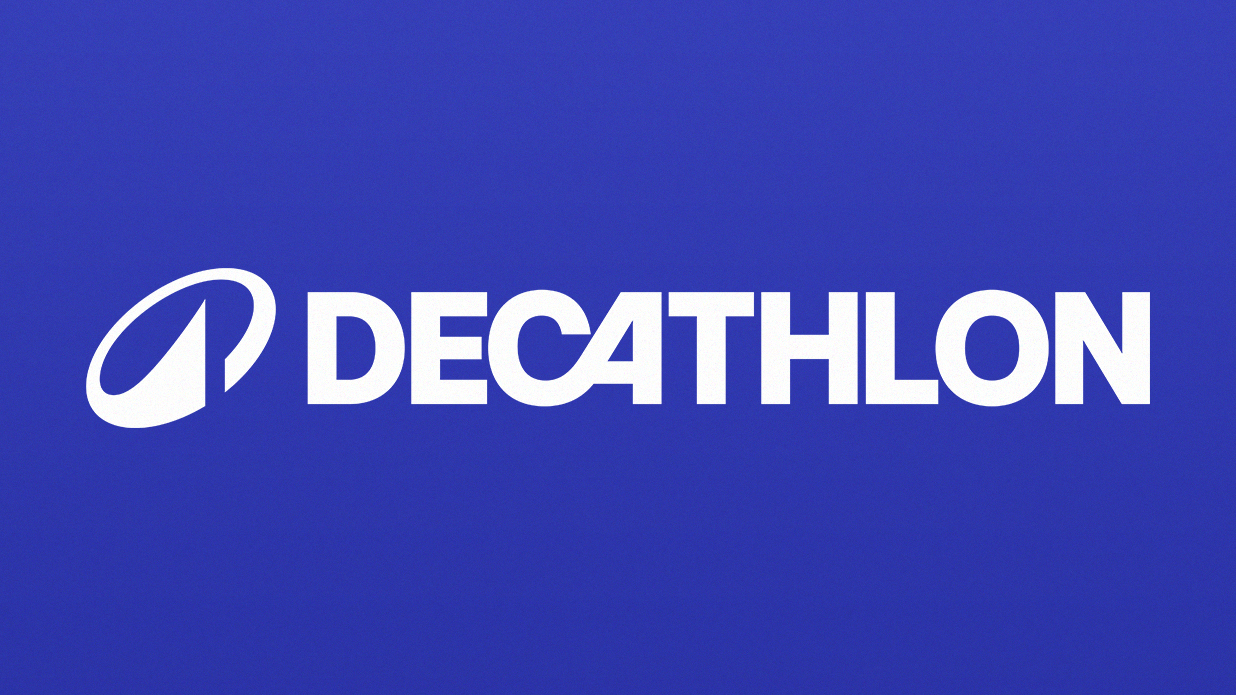
Decathlon is the third biggest sports company in the world, and today has announced a rebrand, created by brand consultancy Wolff Olins. The rebrand aims to take Decathlon from a French retailer to a "future-fit" sports brand, and better reflect the range of people the company supports – all sports, all people, all ages and all levels.
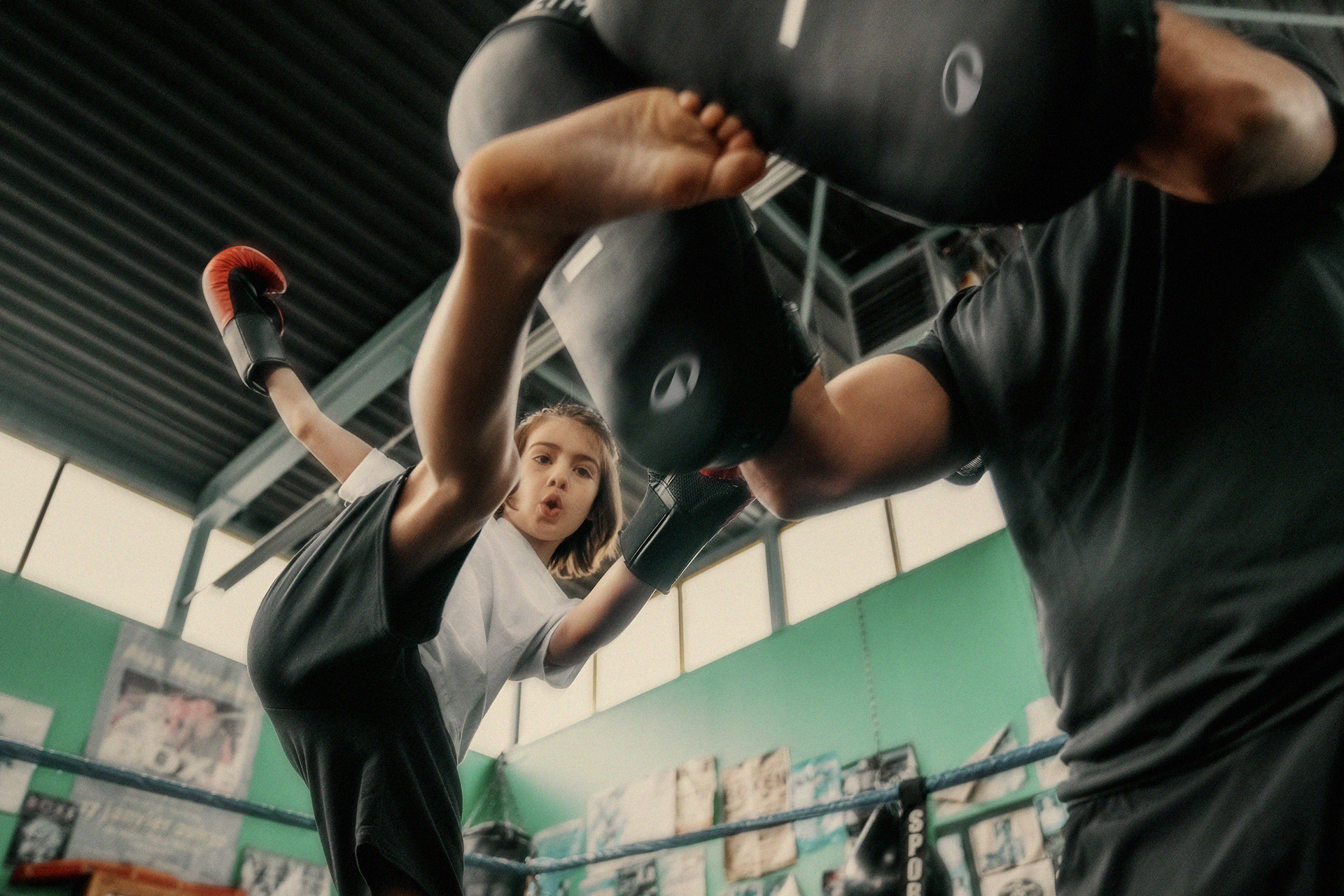
The new brand positioning is based around the new brand purpose: "to move people through the wonders of sports", with "wonder" being a key element. Like the recent Sweaty Betty rebrand, there's a move away from perfection within exercise, and a focus on a sense of play and enjoyment from sports.
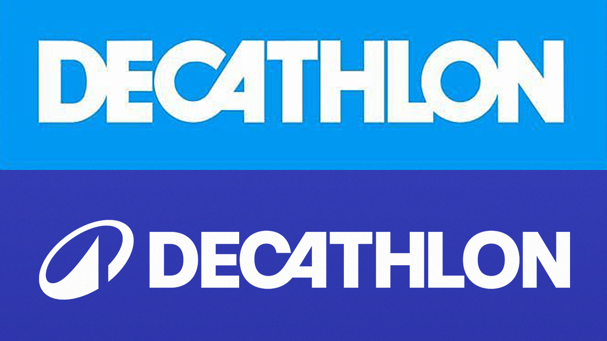
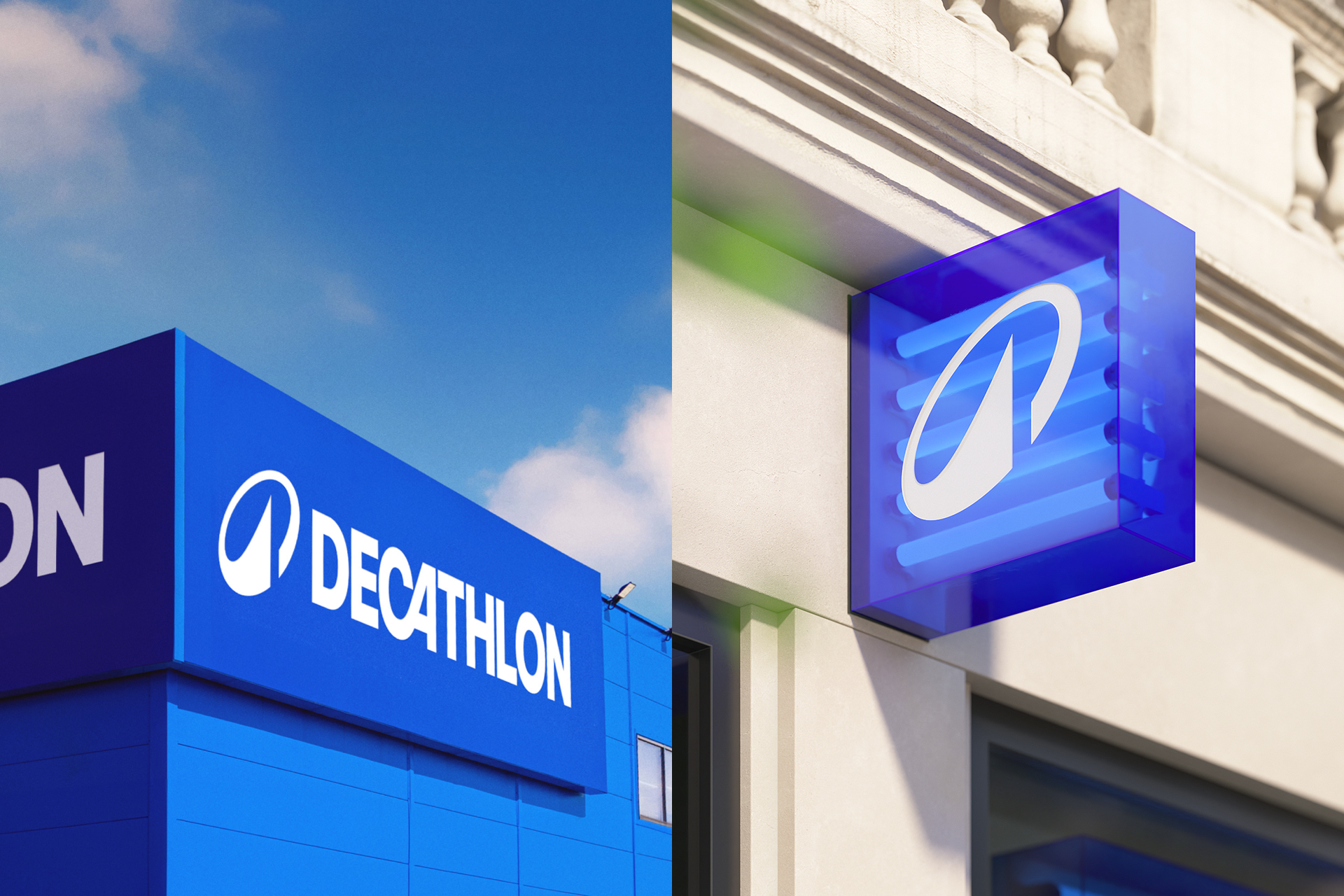
The previous logo's most notable feature was the interconnected 'C' and 'A', this new rebrand keeps this, but introduces a darker blue and a new brand icon, called 'L'Orbit'. With looser kerning, the bespoke typeface, Decathlon Sans, feels more legible than the previous iteration.
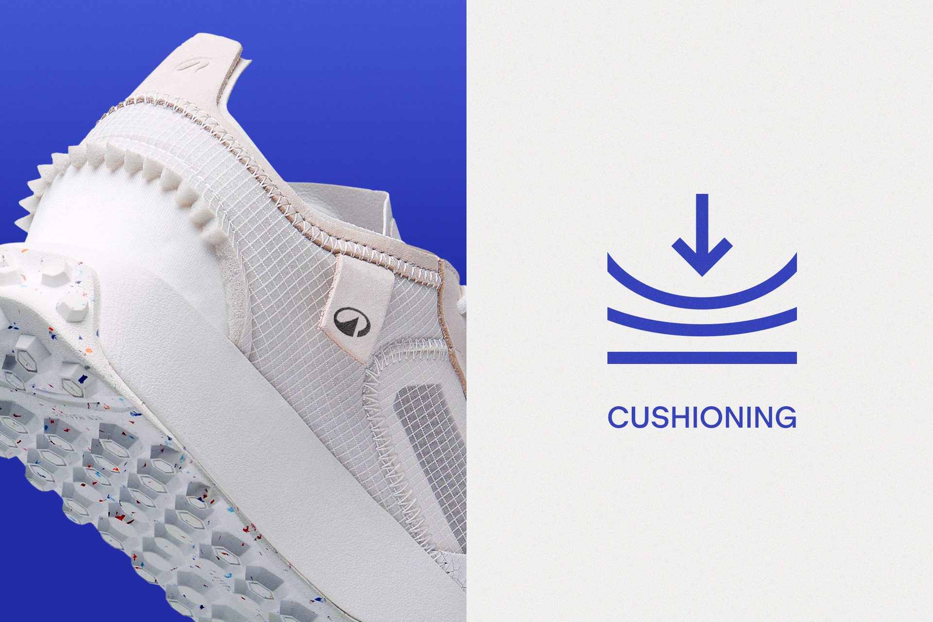
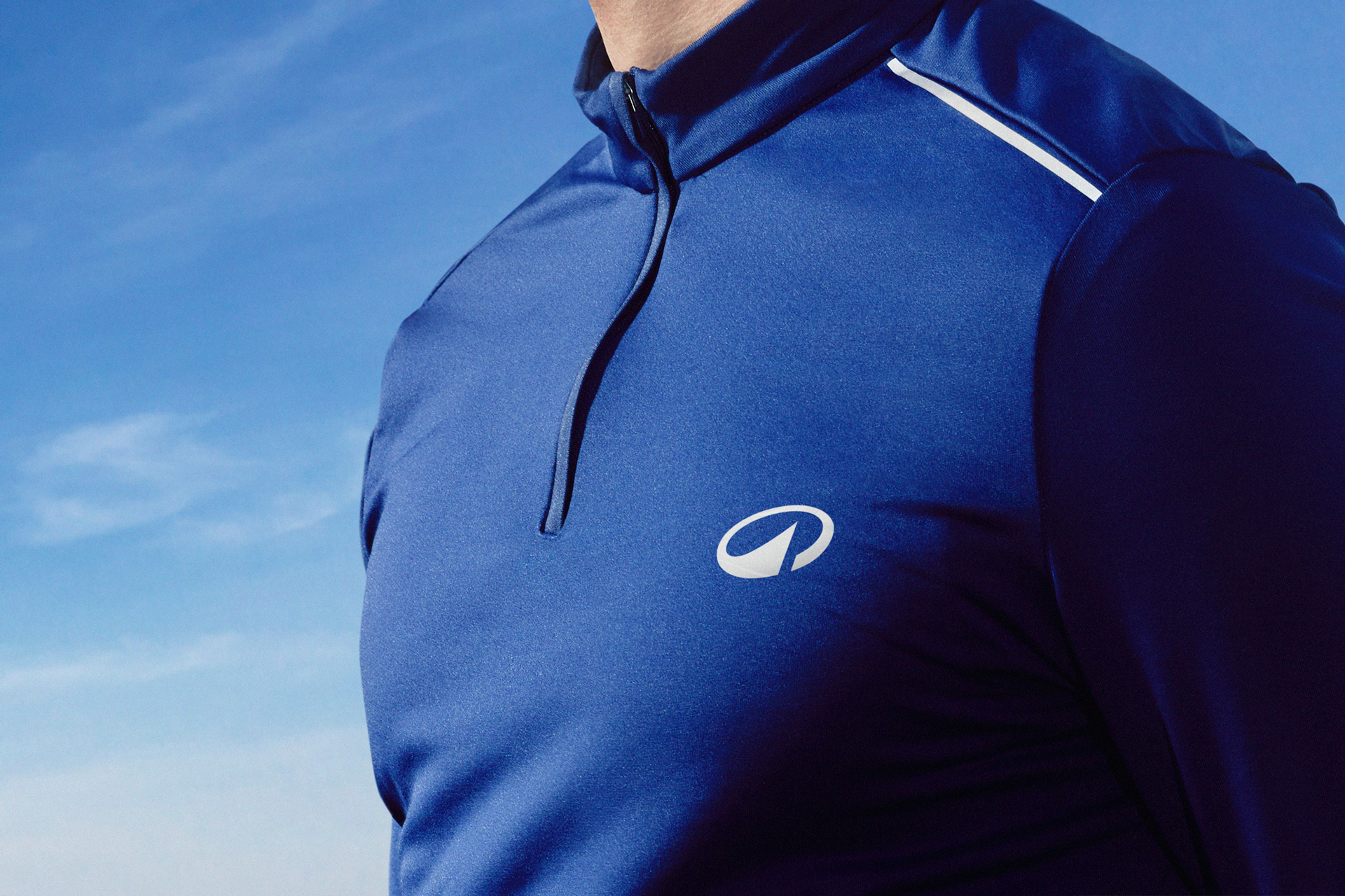
L'Orbit conveys movement and circularity, with a "strong angle inspired by the iconic wordmark and a peak representing its connection to outdoor sporting activities", according to a press release. This icon is set to feature prominently on all products, from tents, to sports bras to boxing gloves.


Elsewhere, there's a new brand voice, art direction and iconography, all brought to life by the motion system and a new campaign by Wolff Olins sister creative agency, AMV BBDO (below), which focuses on play.
"Decathlon has always been for everybody; a sportsmaker, misunderstood as a retailer," says Emma Barratt, global ECD at Wolff Olins. "A democratising influence in sport, fast becoming a leader in circularity. But above all, its aim to simply bring fun, joy and wonder to people of all levels and abilities. We have honoured this with the new brand and identity, which is an open invitation for all to move in their own way."
“Play is at the heart of the Decathlon brand, from their stores to their people and now, in their communications," says Laura Rogers, ECD at AMV BBDO. "We’re delighted to share Decathlon’s unique, democratic and people-centred approach to sport with the world. We hope that this work, which is our first in partnership with the brand, inspires people everywhere to find that joyous spirit within themselves and get out there and play."
It's refreshing to see sports brands moving away from movement being all about elite athletes winning. And if the campaign can encourage people to get moving, that can only be a good thing. As for the rebrand, this is one of those identities that fits so well, it feels like it's always been there.
Find out more about this project on the Wolff Olins website. For more on brand identities, see our pieces on the mesmerising new British Land brand evolution, and Taxi Studio's tips on how to celebrate brand heritage.