Newspapers during redesigns are exciting places; suddenly there's a detailed focus on everything you do - the shape of every picture, the detail of every standfirst, even the placement of every drop cap. The Guardian Weekly tomorrow launches such a major redesign, going from a tabloid size to a half-Berliner ("micro" for the Americans), moving, for the European edition, to the Guardian's state-of-the-art print site, meaning a great leap in the quality of pictures and use of colour.
For the features section my fellow deputy editor, Charlotte Thompson, working with the designer John-Henry Barac and the rest of the editorial team, slaved over every detail, lovingly choosing every picture, leaving us with some great images, including that of the sinking Erika and striking portraits of Muslims serving in the British armed forces. Our production editor and the project manager, Jenny Cogan, battled through complications of print tests, a whole new imaging system and much more.
As a team we've been working with the editor, Patrick Ensor, for months to ensure that we had a great-looking design without any loss of words or features - for Weekly readers will be quick to notice and complain, should we cut either. So we have unusual but striking comment and debate pages heavy with text that is carefully balanced by airy space and colourful graphics - the weighty anchor in the centre of the paper. And the word-count has been maintained throughout.
We've also kept almost every detail in terms of content - there's the much-loved Paul Evans's Nature Watch, the highly popular (to judge from the mailbag) Notes & Queries, and everything else with which readers will be familiar. All that we've dropped is the one sudoku puzzle that's only been around for a couple of years - although that's already been the subject of a lively correspondence from readers. Most won't yet, however, have seen the replacement feature, Chris Maslanka's puzzles, which we think will prove in the end a more popular and durable challenge.
All of that was carefully thought out, designed, managed, organised, crafted. News, however, is rather less pliant, less controlled.
On Monday, I was able to get a nice blend of international stories, starting with Ewen MacAskill's Washington Diary (this week relocating to Orangeburg, South Carolina, for the first of the Democratic presidential debates), taking in French election coverage, the latest on Iraq, the turmoil in Estonia.
On the UK pages Isobel Montgomery began with the long-telegraphed Blair departure, wrapped up the newly graphical "week in Britain" by Derek Brown, and selected a Simon Hoggart sketch. Jim Falzarano produced a nice blend of comment, covering the US role at the World Bank, two views on Iraq and thoughts on the Blair legacy.
I went home, rather late, on Monday night, with a rough plan of Turkey's political crisis on the front page, and the thought that should Paul Wolfowitz unexpectedly quit the World Bank that night, he'd be there instead. Deadline for the whole paper to be off stone: 12.30pm. Sharp.
But old St Francis, the patron saint of journalists, must have been dozing, for what was delivered on Tuesday morning was the dramatic account of "How MI5 missed the July 7 suicide bombers" -- a clear and obvious front page - a great front page for the first redesigned issue, except for one fact: pictures.
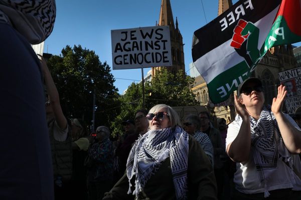
Instead of a forest of lively red Turkish flags, being waved by energetic demonstrators, I had the choice of a mono CCTV image of one of the fertiliser bombers checking out his weapon, an extremely fuzzy MI5 surveillance pic showing three of the plotters - although you can only pick them out because their faces were circled -- or a line-up of mugshots of the convicted would-be bombers.
I went with the grey CCTV image - not quite what the marketing department had in mind for the first edition of the new design - but clearly the best picture for news value. So it was that when we made the trip out to the print site at Stratford to see the Weekly rolling off the presses it was the page three picture of a pink-scarfed young Iranian woman confronted by a Tehran policewoman, and the features pictures, over which we had to marvel at the printers' art - the front might just as well have been on the old Goss Community presses on which the paper used to be printed.
Such is the nature of news: you can never plan ahead.