A confusing change has been uncovered in the latest Android Auto build, switching around the media controls.
The adjusted button order appears to be Google testing a new layout, but currently it's not rolling-out to users.
Android Auto is in line for a big update, with Google recently confirming that Gemini is coming to the in-car version of Android. But while we wait for that update to arrive, another tweak has been spotted that might cause more confusion than anything else.
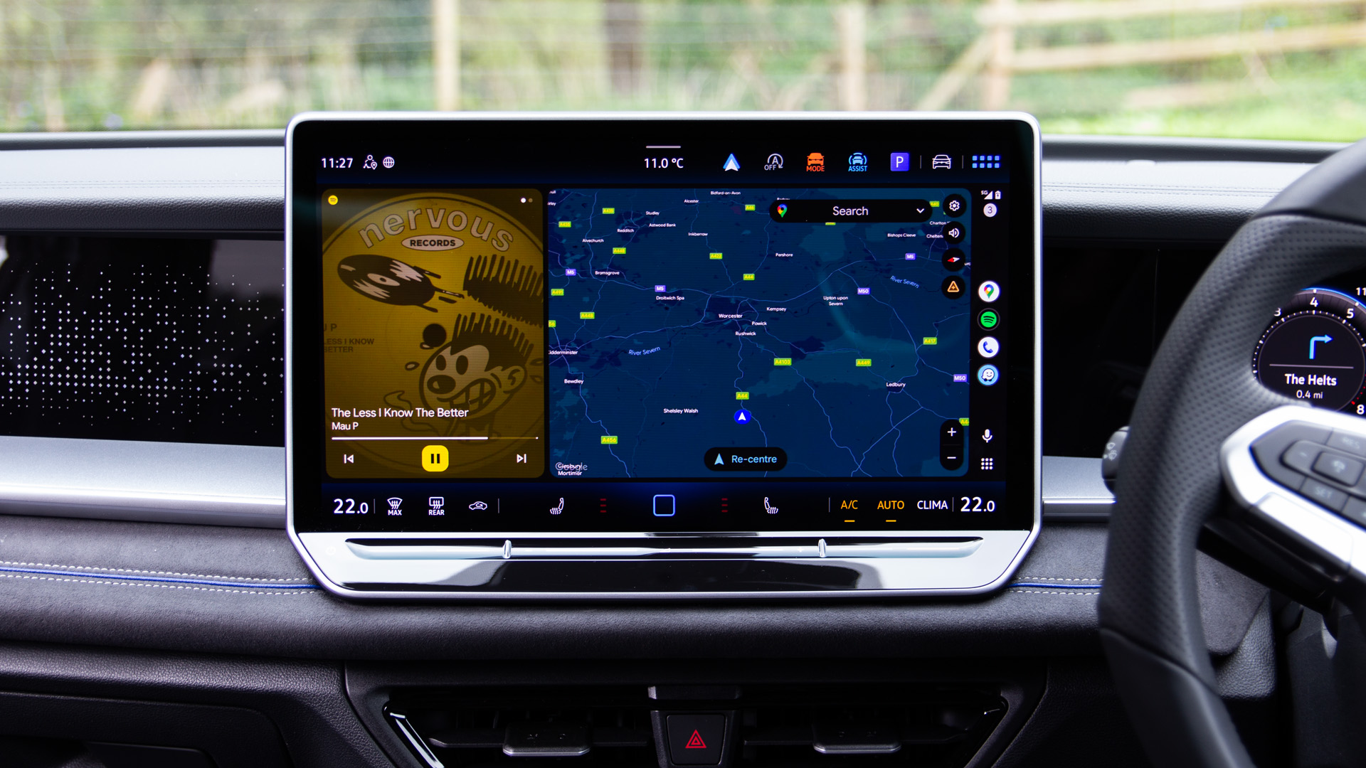
We’re all used to fairly conventional media controls. That sees the play button sitting between the forward and rewind buttons. It forms a logical progressive timeline for your music control, meaning you instinctively know where to tap to go forward and where to tap to go back, as seen in the image above.
However, as uncovered by Android Authority, Google appears to be experimenting with switching around the buttons, so that the play/pause button sits to the left, with the skip buttons placed together.
This breaks that logical progressive timeline and doesn’t match the layout you're probably used to. Looking at media apps on my phone, they all have the play button in the centre.
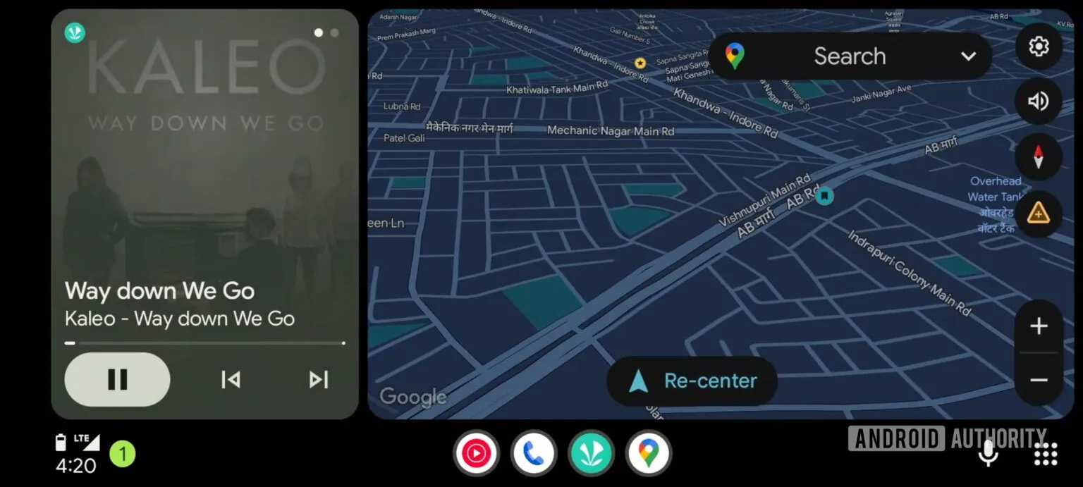
So what could be driving this change? Placing the play/pause button to the left might mean that it’s easier to tap as it’s at the edge. It might mean you’re more likely to see, especially when there are other icons on the screen.
This is one of the principals of Material 3 Expressive, which has been created using things like eye tracking to find the best locations for icons. That could be the intention here, perhaps because people aren’t regularly skipping tracks when driving.
When driving there’s a bigger complication compared to using apps on your phone. Buttons need to be larger so they are easier to hit without taking your eyes off the road. There’s also the issue of tapping the right point on the display when you’re on a bumpy surface, as your hand moves around a lot.
Placing the icon near the edge makes it more prominent and could mean that it’s closer to a hard edge, so easier to tap when moving. But breaking the logical layout that people are familiar with raises its own concerns, because it becomes unfamiliar.
Android Authority points out that this change of button order only applies in the card (as seen here) and when you open the full app, you’ll get the regular layout, which makes no sense at all.
However, it’s worth noting that this change looks like Google is testing something, rather than a change that’s planned to roll-out to all users. At the moment there’s no need to panic, because we’re not seeing this layout on our cars, so let's hope it's just a brief test before Google comes to its senses.