Watched Wednesday yet? If not, and you have access to Netflix, I'd highly recommend it. Yes, I know there's a million shows on a million streaming platforms to catch up on. But trust me, this one's really good.
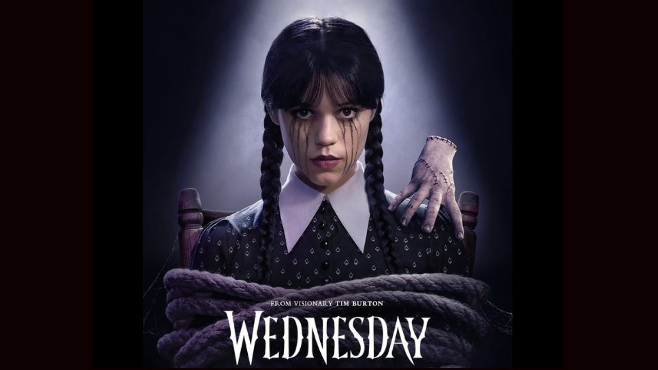
For the uninitiated, the Tim Burton-directed horror comedy, whose season 2 landed last week, follows the iconic Addams Family daughter as she navigates the supernatural politics of Nevermore Academy. Visually, it's an absolute masterclass: from the sweeping shots of the school's neo-Gothic spires to the intimate character moments, every frame feels meticulously crafted.
And don't get me started on the lighting. There's a gorgeous interplay, for instance, between the warm amber tones of the Academy's common areas and the cold, steel-blue shadows that follow the title character wherever she goes. When Wednesday stalks through the hallways in episode one, you feel the temperature drop with every step.
Understanding the assignment
But here's what really got my design-obsessed heart racing faster than Wednesday fleeing a school dance: the typeface. Sweet merciful typography gods, it's genius. The best free fonts might be good, but this is on another level.
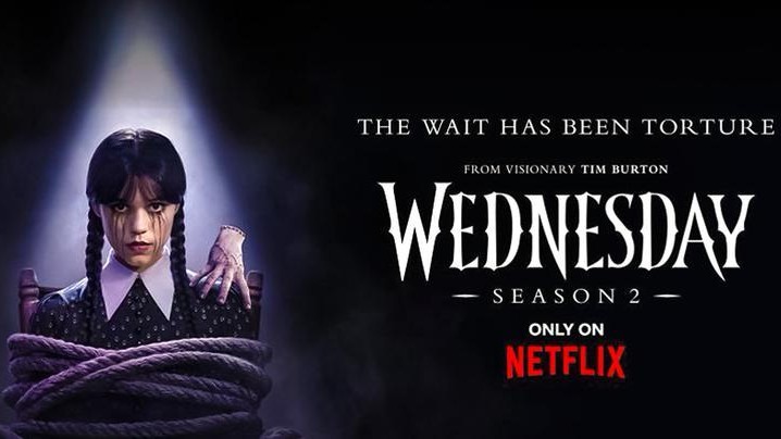
Those angular, razor-sharp letterforms, which viscerally slice across everything promotional materials and title cards, aren't just pretty—they're doing serious heavy lifting for the brand.
This is not, I emphasise, some hastily licensed Blackletter knockoff. This is bespoke typography that understands the assignment. And that shouldn't be a surprise. Because not only is this a custom font, it's one whose development was as methodical as Wednesday's approach to solving the Hyde mystery.
Turns out that Netflix didn't just want something "gothic"; they demanded letterforms that would reflect Wednesday's razor-sharp wit, her cutting observations, and that delicious tension between elegance and danger that makes her character so compelling.
The result, to my eyes, is a typeface that feels like it could slice through pretension as efficiently as Wednesday's verbal takedowns. Each letter has been crafted with surgical precision, featuring sharp angles that feel like they could inflict actual wounds, and contrasts so dramatic they'd make a Victorian mourning dress seem cheerful.
Take for example the way the 'W' extends its arms like a protective raven, or how the 'y' descends with the grace of a funeral shroud. It's typographic poetry that actually serves the narrative.
Custom is king
Moreover, I think there's a broader point to be learned here. As much as you can do with the best professional fonts, I'd argue that if you really want to make an impact, you can't do better than custom typography.
After all, look at the environments brands live in today. In attention-deficit world of visual noise, generic fonts are the equivalent of shouting into the void whilst wearing a beige jumper. Think about it: when was the last time a font made you feel something? When did Arial ever make your pulse quicken or Helvetica ever send a shiver down your spine?
In contrast, The Wednesday typeface manages to be simultaneously elegant and menacing, sophisticated and subversive. It's typography that mirrors the show's own contradictions—a coming-of-age story wrapped in murder mystery; teen romance filtered through Tim Burton's macabre sensibilities.
In short, it creates instant brand recognition whilst simultaneously serving the story. When you see those distinctive letterforms on a poster or social media post, you don't need Netflix's logo or even Wednesday's face to know exactly what you're looking at.
That's the power of proper custom typography—it becomes as integral to brand identity as any logo or colour scheme. And that's why it's always a good instinct to avoid playing it safe.
Too many brands are still relying on the typographic equivalent of fast fashion; readily available, technically adequate, but utterly forgettable. In a marketplace where attention is the ultimate currency, generic choices are commercial suicide.
So here's my challenge: in a world full of Helvetica, dare to be a little more Wednesday.