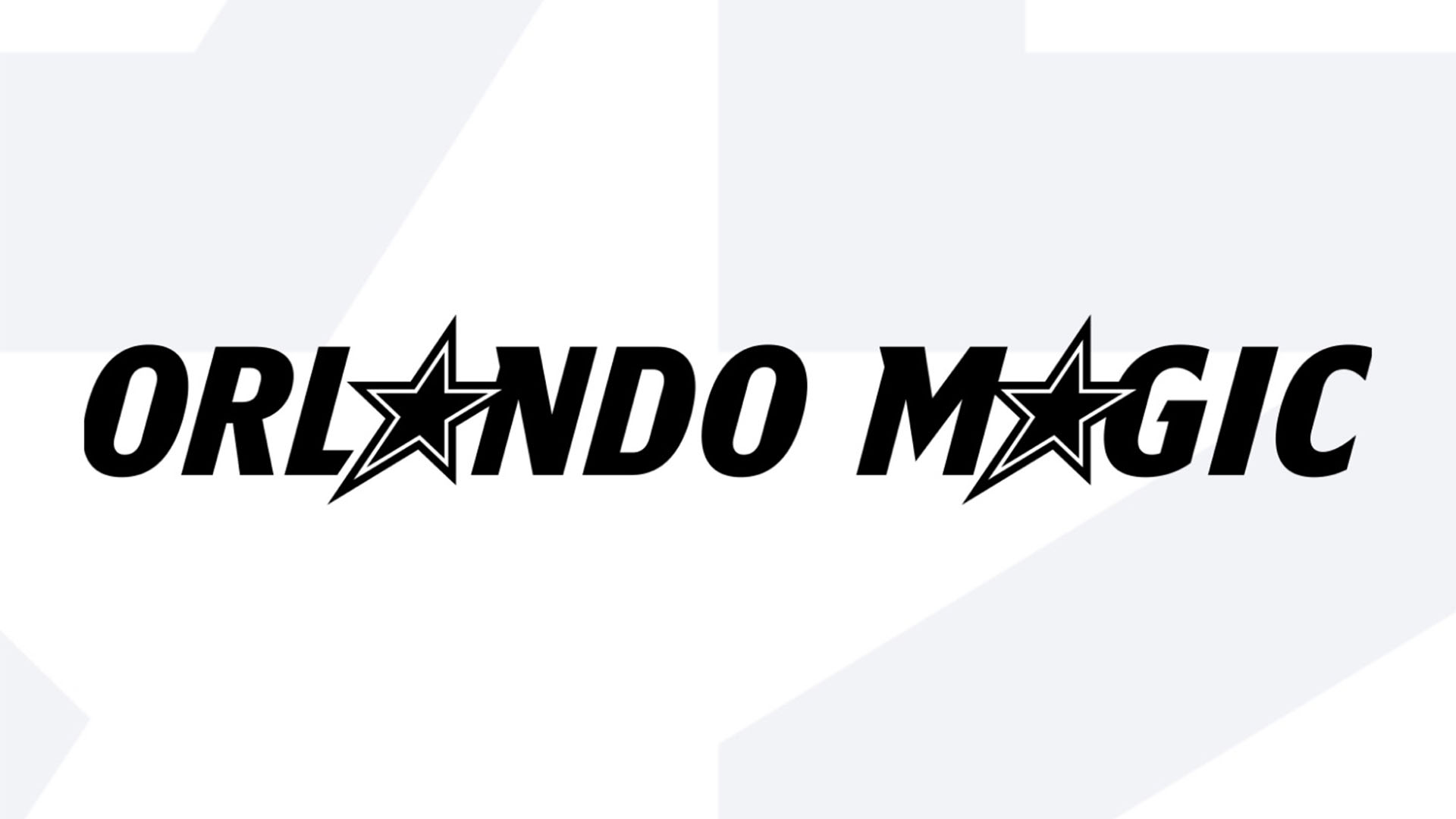
NBA team, the Orlando Magic, have unveiled a new identity, including fresh jerseys, court design, wordmarks and a brand new logo. Despite this being the first update to the team's look in 14 years, the visual revamp has divided fans, with many dissapointed by the "safe" design.
With any creative project, you inevitably can't please everyone, but when it comes to designing sports logos, fans will always be straight-shooting with their opinions. A successful sporting identity has the power to unite a fanbase and become a cult emblem that transcends the sporting world (think the Jordan logo or Nike tick), but it seems the Orlando Magic have failed to impress with their clean rebrand.

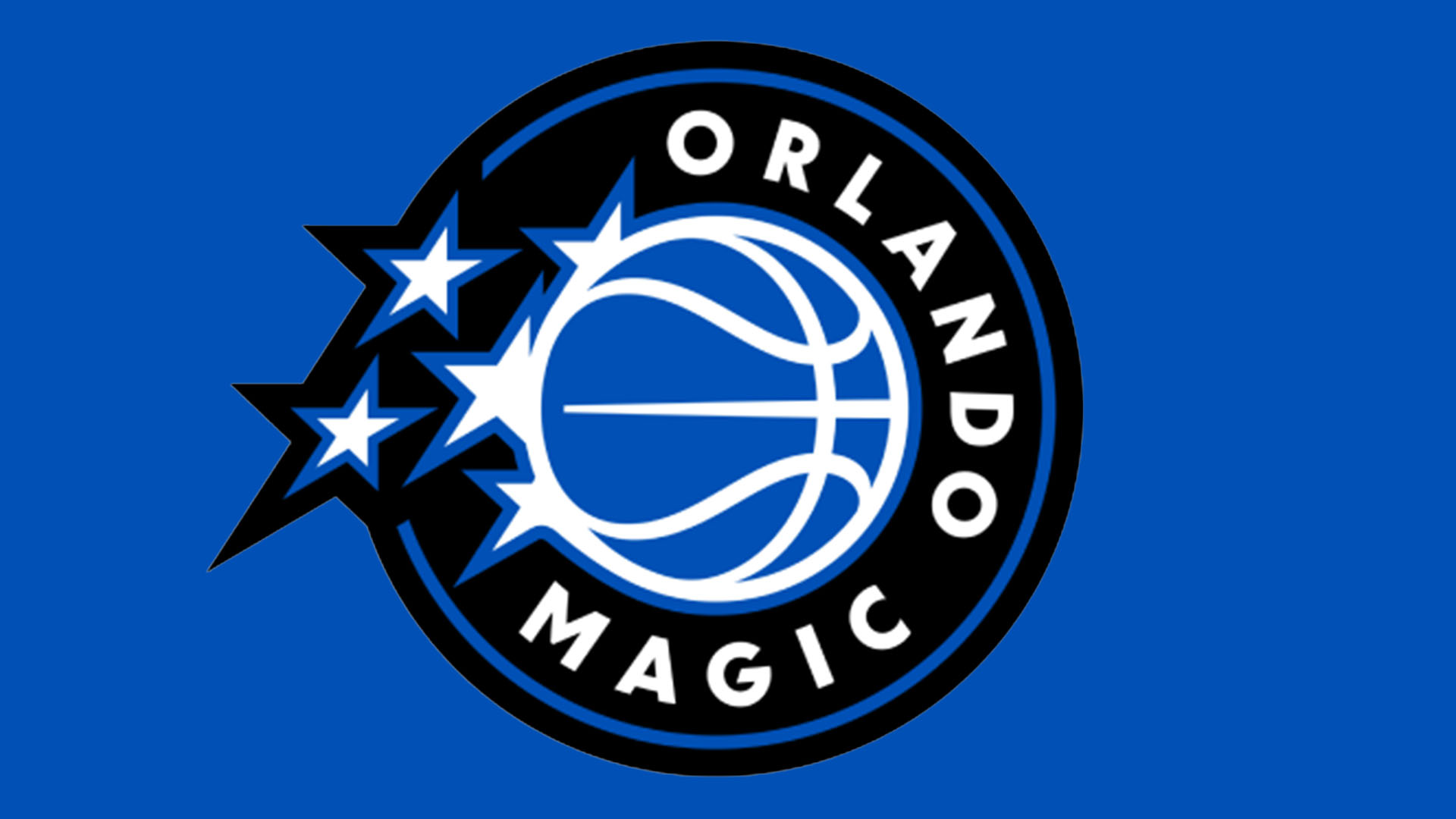
The star of the rebrand is the new Orlando Magic logo, featuring a basketball trailed by stars – a motif that has stayed consistent throughout the team's history. For a more concise emblem, the design has a circular frame accompanied by wrapping sans-serif text reading 'ORLANDO MAGIC'. Simple, modern and graphic, the design has a contemporary appeal that makes it feel current, yet fans thought the long overdue rebrand wasn't quite the slam dunk they expected.
Over on the r/nba subreddit, one fan commented, "Underwhelmed. The worst part to me is the font, 'Magic' is such an evocative term, and they just go with this corporate sans-serif treatment." Others called the design "bland" and "generic", while one fan questioned. "They've had one of the best logos in the league, and instead turn to the 'modern' circular-shaped boring logo. What's up with that?".
The backlash to the Orlando Magic's new identity only reinforces how important it is to carve a unique identity in the sporting sphere. Fans want their sports team to feel authentic – something that can't be achieved with trend-driven modern design. For more sports branding news, check out Angel Reese's new Reebok logo or take a look at Tyrese Haliburton's contemporary branding.