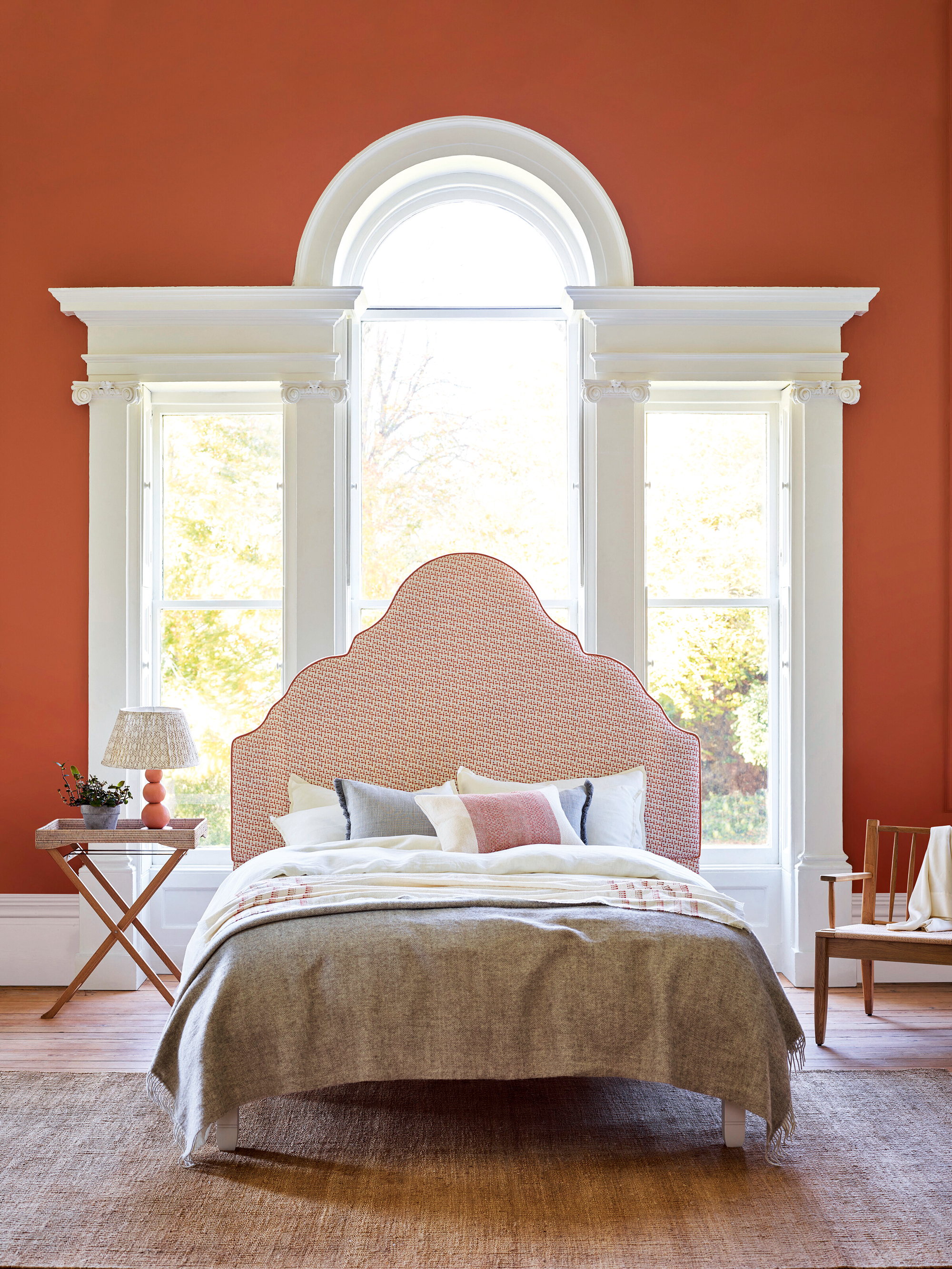
If you haven’t already considered terracotta decor instead of go-to neutrals, then you’re in the right place – this grounding color can be the key to anchoring a space and adding warmth to a bedroom, just as actor Naomi Watts has done to perfection.
F or a decorating scheme with year-round appeal, look no further than the spice and sophistication of burnt terracotta. A bold, fiery color tinged with hints of red and brown, it is zestier than earth tones, yet offers a smokier, more relaxed aesthetic than brighter hues. Terracotta provides decorating schemes with energy, while also imbuing a sense of warmth and calm.
‘A terracotta color scheme feels both cozy and uplifting,' says Natasha Greig, director, of Veere Grenney Associates. 'It has great depth, so when used in small rooms all over the walls, it makes the room feel more generous. For our work as designers, it is a perfect backdrop to almost all colors, so it is no surprise that we are seeing it used more and more in design.’
When it comes to deciding how much terracotta to use in a scheme, Sue Jones, Oka’s co-founder, says: ‘People can be a bit wary of using red as it’s naturally quite a vibrant color, but I think it all comes down to the tones you choose. Richer shades such as terracotta and blood orange can bring a real sense of warmth to a space. I would suggest using them as accent colors and mixing them with a calming, neutral palette.’
For a light, summery feel, contrast terracotta with a palette of white and off-white linen hues, as Naomi Watts has done in her sunshine-laden bedroom. For richer, jewel box interiors contrast a terracotta scheme with French Majorelle blues through to indigo and navy. Or for a more casual look, team with upholstery and soft furnishings in paler denim blues.
George Miller, a home designer at Neptune, suggests taking a tonal approach by ‘choosing other earthy hues that tone down a scheme, resulting in a bedroom that’s calm and soothing.’
Interior designer, Sarah Peake, founder, of Studio Peake extols the virtues of decorating with orange and terracotta: 'This is perhaps not a color palette people think about when designing a scheme – which is a shame as it can really stand out from, but also complement, a more neutral background as we have here with this blue and grey palette.'
Our favorite way to use this color trend is in small doses as an accent color. Dropping burnt orange into an otherwise neutral scheme by way of soft furnishings or as an accent wall offers a more measured approach to its use than painting a whole room.