Home decorator Lara Winter is one of Ideal Home's Open House contributors, sharing her thoughts on revamping a 200 year old cottage to make it right for modern family life. See the rest of her articles here.
I am often asked how I choose colours for our cottage.
The honest answer is that there is no grand plan.
I wish I could tell you I have a sophisticated colour strategy involving mood boards and design theory. In reality, most decisions involve me staring at paint swatches, making tea and hoping for the best.
Yet somehow, over the years, a few colour combinations have emerged that I come back to again and again.
The colour combination that gets the most compliments
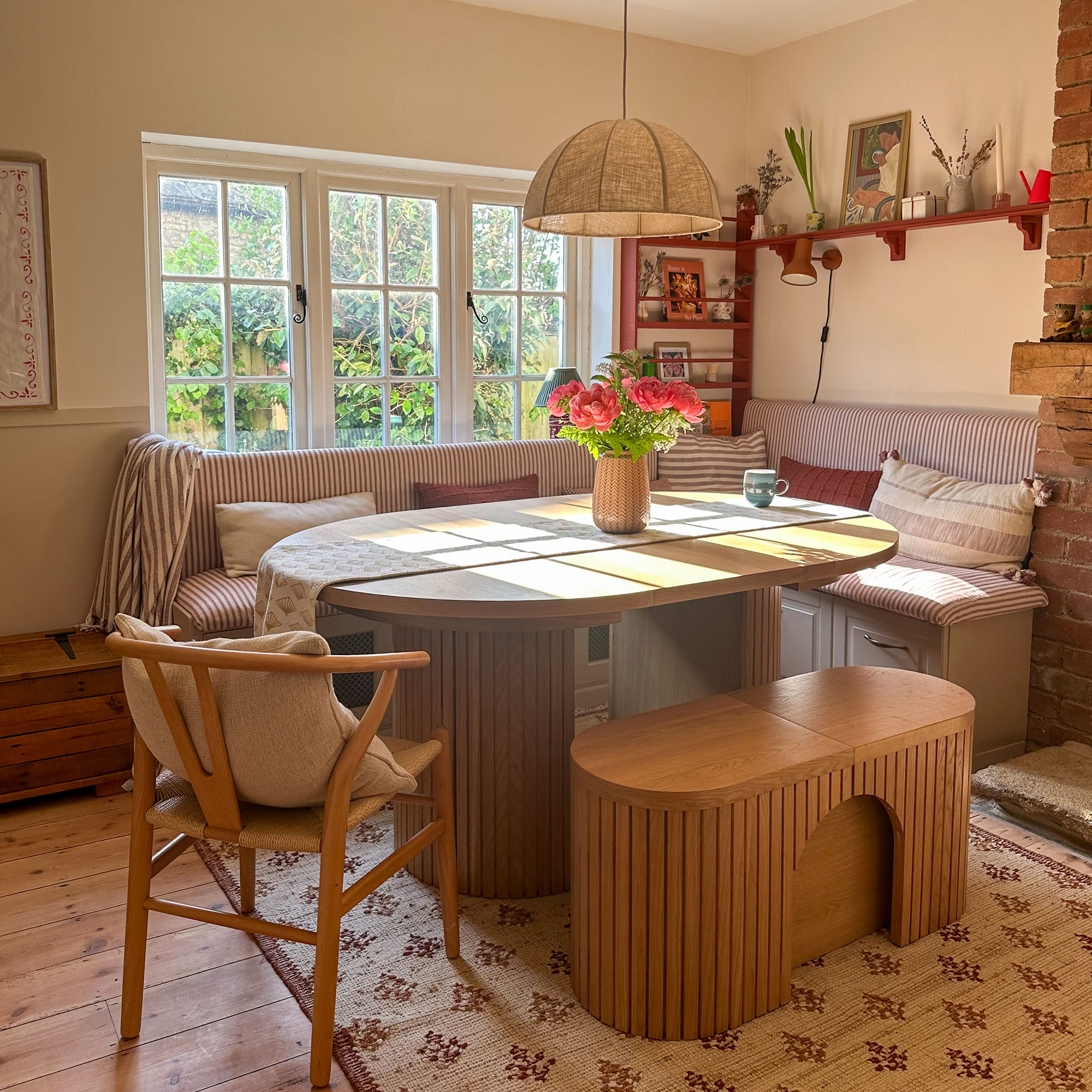
The first is in our dining nook. The walls are painted in a soft sandy beige, while the shelving is a deep firebrick red.
If you had shown me those two colours side by side ten years ago, I probably would have chosen one and rejected the other. Now I can't imagine the room without both.
The beige keeps things light and relaxed, while the red stops it drifting into boring territory. It feels warm, welcoming and slightly unexpected. Like the decorating equivalent of someone sensible wearing bright red lipstick.
It's probably the colour combination that gets the most compliments when people visit.
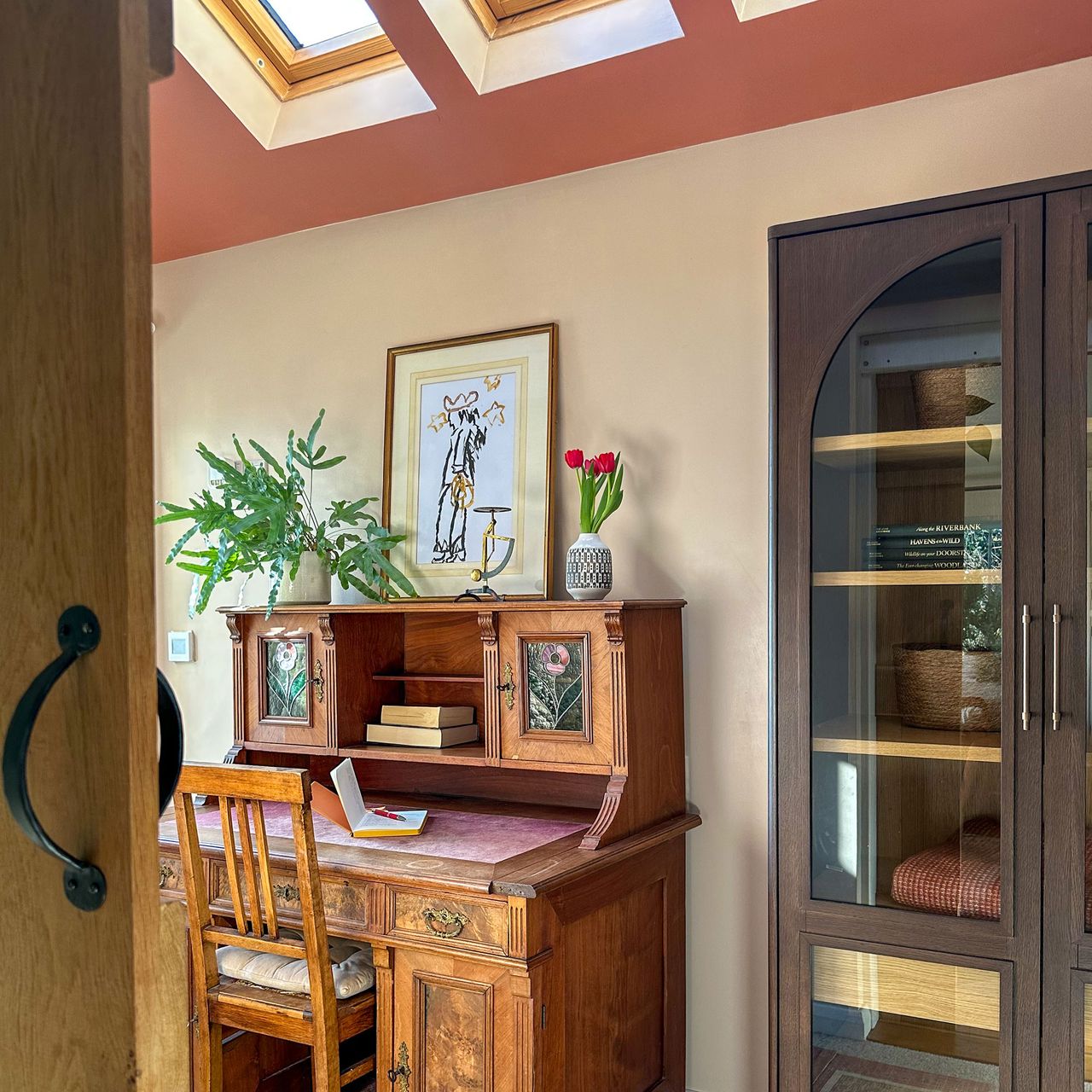
The ceiling colour that sounded like a terrible idea

My office contains another favourite pairing. The walls are Setting Plaster by Farrow & Ball, while the ceiling and door are painted in Red Earth.
I know what you're thinking. Painting a ceiling a darker colour sounds slightly unhinged.
I thought so too.
But the room has high ceilings and roof windows, so instead of making the space feel smaller, the darker ceiling somehow makes it feel more intentional. The soft pink plaster tones on the walls feel creative and uplifting, while the richer terracotta overhead adds depth and warmth.
It's the room where I write, plan projects and occasionally stare out of the window pretending I'm working. The colours seem to understand all three activities equally well.
The cosiest room in the house
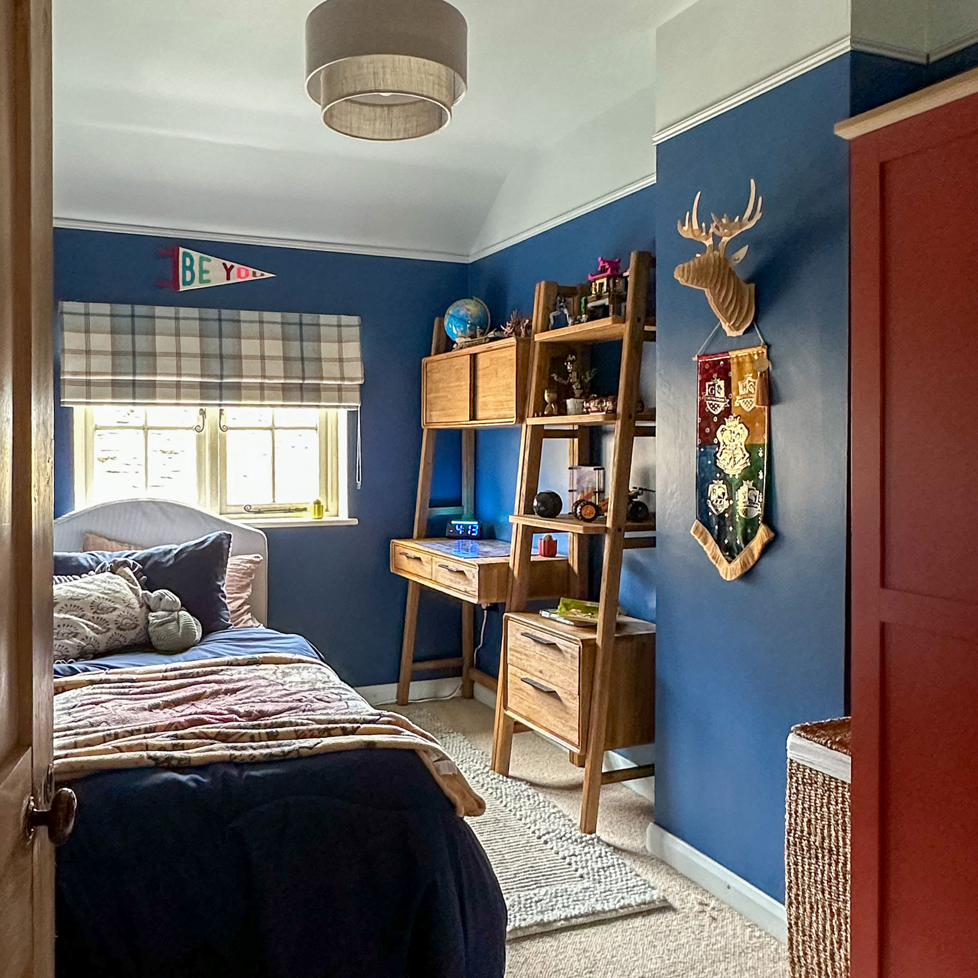
Then there is my son's bedroom. The walls are painted in Woad by Little Greene, a deep blue that immediately makes the room feel cosy. The ceiling is a much lighter blue, which helps lift the space and stops it feeling too serious. The wardrobe is painted in the same firebrick red that appears in our dining area.
I have noticed that children often end up with the best rooms. There is less overthinking. The room isn't trying to impress anyone. It simply feels calm, comfortable and safe. Exactly what a bedroom should be.
Looking around our home, I have realised that my favourite colour combinations all have something in common. None of them are particularly trendy. None of them were chosen because a design expert recommended them. And none of them looked especially exciting as tiny paint samples.
But together they create rooms that feel lived in rather than decorated.
Perhaps that is why I love them.
A soft beige needs a confident red beside it. A gentle pink becomes more interesting next to earthy terracotta. A deep blue feels even cosier with a lighter blue ceiling above it.
The best colour combinations aren't necessarily the most obvious ones. They're the ones that make you happy every time you walk into the room, even years after you've finished painting it.