The share of voters registered either with a minor party — or no party at all — has risen over the past decade. Out of all the counties that require a party affiliation on voting registration, three out of every four had a growing number of people eschewing the nation's two major political parties.
The trend cuts across geography and political tradition, showing up in rural Wyoming and suburban Philadelphia, in states trending red and states that have been blue for decades.
But the shift isn’t the same everywhere. In some states, both parties lost ground in roughly equal measure. In others, it was Democratic registration that gave way to both Republican and unaffiliated growth.
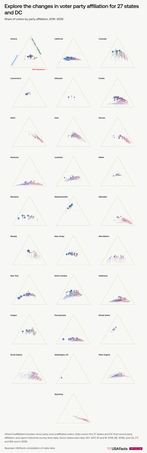
Colorado shows the first pattern most clearly. In 2016, the two major parties were nearly tied at around 30% of registered voters each, with unaffiliated voters already slightly ahead at 38%. By early 2026, more than half of Colorado's registered voters belonged to neither major party.
To see how these shifts played out, the charts below plot every county between three corners — Democrat, Republican, and Other/Unaffiliated. The closer a county sits to a corner, the more of its voters belong to that group. As registration shifts year to year, counties drift like snails, leaving trails so you can see where they’ve been.
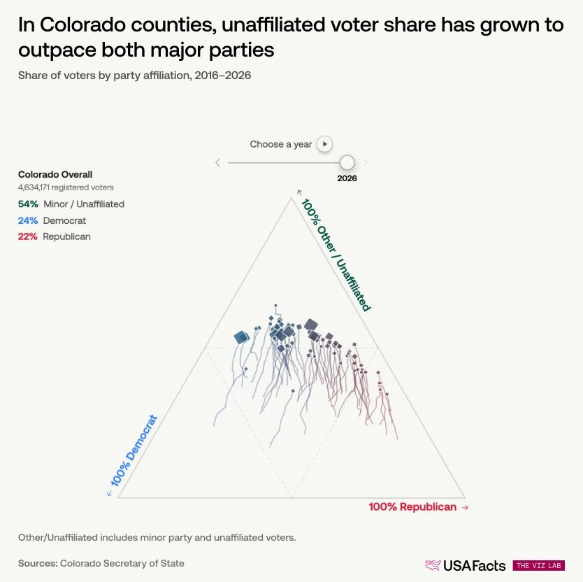
This shift in Colorado was nearly symmetric: unaffiliated and minor party registration climbed 16 percentage points over the decade, while both major parties lost ground in roughly equal measure.
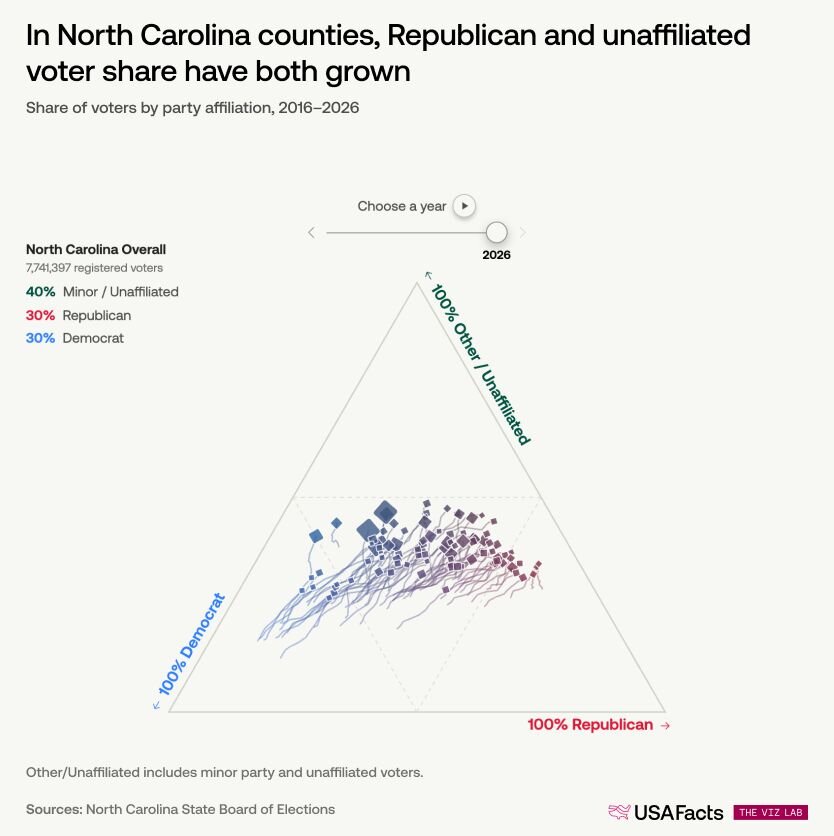
Not every state followed this path. In North Carolina, unaffiliated registration grew in every single county. The Republican share grew alongside it in in 78 of the state’s 100 counties. The Democratic share fell in all 100.
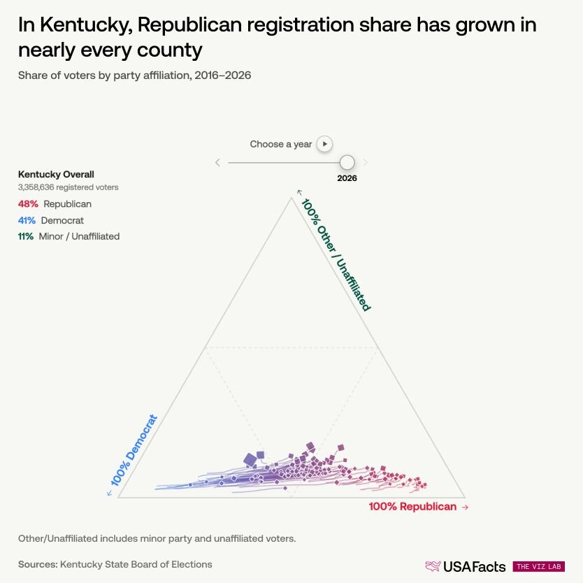
In Kentucky, the balance tipped even further. Unaffiliated registration grew in every county by an average of just two percentage points. The dominant shift was toward Republican registration, which grew in 97% of counties by an average of nearly 12 points.
Democrats held the largest share of registered voters in the state as recently as 2021. By 2022, Republicans had taken the lead and widened the gap every year since.
Colorado, North Carolina, and Kentucky each told similar stories: unaffiliated registration grew, but what happened with registration for the two major parties looked nothing alike.
The remaining states are no less varied. In some, both parties shrank and unaffiliated registration absorbed the difference, much like Colorado. In others, one party's decline was the other's gain. In a handful, unaffiliated share actually fell.
Partisan shifts were biggest in rural America
Within a single state, the shift in each party’s share often moved in the same direction across counties. But how far it moved depended on county type. In the states that track party registration, partisan shifts were largest in rural counties and smallest in urban ones. Unaffiliated growth did not follow that pattern, shifting around 2.5 percentage points across all three county types.
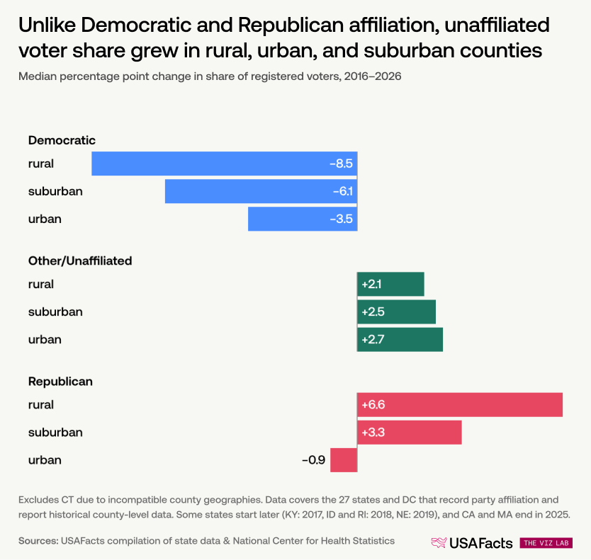
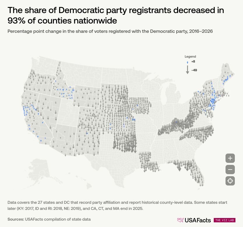
Democratic registration share fell across all county types, dropping the most in rural counties and the least in urban ones. Although Democrats remain the largest group of registered voters nationwide by total count, their share declined in 93% of counties — roughly 1,260 of the 1,360 that track party affiliation over time.
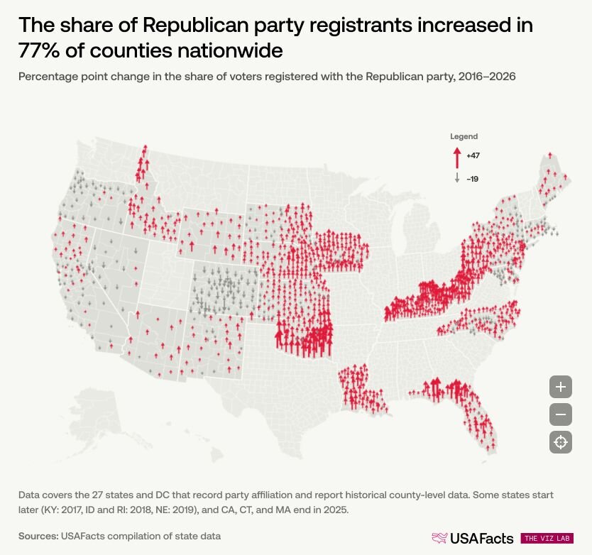
The Republican share of voters rose in 77% of counties, largely in the same rural areas where Democratic registration fell hardest.
Nowhere was the shift starker than in West Virginia, where the share of registered Democrats fell by more than 17 percentage points over the past decade. That’s a decline of roughly a quarter million people.
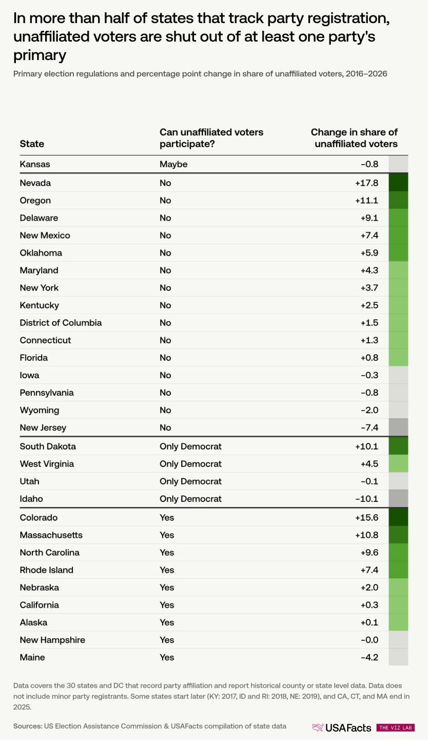
In many states, unaffiliated voters can’t vote on partisan issues in primary elections
Primary elections shape who appears on the general election ballot. But the rules for who can vote in them vary widely. Some states let any registered voter participate in any party's primary. Others restrict primaries to registered party members. In some cases, each party sets its own rules, so unaffiliated voters may be welcome to participate in one party’s primary but not the other. Even where both parties allow it, voters must typically choose one primary to participate in.
Thirty states, along with Washington, DC, report state-level party affiliation data. More than half of them exclude unaffiliated voters from participating in at least one party’s primary. That includes Nevada, where unaffiliated registration grew more than in any other state in the dataset.
What the data shows and what it doesn’t
The shifts described here are broad and consistent. But registration data has real limits. It captures what box someone checked on a form, not what they did in a voting booth. A voter who switches from Democratic to unaffiliated may still vote for Democratic candidates. A newly registered Republican may not show up to vote at all.
The data also can't distinguish between different kinds of change. A county where Democratic registration share fell by 10 points might have longtime Democrats who switch to unaffiliated but keep voting for the same party, or new voters registering as Republican, or inactive voters being removed from the rolls, or all three. The net shift is real, but the individual stories behind it aren't visible in the data.
Voter registration data for this analysis came from official state sources — typically the secretary of state's website — for the 27 states and Washington, DC, that record and publicly report party affiliation at the county level. To be included here, a state needed:
- Data available through at least 2025
- History extending back to somewhere between 2016 and 2018
- Party affiliation reported at the county level (not just statewide)
Because states publish registration snapshots at different frequencies, we standardized the time series by selecting the report closest to November of each year. The most recent data point is generally from early 2026. The arrow maps compare each county's earliest available report against its most recent; the ternary charts show every available annual data point, though coverage varies by state — some states did not publish data for every year, particularly non-election years.
A few other notes on the data:
- Start and end years vary by state. Most span 2016 to 2026, but some start later (Kentucky: 2017; Idaho and Rhode Island: 2018) or end earlier (California, Connecticut, and Massachusetts: 2025).
- Three states (New Hampshire, Utah, and Alaska) had historical data at the state level but not the county level, so they appear in the primary election table but not the county-level charts.
- Active vs. total voters: In states that distinguish between active and inactive registrations, only active voters are counted. Where no such distinction exists, all registered voters are used.
- "Other/Unaffiliated" combines any registration outside the two major parties — minor parties, no party, or unknown affiliation.
- Urban/rural classification uses the 2023 CDC/NCHS Urban-Rural Classification Scheme , collapsed into three groups: urban (large central metro), suburban (large fringe, medium, and small metro), and rural (micropolitan and noncore). Connecticut is excluded from this part of the analysis because the NCHS scheme couldn't be mapped to the county boundaries used in Connecticut's election reporting.
- The urban/rural comparison chart uses the same earliest-to-latest window for each state, which means counties from a small number of states reflect a slightly shorter time span. This has a modest effect on the magnitude of shifts shown, but not on the directional pattern.
- Primary election rules are sourced from the US Election Assistance Commission . For states the EAC classifies as partially open or partially closed — where participation rules are left to each party's discretion — we reviewed current reporting from each party to determine their most recent decision (2026 where available, 2025 otherwise).