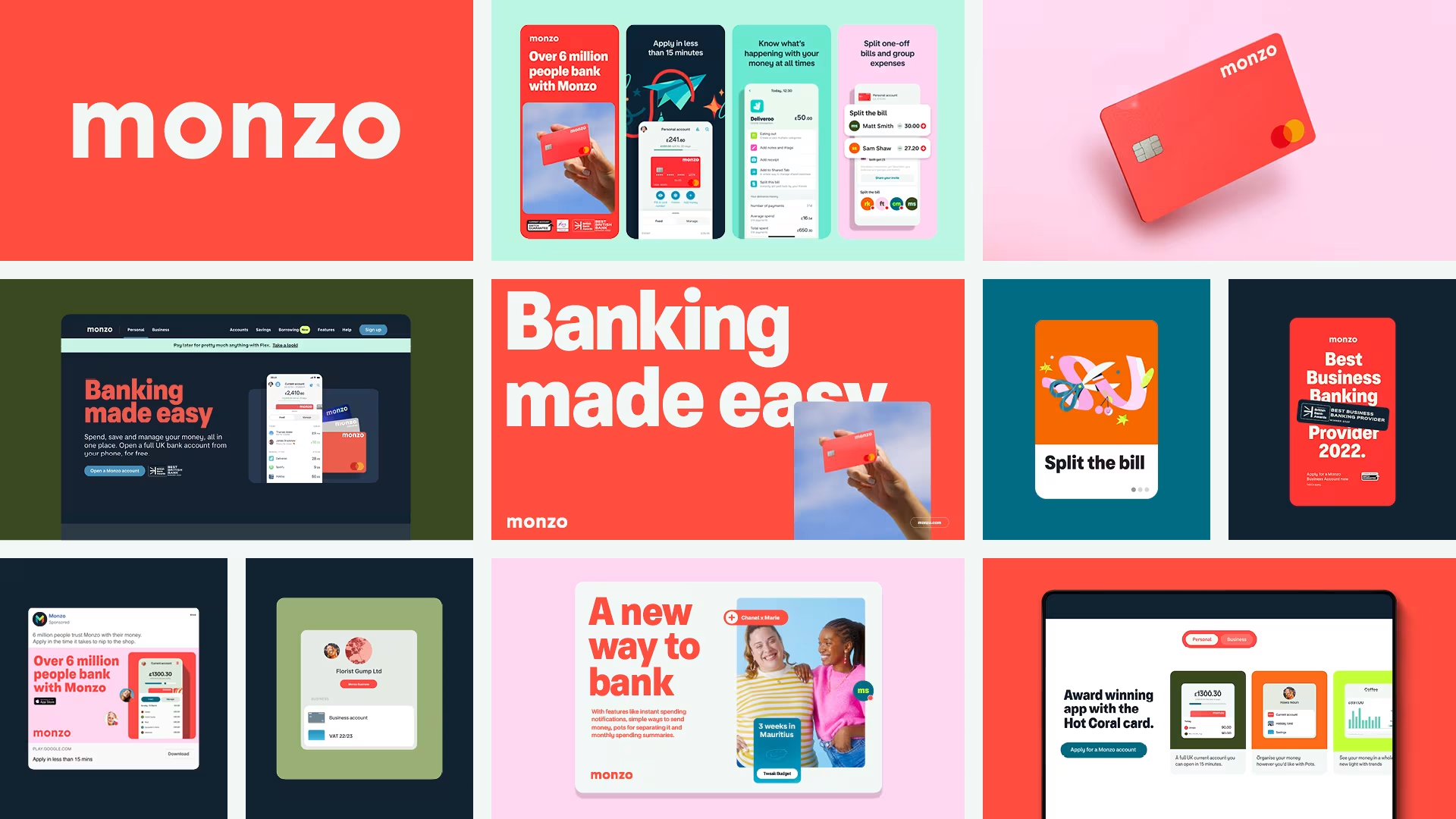
I've had the Monzo banking account for almost 10 years now. When I first got it, its clean UI and uncluttered interface was revolutionary and the bright orange branded cards made me feel like I was part of a special club.
A decade on, the orange cards are everywhere and it seems that traditional banks still haven't caught up with Monzo, although I do realise there are now plenty of Monzo competitors.
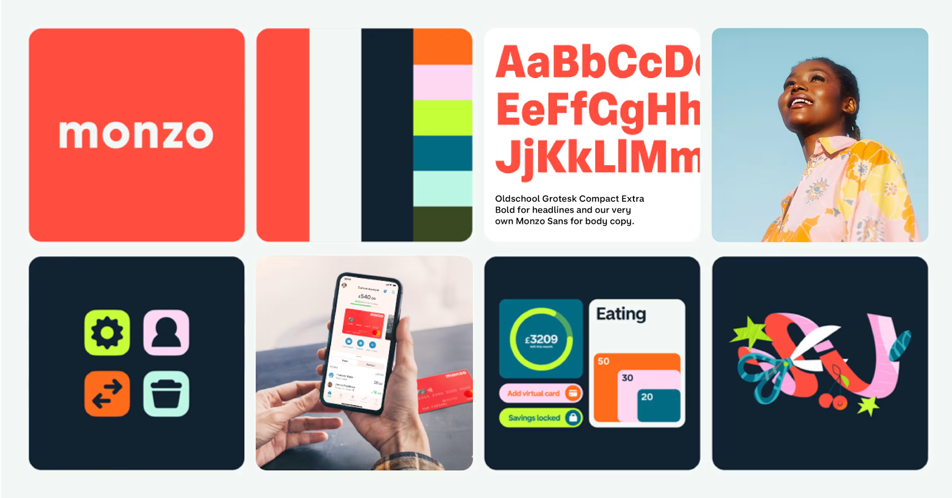
I was explaining the app to someone that hadn't used it recently, and realised that I mainly like it because the branding is on point and the user experience is far superior to other banking apps. Here's what I like about the UX/UI.
For other apps I like, see my favourite gardening app Hota. Elsewhere, you can read about my beef with Google Maps.
01. It shows you what you've spent
This might seem obvious but it's not a given on banking apps. My Nationwide app doesn't show me how much I've spent in a day, it just shows me what my balance is. This makes it more difficult to tally up what I've spent on a particular day and work out how much my monthly direct debits cost, for example.
As the user interface on Monzo shows my balance at the top of the screen, I am able to see both how much I've spent and how much I've got left at a glance.
02. Transferring money is easy
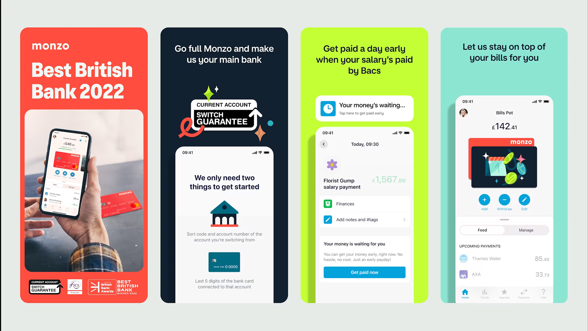
In other banking apps, adding a new payee can be a pain. There are card readers to contend with and what seems like endless identity checks. In Monzo, it takes a limited number of clicks to transfer your cash. You can transfer money to someone using just their phone number, and you can send them a link to pay you with.
Monzo checks new payees are legitimate with a trusty green tick, and with this reassuring UI, you know you're at least sending to the right person.
03. Check trends in spending
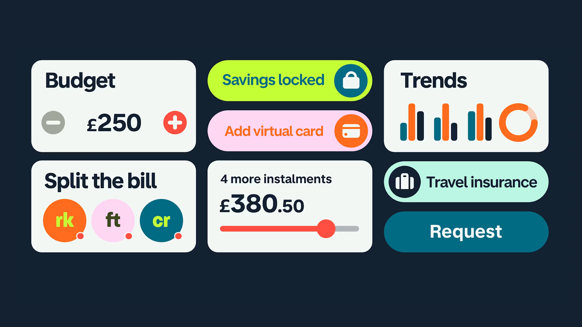
Monzo has changed the way it displays trends in spending and I must admit I preferred the previous interface, but it is still handy to be able to see at a glance how much you've spent in different categories, such as Transport, Shopping and Eating Out in a month or a year (though whether anyone needs to know how much they've spent on Eating Out in a year is debatable).
04. Splitting the bill is fun
I don't use this function often but you can easily split a bill within the Monzo app, and you can also do this for ongoing household expenses. Fun little animations show how it works and the amount each paying and who you're splitting with is really clearly laid out on the screen. This is another case where the user interface makes it really clear what's going on, which is exactly what you need in a banking app.
Overall I love the user experience of using Monzo and find it preferable to other banking apps I've tried.
What's your favourite banking app in terms of UX/UI? Let us know in the comments.