Wondering what's going to be hot in typography in 2024? Monotype's annual typography trends report is one of the annual forecasts that we most look forward to here at Creative Bloq, and this year's installation has just been released.
As expected, the 2024 typography trends report makes fascinating reading, revealing, plenty of juicy ideas, with some fun names for the different trends that the type giant is observing. From the Return of the Serif to EVERYTHINGALLOFTHETIME, here are some of the highlights. See our pick of the best typography tutorials if you need to learn more about all things type.
EVERYTHINGALLOFTHETIME
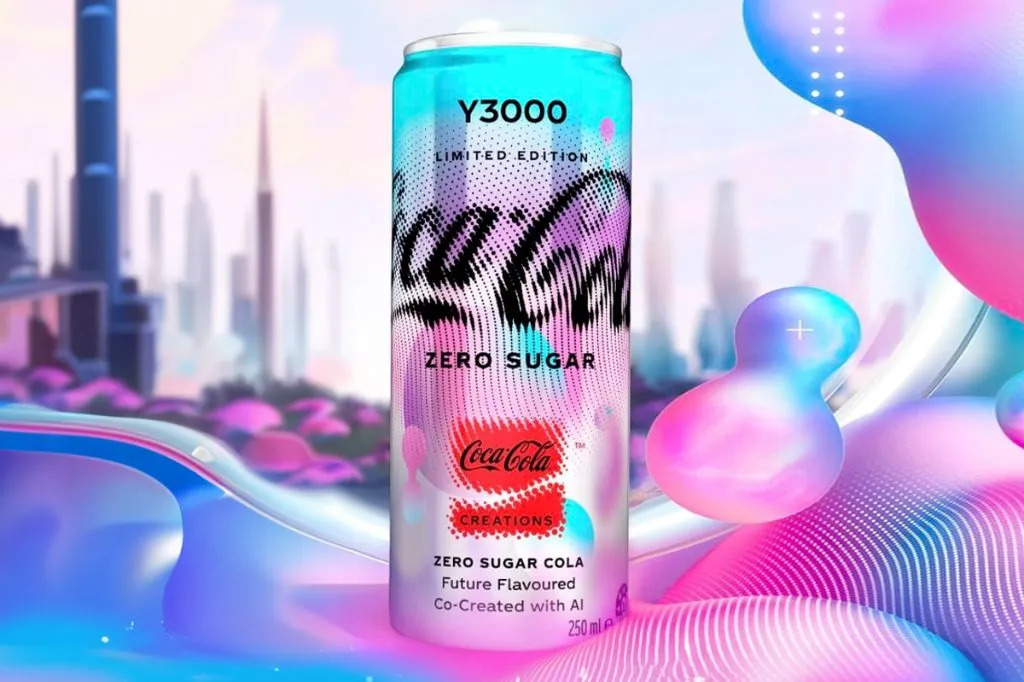
As the amusing name implies, 'EVERYTHINGALLOFTHETIME' refers to the philosophy of “more is more". It's loud; it's maximalist. It's all the colors, textures and typefaces you can "reasonably fit in a design". Examples cited in the report include Pentagram partner Eddie Opara's work for Ben’s Best Binz, or B3, the new cannabis company founded by Ben Cohen of Ben & Jerry’s Ice Cream fame, and Coca-Cola’s packaging for its limited-edition 'co-created with AI' Y3000 flavour, which rendered the brand's iconic Spencerian script in fluid dot clusters.
Whatever
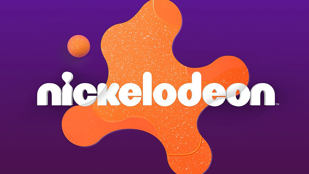
You'll have realised by now that the Monotype trends report opts for more evocative names than the usual utilitarian 'Retro colours' or 'Groovy gradients'. The trend it dubs 'Whatever' is linked to ongoing resurgence of ‘90s nostalgia as gen Z and millennials come of age. Again, this means a wide spectrum of styles, "from nihilistic grunge to colorful pixel play". Yes, there are digital gradients. Also big, bold type and drop shadows. Examples include the many Barbie collabs that sprang up around last year's movie, design studio Roger's Nickelodeon rebranding and the simple but chunky new Jell-O logo.
De-form
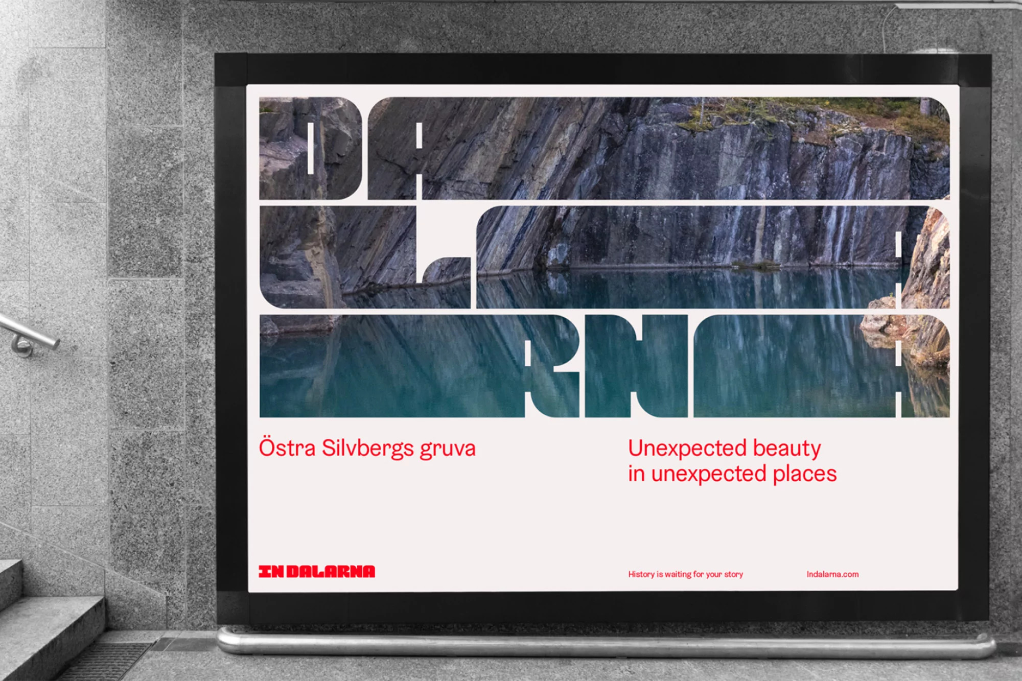
De-form is described as a trend that "breaks typefaces beyond their skeletons". It "pushes them up to the final sub-pixel and wants still more canvas grab", encouraging designers to use methods of typographic distortion that have been discouraged for decades by mistreating weight balance, width consistency and letter proportions for our viewing pleasure. Monotype suggests that it could be emerging as a response to play-it-safe 'blanding' and clean, tech-centric aesthetics or even as a response to the social and political climate.
Examples include Studio Kiln's identity for the Royal Television Society’s Cambridge Convention and the identity for Sweden's Dalarna region created by Stockholm design agency Soderhavet and Placebrander.
Quirk
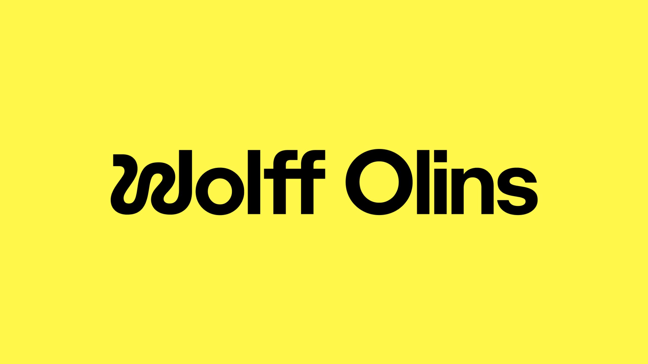
The 'Quirk' trend is defined by type that surprises with a bold detail: something small but unexpected that winks at the viewer and stands outs and feels looser than the broader typeface. It's about finding a balance between comfort and a touch of chaotic energy. Examples provided include the new logo for Wolff Olins, where the “W” in the wordmark does nearly all the work, contrasting with the clean, orderly, and professional-looking sans-serif.
PROFESHINAL
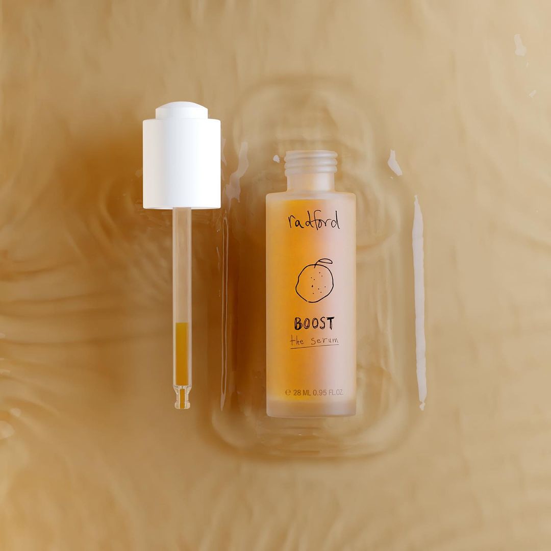
Speaking of professional looking, another trend highlighted in the report is dubbed: 'PROFESHINAL': professional but with a twist. Again, there's a quirkiness about it, but it's constrained, reserved within formal, more sober bounds. "If the world of graphic design strives to produce perfect creations, this trend offers a counterbalance by celebrating perfectly imperfect designs that are proudly and unapologetically authentic," Monotype says. As an example, it highlights Day Job's rebrand of Radford Beauty to highlight product over packaging.
Return of the Serif
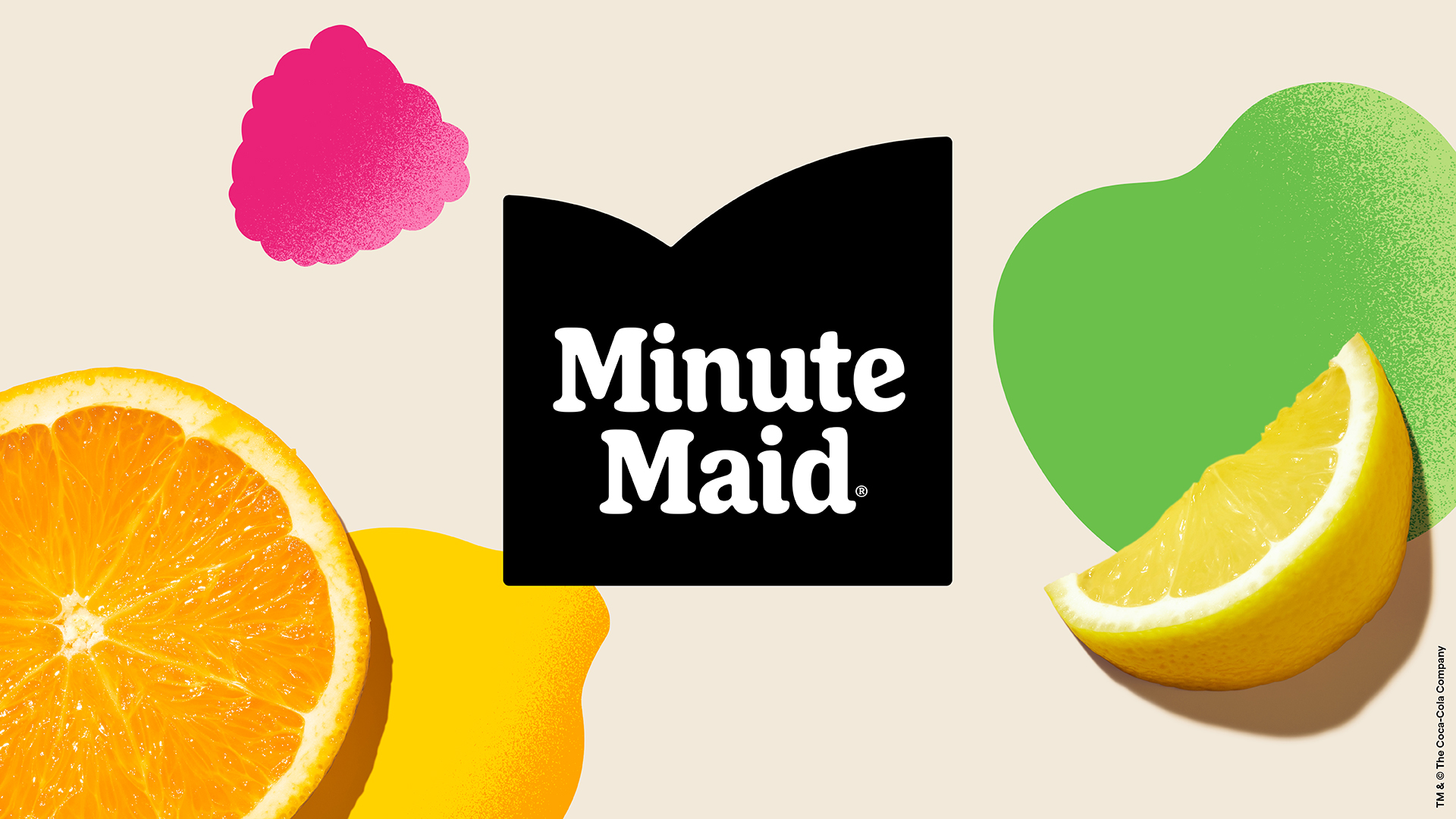
And finally, serifs are back. Hurrah! This isn't the first report to note this, and we've pointed our some examples ourselves over the past year, including the new Burberry logo. As Monotype notes, the minimalistic approach and typefaces like Helvetica have reigned supreme for years, but a more classical look appears to be making a resurgence. It's suggested that this may be due to the comfort that tradition can provide amid more complex surroundings: creating a "demure and serious tone but equally a lighthearted and familiar embrace". Examples here include last year's Minute Maid rebrand.
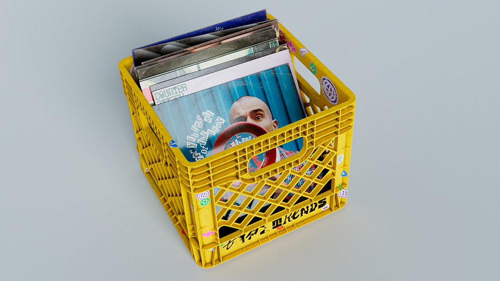
To explore these trends and more in detail, download Monotype's full 2024 trends report, which includes album cover mock ups highlighting each trend. You can also compare its forecasts to our own roundup of typography trends for 2024.