Monochromatic color schemes are often favored by interior designers when it comes to decorating with color, offering depth and boldness while maintaining cohesion.
If you're wondering what is a monochrome color scheme exactly, it's where one color is used throughout a room in various tints, shades, and tones. While a monochromatic color scheme can lean colorful – imagine various shades of blue used to dress a room – it's an equally effective color theory for pared-back rooms, where soft neutrals are layered throughout.
While contrasting colors create boldness, a monochrome palette can feel more restful and calm, while still allowing vibrant hues to be used. Below, we've rounded up a selection of our favorite monochromatic room color ideas to give you some inspiration for your next decorating project.
1. Layer neutrals on neutrals
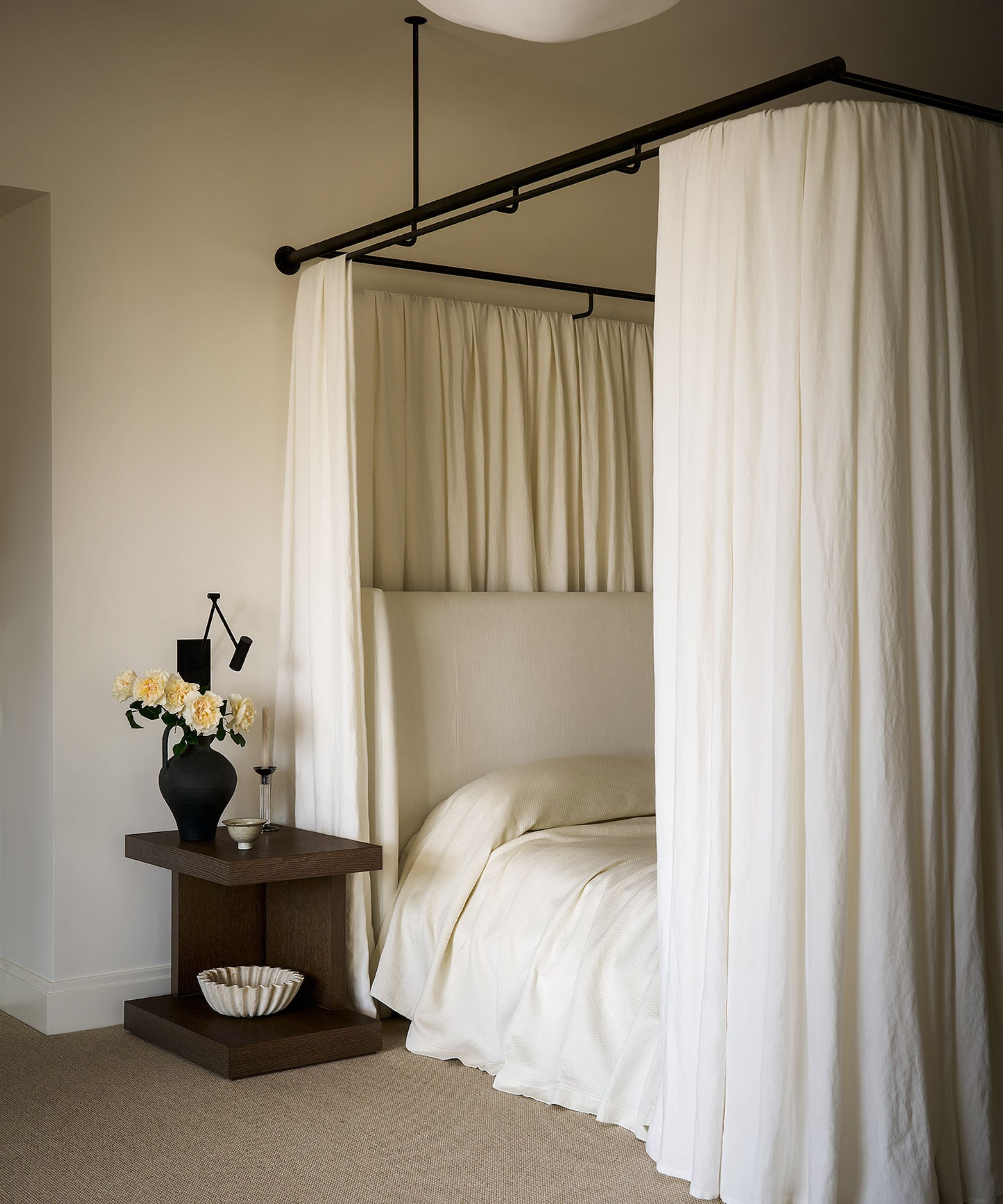
This relaxing bedroom is a lesson on decorating with neutrals. While the color palette reflects the pared-back nature of neutral tones, the success of the space is all about the use of texture.
'Beige is a tough color, so I like to be thoughtful and provide interesting contrast in similar tones but done through texture,' shares the interior designer Diana Wagenbach of Chicago-based Studio W. 'The colors I used were warm whites like Benjamin Moore's White Dove, paired with textures like limestone and ivory drapery on the custom canopy.'
'I think monochromatic schemes work well if used with texture and tone accordingly,' Diana adds. 'When you bring in some visual interest that way, it feels warm and interesting.'
2. Wow with pink
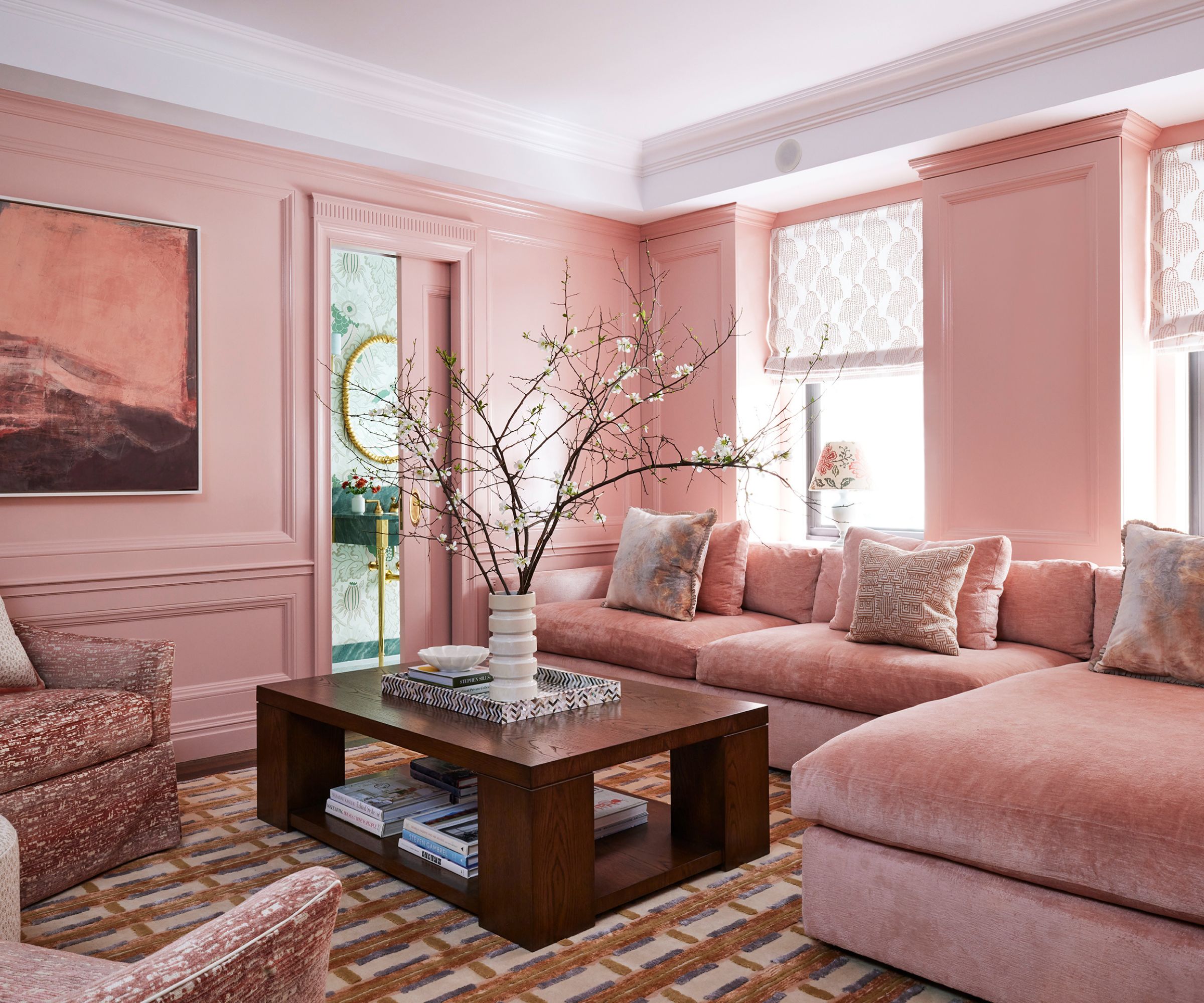
A monochromatic scheme is a great way to make a statement, especially when you turn to playful hues such as pink. While the interior designer of this space, Lisa Frantz Interiors, admits that decorating with pink can seem bold, she explains why it made the perfect choice for this family room.
'The homeowner is from Texas, and she loves very feminine colors and patterns,' says Lisa. 'When I presented the idea of a pink family room, she loved it but was worried that it would be difficult to find a pink that would still feel sophisticated without leaning too far into Barbie-core. We chose Benjamin Moore's Desert Rose and gave it a high gloss finish to make this dusty pink come to life.'
'The fleshy undertones of this pink almost make it feel like a neutral. Also, the second-floor apartment can feel a little dark in the winter, and Desert Rose gives off Bermuda-pink sand beach vibes that create a brightness all year long,' Lisa adds.
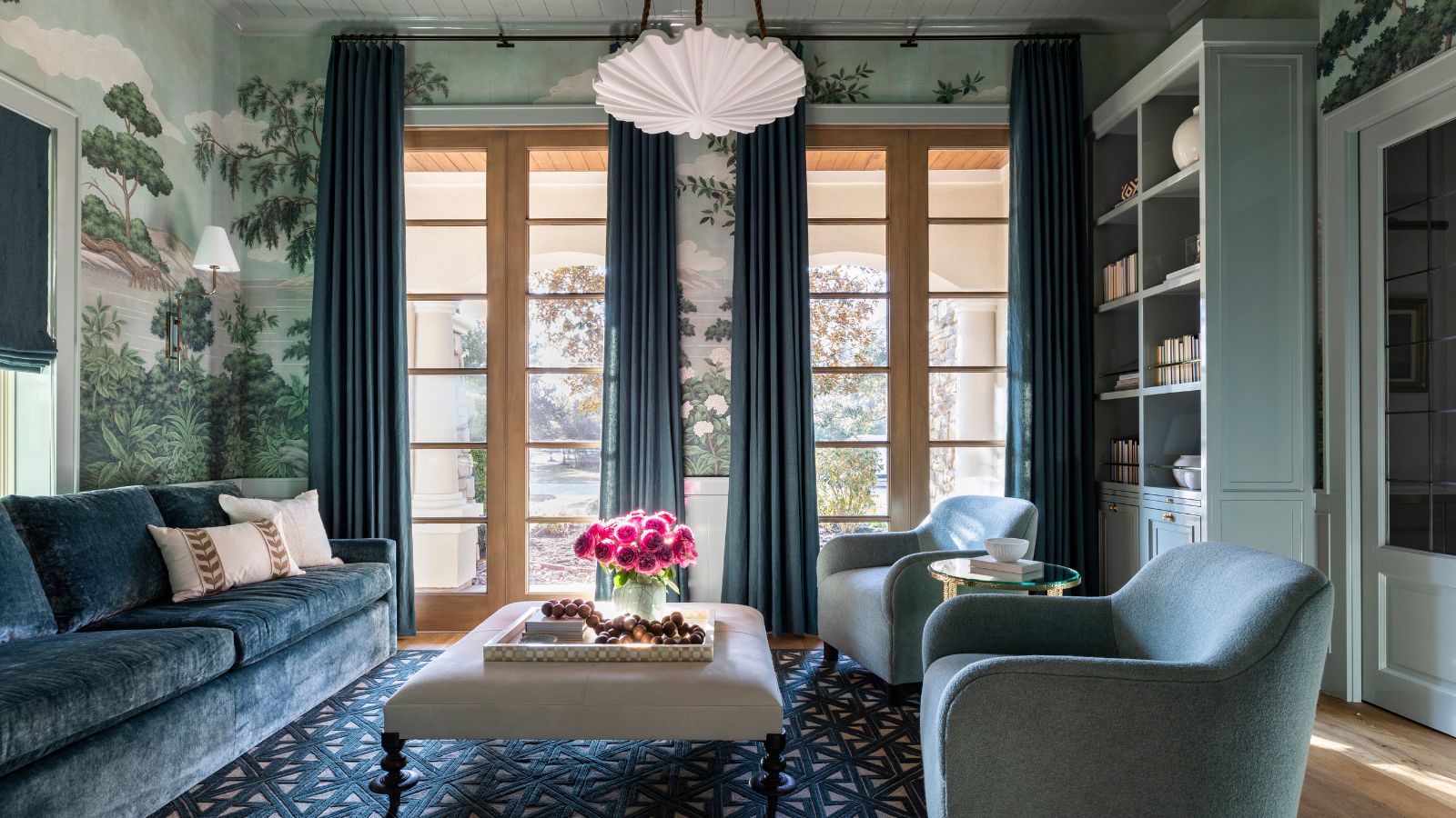
3. Create calm with blue
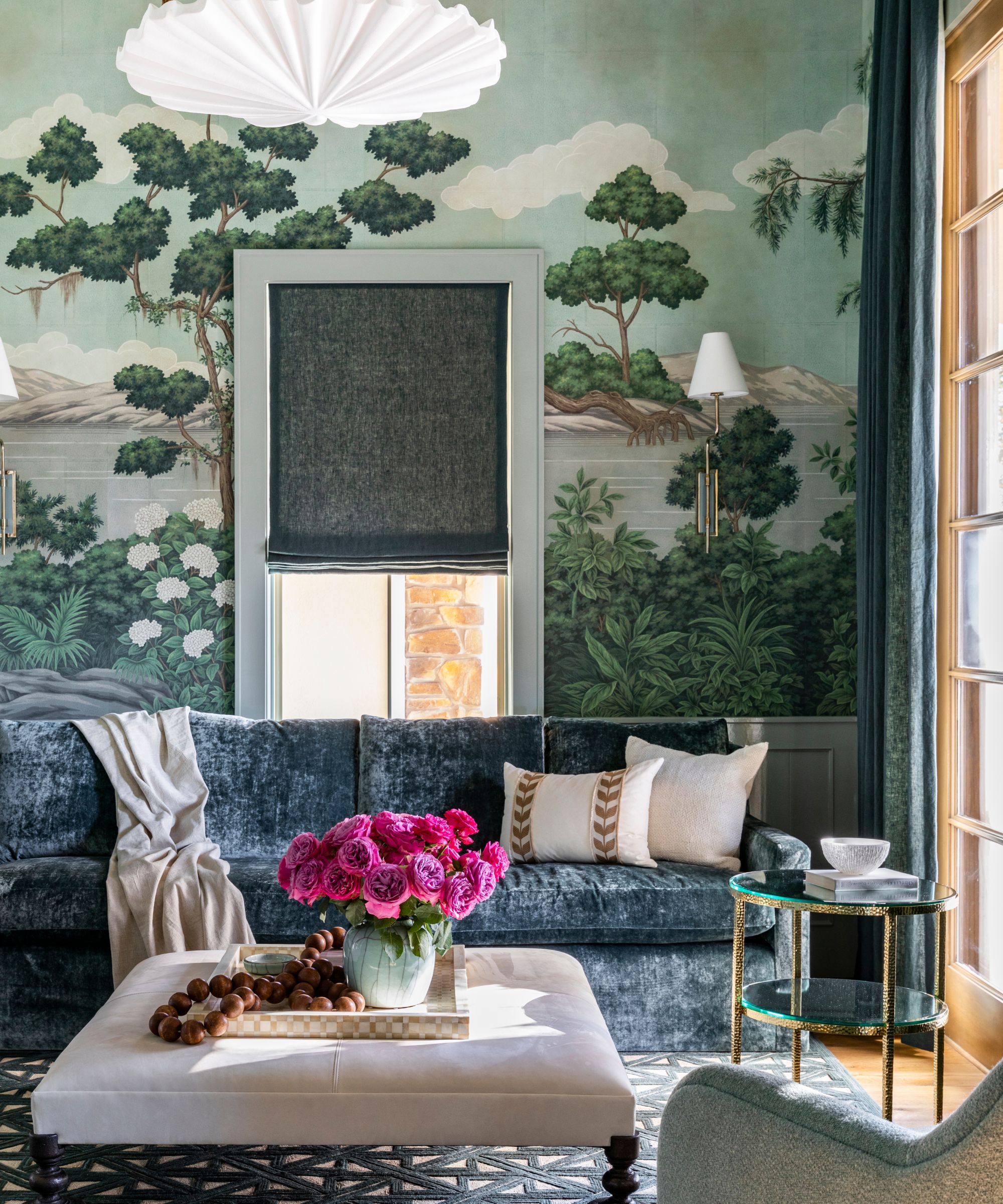
'In this space, the monochromatic color scheme was a deliberate choice to evoke a sense of calm and cohesion,' explains Houston-based interior designer Marie Flanigan. 'By layering varying shades of blue – from the custom wallcovering to the built-in cabinetry and upholstery – we created a room that feels immersive and grounded in nature.'
Decorating with blue is an effective color choice if your aim is to create a feeling of calm, and as shown in this living room, it can feel warm and inviting when various tones are incorporated.
'The subtle shifts in hue offer depth without distraction, and by carrying the color story across materials – paint, fabric, glass, and wood – the room feels harmonious and thoughtfully composed. It’s a way of inviting serenity into the space while still making a visual impact. Monochrome doesn’t have to be quiet; when done well, it speaks volumes through restraint,' says Marie.
4. Decorate with neutrals in a bathroom
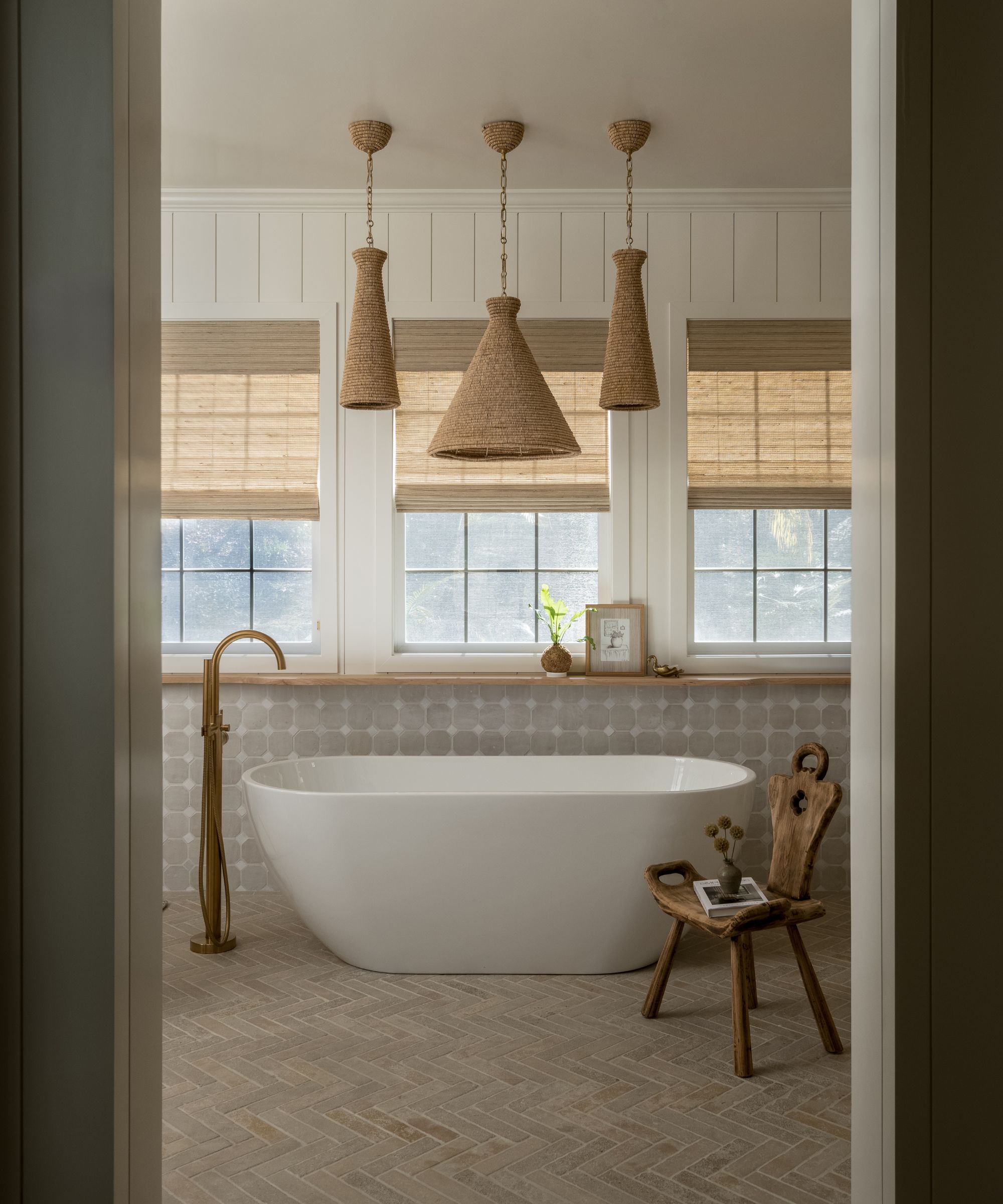
Creating a feeling of calm, thoughtfully layered warm neutrals used for bathroom color ideas is a wonderful way to channel a monochromatic scheme.
'We wanted these tired parents to have a spa-like space to retreat to at the end of the day, so we went with calming earthly tones to achieve that,' says the interior designer of this neutral bathroom, Kristyn Harvey. 'Layering monochromatic colors allows the eye and brain to rest and creates that feeling of peacefulness.'
'Since beige is in the warm color family, I like to pair it with warm whites such as Swiss Coffee by Benjamin Moore and brass hardware, as well as shades of taupe that pair nicely with a warm white, and I also love to add in white oak wood tones,' Kristyn adds.
5. Color-drench with a saturated paint shade
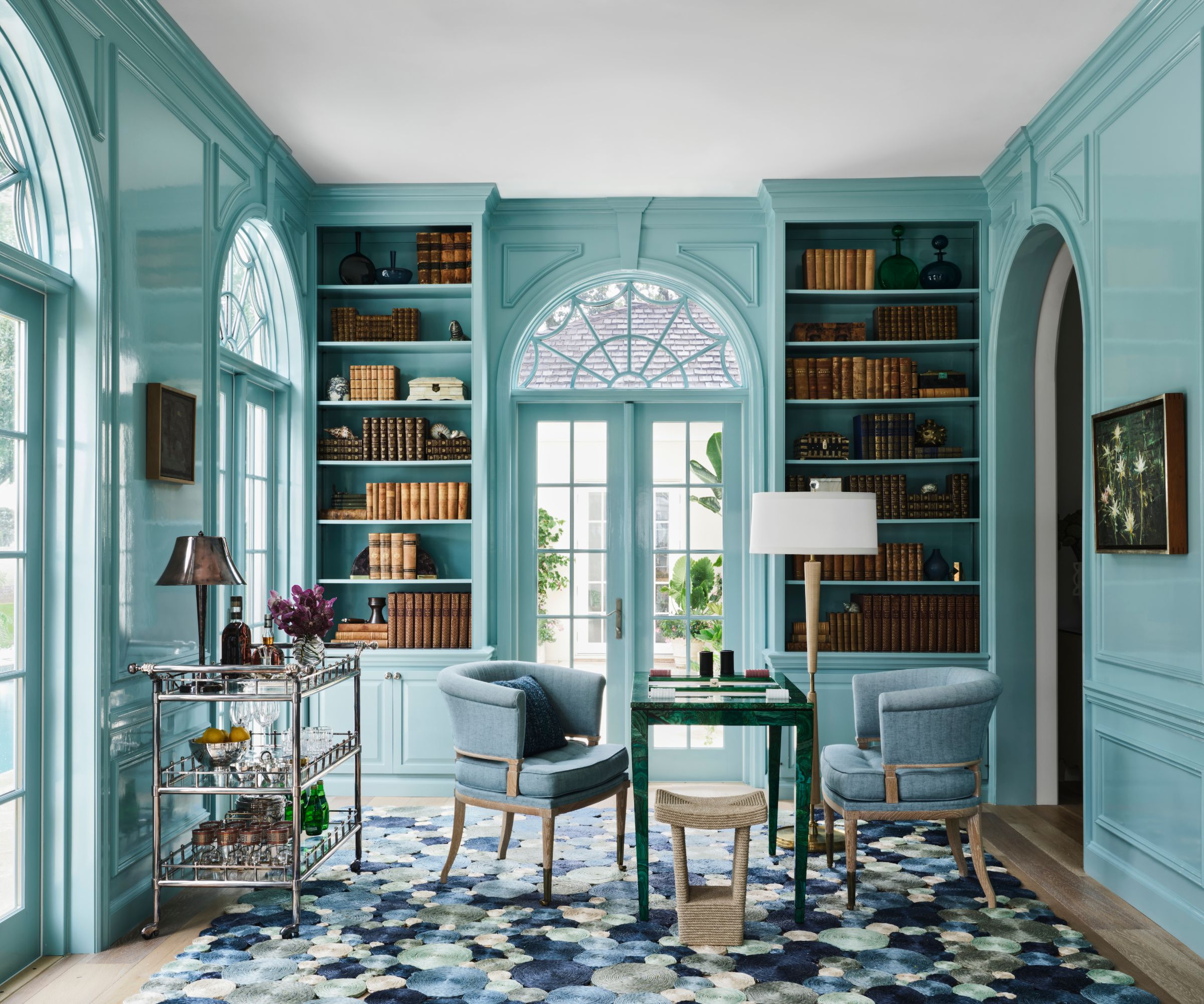
Color-drenching ideas go hand in hand with monochromatic schemes, allowing your chosen color to coat all the walls for a statement look. In this case, a warm shade of blue adorns this library room, while cooler powder blues complete the monochrome scheme through the rug and accent chairs.
'Saturated or moody monochromatic schemes are wonderful in that they create an immediate sense of warmth,' explains the Dallas-based interior designer Doniphan Moore. 'These color palettes, if used effectively, even with a slightly mismatched element, can be completely enveloping and feel effortless.'
6. Create a cozy living room with dark hues
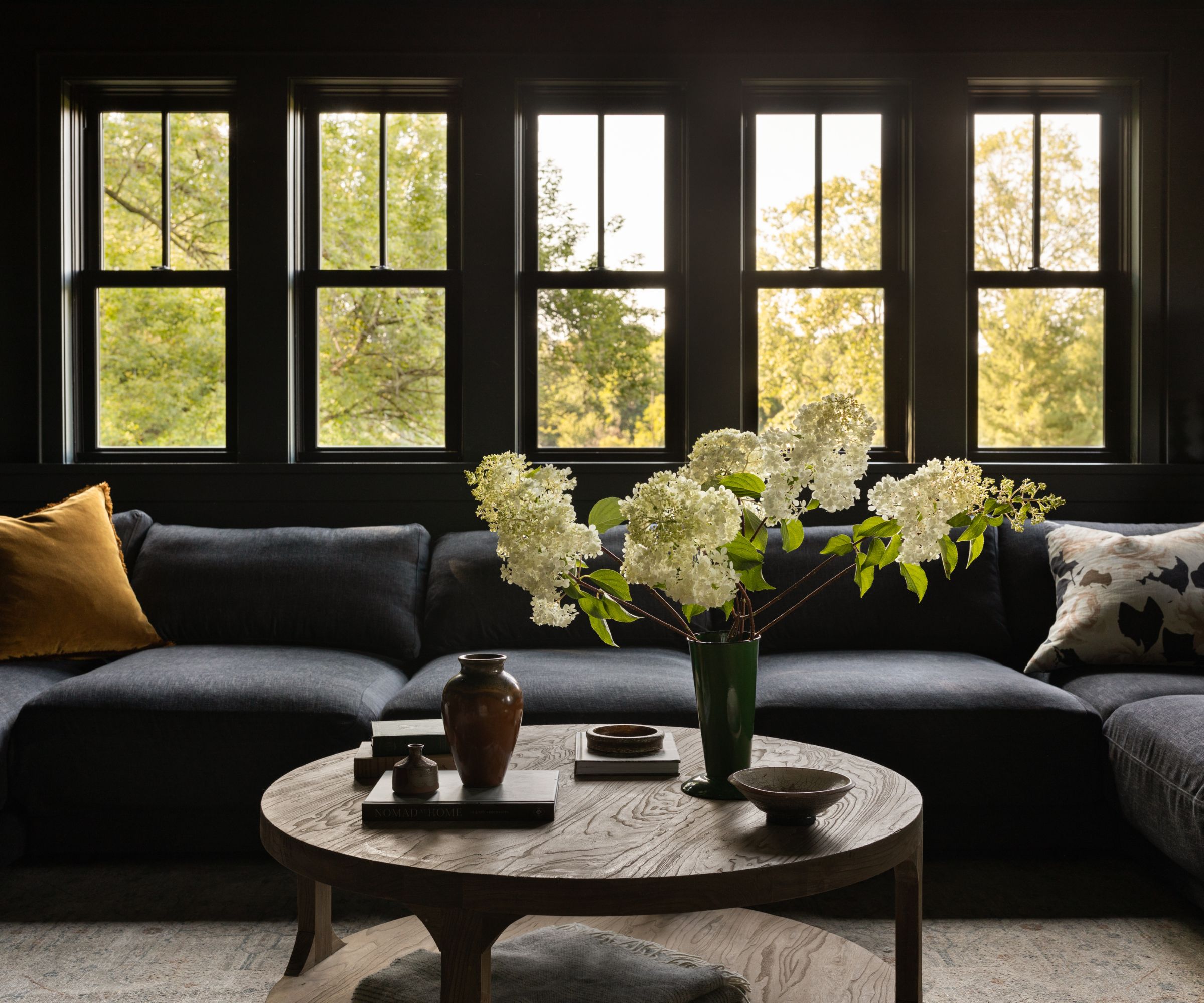
In this dark living room, a color palette of deep blues and greens creates a cozy feel. While lighter hues are often used in living spaces, the use of dark paints here proves how effective a bolder approach can be in making the space feel more intimate.
'In this living space, deep blue-green walls wrap the room, matched by a similarly saturated blue sofa,' says designer Lucas Goldbach, partner and design director at En Masse Architecture & Design. 'The cohesion of tone creates a cocooning effect: it’s a space meant to feel restful and private, a retreat from the brightness of day and a nice place to take a nap away from the sun. The monochrome allows the eye to rest, while subtle shifts in hue (copper in the pillows and coffee table) offer warmth and richness without breaking the mood.'
7. Keep the walls white and add color through decor
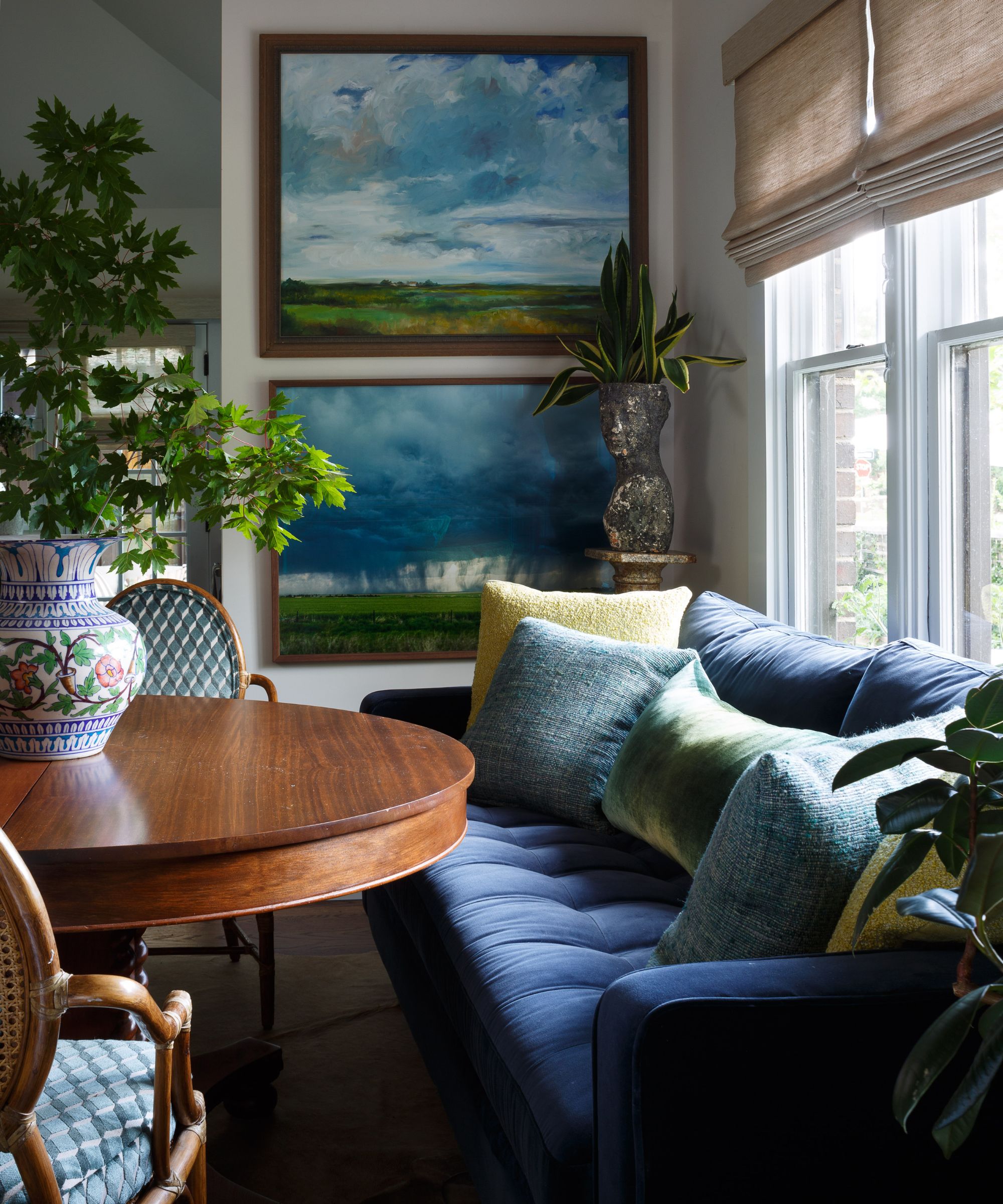
If you prefer a more understated look, consider keeping your walls white while adding your color through decor. In this cozy nook, interior designer Nadia Watts used a palette of blues and greens to create a more subtle monochrome scheme.
'Using a monochromatic scheme – like layered shades of blue – creates a cohesive, calming environment,' says Nadia. 'This approach brings depth and interest through variations in texture and tone, all while maintaining a sense of visual harmony. I’ve found that clients often gravitate toward blues and greens before exploring bolder hues; these colors feel both familiar and restorative.'
8. Choose a tonal white palette
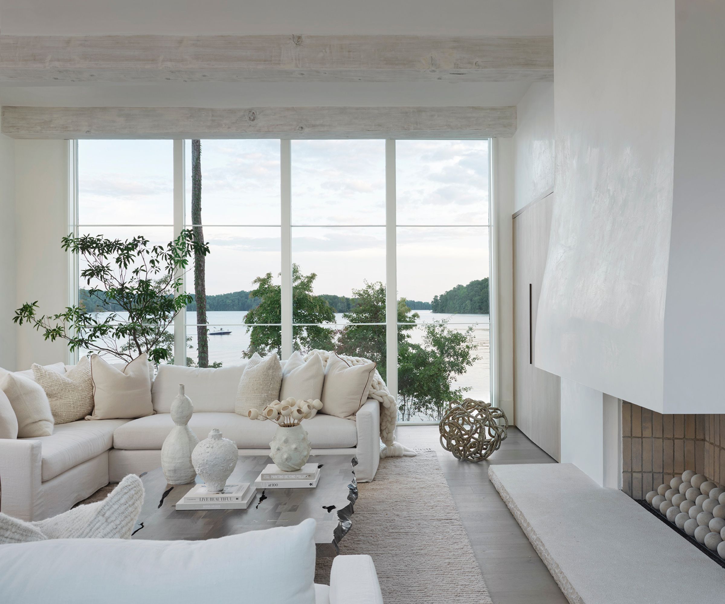
Don't rule out decorating with white for a monochromatic scheme. An undisturbed palette of white offers sophistication and tranquility, but texture is needed to ensure it doesn't feel flat.
'In this Lake Keowee living room, we embraced a tonal white palette to create a calm, sculptural environment,' shares the interior designer, Jessica Whitley. 'The beauty of a monochromatic scheme is in the layering – bouclé upholstery, limewashed beams, smooth plaster walls, and even the spherical stone fireballs in the fireplace all work together to create interest through texture, not contrast. When every element is thoughtfully chosen in a similar palette, the room feels serene but far from flat.'
9. Go for moody charcoal grays and blacks
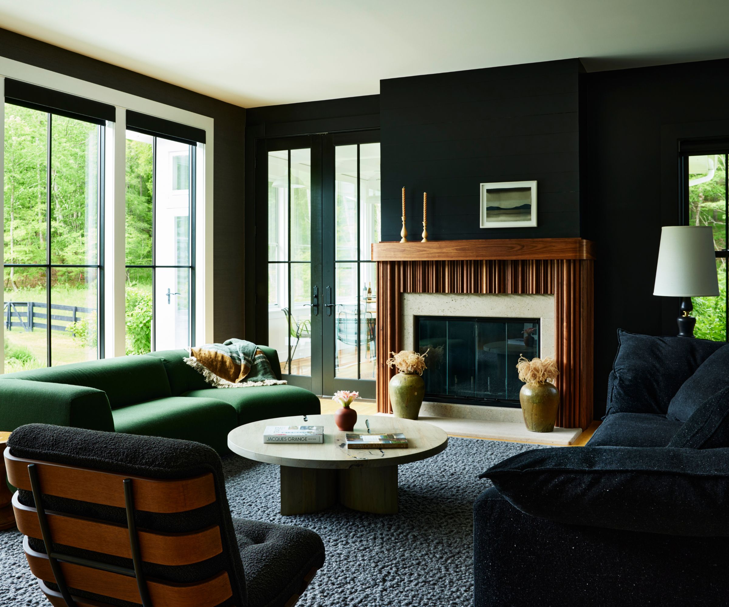
While decorating with black can sound daunting, it's best used liberally to avoid harsh contrast with lighter tones. In this living room, a palette of dark gray and black wraps the space, from the wall color to the sofa. The room is complete with a lighter gray rug and green accents, ensuring this bold color palette feels warm and inviting.
'We used a monochromatic palette of deep grays and black to transform this living room into a space that feels grounded and welcoming, no matter the time of day,' shares designer Nicole Lanteri, founder of Nicole Lanteri Design. 'The room’s original white walls and gray furniture made it feel stark – too bright by day, and too exposed at night. By layering rich textures and tonal elements – like charcoal grasscloth wallpaper, a black sofa, and a custom sculptural fireplace – we created a warm, cocooning atmosphere that feels connected to the natural surroundings.'
Creating a monochromatic color scheme ensures a room has depth, with varying tones – from light to dark – adding visual weight and interest. That said, it also keeps things cohesive, so even if you're going bold with a vibrant color, a feeling of calm remains with no strong contrasts. If you're keen to create your own single-color room, take a look at the latest color trends to choose a stylish hue.