Minimalist website design is an under-appreciated art. We've all heard the saying 'Less is more', but it's a principle that's often easier said than done. As progressions in technology open up new possibilities in site design, it becomes more and more difficult to resist adding some fancy flourishes.
Minimalist website design benefits users in the shape of faster loading times and better compatibility between screen sizes. What's more, a simple UI design is attuned to mobile browsing, without harming the desktop or user experience. Below, we've collected our favourite minimalist site designs to inspire you to do more by doing less.
01. HalloBasis
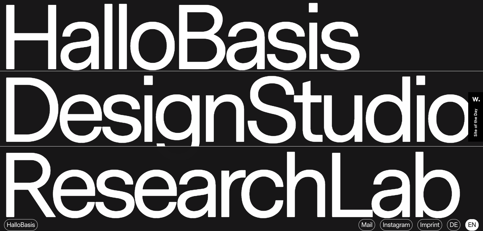
Friends, designers and business partners Felix Vorbeck and Johannes Winkler also go by the moniker HalloBasis. The Dusseldorf design studio takes pride in delivering projects that communicate well on behalf of its clients. This WordPress website acts as the studio's online portfolio site, and is a shining example of minimalist website design done differently.
The site makes a bold statement with just a few elements, thanks to its oversized aesthetic – which has the added bonus of aiding accessibility. In fact you might be forgiven for thinking the zoom feature of your chosen browser is maxed out, such is the 17.5vw font sizing for 770px min-width headlines. So typographically, it’s big, with the Messina Sans font suiting that chunkiness and ensuring readability. What’s really refreshing is that this applies to both navigational links and the custom GDPR prompts for accepting cookies. It’s also a cinch to toggle between German and English translations using the buttons on the main screen.
02. Uber Sign Language
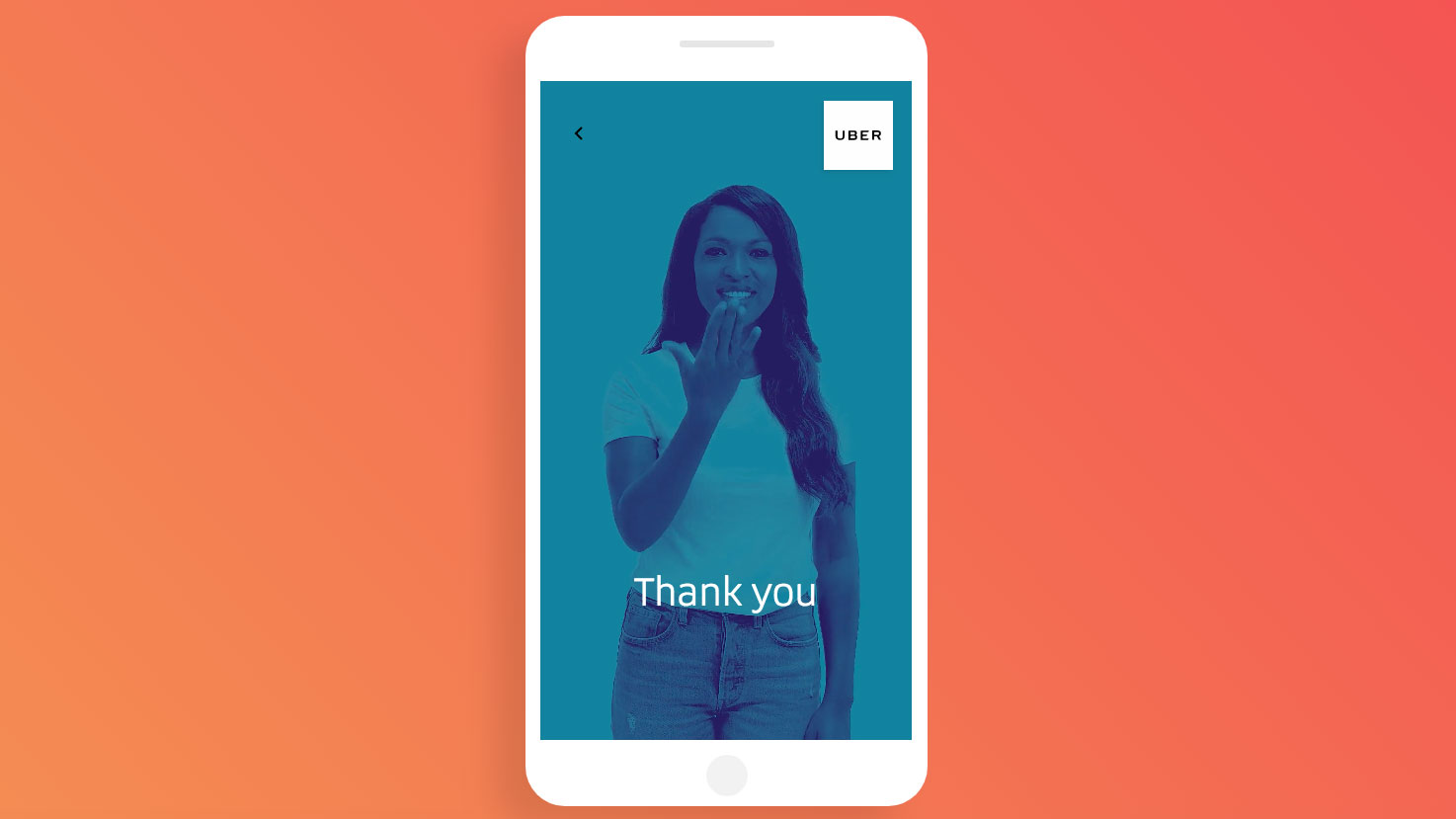
In line with its ethos of accessibility, Uber has created a website dedicated to teaching its customers basic sign language, so they can interact with hearing impaired drivers. Uber Sign Language is a masterclass in design with restraint. It shows users how to sign simple common phrases (yes, no, turn left and so on), or even their name, through simple, shortform videos. There is very little copy, or explanation; the content speaks for itself, proving you don't need clever words to capture an important brand message.
03. Evoulve
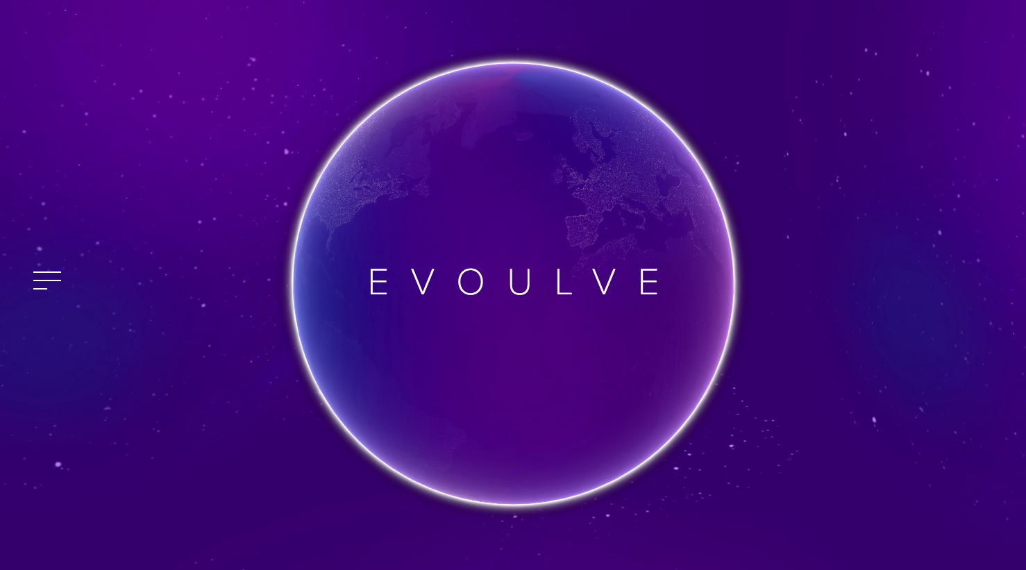
Evoulve is a company dedicated to turning emerging technologies into viable products. The site design – the work of design agency Fleava – has a mesmerising, futuristic feel. There are very few elements on screen: simple text annotations and very minimal navigation options, set against the backdrop of a slowly rotating globe and starry sky. However, each one has been crafted perfectly, with subtle CSS animations amping up the sense of magic and creating a mood of discovery.
04. Leen Heyne
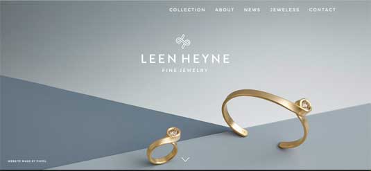
Beside its jewellery, Leen Heyne's monochrome logo and company name are the only significant visual elements on its homepage. The surrounding expanse of whitespace makes it a safe bet the user's eyes will be drawn to the products.
05. We Ain't Plastic
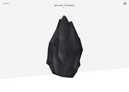
Contrast is another useful visual tactic for keeping minimalist designs interesting. German UX engineer Roland Lösslein's website We Ain't Plastic sets up a stark contrast in size between the central image and the text and icons above.
06. Nua Bikes
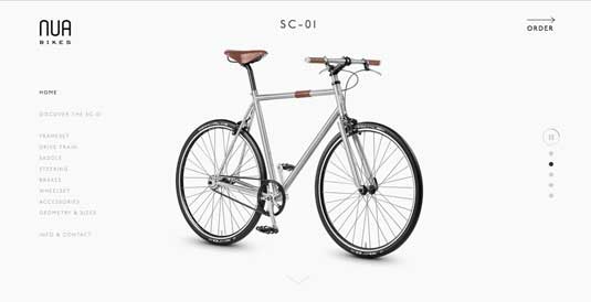
Nua Bikes' site is deceptively minimalist, because there are actually a lot of elements on the screen. However, by condensing the text and maximising the whitespace, the firm is able to draw attention to its product, the bike.
07. Sendamessage.to
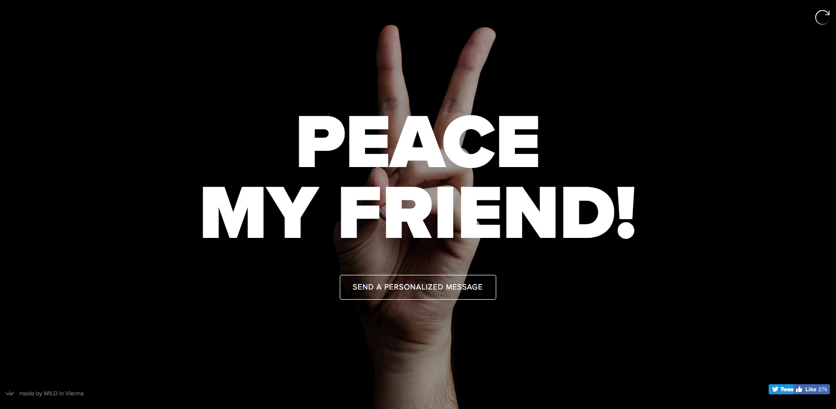
Amusing, if possibly inane, Sendamessage.to lets people customise messages to friends with a hand gesture. The barren black background adds power to the main image and the bold white letters of the text.
08. Maaemo
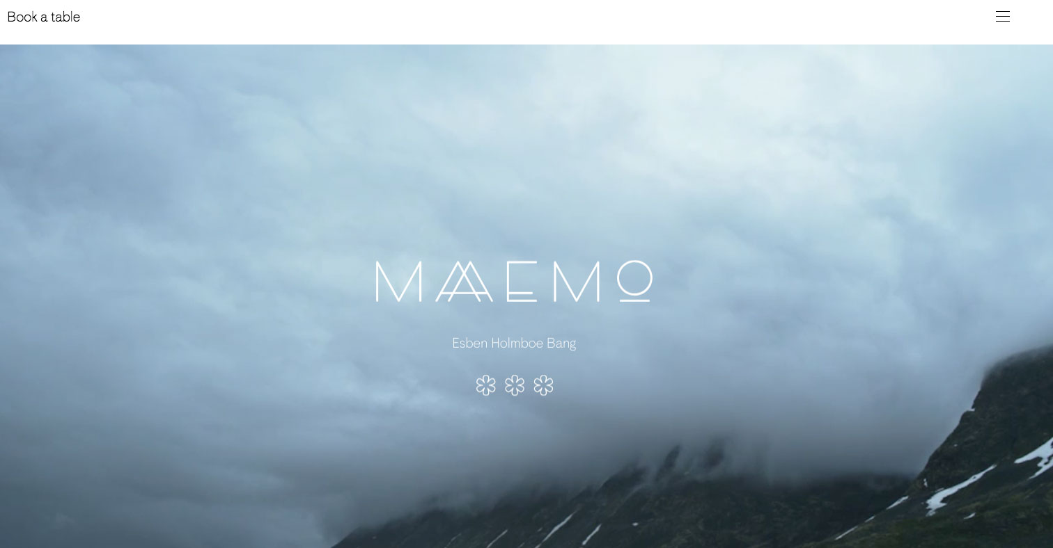
The website for triple-Michelin-starred Norwegian restaurant Maaemo uses minimalism to create a sense of class. The visual treatment is perfect for storytelling, as the site demonstrates with HD photos of dishes being created.
09. Ava
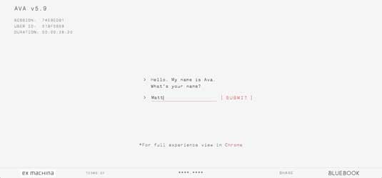
This black-and-white colour scheme and conformity of typography of this promotional site for sci-fi thriller Ex Machina keep the focus on the text – an interactive conversation with the film's star, the AI robot Ava.
10. Symbolset
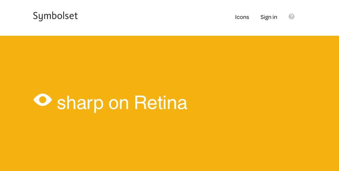
Icon font vendor Symbolset attracts attention to the interactive area in the middle of its site by minimising the competing elements and adding a brightly coloured, ever-changing background.