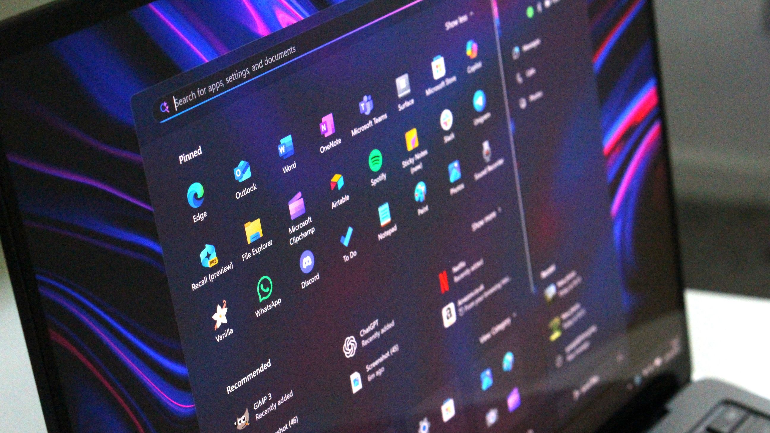
Last week, Microsoft announced that it will be bringing a new Start menu to Windows 11 later this year that combines the all apps list with the main Start menu page. The layout will also be more customizable, with more pinned rows and a removable Recommended feed.
Now, the company has shared a blog post that details how the new Start menu came together, maintaining familiarity while also making it easier to access your apps. More interestingly, the blog post gives us a rare look at some other Start menu design concepts that the company explored during early planning and development.
These design explorations reveal that pretty much nothing was off the table. One of the designs attempts to merge the Windows 10 Start menu with Windows 11's, by bringing the all apps list to the forefront on the left side while keeping Windows 11's pinned and recent files on the right.
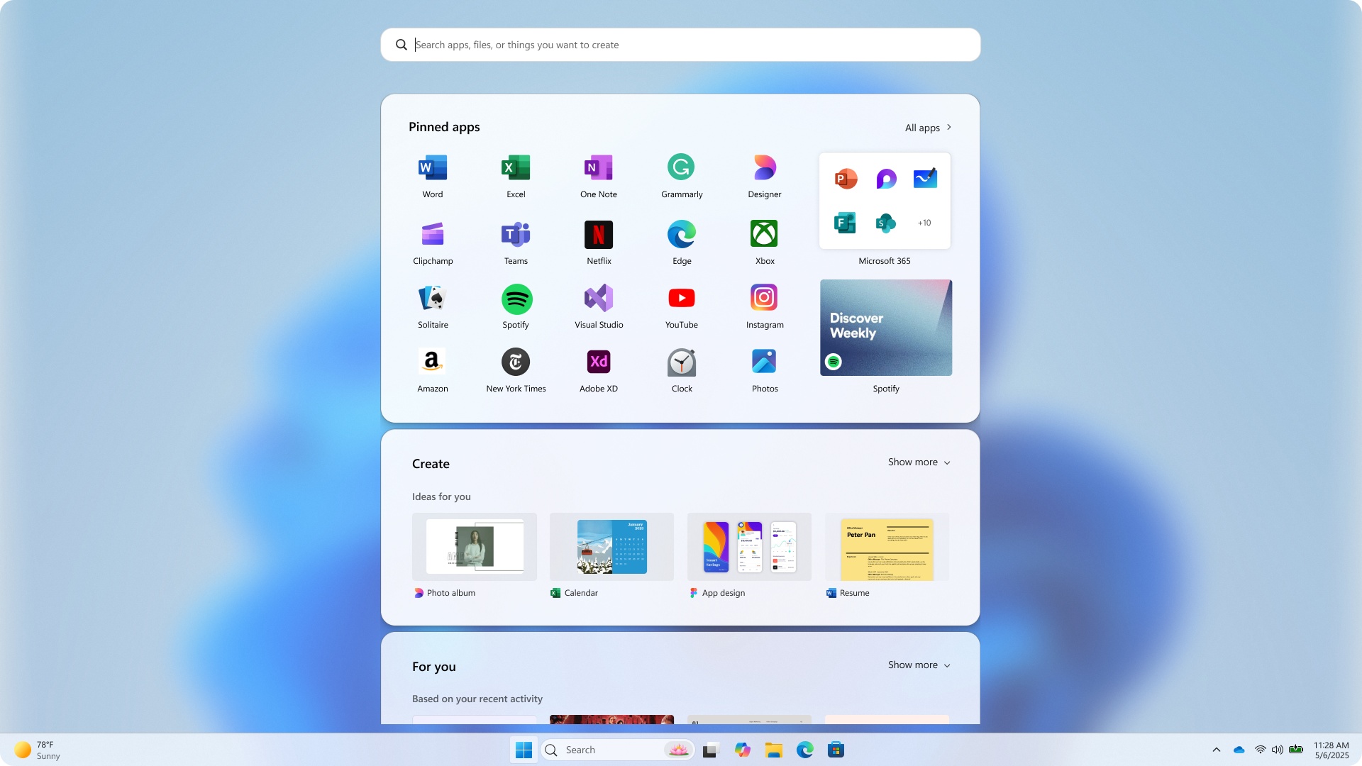
Another design explores a spiritual successor to Windows 8's full-screen menu, with a "Start screen" that blurs the background and takes up a large chunk of the display area. It shows your pinned apps above a new "create" section for quickly launching Microsoft services like Designer, Clipchamp, or PowerPoint.
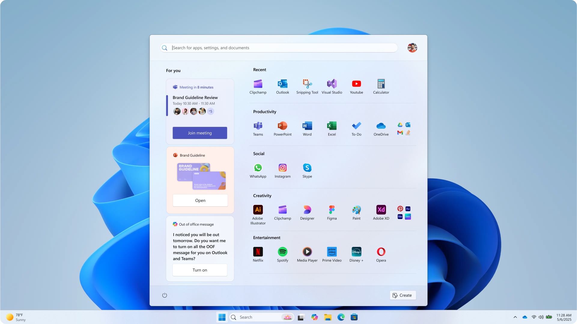
Curiously, many of these design ideas include both a "create" and a "for you" area, which would showcase your upcoming day, including meetings, tasks to complete, and recent files. Both of these areas are absent from the Start menu design that is ultimately shipping.
One Start menu design even included an area dedicated to your phone. Microsoft is now shipping the Phone Link companion alongside the new Start menu, but one of the design concepts appears to have integrated it directly into the menu itself, instead of as a sidebar.
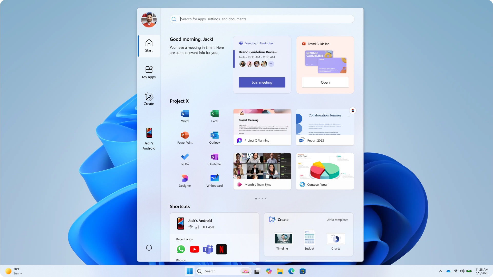
Unfortunately, it looks like these more radical Start menu designs were discarded in favor of something simpler. The new Start menu that is shipping addresses most of my criticisms of the original Windows 11 Start menu, but I would be lying if I said I didn't prefer pretty much all the design explorations that Microsoft discarded over the one we're getting.
What are your thoughts on these Start menu explorations? Let us know in the comments.
