Microsoft Security has unveiled a slick new rebrand, taking a unique human approach to cyber protection. Avoiding cliched symbolism and dark, soulless colour palettes, Microsoft Security's new branding is a refreshing take on digital protection design, doing away with hostile cyber stereotypes for a brand that feels authoritative yet accessible.
In line with the best rebrands from across the decades, Microsoft Security's new look has a distinct sense of cohesion that tells a story through visuals alone. With slick motion design, clean typography and an adaptable colour palette, the new identity excels in its dynamic design, standing out from the crowd for all the right reasons.
Created by global creative studio Koto, Microsoft Security's rebrand centres around a brand strategy that ventures 'Beyond the Surface'. With its broad suite of protective solutions, the new visual identity aims to spotlight what goes on underneath to show the comprehensive work of Microsoft's advanced AI and deep threat intelligence.
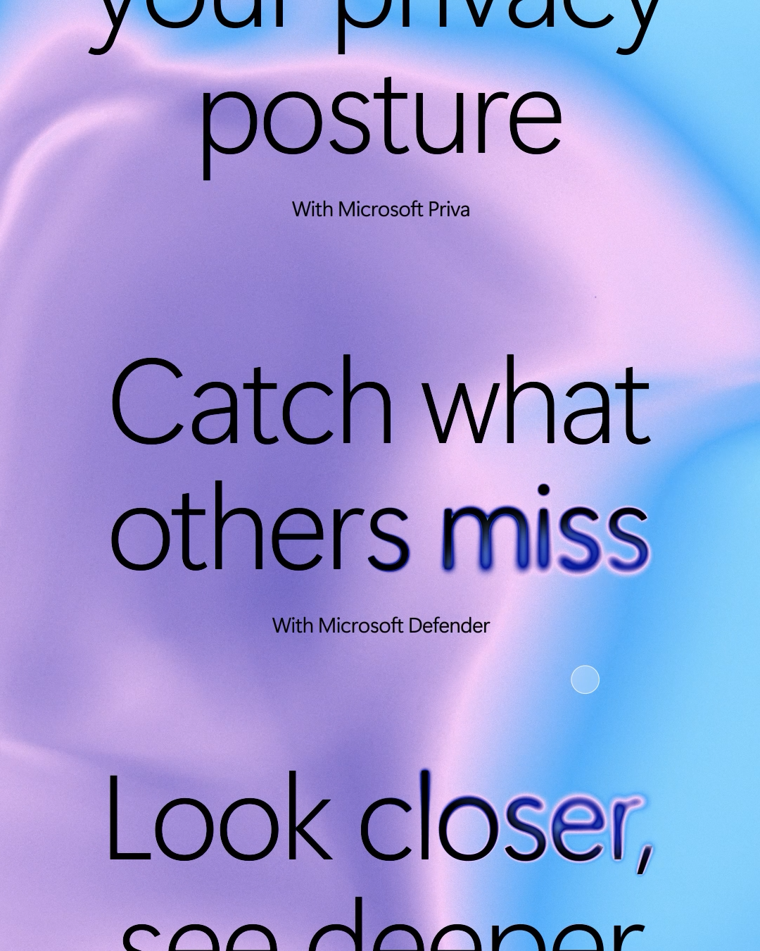
Across the new visual identity is a design system shaped by a scanning motif, unveiling the power of Microsoft's security by illuminating hidden threats. "Traditionally, the security industry has leaned on visuals that evoke fear – shields, swords, and dark colours that communicate danger. Our challenge was to flip that narrative and present security in a way that feels modern, reassuring and proactive," says Koto's creative director, Joe Ling.
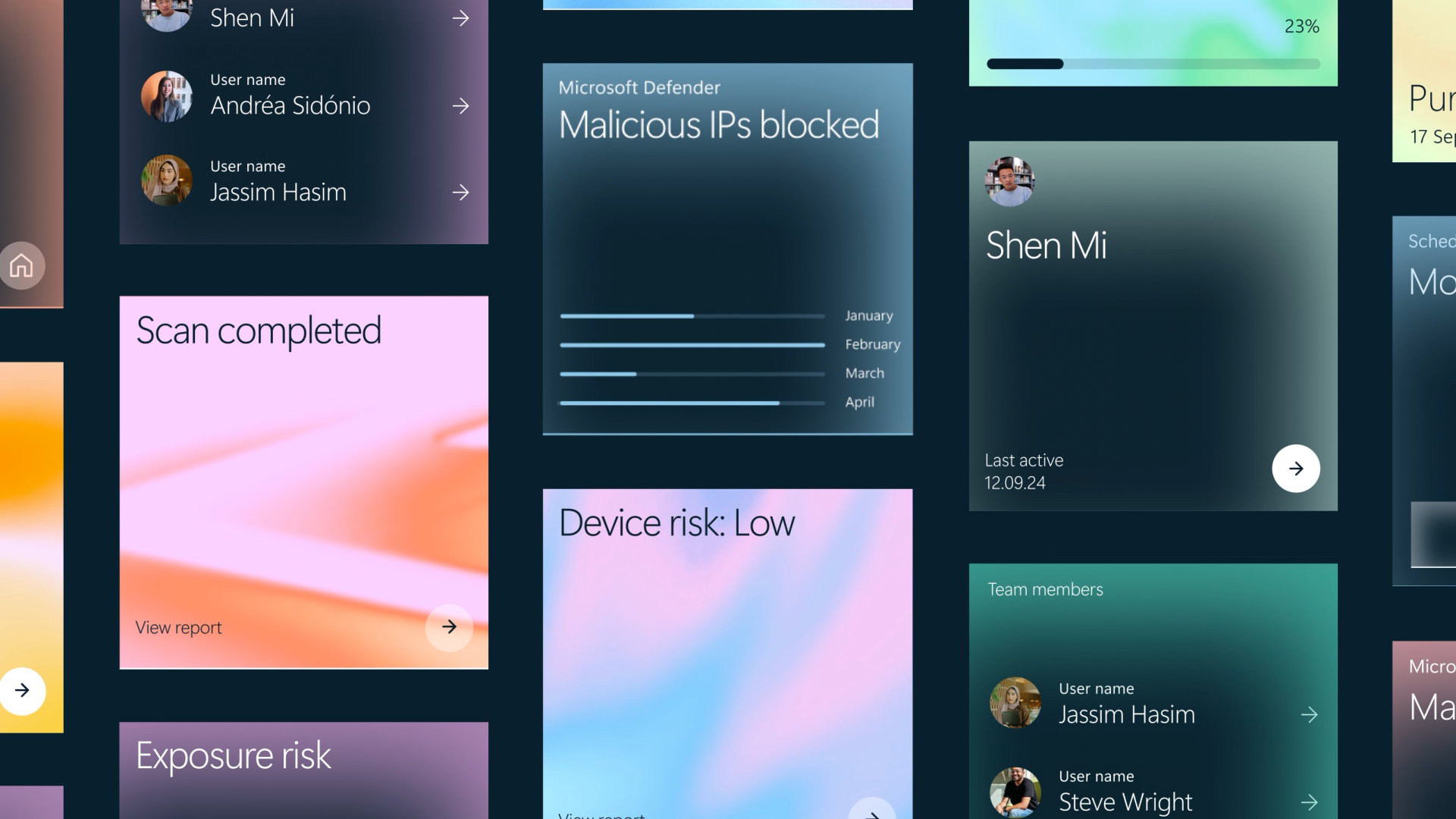
This visual system shines through Koto's dynamic motion design, creating a memorable and immersive brand experience throughout data visualisations, infographics, and wider UI elements. As the scan moves throughout the visual assets, its slow pace highlights the thorough process of Microsoft's tools, reinforcing a sense of authority and assurance.
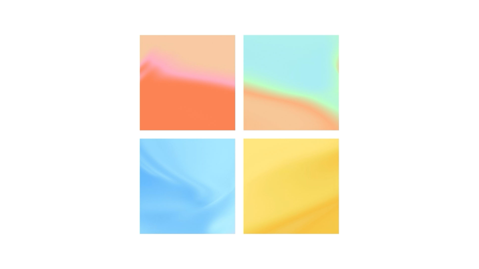
Doing away with austere dark shades and sterile whites, the rebrand embraces colour to add a playful flavour to the design. With five adaptable pre-designed gradient maps, the visual identity has a curated feel, adapting to each brand display. The design also takes into consideration the increased use of dark mode on devices, transitioning seamlessly with backgrounds in either white or navy for visual harmony.
The rebrand's typography was selected for legibility and impact, using Segoe Sans Display Semilight for headlines to create a clean look. As the scanning motif interacts with the typography, words and key messages are unveiled, bringing a sense of clarity and dimension to the design.
“Hats off to Koto," says Ben Hermel, creative director at Microsoft. "With this new identity, we’re bringing clarity and impact to a complex space, and we couldn’t be more excited about what’s next,” he adds.
"We wanted Microsoft Security to be seen as an ever-present force, working quietly behind the scenes, protecting people and organisations as they go about their day. By shifting away from typical security tropes and using vibrant colours, dynamic scanning effects, and human-centred imagery, we’ve created a brand identity that’s more accessible, comprehensive, and connected to people’s everyday lives," says Joe Ling.
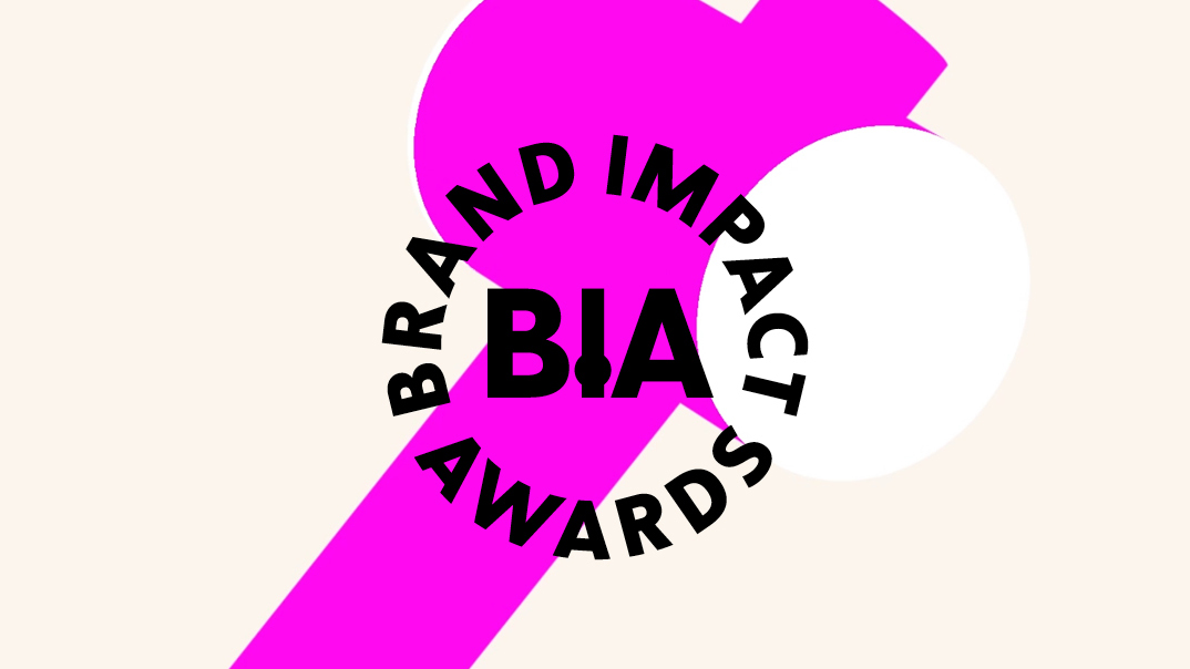
For more creative inspiration, take a look at Microsoft's 50th Anniversay campaign or check out the new Microsoft Office logo. Have you created some standout branding? Enter the Brand Impact Awards today