
It's official, Microsoft just killed a part of my childhood nostalgia. Okay, maybe that's a little dramatic, but the company recently announced it's retiring the humble blue screen of death, and quite frankly, I never thought I'd miss it.
The iconic critical error screen was by no means the peak of outstanding UX and digital design, but over the years, I've come to love the simplicity of the watery blue screen paired with that disingenuous little sad face. I dare say I'm forlorn to see my old friend put into retirement, so here's to the blue screen of death – soon to be gone, but not forgotten.
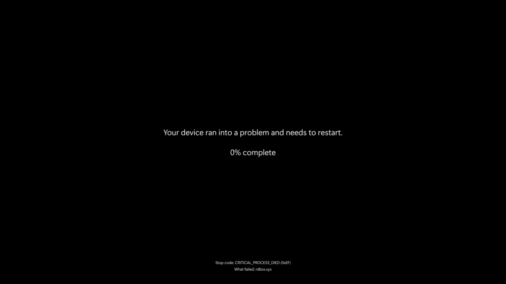
In a recent blog post, Microsoft announced that the blue error screen would soon be replaced with a more streamlined experience to "maintain productivity and minimise disruptions" during reboots. The Windows 11 24H2 update will now feature a slightly more ominous black screen of death (sans comforting sad face) to reduce downtime by approximately two seconds.
Set to roll out later this summer, Microsoft claims that the update "improves readability and aligns better with Windows 11 design principles, while preserving the technical information on the screen for when it is needed." While I'm sad to see the :( go, I'm grateful for the precious two seconds of my life I'll be getting back. For more design news, check out Monzo's brilliant new UI or take a look at how Microsoft is mocking Apple's Liquid Glass UI design