
Microsoft recently prototyped a new UI for the Edge web browser that places Copilot at the forefront of the experience on Windows 11. The mysterious UI appears to be codenamed Olympia, and features a cleaner address bar and window frame, vertical tabs, and other big changes.
The Olympia UI was first spotted by Leopeva64 on X, though he believes the UI has since been scrapped, replaced with an interface that mimics the Copilot for Windows app instead. The old Olympia UI is still present in the latest Edge Canary builds however, and we've taken a closer look at it.
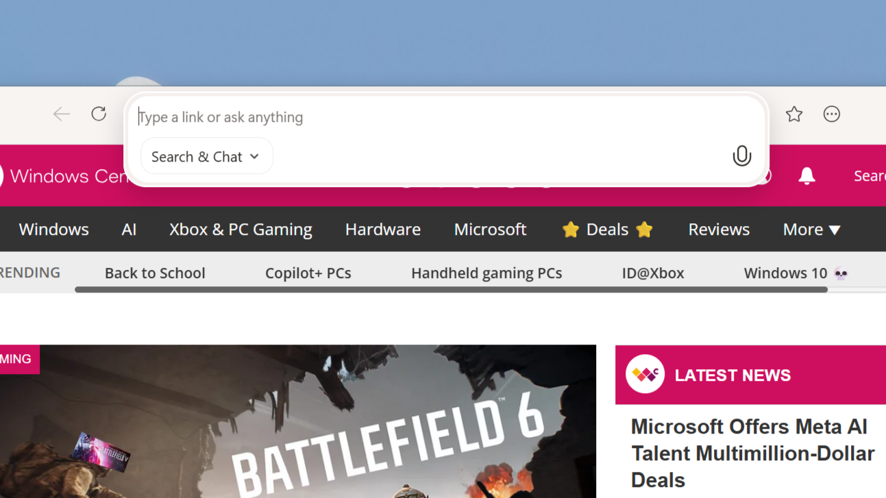
We can see that this experiment places Copilot directly into the address bar, which now takes on a smaller footprint and is centered along the top of the interface. This new address bar places heavy emphasis on Copilot, with the omnibox now prioritizing search and chat, as well as voice input with a microphone icon placed directly in the address bar that is accessible at all times.
The overall interface is more streamlined compared to the standard Edge layout, with tabs moved into a vertical list sidebar that is accessed via a dropdown button from the top left of the interface. There's also a layout that curiously places horizontal tabs below the address bar, instead of above like in most browsers.
On the right side of the window frame, there's options to bookmark a webpage, and a drop down menu with more browser locations such as history, downloads, and settings.
This new interface would have been a big departure from the Edge UI that we're all familiar with. It's unclear what this new design was going to be for, especially as it's so early on in development that most of it is still non-functional.
For now, we can speculate as to what Microsoft was planning with this new interface. It could have been an outright replacement for the existing UI in an attempt to have Edge stand out more as its own browser. Everyone agrees that the current version of Edge's UI is a shadow of Google Chrome, which is rather uninspiring.
I think it's more likely that this new UI was being built as a dedicated interface for Edge's new Copilot Mode, which would explain the emphasis on Copilot in the address bar.
Right now, accessing Copilot Mode in Edge doesn't immediate do much for the end user. The browser looks the same, with the only key difference being that the Copilot button moves from the right hand side of the window frame to inside the address bar on the left. Notably, this new Olympia layout places the Copilot icon in the exact same spot on the address bar.
As Copilot Mode evolves and becomes more capable, I can totally see Microsoft giving the mode and entirely unique interface that leans into the AI assistants more agentic capabilities as they become available. "AI browsers" are the trend currently, with Perplexity, The Browser Company, and now Microsoft leaning into building out dedicated AI modes for surfing the web.
It makes sense for Microsoft to believe that Copilot Mode can warrant a radical new interface, especially if there is going to be an emphasis on agentic capabilities down the line. We've seen Microsoft on record claim that generative AI and agentic capabilities will fundamentally change what a UI looks like, and this might be an early look at that change.
This isn't the first time Microsoft has attempted to bring a new UI to Edge before scrapping it. Back in 2023, the company unveiled an updated design for Edge which featured rounded floating tabs among other smaller changes to better align the browser with Windows 11's design language. Unfortunately, Microsoft ended up scrapping this new design for unknown reasons.
For now, what are your thoughts on this Microsoft Edge UI codenamed Olympia? Do you think it had something to do with Copilot Mode, or was it more of an experiment that never got off the ground? Let us know in the comments below.