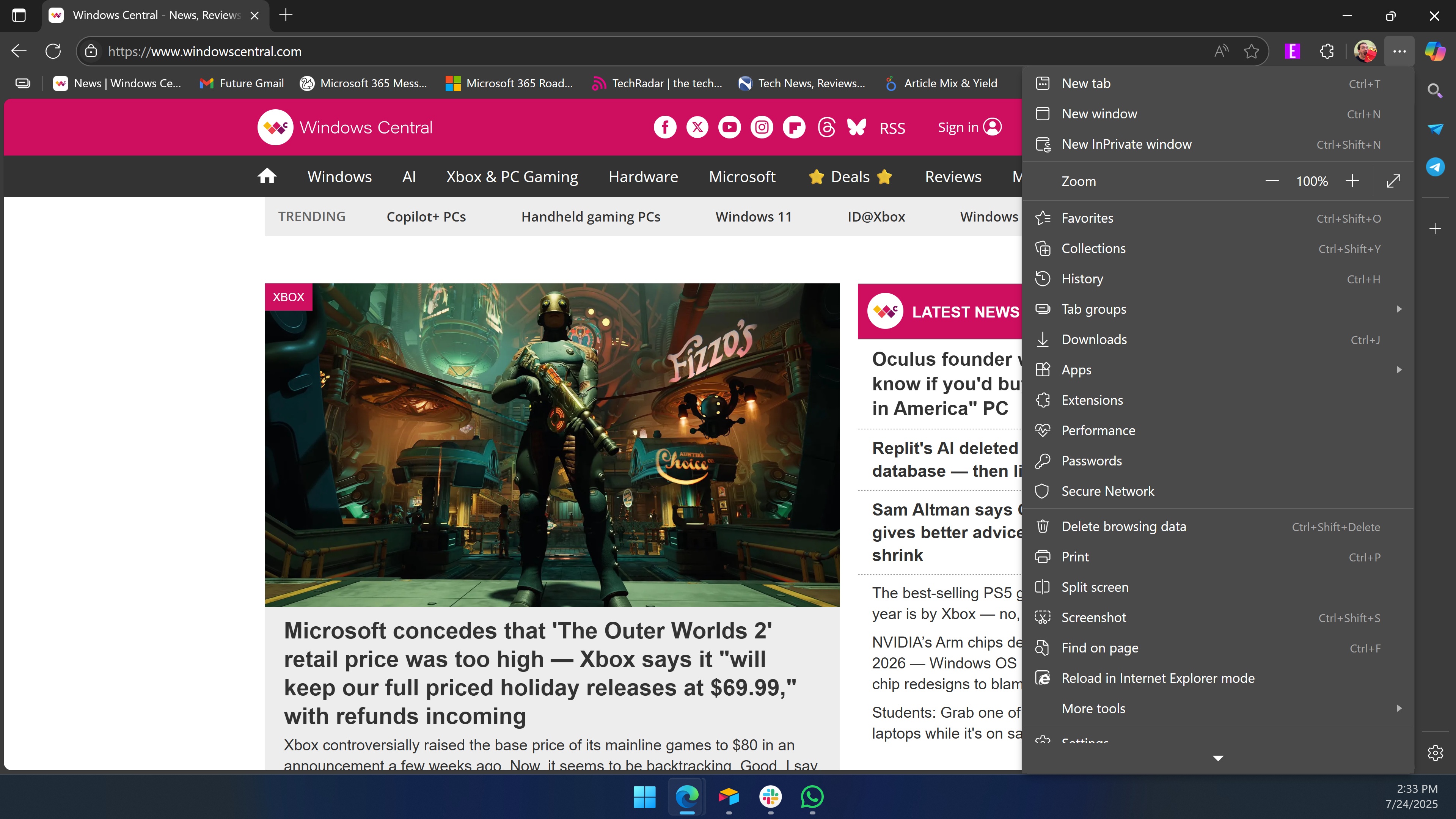
Microsoft Edge now shows the shortcut to create tab groups within the browser's dropdown menu. Normally, such a small addition would go unnoticed or be added with little fanfare, but the tab group shortcut pushed Edge over a milestone.
Now, when you open the "Settings and more" menu within Edge, the browser can’t fit everything on the screen — at least not on many laptops.
If you're on a desktop or a massive laptop, you may be able to see each item, but even on my 16-inch workstation I need to scroll down in that Edge menu to select "Settings" or "Help and Feedback."
The need to scroll within that menu was highlighted on Reddit by user "JiroBibi."
To be completely honest, I don't think scrolling is a massive deal, but I would prefer the option to remove some of the items from the menu. At minimum, it makes sense to move the "more tools" section further up in the menu since smaller screens require scrolling to get to that shortcut.
Does Microsoft care about consistency?
One of the benefits of Windows is that it supports a tremendous number of programs and apps. But with backward compatibility and legacy support comes inconsistency, unless a company is willing to do a visual overhaul of an operating system.
My colleague Zac Bowden has highlighted context menu inconsistencies in Windows since at least 2015. Admittedly, Microsoft has upgraded several UI elements over the past decade, but Windows is far from perfect.
To Microsoft's credit, modern design elements generally follow consistent guidelines and look similar, though the company has given us the occasional design “scare” — and yes, that’s sarcastic.
The context menus in Recall / Click To Do having even more rounded corners in the latest Windows 11 preview build can only mean one of either two things: Windows is about to get ROUNDER or Windows is back to not caring about UI consistency pic.twitter.com/uAs7KevA16February 18, 2025
The above rounder menus don't seem destined to ship. Click To Do does not have those menus, so it seems Microsoft briefly used the rounder designs during testing then aligned the menus later.
Windows is a massive operating system with elements dating back decades. While I love mockups of clean interfaces for legacy software, making real-world changes is more difficult than creating a still image.
In my opinion, Microsoft does a good job of keeping its various apps and services in line with each other visually. But I still think they should let us trim down how many items appear in context menus.