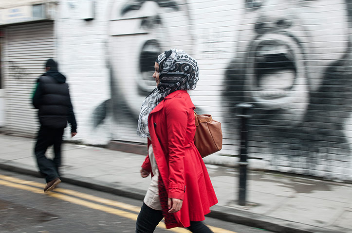
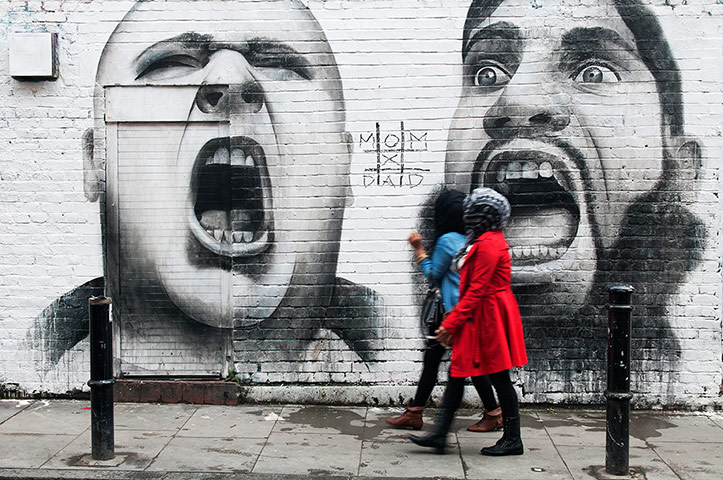
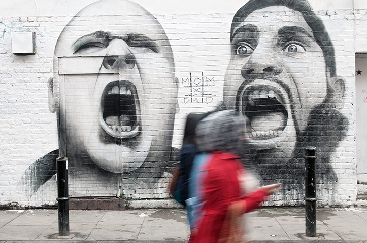
The first image captures the movement of the woman as she wanders by – her red coat against the black and white of the wall works well but the angle is wrongPhotograph: Christian Sinibaldi for the GuardianThe girls walk closer to the graffiti, but their closeness to the wall makes the image seem flatPhotograph: Christian Sinibaldi for the GuardianThe blue and red blur contrasts really well against the strong faces on the monotone wall. This square-on view is much cleanerPhotograph: Christian Sinibaldi for the Guardian
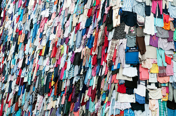
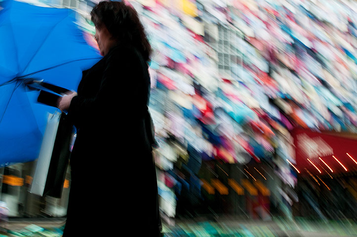
This picture is all about pattern and colour, recalling the rag trade origins of the areaPhotograph: Christian Sinibaldi for the GuardianUsing the textiles from the last image but introducing a figure and blur has made it more abstract Photograph: Christian Sinibaldi for the GuardianA more obvious, photojournalistic image of Brick Lane. This may have worked well in black and whitePhotograph: Christian Sinibaldi for the Guardian
Sign up to read this article
Read news from 100’s of titles, curated specifically for you.