America’s favorite lifestyle icon, Martha Stewart, has an unrivaled eye for design – she doesn’t just follow trends, she defines them. A household name for decades, her archives remain a masterclass in timeless style.
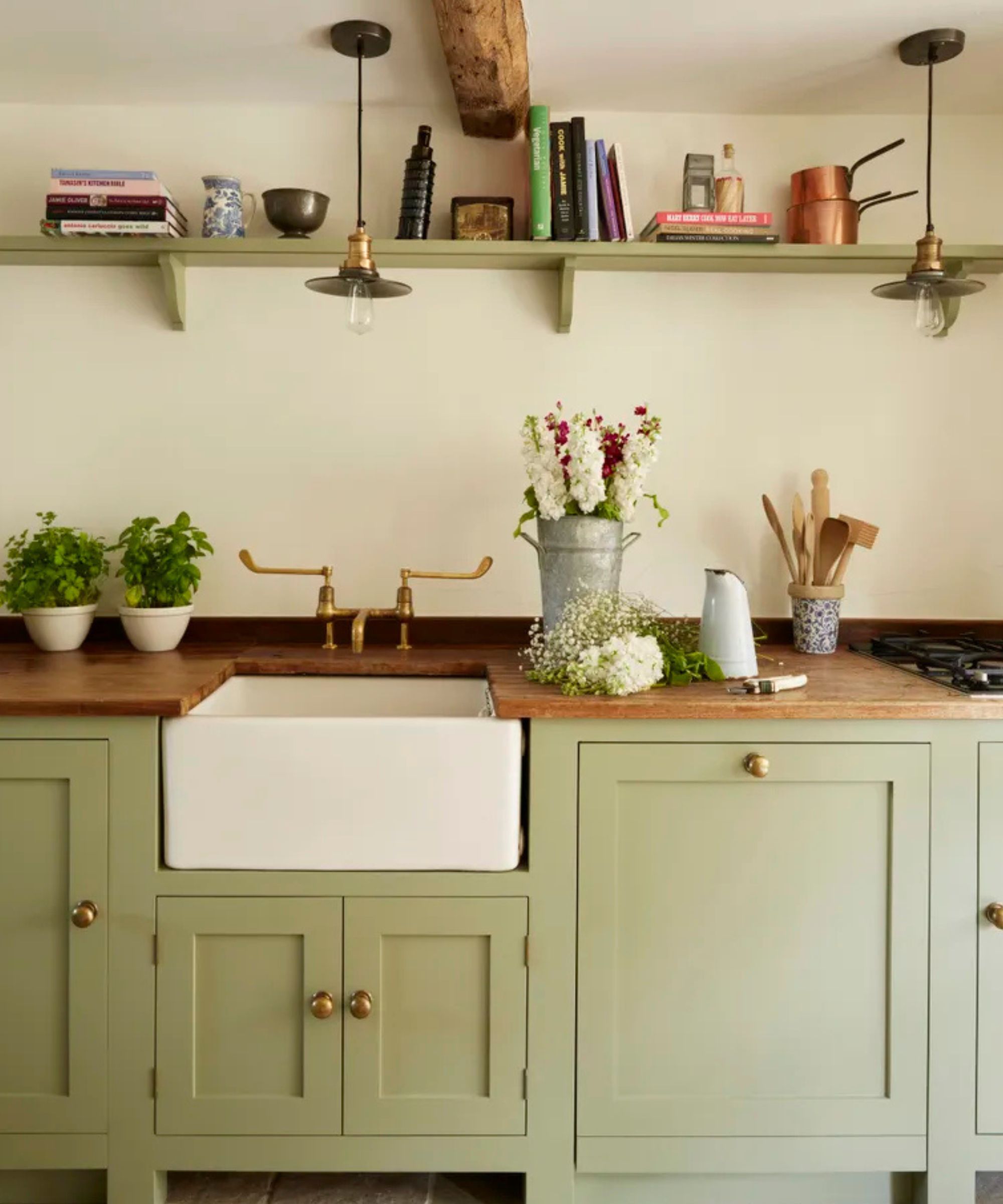
Products from her Martha Stewart Collection on Amazon and the Martha Stewart Essentials range from Walmart, take pride of place in my own kitchen, a testament to her enduring influence. So when Stewart shared a throwback photo of her former culinary space, one detail stood out immediately: the beautifully sophisticated gray-green color gracing her kitchen cabinets.
This particular shade of pale green, or gray-green, is currently having an undeniable moment. It’s no wonder: post-pandemic, the cool minimalism of stark gray and white is being definitively replaced by warmer, more inviting neutrals. Timeless, elegant, and profoundly calming, gray-green is the perfect antidote to design fatigue.
An amalgamation of gray, green, and often a hint of blue-brown, this shade has a moody, sophisticated feel and adds remarkable depth to kitchen cabinetry. It is perfect for the heart of the home, effortlessly pairing with natural wood accents or serving as a subtle background color for a heavily-veined marble backsplash or countertop. This nuanced color is a remarkable decorating medium and an easy way to make a kitchen look instantly more expensive.
Classic, calming, and deeply synonymous with nature, the color acts as a restorative bridge between outdoors and inside when used in high-traffic spaces. When seen on joinery and softer furnishings, the color brings relief and reassurance and elegantly reminds us of the living world beyond our four walls, working beautifully throughout the year.
The longevity of Stewart’s style underscores the enduring power of this hue. ‘Decorating with neutrals, similar to one in Martha Stewart's home, while avoiding a minimal or stark atmosphere is a delicate balancing act between the natural light, artificial lighting and the other textures and tones used throughout,' says Deborah Bass, director, Base Interior. She stresses the importance of precision, adding: 'Sampling on site, in various lights including artificial lighting, and at different times of day cannot be underestimated.’
This pale green-gray color scheme has enormous scope as a mindful decor mainstay and is also seen as an effective backdrop for other organic shades. This shift toward complex, nature-inspired color trends is a defining movement in modern interiors.
‘We are noticing a change to the use of softer hues, such as gray-green and greige, being used all over as a base color or on kitchen cabinets, just how neutrals have been used traditionally,’ says Ruth Mottershead, creative director at Little Greene. ‘These are very calming, positive shades with a timeless quality, that are muted but not enough that they fade into the background, so they work beautifully as a foil for similar earthy tones and richer colors, which can give a more dynamic effect.’
It's clear that Martha Stewart’s archival choices are still guiding us toward the best in enduring, sophisticated home design. If you haven't seen it yet – Martha Stewart's gray-green entryway is equally delightful.
Shop the look
Not planning to repaint your kitchen cabinets? You can still capture the look with ease. I’ve scoured the internet to find the best gray-green and greige (that perfect blend of gray and beige) accessories and soft furnishings to help you recreate the same sophisticated feel.
If a full green paint makeover isn’t on your agenda, introduce the color through furnishings and accessories instead. These charming gray-green ceramic pots add just the right touch of this timeless hue – perfect for displaying Baby’s-breath or eucalyptus to create a serene, calming aesthetic.
Add texture and dimension to your kitchen countertop or shelf decor with this on-trend ruffled stoneware vase in a gray-green colorway. The reactive glaze creates an eye-catching finish unique to each decorative piece. The Darcia will instantly make your kitchen look better.
Experience all-day comfort with these extra-thick anti-fatigue mats that cushion feet, knees, and joints. The two eco-friendly, slip-resistant mats (17.3 x 59" and 17.3 x 29") are waterproof, stain-resistant, and easy to clean – perfect for kitchens, standing desks, or any space where comfort matters.
Cook with confidence using the Martha Stewart Kitchen 12-Piece Non-Stick Aluminum Cookware Set. Made from durable aluminum for even heat distribution, each piece features a ceramic nonstick interior for easy food release and cleanup. The soft-grip handles provide comfort, while the sage green finish – perfectly paired with gray-green tones – adds a touch of style to any kitchen.
Bring timeless style and everyday convenience to your kitchen with the Martha Stewart Stainless Steel Stovetop Kettle. Crafted from durable, rust-resistant stainless steel, it heats quickly for effortless boiling – perfect for cooking or entertaining. A boil indicator lets you know when the water’s ready, while its versatile design works on all stovetops, including induction, gas, electric, halogen, ceramic, and glass.
Organize in style with the Martha Stewart 2-Piece Ceramic Utensil Holder Set. The large (6.7") and small (5.1") crocks keep tools within reach, while the sage green glaze beautifully complements gray-green kitchens. Made from durable, dishwasher-safe ceramic, they also double as mini planters or holders for eggs and small gadgets.