Orange was everywhere in the late ’80s and early ’90s – bold, loud, and anything but subtle. But the orange I’m drawn to now is something entirely different. Fast forward three decades, and this once divisive color trend has made a spectacular comeback – reimagined as something far more sophisticated and endlessly versatile. Today’s burnt orange isn’t about flash; it’s about warmth, spice, and understated luxury.
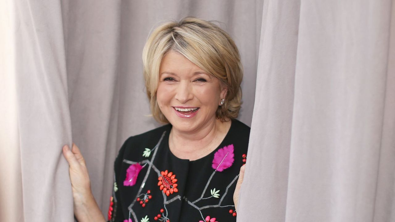
I’ve always loved how certain room color ideas can transform a space, and few shades do it as beautifully as burnt orange. It has this incredible ability to make a room feel both vibrant and grounded – full of energy but also deeply comforting. It’s no wonder that Martha Stewart was way ahead of the rest of us. Her orange three-season room in her former Lily Pond Lane home still feels so daring, elegant, and relevant even years later.
When I’m decorating with orange, I've found it works best when it’s paired with jade green – the two together just sing. As designer Emma Deterding of Kelling Designs puts it, ‘I don’t just pair orange with jade green; I view them as an effortless, essential combination for a striking, modern interior.’ I couldn’t agree more.
If you’re exploring colors that go with orange, jade is my top pick, whether it’s an accent wall, a patterned rug, or a piece of furniture. The warmth of orange against the calm of jade creates a balance that feels both uplifting and timeless.
Color consultant Clare Tilbrook also nails it when she says, ‘Orange can look truly smart and architectural when used with jade.’ I’ve seen this pairing work beautifully in dining rooms – think warm orange walls, and soft jade-tinged fabrics and decor layered throughout. It’s rich and inviting without feeling overdone, like a space that’s evolved naturally over time.
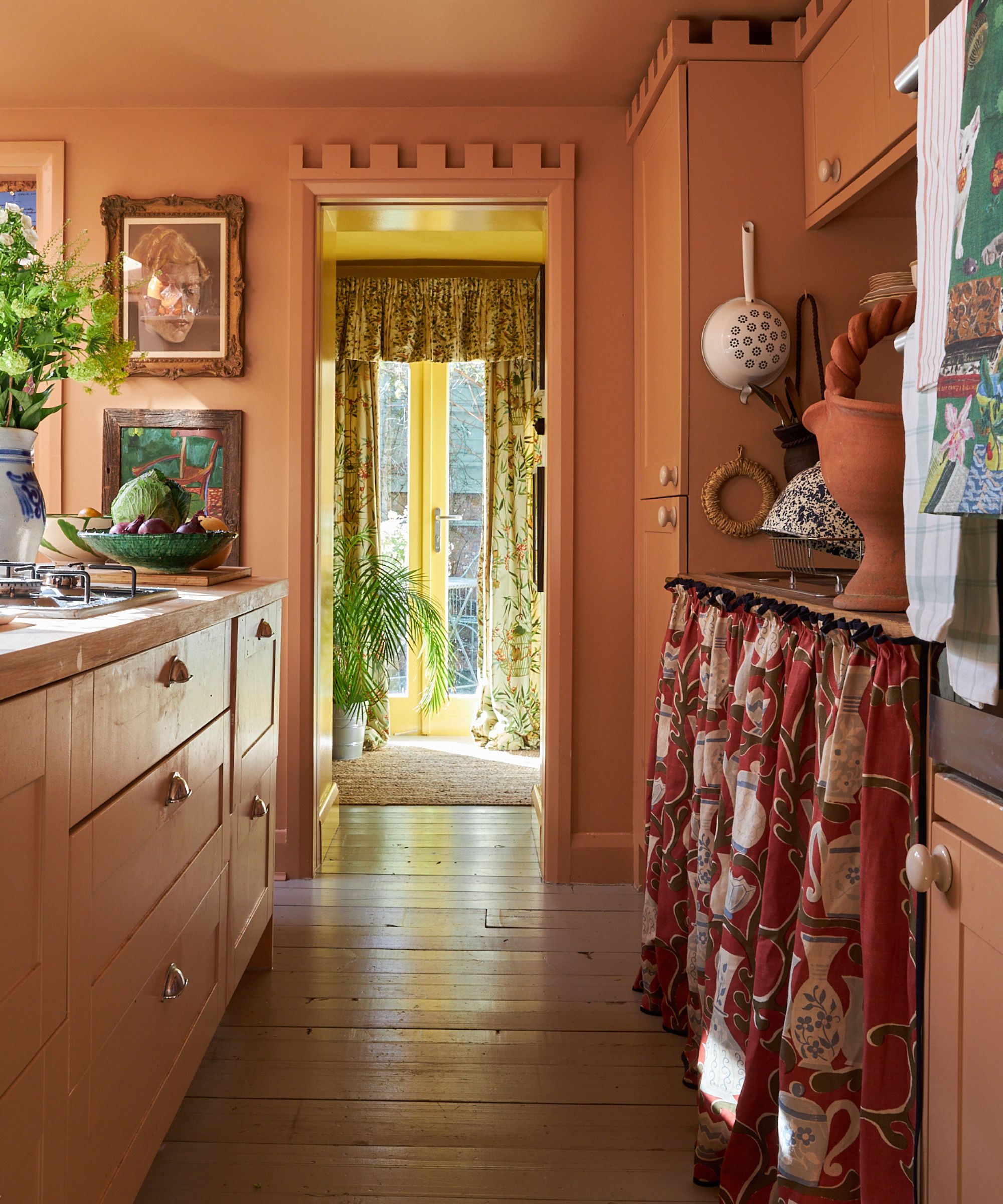
Orange is, in my opinion, the perfect color for a dining room – especially when styled with a few antiques, a touch of jadeite (Martha’s signature), and lots of fresh foliage. In natural light, it’s radiant and joyful; by evening, it glows with cozy intimacy. That kind of versatility is rare.
For me, the place you live in should be filled with colors that make you feel happier at home, as it adds personality to a space. Orange shades are a great choice – they bring an uplifting feel during the day and can help create a cozy, relaxed atmosphere in the evening. This sophisticated color combination will remain a winner when scaled and balanced correctly in your home.
Shop the look
A final decorative element to complete this sophisticated pairing is the inclusion of glass and ceramic accents. Martha Stewart is a well-known collector of Fire-King Restaurantware, a highly popular and increasingly rare type of jadeite. If you are not ready to invest in these original vintage pieces, you can easily replicate the elegant look.
Look to the likes of Amazon, Target, and Martha Stewart's Bed, Bath & Beyond collection for similar, yet equally beautiful, glassware. The signature jade-like color of these pieces will sit in perfect, striking contrast against a fiery orange backdrop, just as Stewart herself styled it.
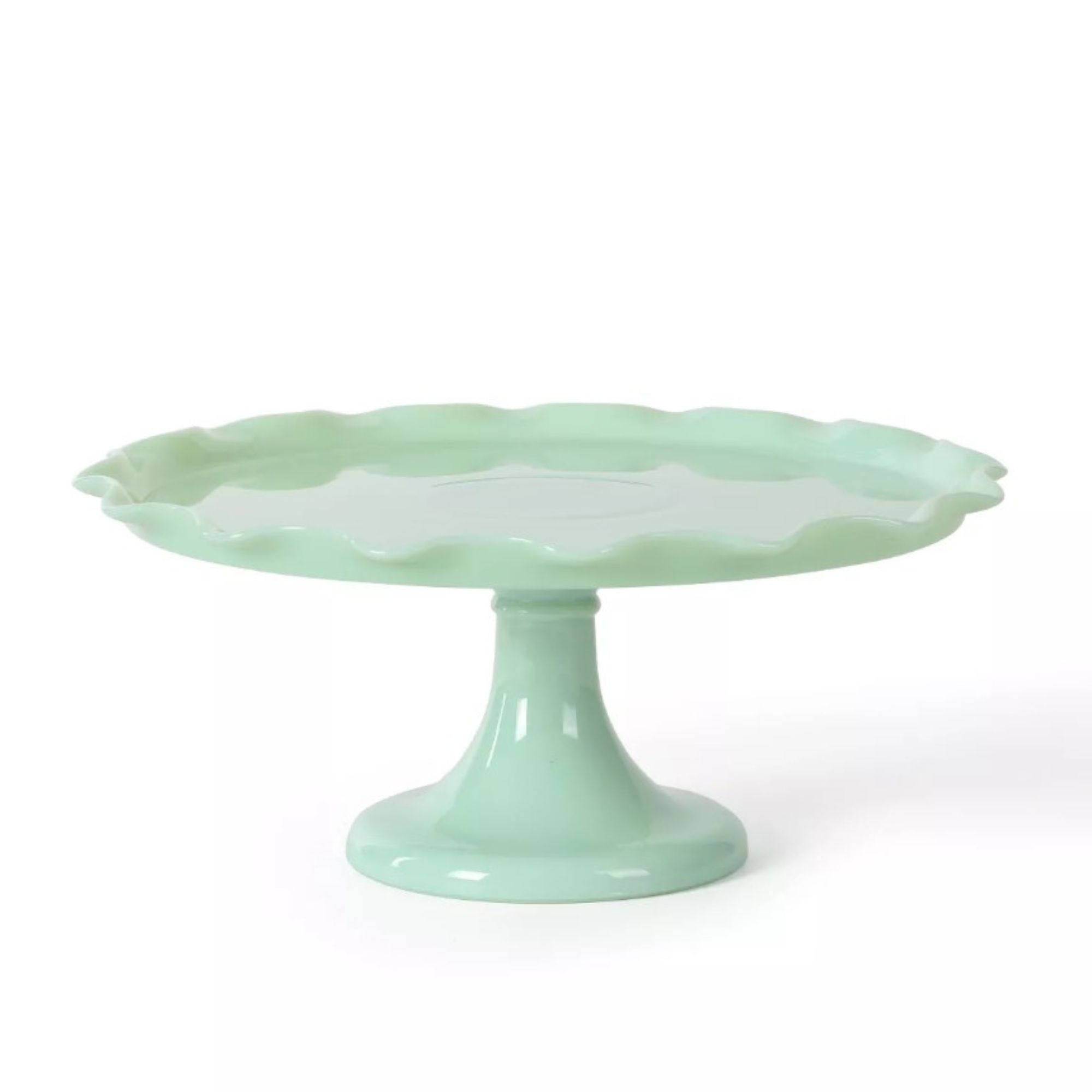
Display your baked creations in timeless style with this handcrafted 11-inch jadeite glass cake stand. Made from elegant jadeite milk glass, it features gently ruffled edges, a glossy vintage-inspired finish, and a sturdy footed base for stability. Perfect for showcasing cakes, pies, cookies, or cupcakes, this whimsical piece adds a touch of Martha Stewart’s signature charm to any table.
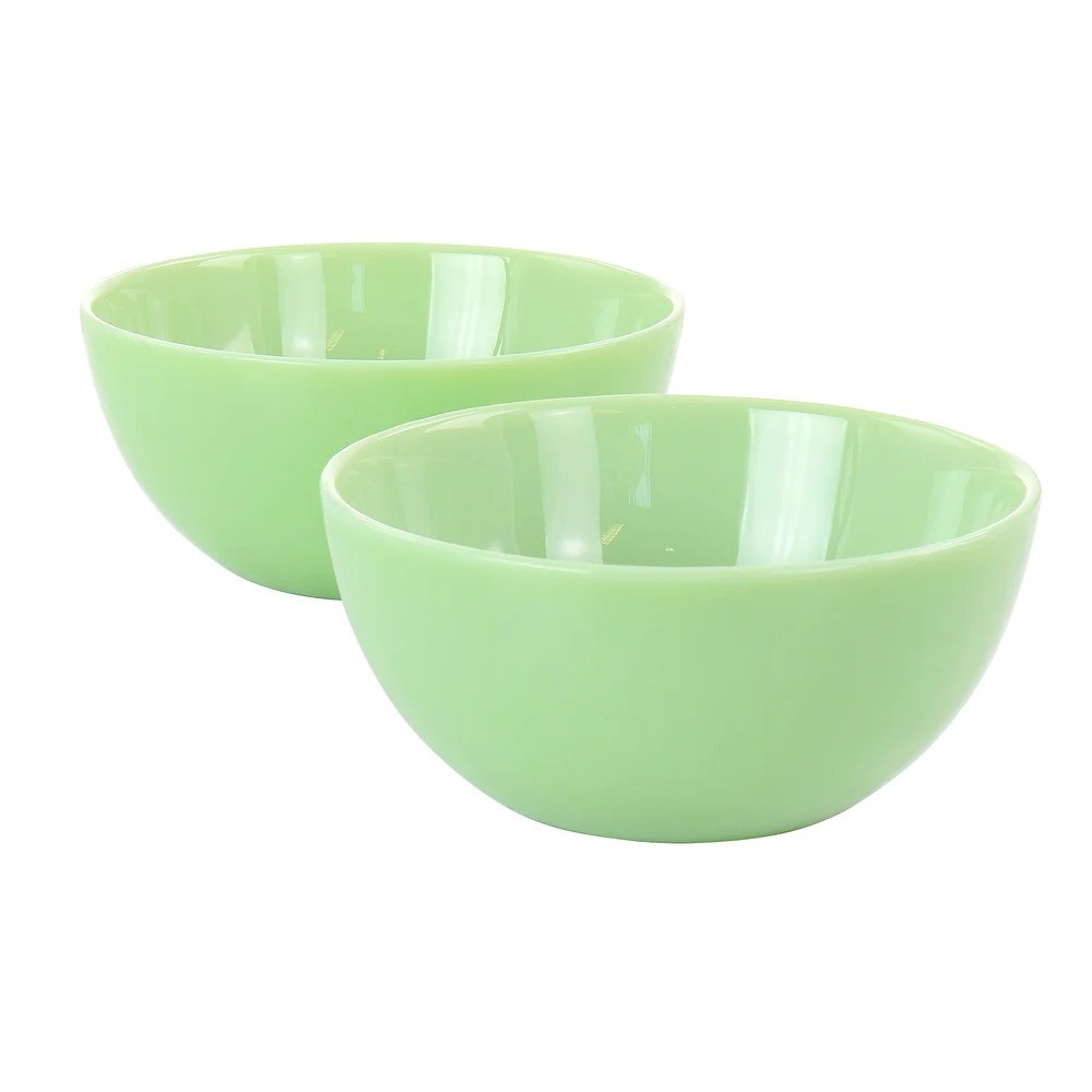
Add vintage charm to your table with the Martha Stewart 2-Piece Jadeite Glass Bowl Set in soft jade green. Crafted from milky jadeite glass, these 6-inch bowls bring timeless elegance to any setting. Perfect for serving oatmeal, hearty soups, or indulgent desserts, each piece is dishwasher safe for easy cleanup. Beautiful and practical, they’re a stylish way to elevate everyday dining or impress guests at your next gathering.
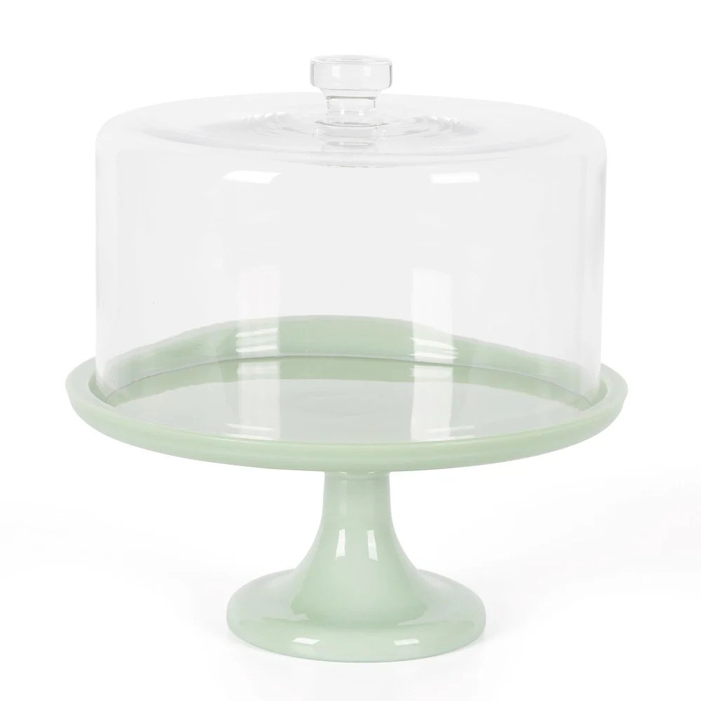
Elevate your table with the Highbrook 10.2-inch Jadeite Cake Stand, one of Martha Stewart’s favorite vintage-inspired pieces. Handmade from milk glass in jadeite’s signature pale green, this elegant stand is designed to last while adding a touch of timeless charm. A versatile and eye-catching addition, it turns every tabletop into a statement.