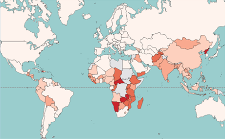
Did you know that two countries account for 81% of the total reduction of the number of hungry in the developing regions since 1990? That there are 15 million people in developed countries who are regularly undernourished? Or that the percentage reduction in the number of hungry people has been greatest in south-eastern Asia and Latin America?
Bringing together data for countries all across the world over 25 years, FAO’s redesigned interactive hunger map offers these and many other statistics on hunger trends during the MDG monitoring period (1990-2015).
Split into three categories – hunger by country, millennium development goal and World Food Summit – drop-down boxes allow users to search data by country, region and time period.
Complementing the hunger map, the SOFI2015 report, press release, FAQs and key messages bring greater context to the numbers.
Click here to view the interactive map.
Content on this page is paid for and provided by FAO, a sponsor of the Guardian Global Development Professionals Network.