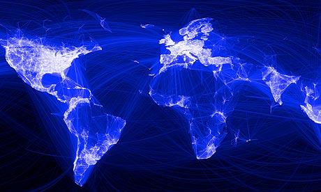
How do you visualise a social phenomenon? Paul Butler at Facebook has just produced this visualisation of pairs of facebook friends around the world.
He says of the process:
Visualizing data is like photography. Instead of starting with a blank canvas, you manipulate the lens used to present the data from a certain angle… When the data is the social graph of 500 million people, there are a lot of lenses through which you can view it. One that piqued my curiosity was the locality of friendship. I was interested in seeing how geography and political borders affected where people lived relative to their friends. I wanted a visualization that would show which cities had a lot of friendships between them
It shows a map of the world with great holes in it: Russia, China, Africa and South America. Facebook is very much a western beast.
You can read more about how he did it here.
What do you think of it?
World government data
• Search the world's government with our gateway
Development and aid data
• Search the world's global development data with our gateway
Can you do something with this data?
• Flickr Please post your visualisations and mash-ups on our Flickr group
• Contact us at data@guardian.co.uk
• Get the A-Z of data
• More at the Datastore directory
• Follow us on Twitter