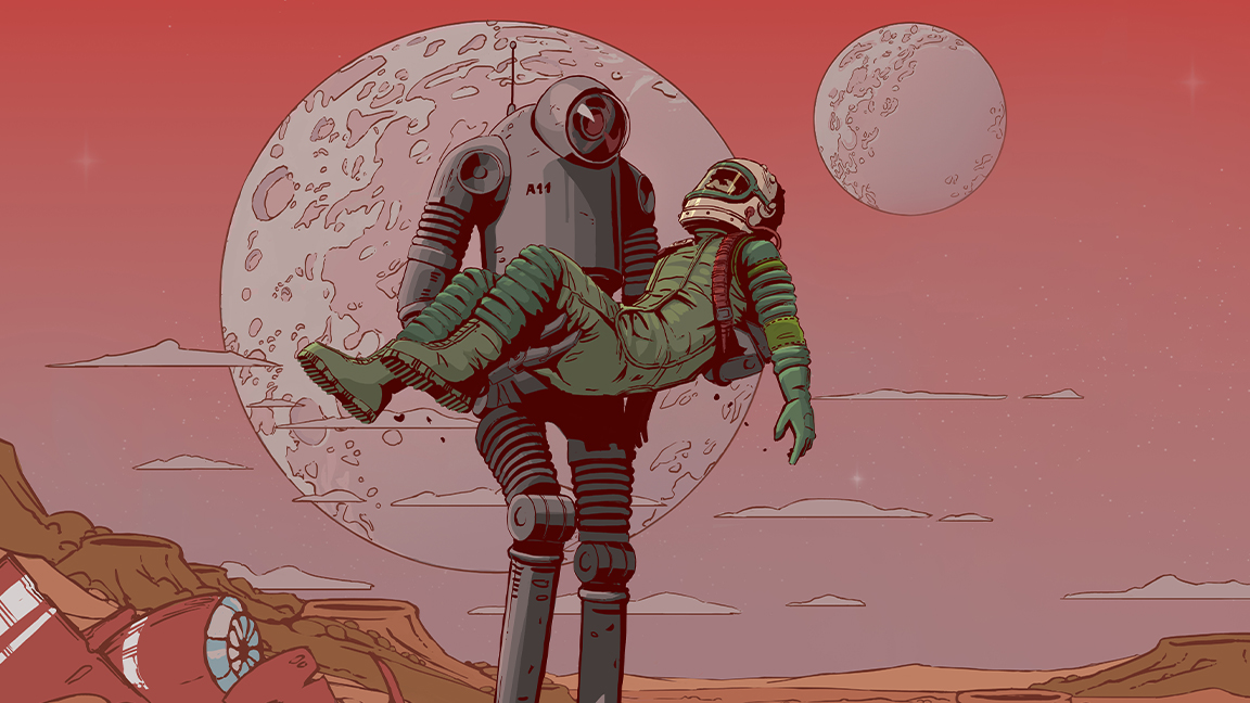
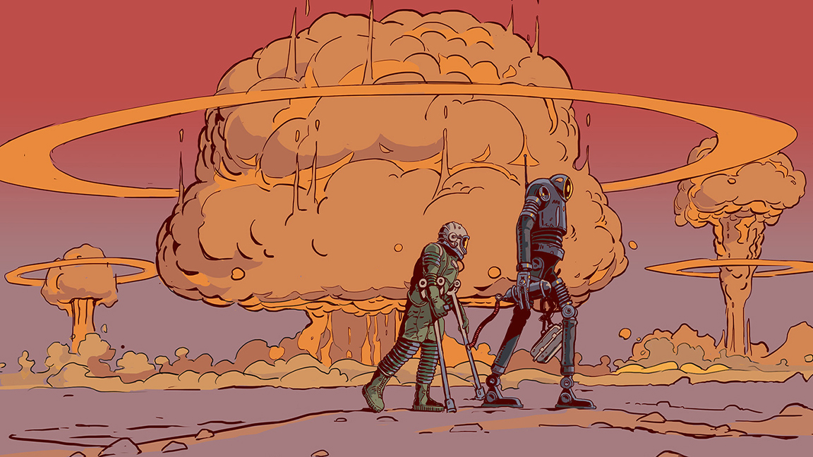
It's no secret I loved my time playing The Invincible for our PS5 review, its blend of retrofuturism, classic sci-fi art influences and great storytelling really came to life. There is a clear passion for 1950s design and the challenge of bringing Stanisław Lem's novel to life as a video game.
Below, The Invincible's art director Wojciech Ostrycharz shares his insights into how the game was made, the art influences that affected its visual design, from Chris Foss to Syd Mead, as well as how Unreal Engine brought Lem's 1950's sci-fi world to life.
You can read my The Invincible review to see why I loved this game (played on PlayStation 5), but look below for Ostrycharz's art insights as well as exclusive, unseen concept art. If you love the style of The Invincible, you can buy the art book, on sale now, which features more unseen art as well as quotes from Stanisław Lem's book - "our source and main inspiration," says Ostrycharz.
The Invincible: Wojciech Ostrycharz interview
The art direction resembles 1950's sci-fi book covers, how hard is it to bring that style to life in a video game?
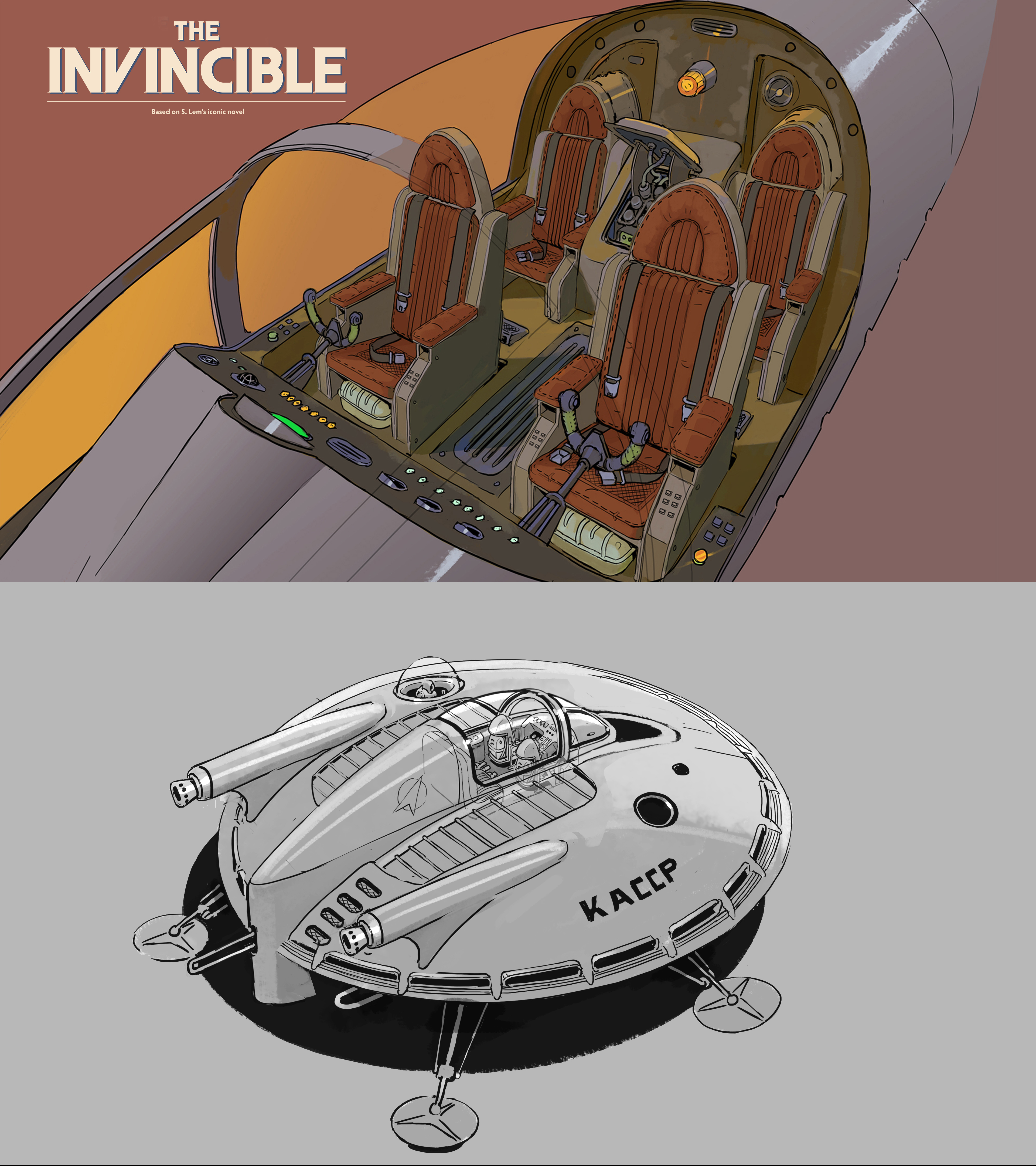
The most challenging aspect was clarifying my vision for achieving and enforcing the retro aesthetic. I sought numerous inspirations, with book covers from the era when Stanisław Lem was creating, serving as a natural path to shape the art style for the game.
I further refined this by drawing inspiration from Chris Foss's illustrations, analysing the choices of 1950s designers, and even examining astronomy textbooks from the mid-20th century.
Did you need to control yourself when it came to the colour palette?
I aimed for warm, vibrant, and bright colours that would give Regis III in the game a painterly quality, a sort of 'unrealism'. Following this direction, we developed a colour palette that the entire team found quite natural to work with, achieving the desired effects. We were fairly confident about what we wanted to see in The Invincible world, and as we progressed, we became convinced that our chosen solutions were effective.
Is it easy to get retro-futurism wrong?
We had an important principle - we sought a lightness and naivety in form while maximising the functional realism of objects, costumes, and vehicles. I made a conscious effort to immerse myself deeply in the imagination of a person from the pre-space exploration era, someone living in a world without digitisation and lacking knowledge about it - envisioning how they would dream of a world from, for example, 2023.
You were influenced by Chris Foss, what do you like about his work?
I highly appreciated his imagination, stylisation, departure from realism, and the way he played with form while maintaining a keen awareness of colour.
How has using Unreal Engine affected the look of the game?
We're thrilled that the game looks like it was created on Unreal Engine 5. We put in a lot of effort to achieve the current result, primarily influenced by our developed colour composition, material choices, and lighting. However, it's important to note that we utilised Unreal Engine 4 for the project. Heh, it's nice that the game gives the impression of being built on Unreal Engine 5. I believe the artistic team can be proud of their achievements.
Did you need to consider the 'texture' of the game's world, given its style. For example, did you hold off making things too shiny?
Textures are an incredibly important hallmark of the style we've crafted - atompunk with heavy, manual machines. Unreal Engine 4 aided us in achieving an impressive material of sunlight-reflecting chrome, which mirrors the environment's cube map.
This allowed us to obtain vibrant colours in reflections and a very tactile effect on the gleaming chromed surfaces, contrasting with the dry, matte sand of Regis III. This contrast is also foundational to the entire game's style. The brilliant illustrations of the genius Syd Mead were a significant inspiration for this effect.
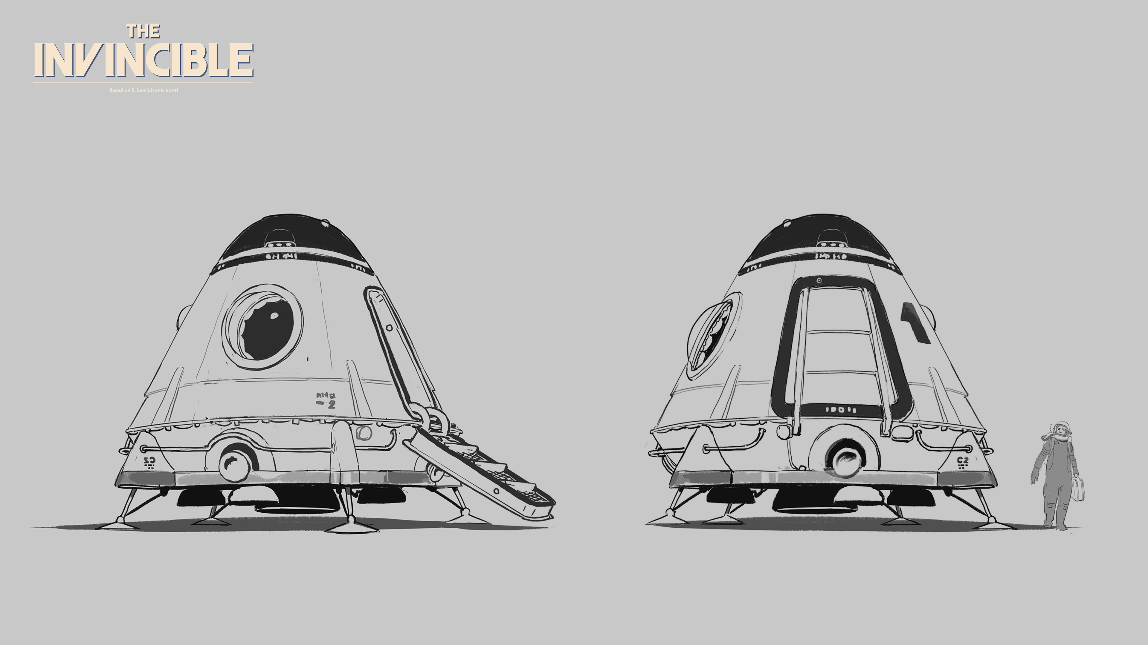
Was it fun to find the balance between realistic, functional designs and the kind of design aesthetic associated with the 50s?
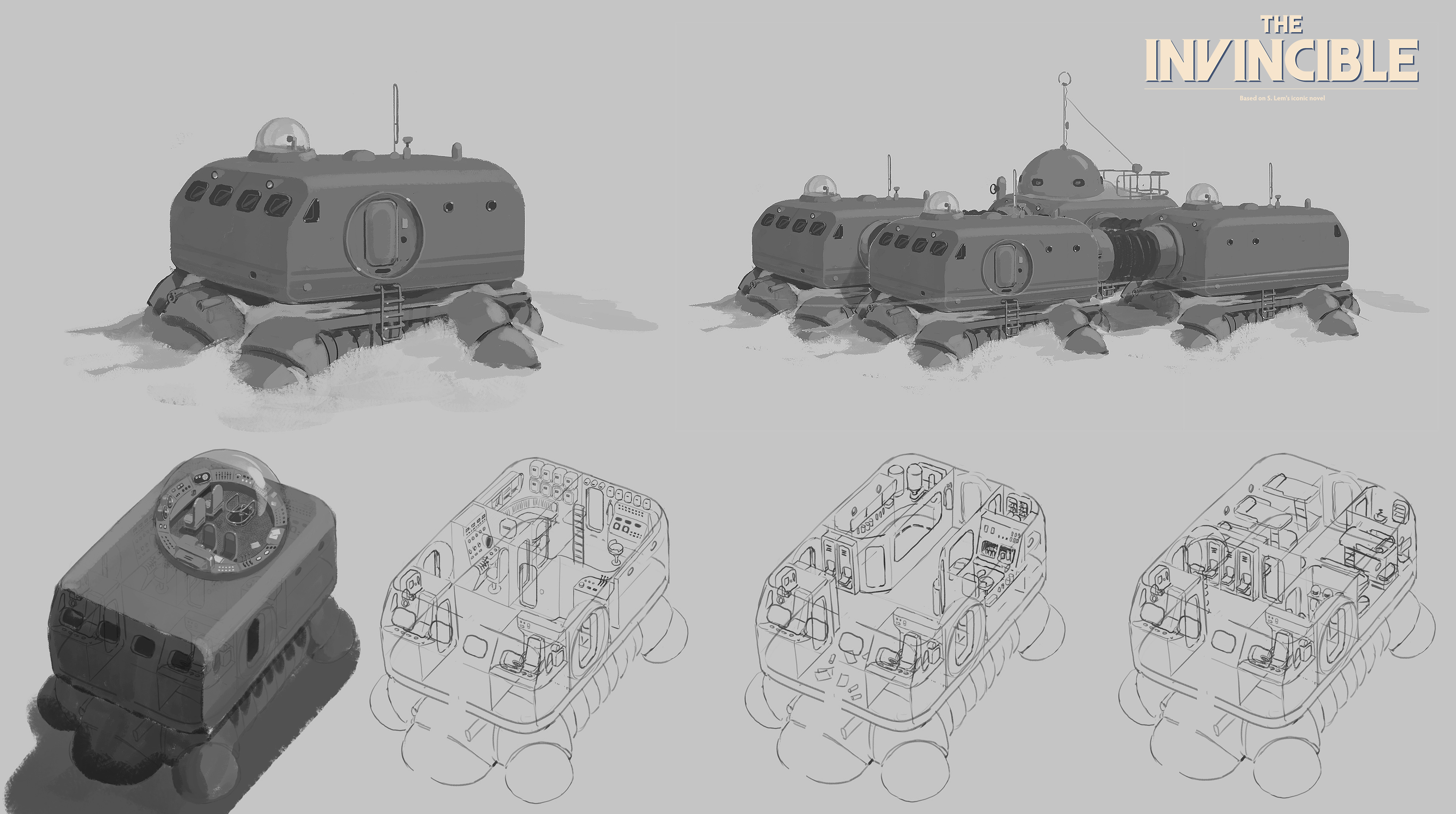
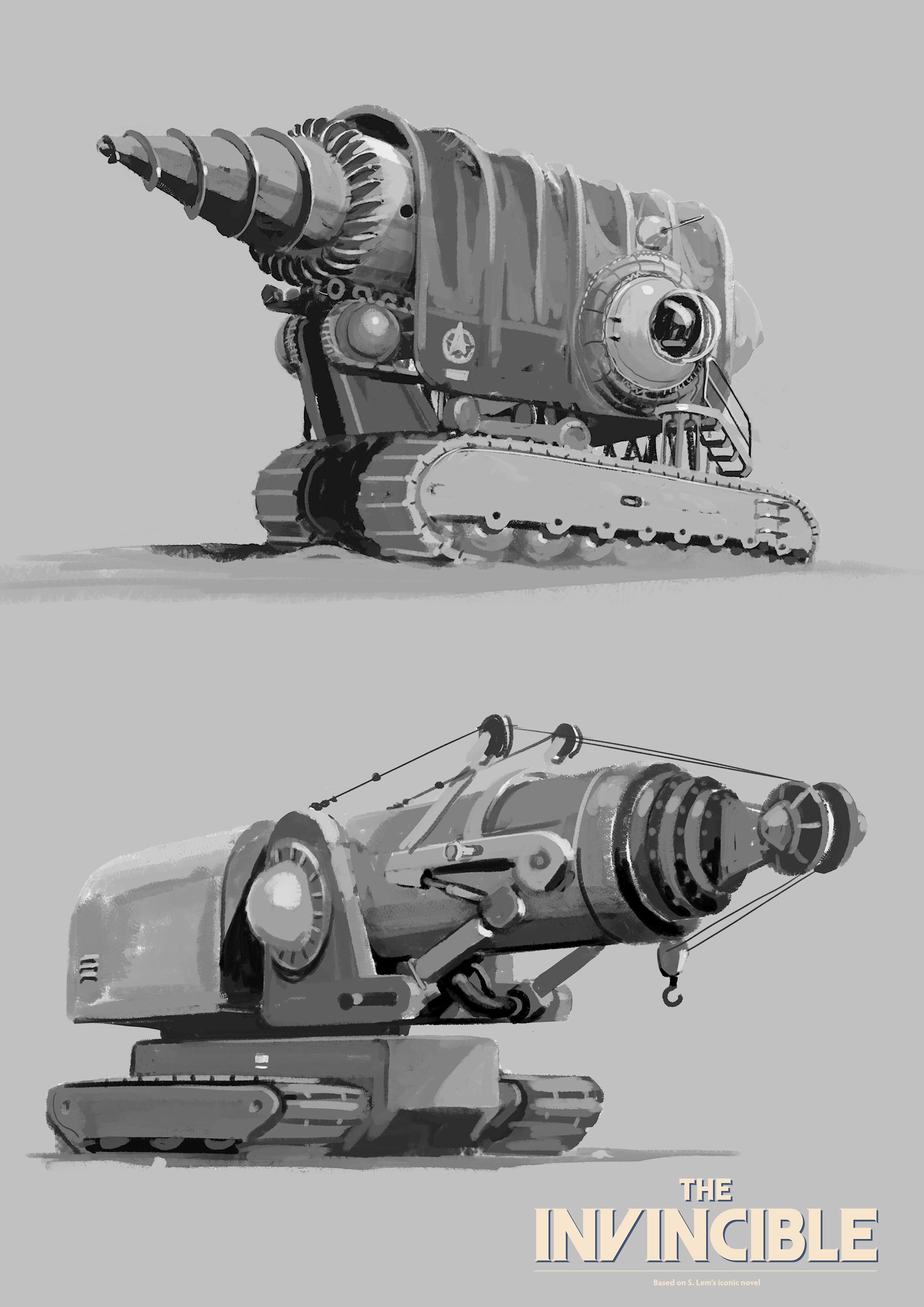
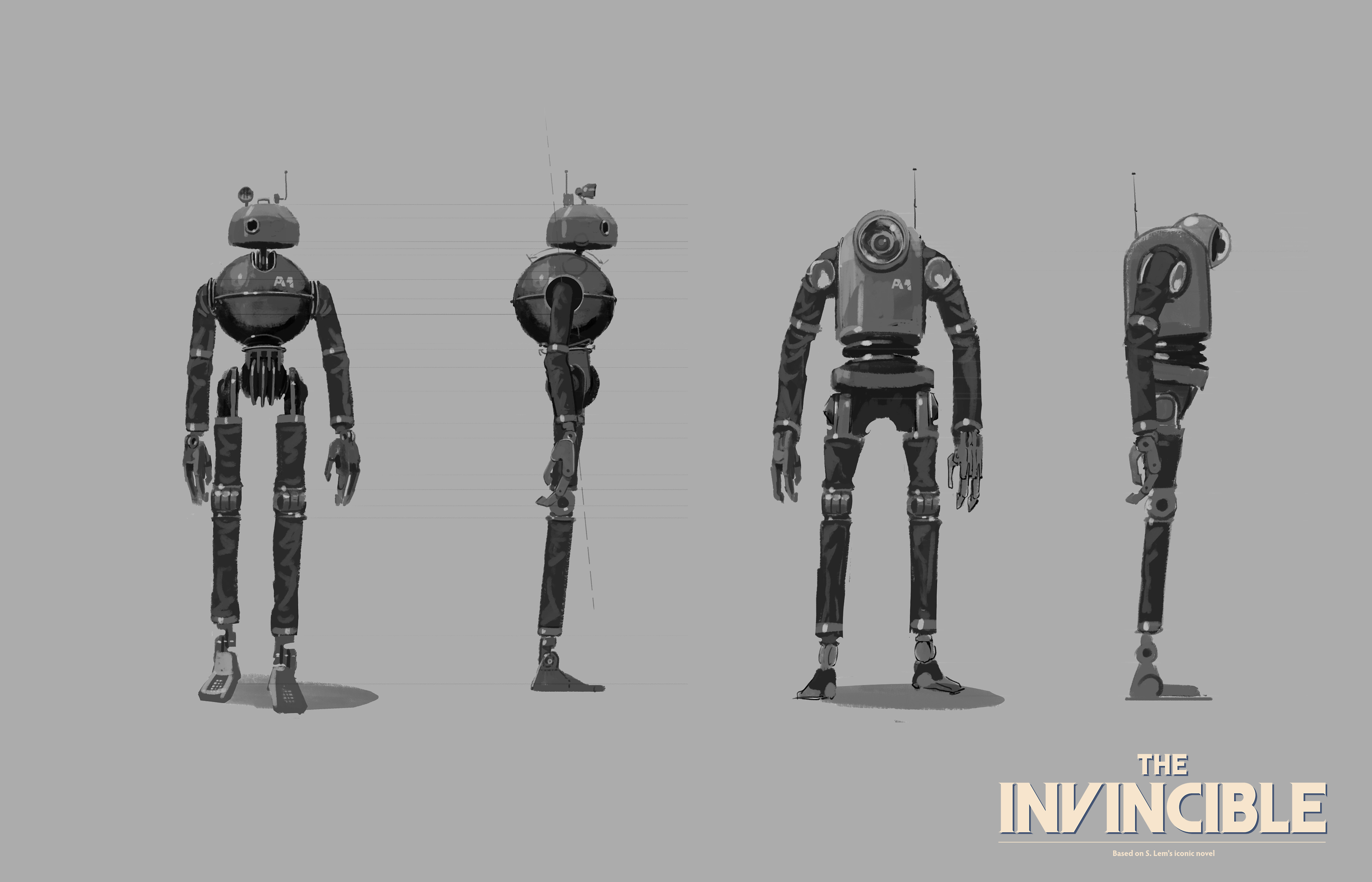
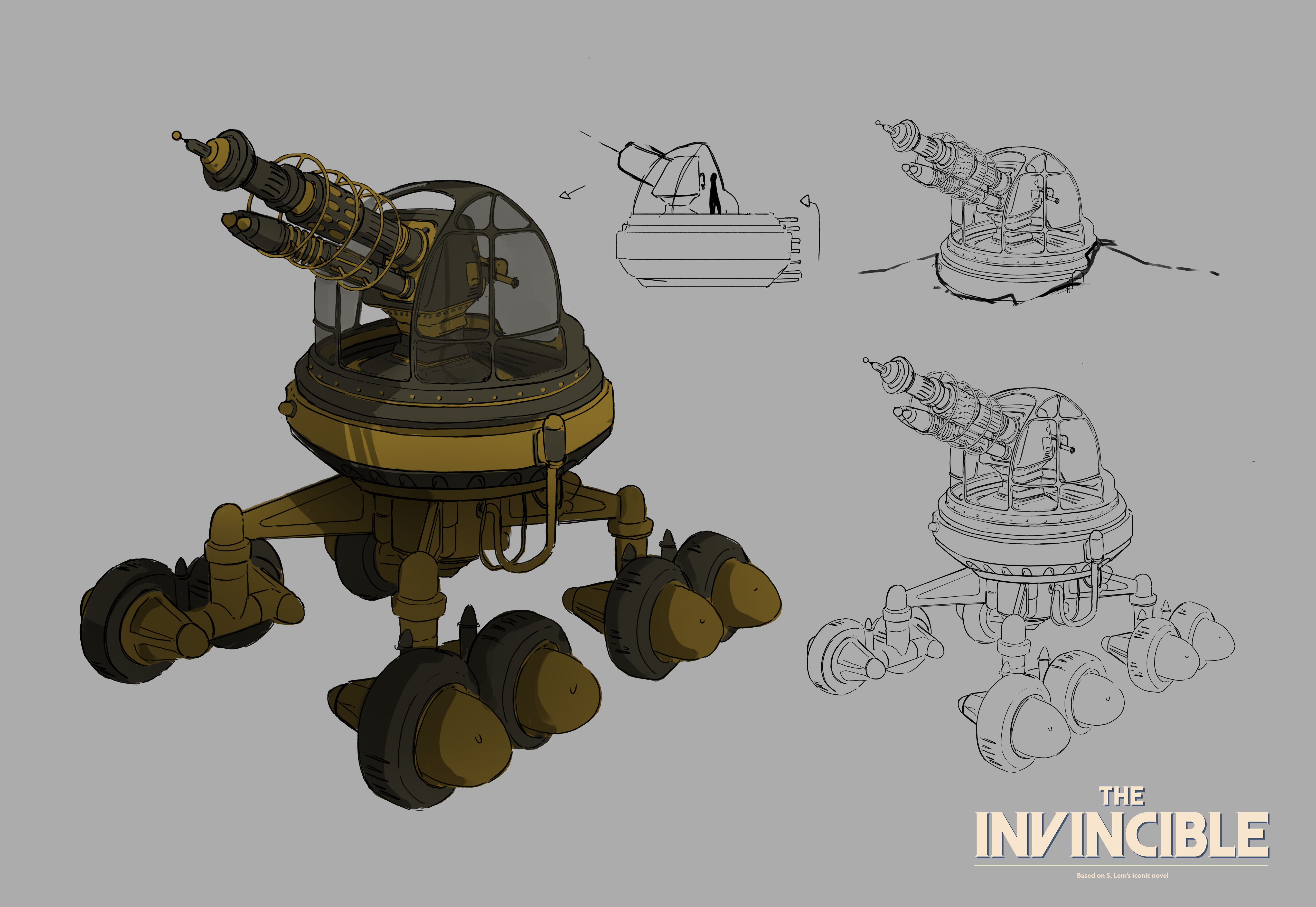
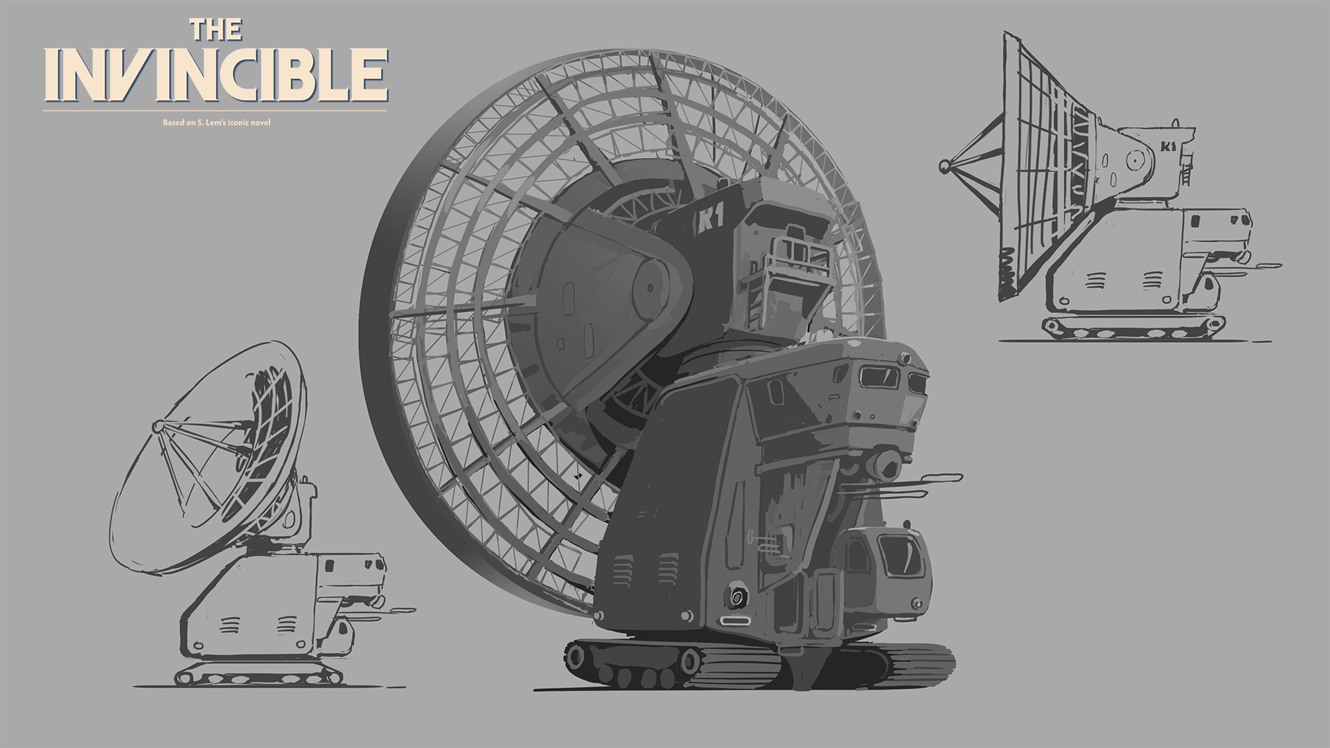
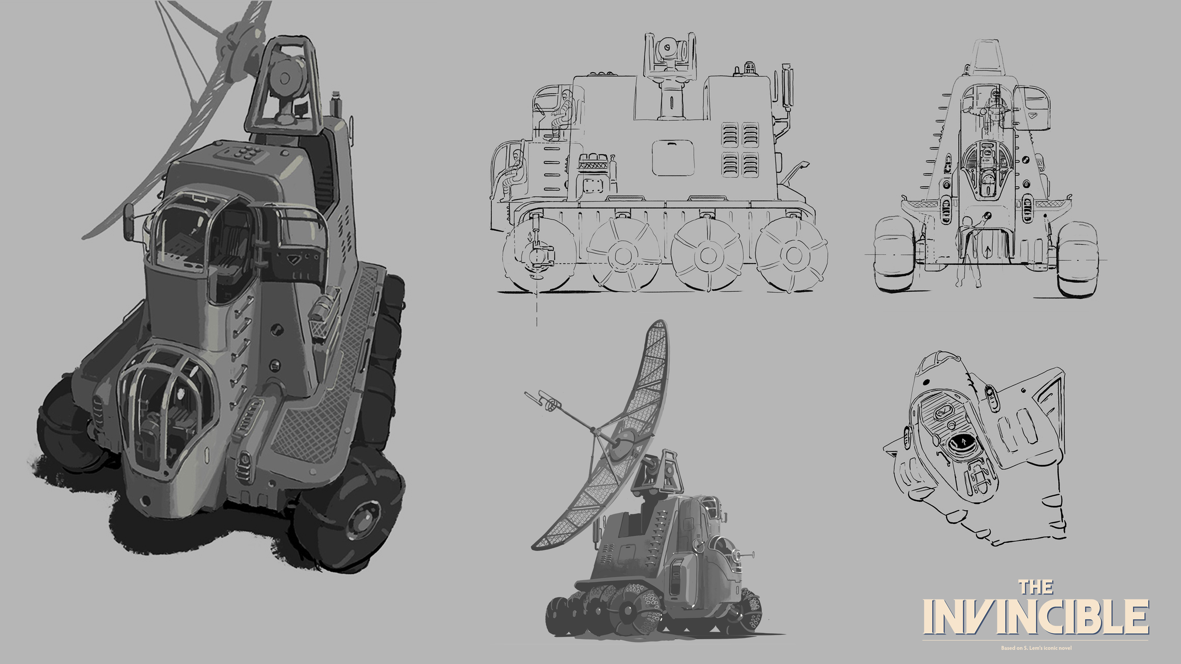
Yes, it was an extraordinary experience. Having an engineering background, I particularly enjoyed analysing the technical aspects, in line with the spirit of hard science. I enjoy delving into the works and outlines that emerged during the creative process - many intriguing atompunk devices and robots.
Was there a design that gave you nightmares, one that you kept coming back to time and again, and why?
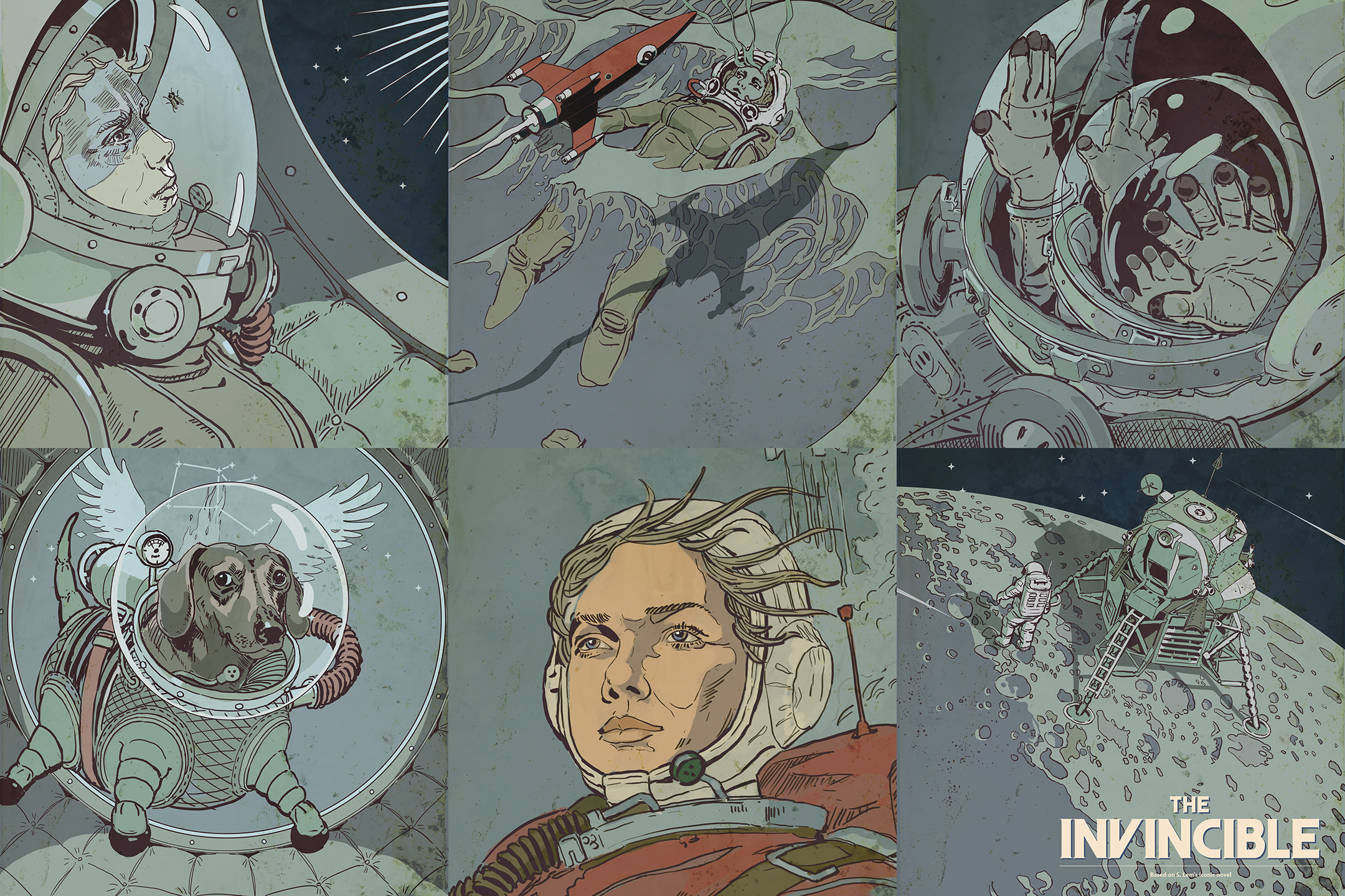
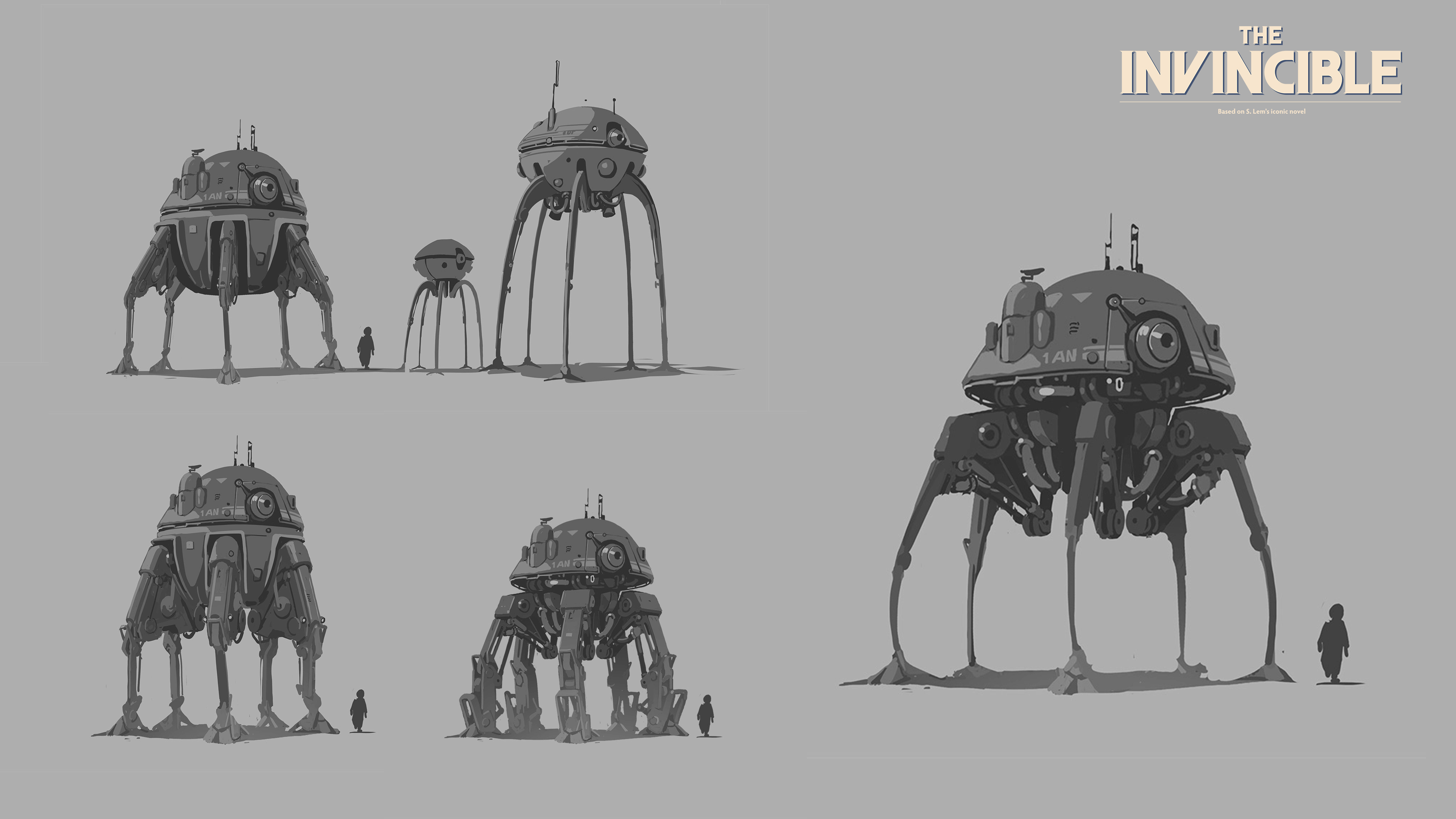
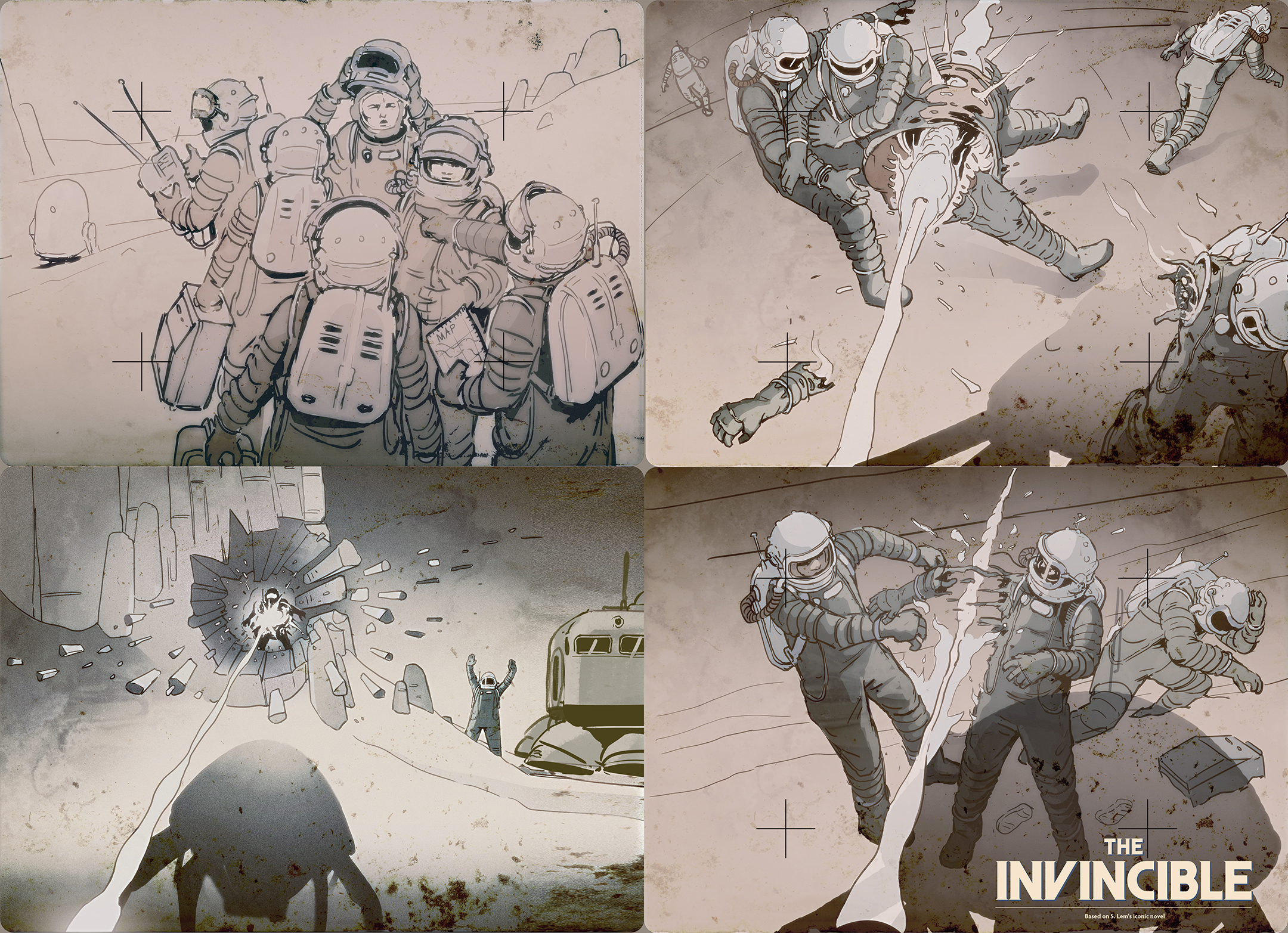
In terms of the game's design? If I could improve something, I would focus on the character's spacesuits. It can be done better. When it comes to things that are closest to my heart, it would be the design of the robots, especially the Arktan. Personally, I would love to have a loader like that.
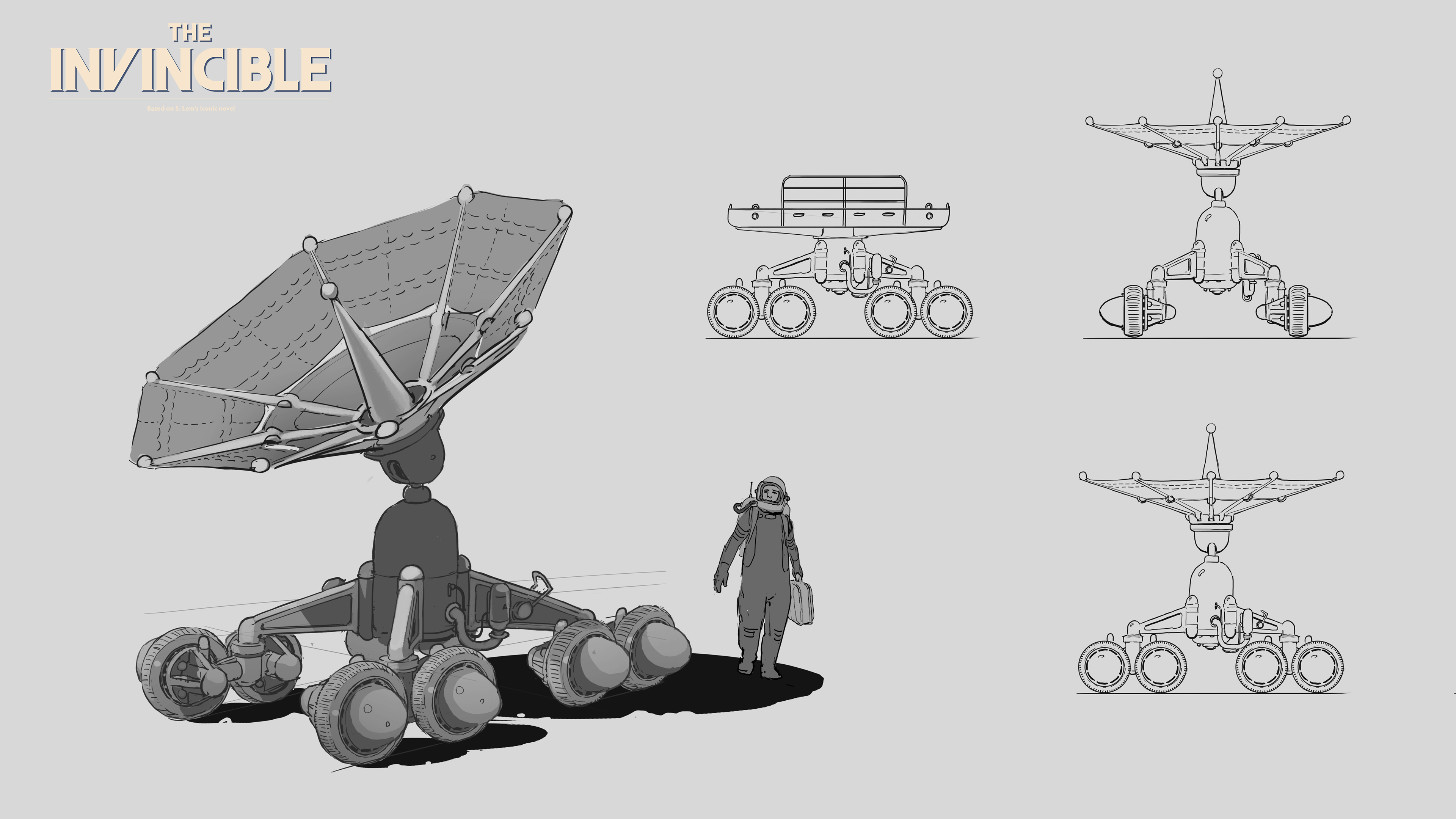
Is there a 'shape language' to the planet's design, its terrain shape, that you had to adhere to? How did this work?
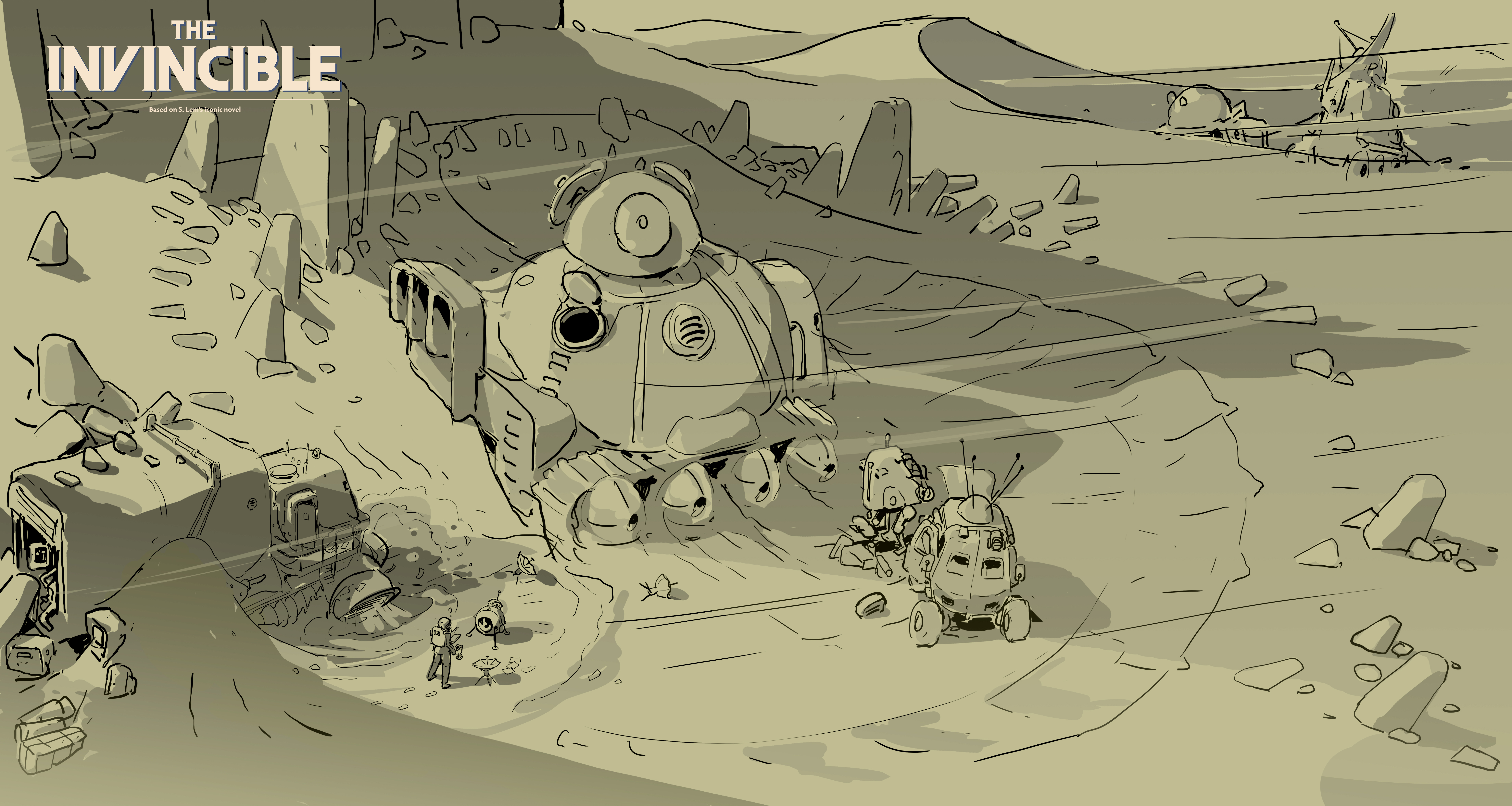
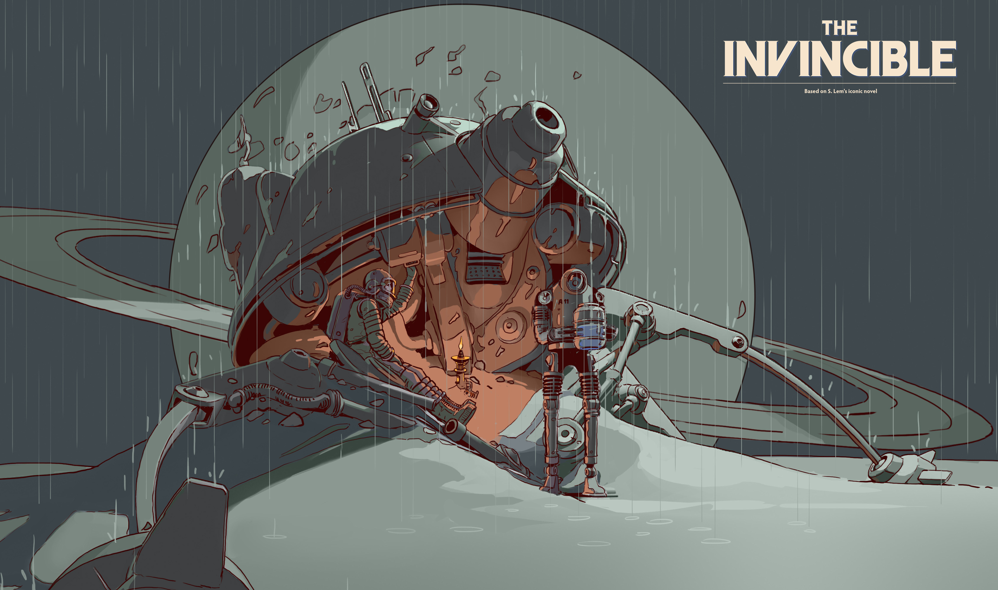
Designing Regis III… we constantly referred to Stanisław Lem's book The Invincible. We aimed to refine and imagine the image of the planet that existed in Lem's mind.
We wanted to capture its eerie beauty, cosmic otherness, a certain warmth, and the stifling atmosphere. We focused on environmental storytelling, leaving traces of ships and abandoned machinery on the surface of Regis, as if it were seamlessly integrated into the planet.
In a game like this the hands become the character, how much time was spent refining the animation here?
The animation for the game was handled by another team directly under the game director. However I can say that a significant improvement in the game's animation creation process was the introduction of mockup technology.
Can you tell us a little about the logo designs and in-game branding; what inspired these and did you enjoy working on graphic design elements?
We were searching for a distinct, characteristic stylised form that would resonate well with the art style based on book covers. It was a very good, creative process.
The invincible is on sale now for PlayStation 5, Xbox Series X and Series S, Microsoft Windows, GeForce Now, developed by Starward Industries and published by 11bit Studios.