Movies often create a mood through a unique colour palette and colour grading. For example, Wes Anderson’s Asteroid City became a sensation on social media, thanks to its striking colour scheme that leaves a lasting impression on viewers.
This has inspired other creatives to adapt a similar colour scheme to their own images, allowing them to display everyday scenes in a different visual aesthetic.
What you'll be using:
- Develop Persona
- Exposure and Detail settings
- HSL Shift Adjustment layer
- Hue, Saturation and Luminosity Shift
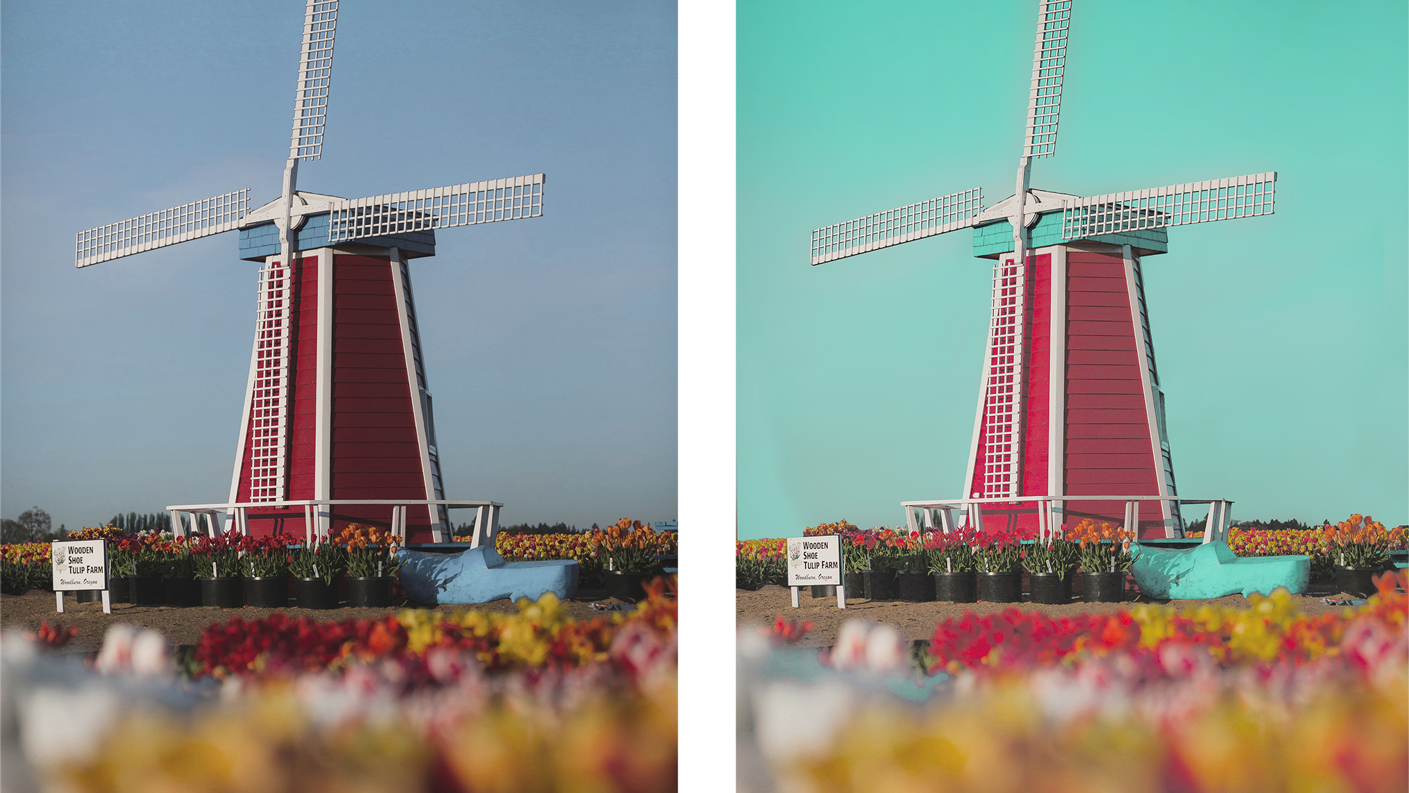
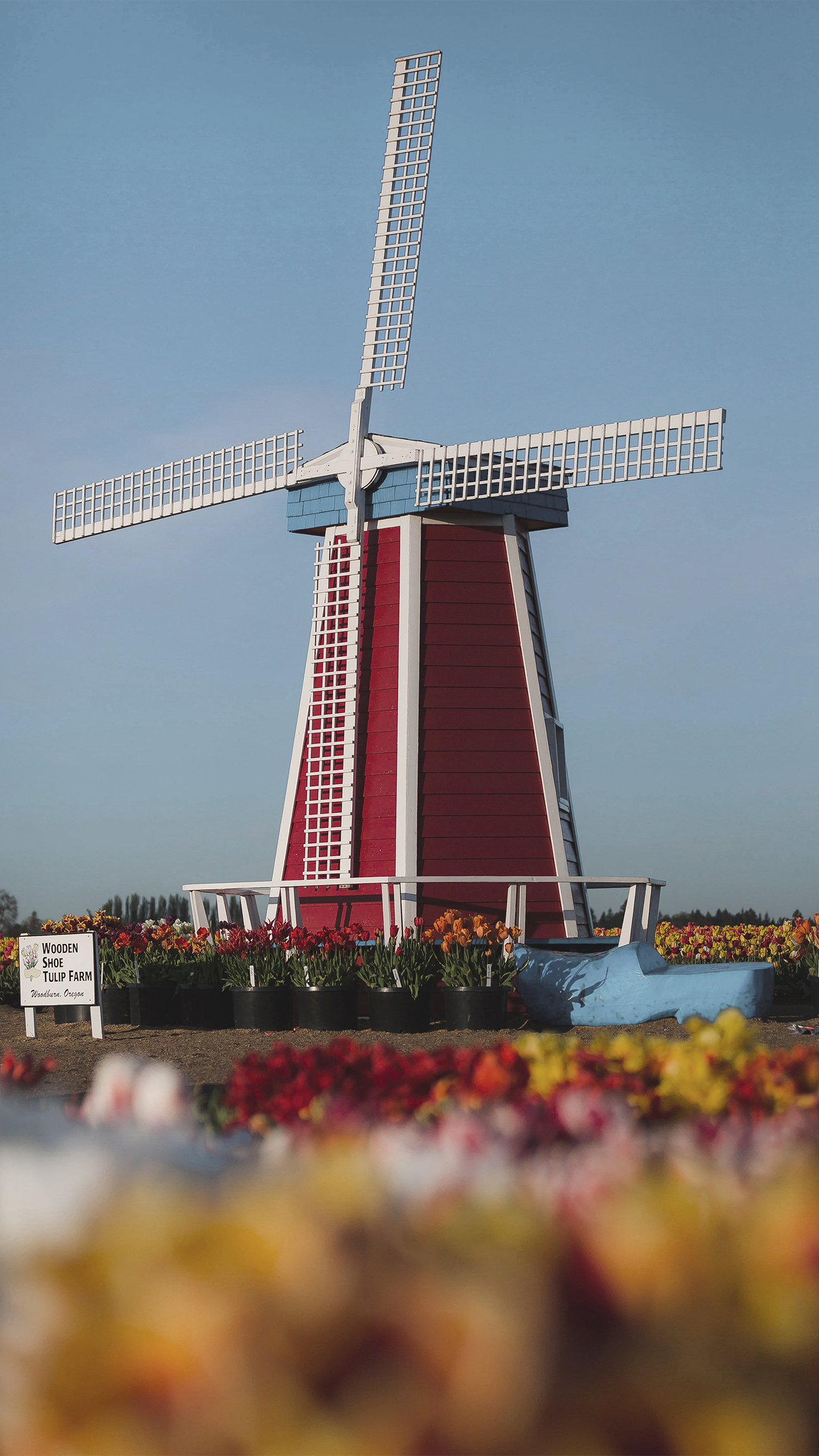
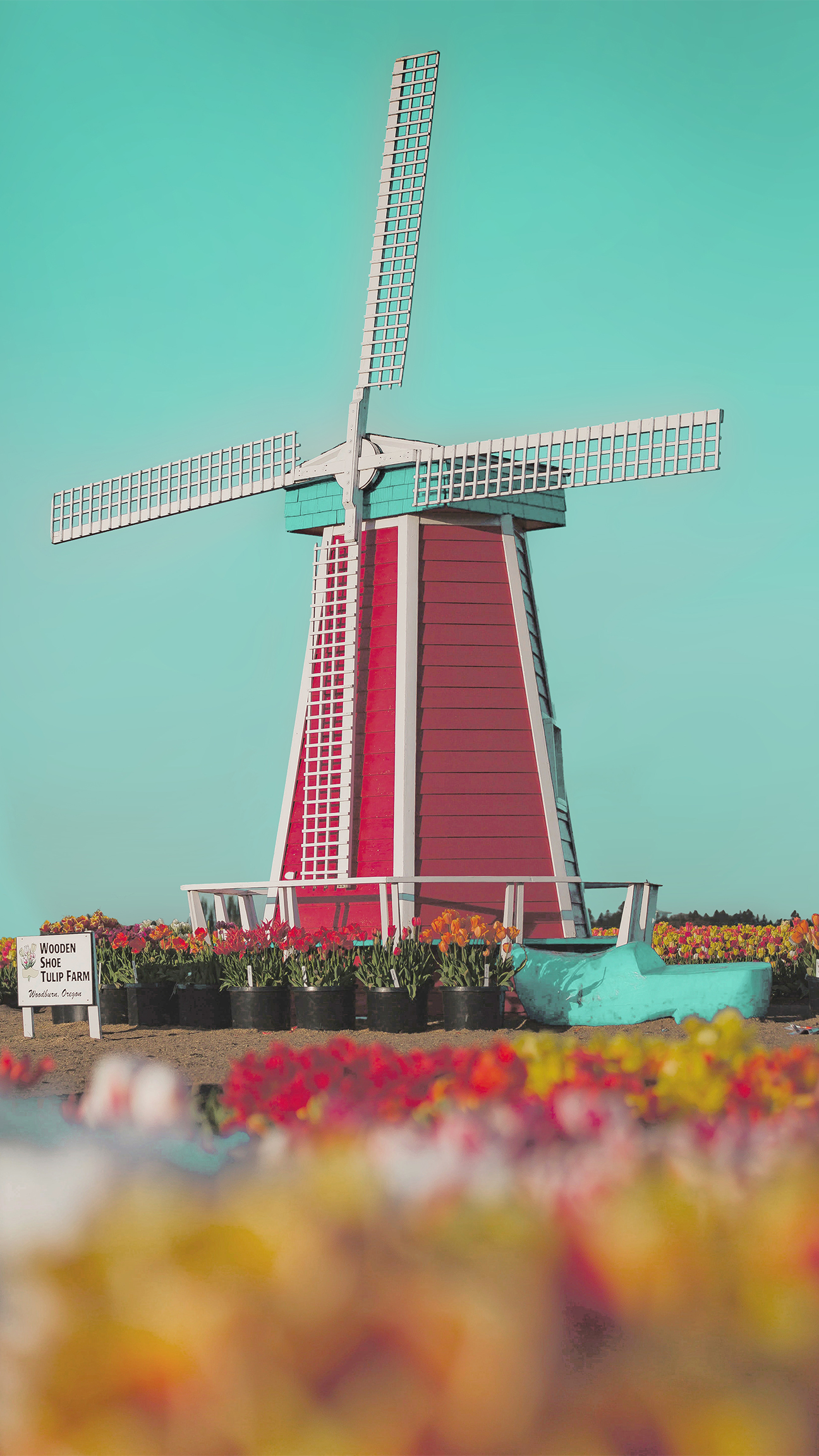
Before and after
Editing steps
1. Adapt basic settings
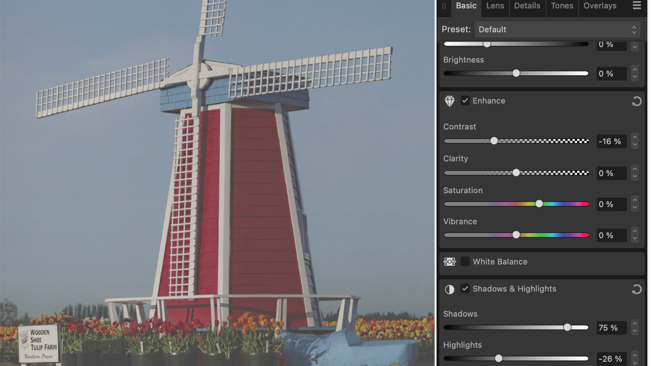
Start by adding a new layer to copy in a reference image from the movie. This makes it easier to compare and ensure the colours are accurate. Select the Background layer and open Develop Persona. Work on the Basics and decrease the contrast and highlights while increasing the shadows.
2. Increase saturation and details
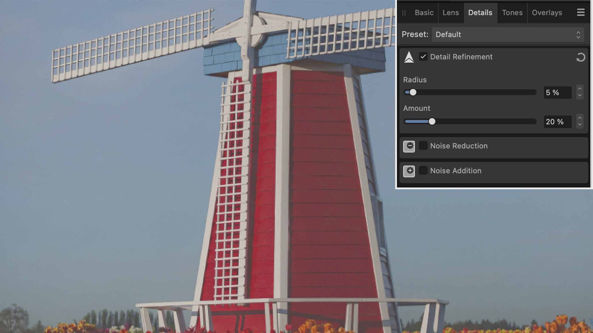
To achieve this iconic colour scheme, use the saturation slider to intensify the colours. As we decreased the contrast, open the Enhance section to restore lost details. Under the Detail refinement setting, choose a small radius and percentage amount to avoid over-sharpening.
3. Work on hues
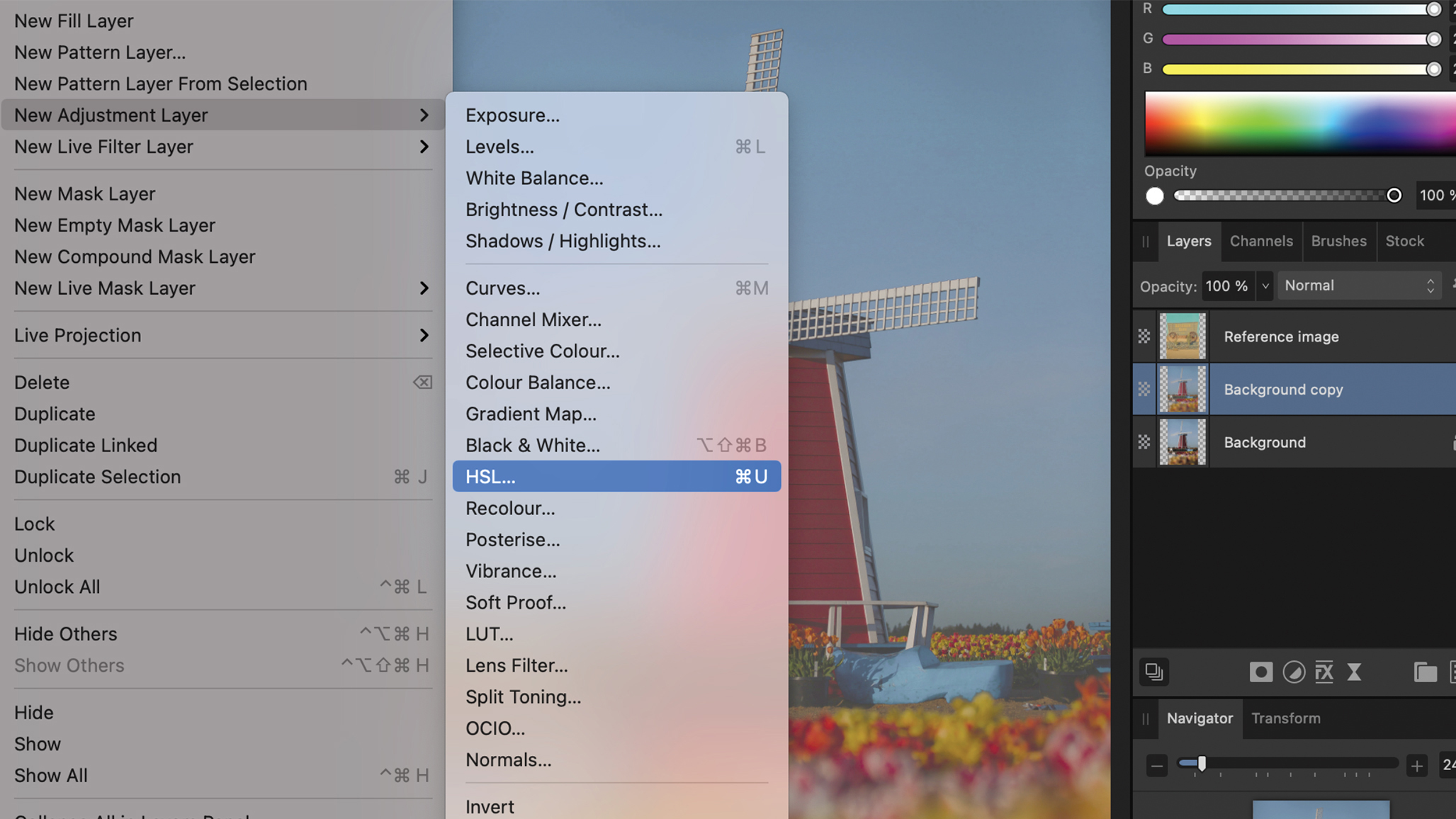
After developing the image, add an HSL Shift Adjustment layer – you will find the specific colours under the wheel. First, adapt the hues. Decrease the Yellow and Red hues slightly, while increasing the Blue and Aqua hues. If you are unsure about the settings, open the reference image to use it as a guide
4. Adapt saturation
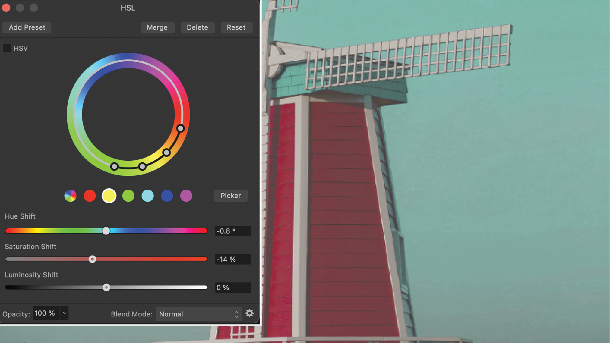
Use the Saturation Shift slider to adjust saturation, paying particular attention to the sky – a crucial element in Wes Anderson movies. Boost the Blue and Aqua tones, particularly Aqua. Decrease the Yellow and Red values until the overall colours match the desired theme.
5. Refine luminance
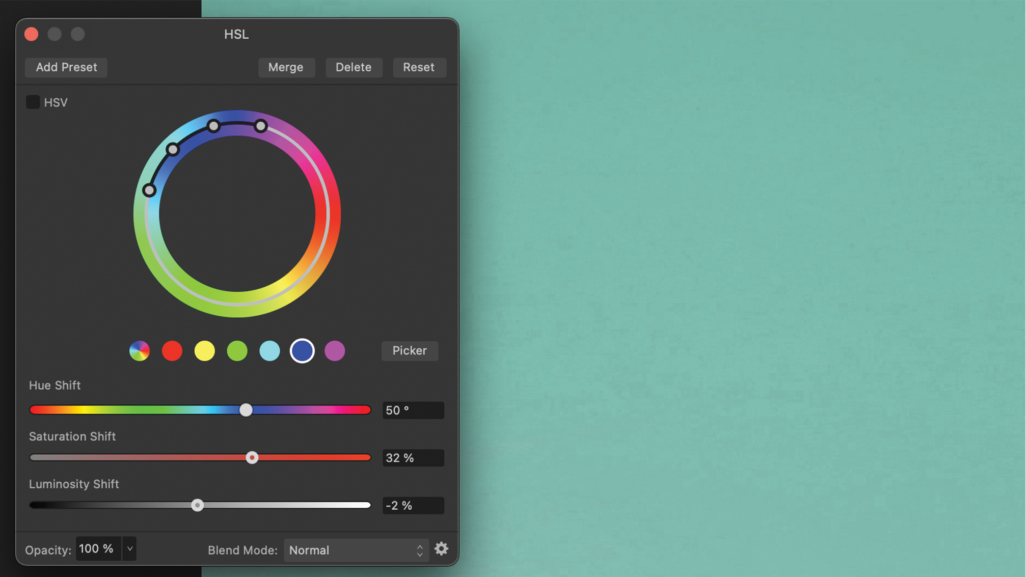
As a final touch, adjust the Luminosity slider. Decrease the values for Aqua and Blue to enhance the depth of the sky. For greater depth, you can use the Dodge and Burn tools to create a subtle gradient. Compare the tones with your reference image and adjust the settings if necessary.
Key tip
Go beyond and build your style
This style allows for plenty of creativity and experimentation so feel free to push the boundaries and explore all the possibilities. Above all, have fun with the process, there is no such thing as ‘too much’ editing. This will also assist you in developing your own colour palette for future projects.