Is magnolia back on trend? Anyone who's ever lived in a soulless rental painted in nothing but the divisive shade might be rolling their eyes right now. Can this yellow-toned neutral ever be stylish again?
Well, yes – because this is magnolia 2.0. Shaking off its former boring, basic image, this warm beige is making its way into designers' schemes all over – making this one of the hottest interior design trends of 2024, and definitely the color trend to know right now.
Warm and cocooning, cool and breezy, and incredibly versatile – there are plenty of ways to make this color work for you. Check out the designer spaces below for inspiration.
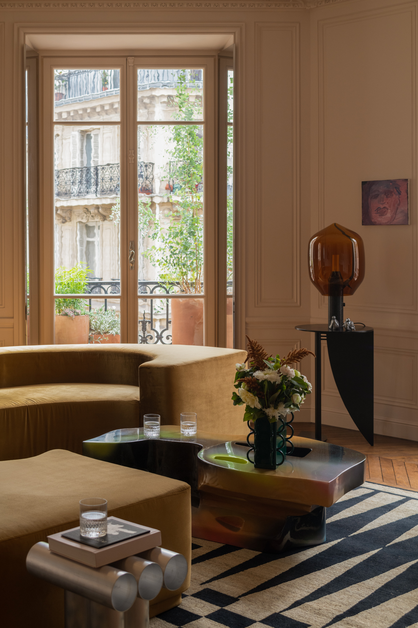
1. Paired with straw marquetry in a luxe living room
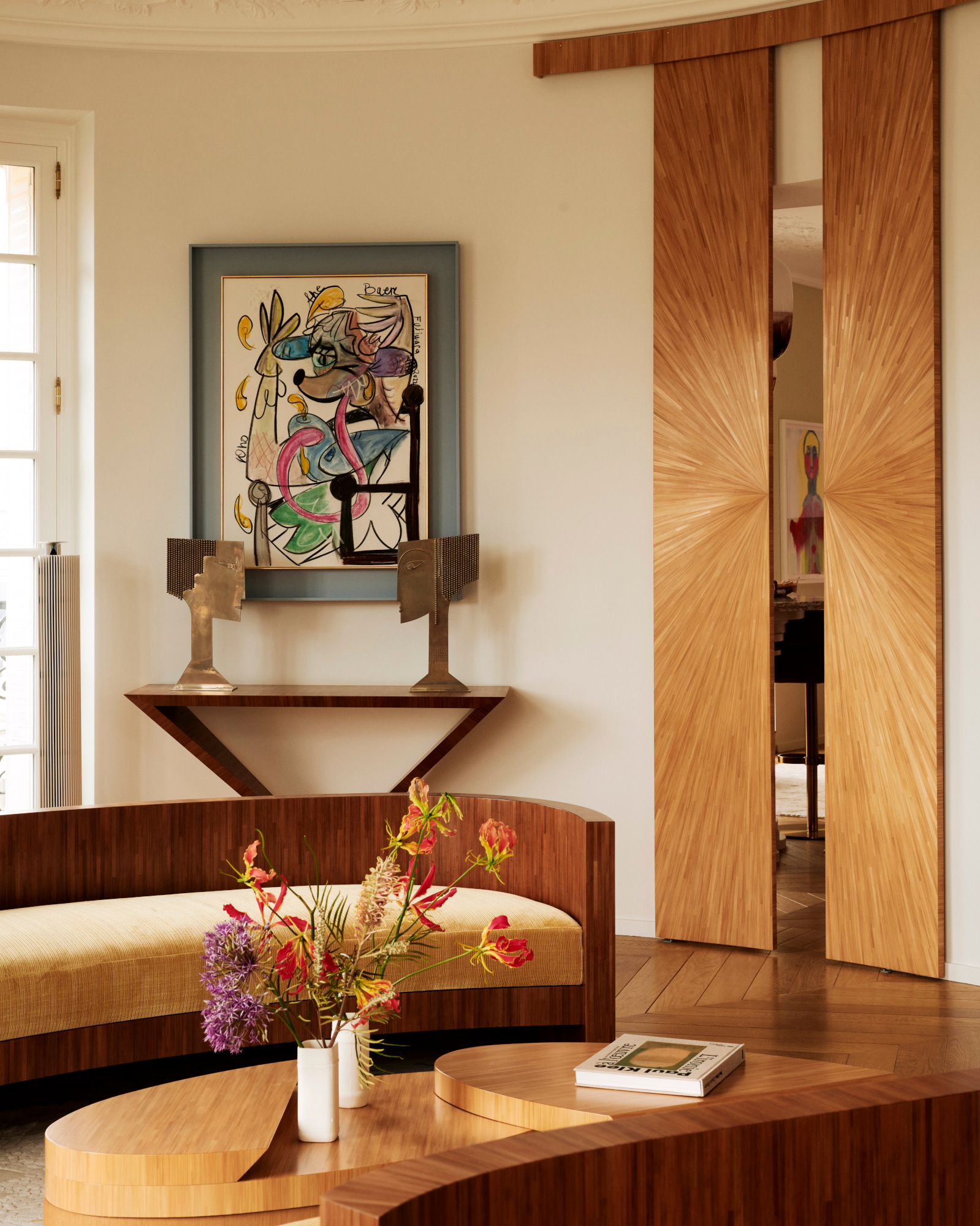
Built-in furniture and marquetry in complementary tones to the walls – painted in Farrow & Ball's Matchstick – were key to the success of this living room by Parisian design duo Hauvette & Madani. ‘We chose straw marquetry for this project because of the warmth of its blonde/gold color and the preciousness of its finish,’ Samantha Hauvette and Lucas Madani explain of the modern furniture idea. ‘It also has a powerful light reflection.’ The result is a scheme that allows the colors of the artwork on display to sing against the warm beige walls.
2. As the basis of an organic, French-inspired dining scheme
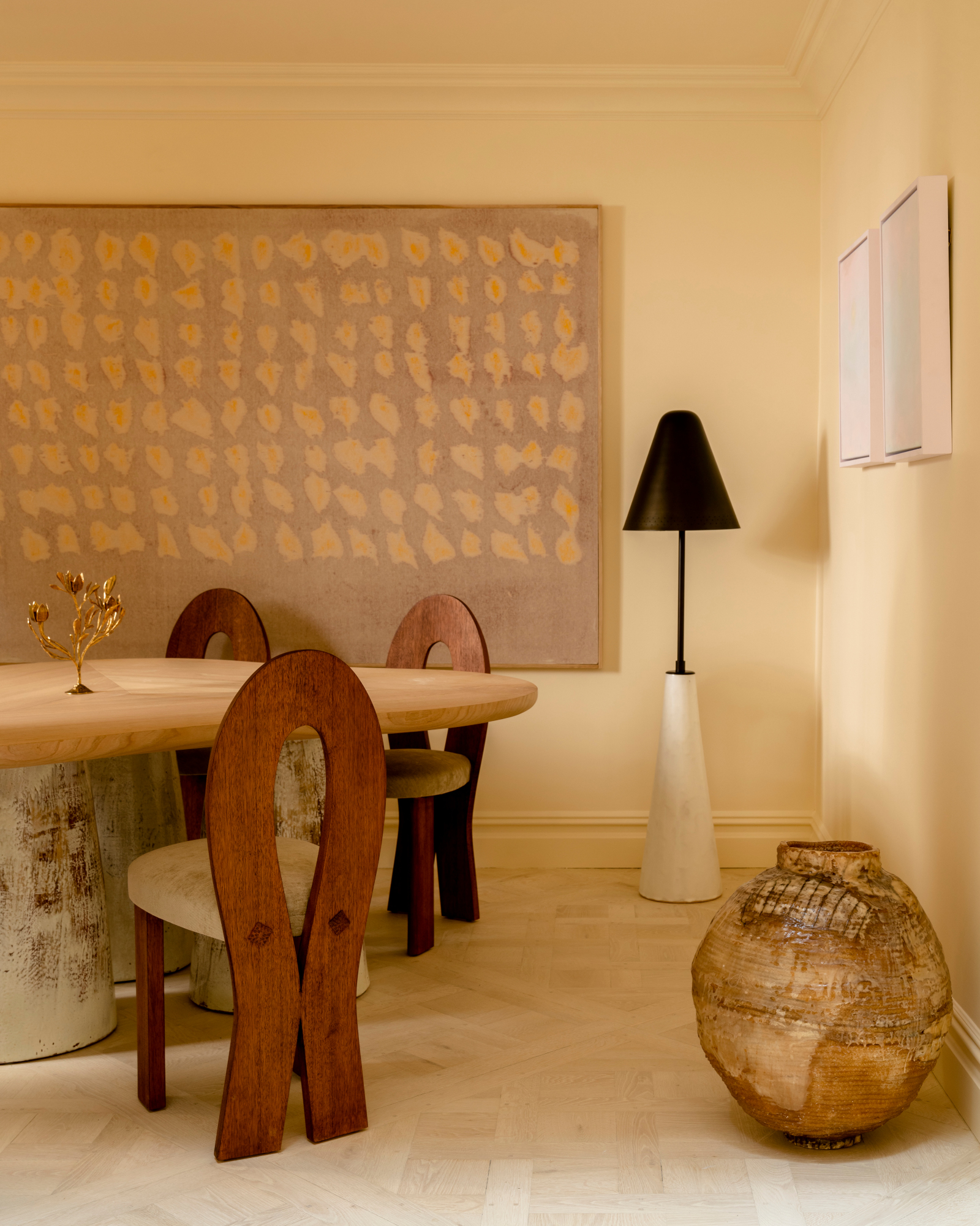
There’s something of a fanciful story behind this dining room idea, created by Invisible Collection co-founder Isabelle Dubern-Mallevays. ‘We imagined the atmosphere of a French home in an Upper East townhouse,’ she says. ‘The paint, Blanc d’Ivoire by Mériguet-Carrère, is very soft. We particularly like to mix organic materials and works of art in this room.’
3. Used on units for a warmed-up approach to a kitchen
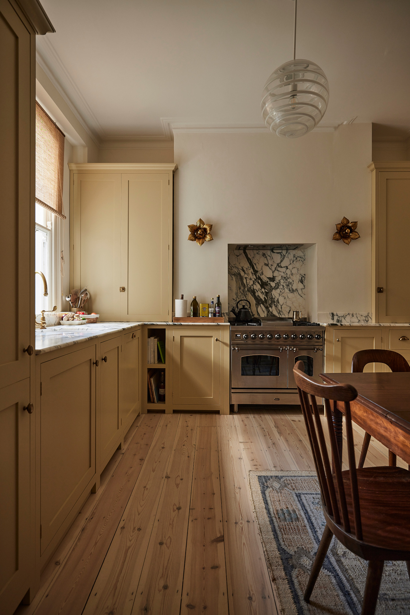
A gentle, muted yellow – Farrow & Ball's Cord – adorns this kitchen by London's Pernille Lind Studio, the neutral paint color complementing the original pine floors. ‘The Arabescato marble adorning the alcove wall and worktops adds depth to the otherwise pared back interior,' says Pernille Lind. 'For an unexpected layer, a pair of gold leaf French flower wall lights frame the cooker opening, while the vintage chairs and dining table add contrast to the coherent color scheme.’
4. Applied in abundance in this layered living room
For Parisian interior designer Rodolphe Parente, it was crucial to keep the ‘Parisian vibration’ of his client’s home when embarking on this overhaul. Soothing yellow-toned walls, a bespoke color for this project, set the scene – but it’s a curved sofa, in a new-magnolia-adjacent beige-brown, that pulls the focus. ‘We kept a neutral tone backdrop, enhancing the classical heritage of the apartment while creating a tension with expressive materials.’
5. Given textural appeal in this bedroom
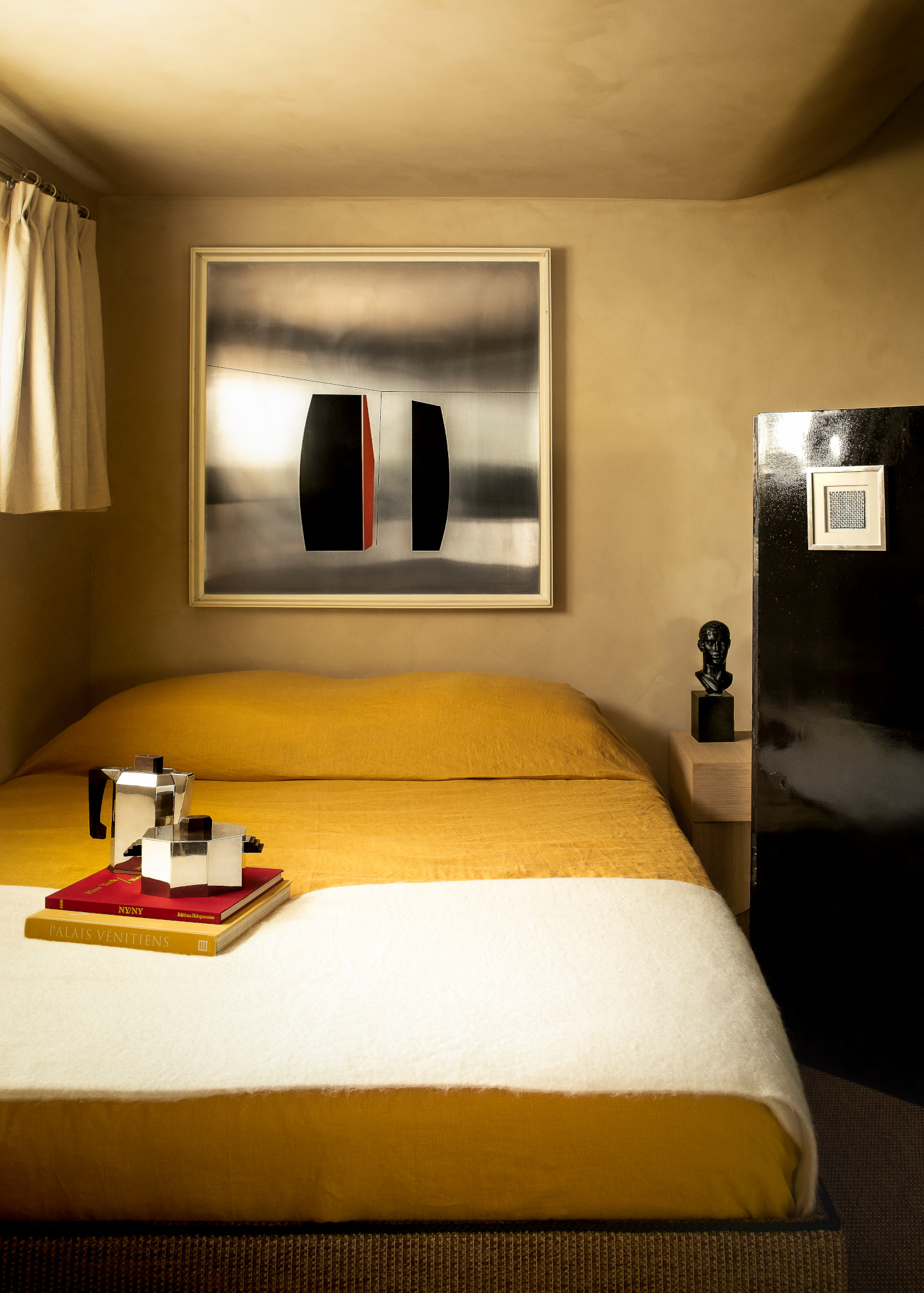
Enveloping the bedroom of this project by Parisian studio Le Cann, beige clay paint gives the scheme a moody, cocooning feel – yet the textured walls and warm color is offset by large sheets of chrome in the artwork. ‘The finish of the lime paint is contrasted by the style, materials and colors of the art, explains co-founder Guillaume Fantin. ‘[The piece] by Giorgio Tonti from the 1970s, in brushed stainless steel and lacquer, energizes this beige envelope and brings astonishing reflections to the environment.’
6. Taken in a lighter direction in this kitchen-diner
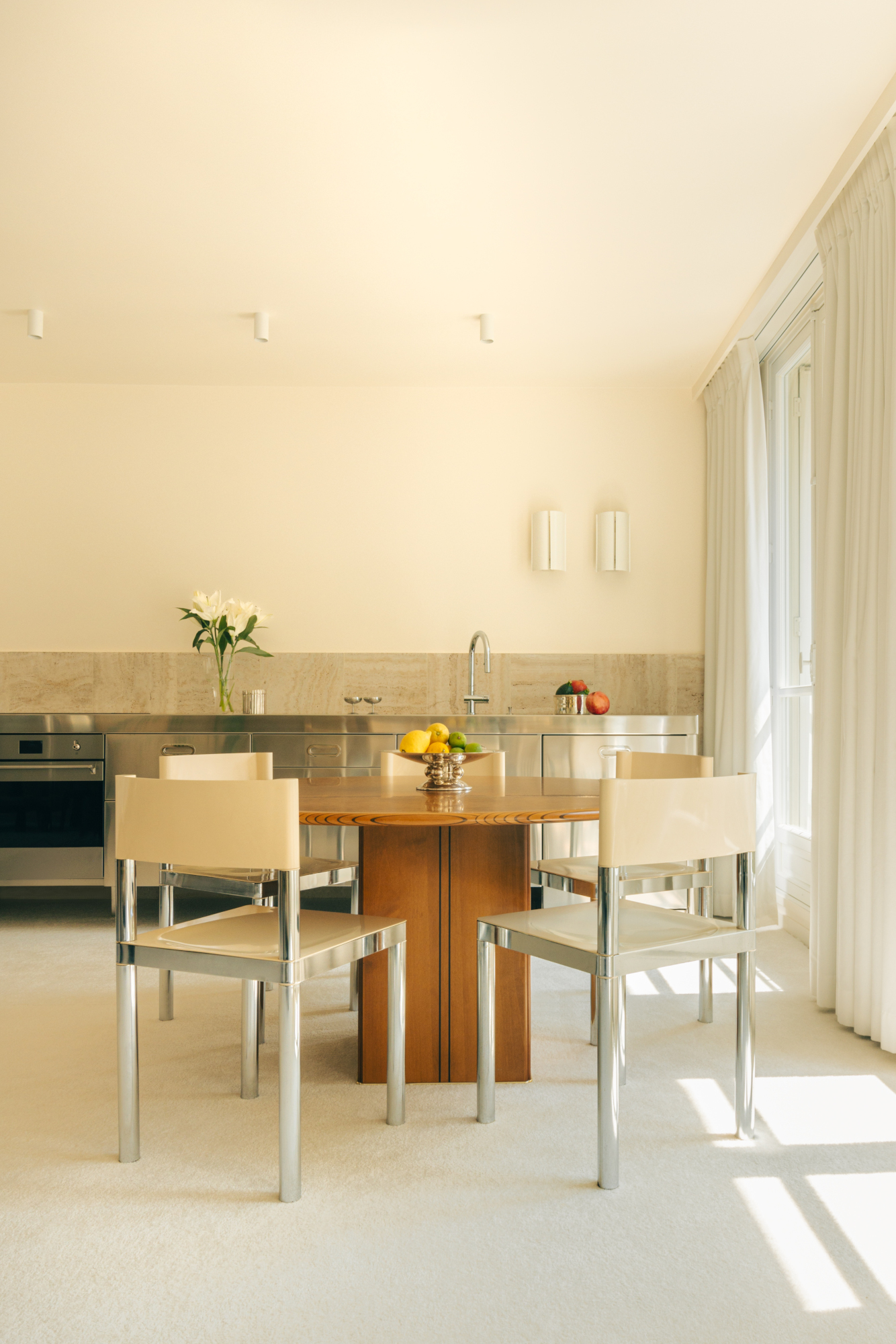
If darker beiges don’t tie in with your look, this nostalgic scheme by Studio Haddou Dufourcq, based in Paris, is a masterclass in using yellow-toned neutrals in paler, brighter shades. ‘The project is all about finding a balance between the blurry reflection and shininess of the stainless steel kitchen and the roughness of the travertine stone,’ Kim Haddou and Florent Dufourcq explain. ‘We added softness with neutral curtains, carpet and walls. It was important for us to add some contrast with a vintage wooden table to warm up the atmosphere – and sparkle everything with chrome legged chairs for a guaranteed mirror ball effect.’
7. Used among moody hues in this dining room
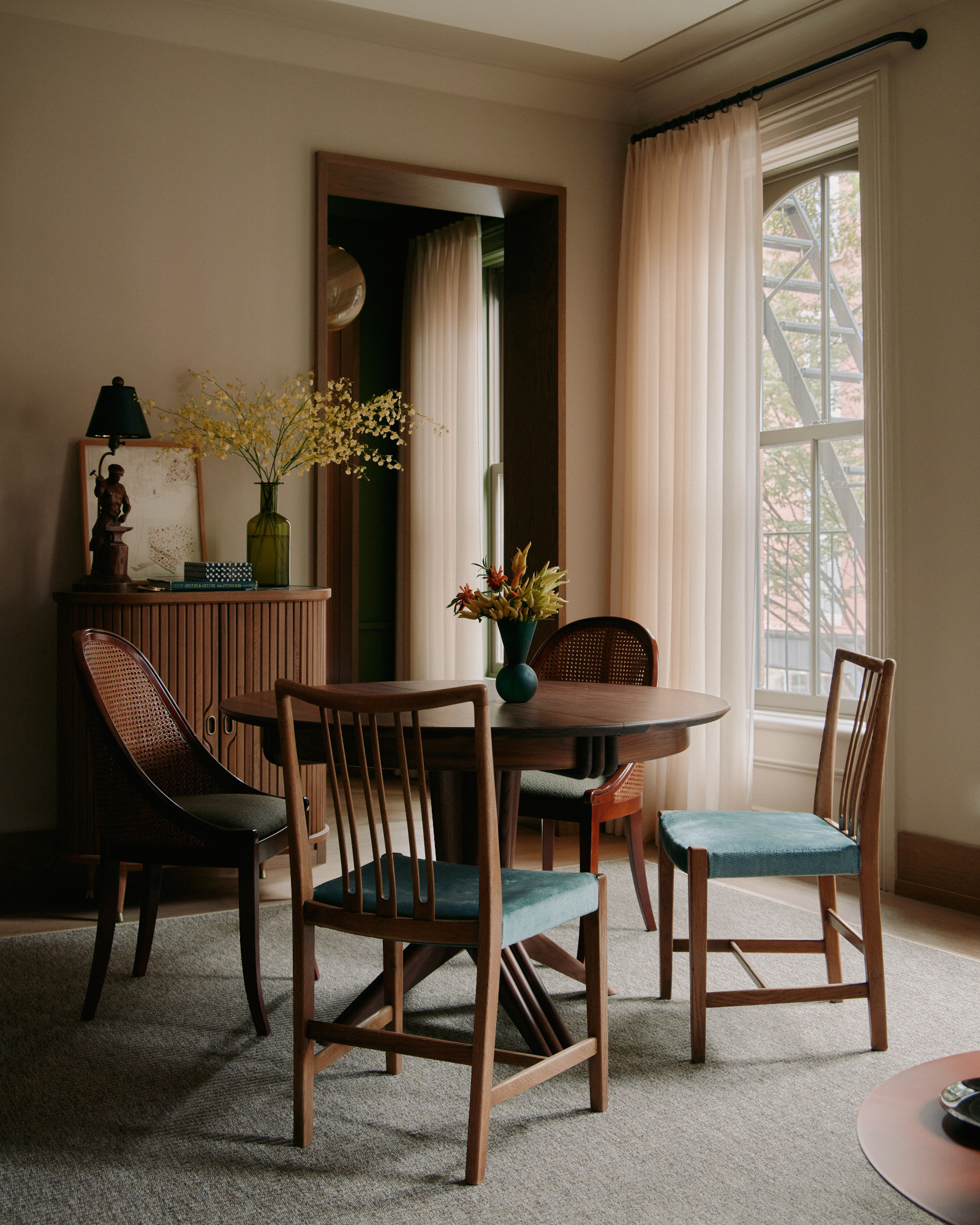
Carrying this color up and over, cutting into the ceiling, makes a space feel instantly cocooning – perfect for a cozy dining room, bedroom, or anywhere else you want to feel a little more intimate. In this dining space by Brooklyn interior design studio General Assembly, Farrow and Ball's Oxford Stone is paired with rich wood furniture for a moodier take on this palette – we love the injections of denim blue into the scheme through the chairs.
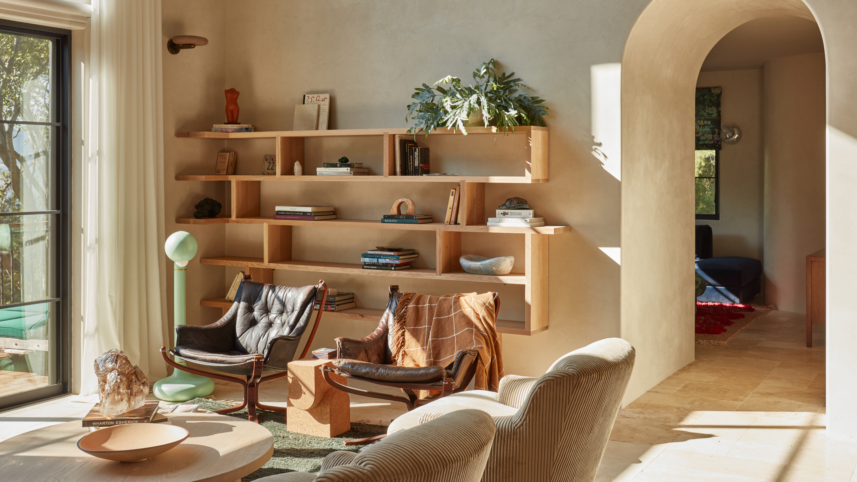
8. As a limewash-look base in this breezy living space
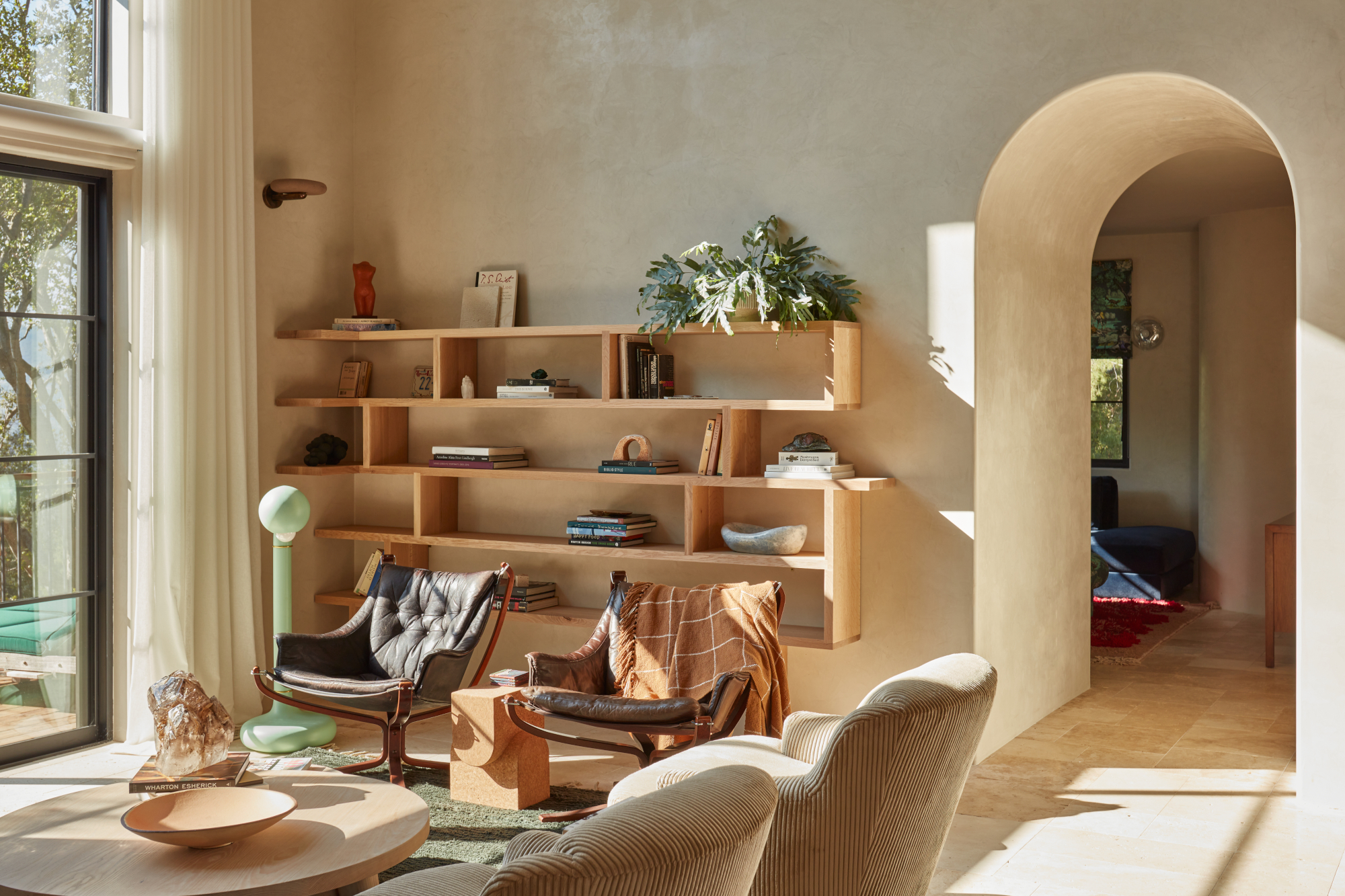
Roman clay paint gives magnolia tones a new depth – and makes for a breezier, almost beachy feel. For the living space of this house designed by Los Angeles firm Aker Interiors, the studio decided on Patagonia by Portola Paints. 'We sampled a few different colors, but Patagonia was the "light & bright neutral with depth" we were looking for,' says founder and principal designer Gabrielle Aker.
9. As the unexpected accent of this colorful bedroom scheme
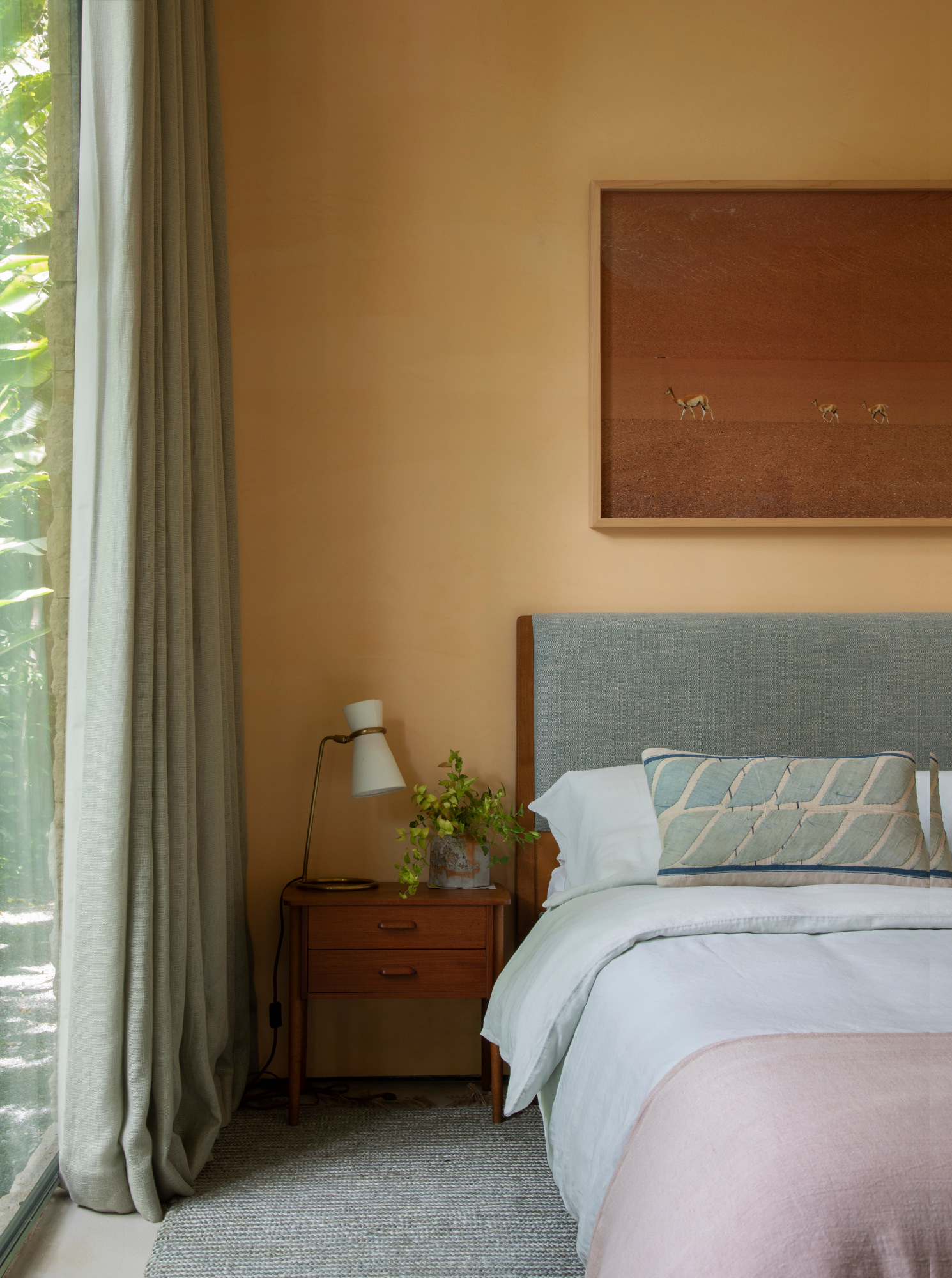
A deeper-toned yellow-beige takes center stage in this neutral bedroom scheme by NYC and Miami-based designer Sandra Weingort, boosted by the brown tones of the wood furniture and the framed photograph by Pablo Cersosimo hanging above the bed. Used with pastel shades of blue, aqua and pink, it's an interesting combination that places the wall color at the heart of the scheme, rather than as the background shade.