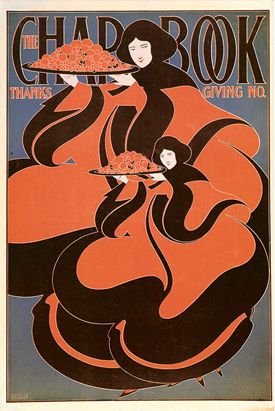
William H Bradley
Bradley’s cover for the 1895 Thanksgiving issue of the literary magazine Chap-Book is one of the first examples of American art nouveau. Bradley maximised the potential of emerging print technology, using effects of repetition, variations in scale and overlapping imagery. As the magazine grew increasingly famous, the publishers began to reprint the covers as posters, which served as advertisements for readers to collect Photograph: The Phaidon Archive of Graphic Design
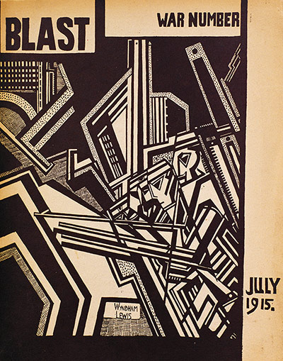
Wyndham Lewis
Conceived by the Anglo-American journalist and writer Wyndham Lewis, Blast was a short-lived journal that ran for just two issues as a manifesto for the avant garde art movement vorticism. As well as Lewis's manifesto, Blast contained poems and prose by Ezra Pound, TS Eliot and Ford Madox Ford, and reproduced the work of key modernist artists, such as David Bomberg, Edward Wadsworth and Jacob Epstein Photograph: The Phaidon Archive of Graphic Design
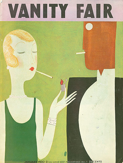
Mehemed Fehmy Agha
American periodical Vanity Fair's links to Europe were strengthened by the arrival in 1929 of the Russian-born Agha (previously at German Vogue), who took over as art director. With a thorough understanding of print and production techniques, as well as the ability to spot truly avant-garde work, Agha brought a mixture of Parisian style and German practicality to the magazine's cover designs, and introduced groundbreaking illustrative and photographic imagery Photograph: The Phaidon Archive of Graphic Design
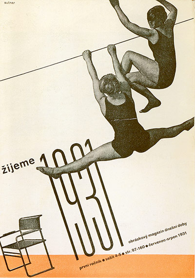
Ladislav Sutnar
Zijeme (We Live) was a Czech arts journal from the 1930s whose subtitle was ‘An Illustrated Magazine of Modern Times’. Its art director was Ladislav Sutnar, a pioneer in the use of photographic figures on graphic backgrounds, typographic grids and functional sans-serif typeface Photograph: The Phaidon Archive of Graphic Design
Mehemed Fehmy Agha
The August 1940 issue was designed by art director Mehemed Fehmy Agha from a photoshoot by the great German fashion photographer Horst. Agha introduced many important features to Vogue, pioneering the use of duotone, colour photographs and full-bleed images, and commissioning Picasso, Matisse and Dalí to design covers
Photograph: The Phaidon Archive of Graphic Design

Lester Beall
Scope was a US magazine for ‘the medical profession and other health workers’, designed by Lester Beall. Beall was influenced by dada and the Bauhaus, and combined photography, illustration and type from different eras to dramatic effect. Granted remarkable freedom, he would sometimes send the magazine to the printers without first seeking the management's approval Photograph: The Phaidon Archive of Graphic Design
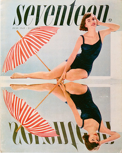
Cipe Pineles
After 10 years as art director of Glamour, Pineles moved to Seventeen, the first magazine for teenage girls, for which she commissioned the best artists of the time. This cover of the July 1949 issue illustrates her eye for detail and inventive approach to graphic design – what appears to be a mirror image was carefully nuanced to create a more interesting trompe l'oeil. Photograph: The Phaidon Archive of Graphic Design
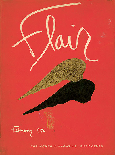
Federico Pallavicini
This first issue (February 1950) of the short-lived US magazine was designed by Swiss-Italian art director Pallavicini, who used a cut-out to reveal the page beneath. Inside, cut-outs, inserts and fold-outs added to the sense of meticulously hand-crafted beauty. Flair proved highly influential, inspiring designers for years to come Photograph: The Phaidon Archive of Graphic Design
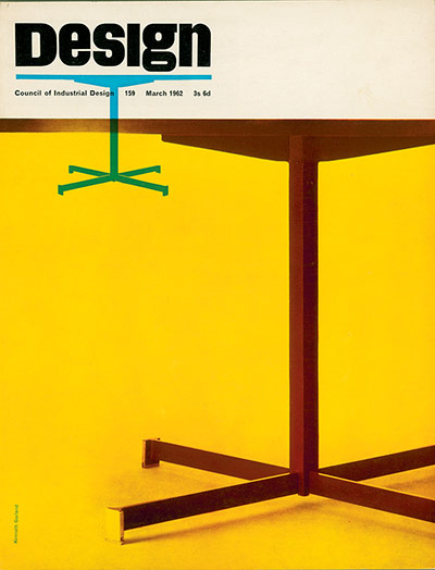
Ken Garland
The March 1962 issue is one of British art director Ken Garland’s strikingly simple covers: bold photographic images are dramatically cropped and repeated for ultra-contemporary effect. The masthead, introduced in January 1962, would remain untouched for 25 years – a testament to Garland's enduring contribution Photograph: The Phaidon Archive of Graphic Design
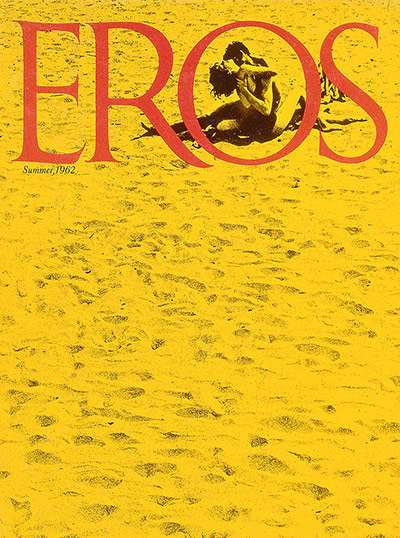
Ralph Ginzburg
Eros was a beautifully designed subscription-only erotic magazine created by Ralph Ginzburg in 1962. It was the first American magazine to feature intimacy between a black man and a white woman. In 1963, Ginzburg was charged with obscenity and sentenced to five years in prison (serving eight months) Photograph: The Phaidon Archive of Graphic Design
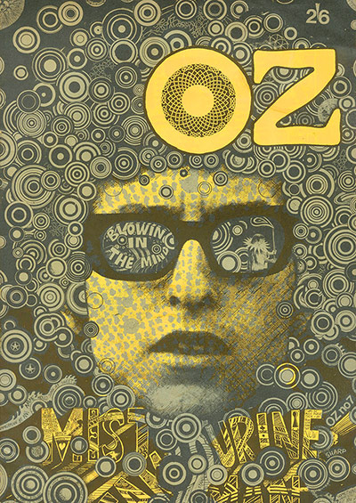
Martin Sharp
Oz magazine was one of the most visually exciting magazines of its time. The chief organ of the British underground press, Oz was anti-establishment, filled with anger, radical ideas and leftwing politics. Although certain issues were designed by Hapshash and the Coloured Coat, the majority were the work of the Australian artist Martin Sharp, whose posters of Bob Dylan, Donovan and others are considered classics of the genre. Sharp experimented with LSD and his stunning Oz covers were a testament to his new-found influences. Perhaps the most famous of all was this, Sharp's Dylan cover for issue 7 in October 1967 Photograph: The Phaidon Archive of Graphic Design
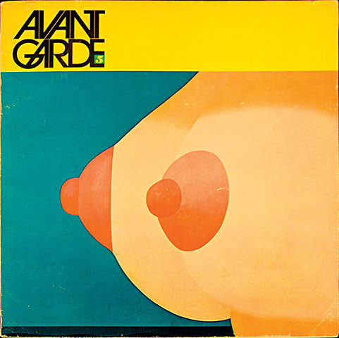
Herb Lubalin
An arts and politics magazine, Avant Garde was Herb Lubalin's third collaboration with the independent publisher Ralph Ginzburg. Thanks to its critical stance on American politics and provocative sexual imagery, the magazine perfectly framed the zeitgeist of the 1960s and quickly established a reputation for controversy. Art director Lubalin produced outstanding spreads and created the magazine's typeface: both the magazine and its eponymous typeface are landmarks in their fields Photograph: The Phaidon Archive of Graphic Design
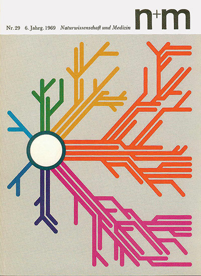
Erwin Poell
n+m, an acronym for Naturwissenschaft und Medizin (Natural Science and Medicine), was a 1960s medical journal designed by Erwin Poell, who brought a touch of psychedelia to science. Each highly stylised cover design, such as this one from 1969, related to a topic inside and ranged from a graph of the world’s population to the structure of a nerve cell Photograph: The Phaidon Archive of Graphic Design
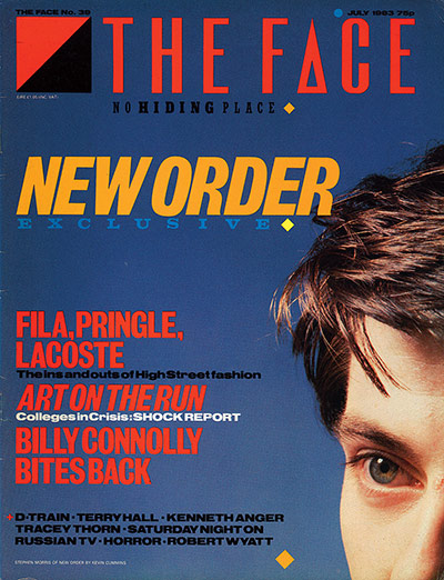
Neville Brody
Styled by British graphic designer Neville Brody, the Face was launched in May 1980 and immediately set the tone for what became known as the style decade. Brody’s groundbreaking art direction merged dynamic typography with stylish and dramatically cropped photography, as on this July 1983 cover, creating a new visual language for magazines Photograph: The Phaidon Archive of Graphic Design