Thinking of updating your living room but want to be on trend? We've asked our favourite paint companies what their most popular living room paint colours for 2023 are to find out what shades are catching eyes and drawing compliments.
Of course, when you're choosing for your living room colour scheme it's down to personal preference and you can choose a tone of one of these colours if you find it too bright or too dark. Alternatively, use these colours as accents and team with white living room ideas. But if you want a surefire colour combination that is going to be a truly styling crowd-pleaser we have 10 popular shades to choose from.
'It's really worth taking time to choose the perfect shade for your living room walls since the ideal colour – one that is as restful, uplifting, restrained or vibrant as you want it to be – will be a source of joy and satisfaction every day,' advises James Sirett, head of product, Fired Earth.
Living room paint colours for 2023
There's no doubt about it, paint colour choices have changed over the last few years, grey was the colour to have in your living room, that or neutrals, but right now, colour is back, which makes our guide on living room paint colours for 2023 even more exciting.
Choosing the right colour for your space is personal. 'Think about how and when you use the room,' says James. 'For example whether it's a softly lit space to relax in during the evening, or somewhere bright that you might spend time working in during the day. Then try out a good selection of sample pots to see how the colours look in the relevant light (and how they work with soft furnishings etc) and, most importantly, how they make you feel.'
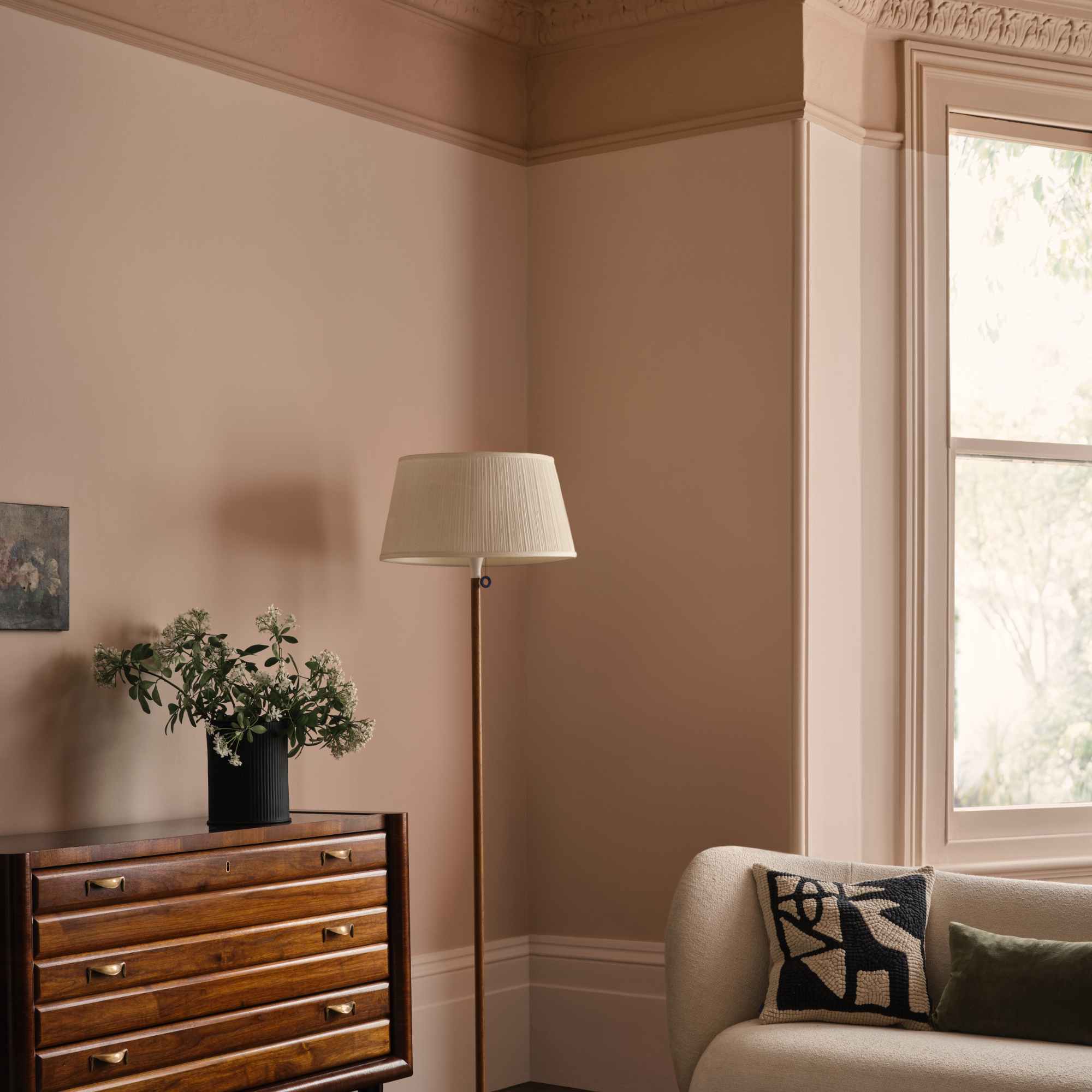
1. Caramel
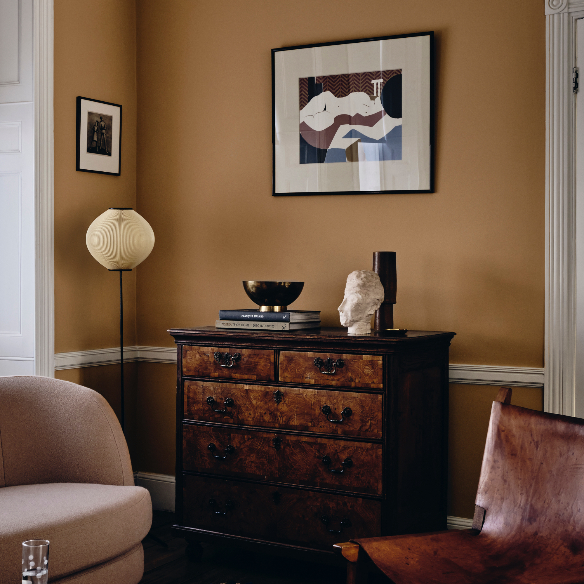
Oh so warming and ideal for a North facing living room, caramel is a lovely shade to consider. It goes well with dark wood furniture, perfect if you're a fan of buying second-hand. Alternatively, it can be freshened up when paired with white.
'Lichen is a bold yet balanced caramel shade which exudes warmth and versatility,' says Francesca Wezel, founder of Francesca's Paints. 'It’s ideal for living areas because it radiates light without being too overpoweringly yellow or bright. I would say it is a joyous colour that brings a positive atmosphere to interiors. It also pairs well with dark wood, as well as deeper greens, blues and black.'
2. Electric blue
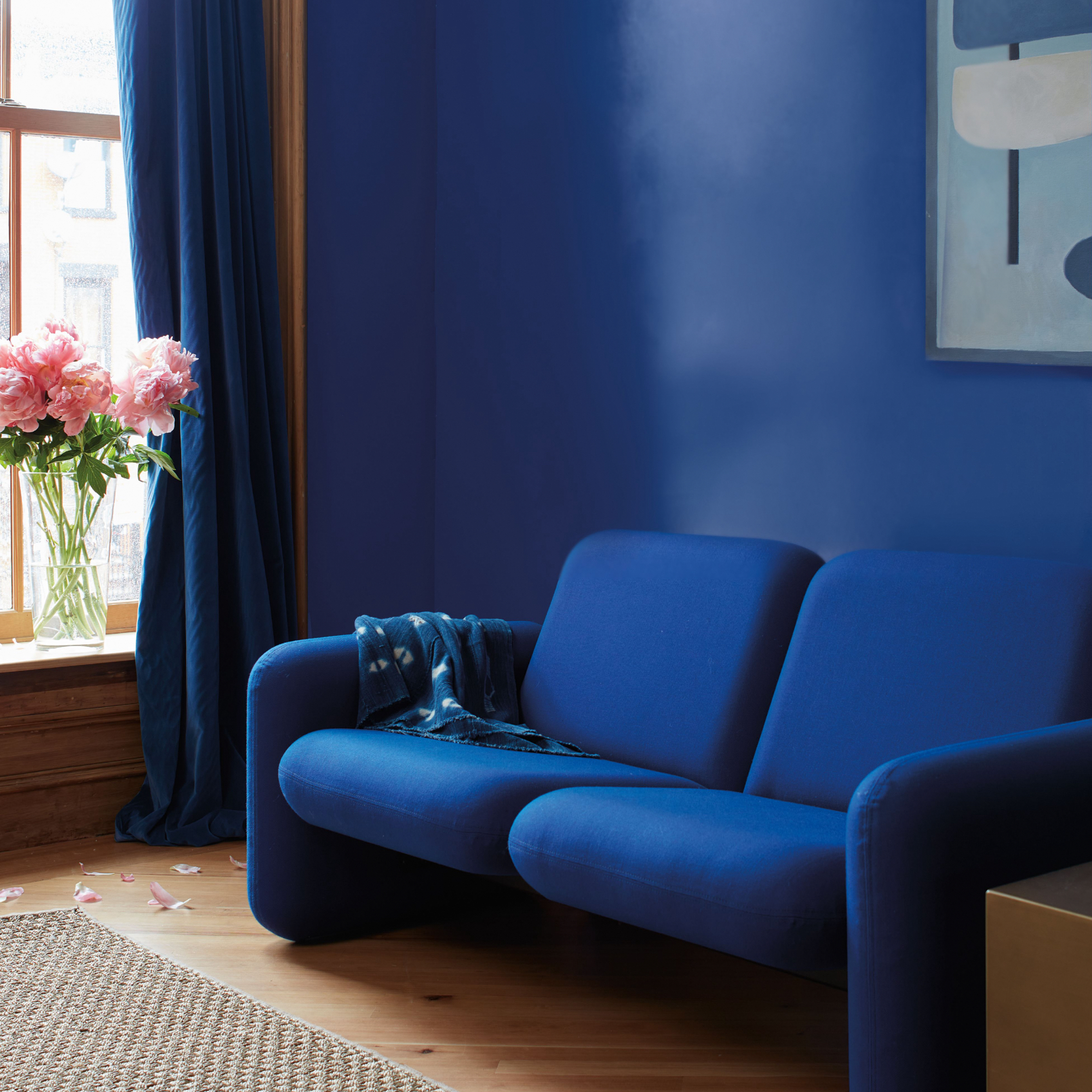
Not for the faint-hearted, an electric blue living room idea is certainly a bold choice. If you balance it well, it can work in both traditional and modern living rooms, the key is to keep the flooring light and add in some pops of colour to break it up.
'Starry Night Blue is a radiant navy akin to the deep indigo of dusk,' enthuses Helen Shaw, UK marketing director, Benjamin Moore. 'The touch of violet in its undertone makes it feel sophisticated but there is also a playful side to this colour.
When using colours this rich, don’t be afraid to go bold and colour-drench the living room. Opt for a higher sheen to emulate the glimmer of the night sky and pair with velvet blue furnishings to complete the look.'
3. Sunshine yellow
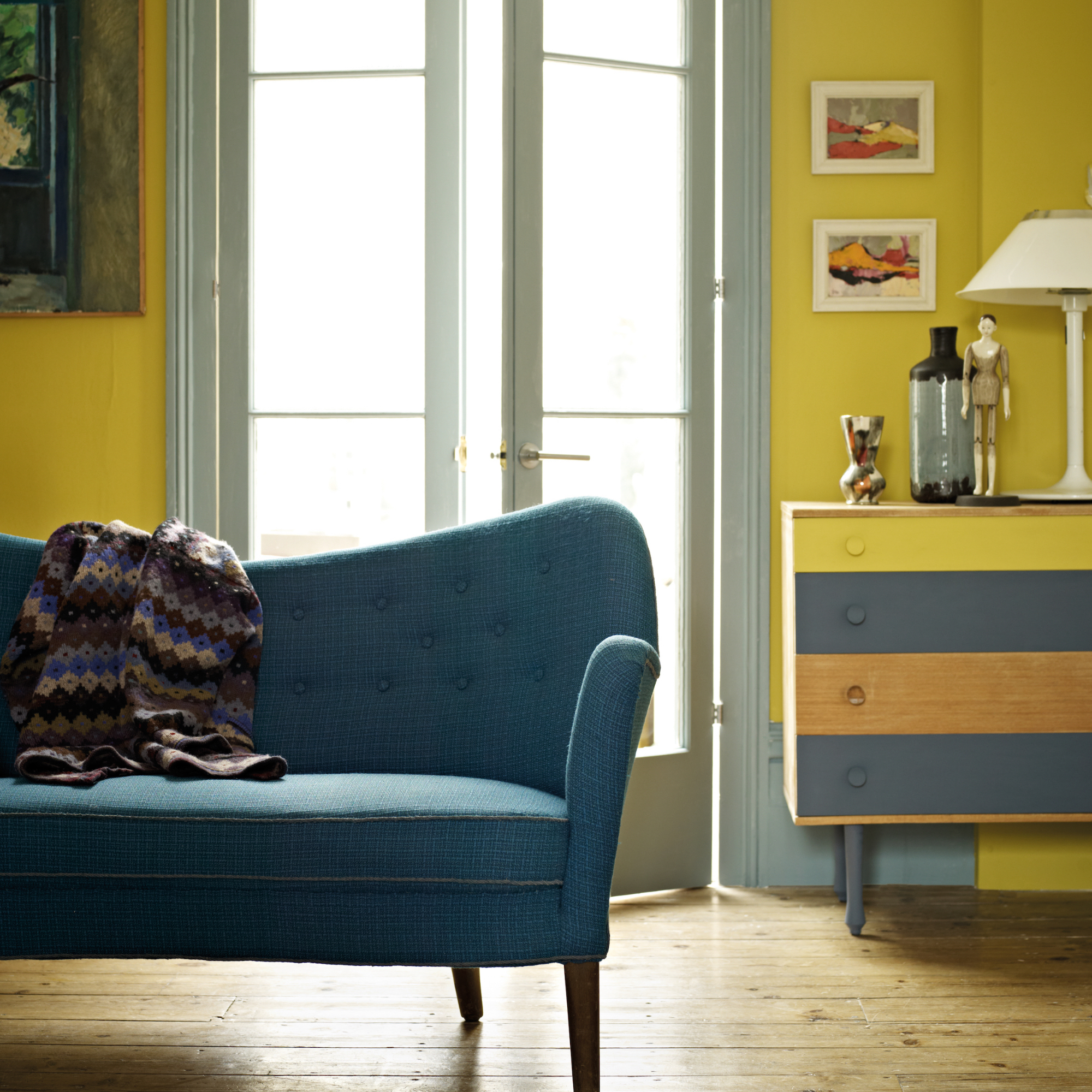
Oh for the joys of sunshine pouring through the window – not only will this colour add warmth to your living room, it will lift your spirits too.
'With their sunny associations and instant ability to lift the spirits, shades of yellow are perfect for introducing a sense of warmth and energy into any living room,' says James Sirett, head of product, Fired Earth. 'Yellows work beautifully as a backdrop to a wide range of colours – from sky blues and terracottas to greys and pinks – so they're much more versatile than they might first appear.
From sophisticated, earthy-toned yellows (such as Fired Earth's Hustle at 5pm) that would work well in a mid-century style scheme, to joyful pastel shades, and fresh citrus brights, there's a yellow for every living room.'
4. Plaster
The craze for that 'freshly plastered' wall sees no signs of going, and it's easy to see why – it's a calming living room colour that goes so well with other colours, be it a zingy accent or a moody blue. Or, use a darker shade for your coving as Andy Greenall, creative director, Paint & Paper Library explains:
'Choosing a colour in graduating shades creates layers of colour which can emphasise architectural features in a living room, or emulate them where they lack.
'Provided in varying strengths of the same pigment, combining subtle nuances of one shade will create a tranquil harmonious atmosphere, whilst pairing the deepest hue with the palest will deliver an impactful, tonal scheme,' he says.
'Powder V is the most intense hue which can be used to highlight architectural detailing on a ceiling and cornicing. It will create impact but remain elegant and harmonious when paired with the softer hues of Powder III on walls and the lightest hue, Powder I, on skirting and woodwork.'
5. Teal
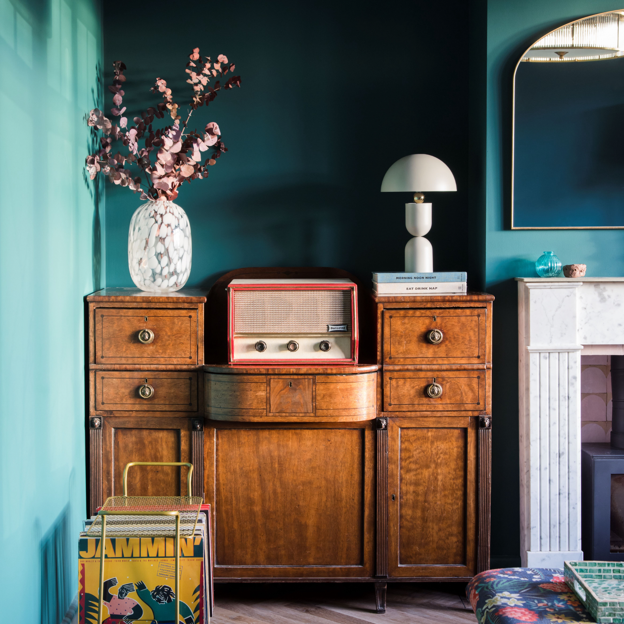
Teal has been a particularly popular colour for living rooms this year. The rise of colour and a more maximalist approach to interiors has inspired us to take that leap and be a little braver.
'Teal is one of the hottest colours out there right now, both when it comes to paint colours and furniture/home decor items,' agrees Emma Bestley, creative director and co-founder of YesColours.
'It’s a timeless shade that, when paired with the right complementary colours, can easily become the star of your home and get you hundreds of compliments from your friends and family members.'
'Depending on the undertone or the lighting in your space, as well as the surrounding colours, teal can look differently in different rooms or corners. It can be warm, with a hint of yellow, or colder, with a blue tone that will add even more drama to its royal look,' she adds, recommending YesColours Passionate Teal paint as one of her favourite teal shades.
'It provides tranquillity while the green boosts the energy completely, making it a perfect hue for almost every area of the home.'
6. Pastel pink
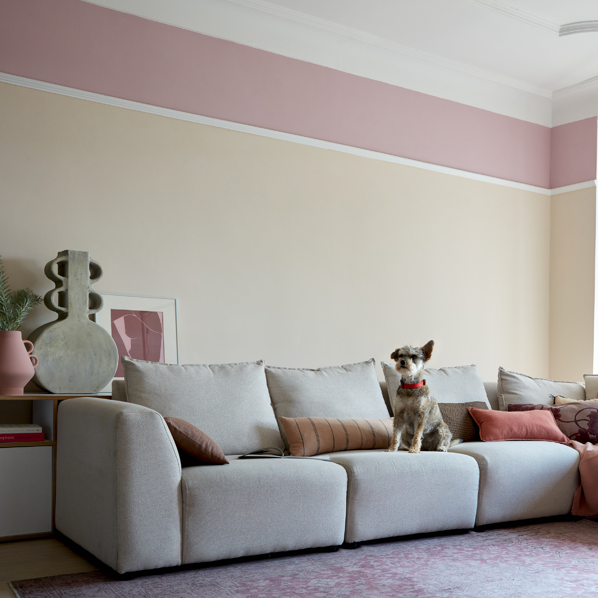
Pastel pink has had a resurgence this year, pink living room ideas are firmly back in fashion thanks in part to Greta Gerwigs Barbie.
'For too long, shades of pink in the home have been associated with a girl’s bedroom when, if painted appropriately, the colour can work in all rooms of the house,' says Cathryn Sanders, head of creative at Earthborn's advice.
'The beauty of pink is that it is very versatile. From millennial pink to dusty rose, this season's ‘it’ colour evokes a sense of playfulness we should all feel when decorating our homes.
'Creating a two-tone wall can be done by layering different shades of pink beside each other. The contrast between your chosen pink shades creates a dynamic effect and can inject some serious drama into the room.
'Opt for a bold pink shade and a lighter tone to add dimension. You can use the paint in any sections you desire, but usually, a half-and-half design provides the best contrast. Map out the area you wish to paint with masking tape to ensure crisp, neat lines that really emphasise the desired contrast.'
7. Deep green
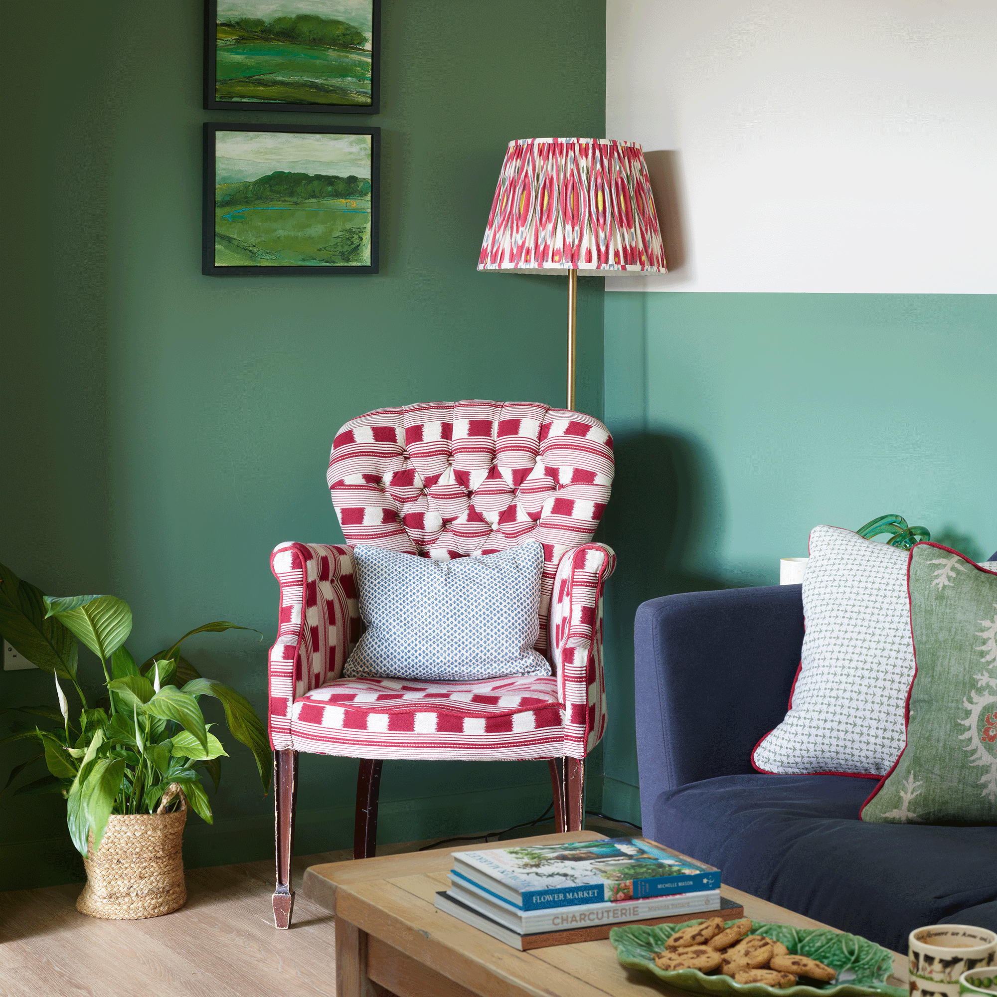
Green living room ideas are always a firm favourite. It's nurturing, grounding and yes, the cliche of 'bringing nature in' – but it's so true!
'The sense of wellbeing that we gain from time outside in the natural world has resulted in a desire to re-create this sense of connection and positivity in our homes, driving a renewed love for greens of all hues, as well as biophilic design,' says Ruth Mottershead, creative director, Little Greene.
'Leaf wallpaper prints, dense foliage-based patterns, rich deep woodland hues and earthy, natural shades are being used alongside a myriad of green colours to really bring a sense of the outdoors in.
'Darker colours work wonderfully to harness the character and depth of a space, creating intimacy and warmth, well suited to a living room.'
8. Damson

Love rich tones? Damson – or plum – is a colour to watch for autumn winter, but also one that works all year round. Cosy in the winter and vibrant in the summer, it's a shade that has links to Royalty.
'Once reserved for Kings and emperors, purple is a bold and intriguing choice for living rooms,' says Annie Sloan, paint and colour expert. 'A rich, jewel-toned plum with both maroon and red elements, Tryian Plum is a homage to the ancient pigment, Tyrian purple.'
'Despite its richness, it's not just for winter months, deep purple pairs beautifully with navy blue and can be lifted depending on the season with cornflower blues, soft pinks and whites for a flattering year-round look.'
9. Scarlett red
Red is a wonderful colour to use and has been rising up the colour ranks this year. The beauty of it is, you don't need to 'colour drench' red, in fact, using it sparingly will have a much bigger impact.
'Bright, energising reds such as Bamboozle, a fiery-toned shade, bring richness and warmth to every space, particularly with an earthy neutral like Stirabout or Joa’s White for a cosy living room scheme,' says Charlotte Cosby, creative director, Farrow & Ball. 'It is incredibly joyful when introduced in surprising doses, whether on a bookcase, across woodwork or an even a piece of furniture.'
Red goes with so many other colours too – grey, yellow, green and teal all look fabulous. Keep red as your main colour and use others as accents.
10. Lavender
Uber pretty and easy to live with, lavender, like blush pink sits in the ice cream shades camp. If you've always fancied it as a living room option but don't want it to be too saccharine in style, then team it with a darker shade – like mid-grey or a purple for contrast.
'Lavender is traditionally a romantic and feminine hue but is increasingly popular for many rooms in the home thanks to its subtlety and adaptability,' says Dominic Mylands, CEO, Mylands.
'We’re noticing more and more customers choosing lavender for their living rooms because it adds a pop of colour, but isn’t overwhelming or intimidating like other, bolder shades, and its versatile nature means it pairs well with a myriad of colours.'
FAQs
What colours are in for living rooms in 2023?
'Blues still reign in the decorative repertoire but they are becoming cleaner and brighter of late – something like Kittiwake or the bolder archive shade of Chinese Blue would fit the brief perfectly,' says Patrick O'Donnell, brand ambassador, Farrow & Ball. 'How you layer is up to you, keep it controlled with natural tones of biscuit and earthy whites or splash with strong pinks and greens.'
What are the colour trends for 2023?
Neutrals are still popular, but not necessarily the shades that spring to mind like off-whites, stone and oatmeal. Think pastel and hints of colour instead.
'The new neutrals – we are often conditioned to think neutrals are versions of off-whites and pale greys but they can also be colourful too, such as subtle green blues to earthy, natural pinks,' says Patrick.
'Look to Blue Gray for the former and Setting Plaster for the latter. Both colours will get rather beautifully washed out in full sun, but the former will give you the right balance in an east-facing room while the latter will add warmth in those awkwardly lit spaces.'